Files: Concept design for navigation bar
updated:
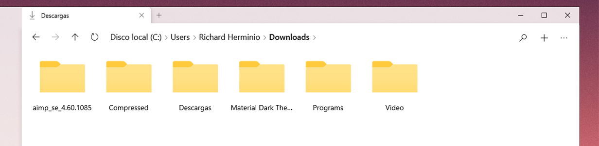
Update: 07/2020
 XPoppyX
All 36 comments
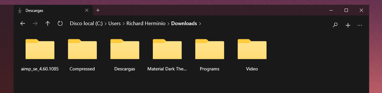
I am a fan of highlighting the nav bar when hovering over, not so much of the other changes in this design.
 yaichenbaum
on 24 Apr 2020
yaichenbaum
on 24 Apr 2020
I like it too, it looks very clean.
 R3voA3
on 24 Apr 2020
R3voA3
on 24 Apr 2020
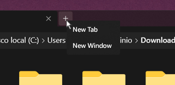
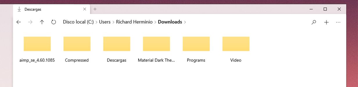
I like the design for navigation bar. I think adding another button for opening new windows besides the existing one would be a better solution. Using a flyout means you have to click twice every time when you want a new tab.
 GavinYou082
on 24 Apr 2020
GavinYou082
on 24 Apr 2020
@GavinYou082
Using a flyout means you have to click twice every time when you want a new tab.
Sorry I forgot to clarify that, it's supposed to be a context menu (right-click)
XPoppyX
on 24 Apr 2020
@xPoppyx That's nice!
GavinYou082
on 24 Apr 2020
I approve everything, but why would you remove the Up button?
 SOI7
on 24 Apr 2020
SOI7
on 24 Apr 2020
@SOI7 Well, I thought it was not very useful since you can do exactly the same in the navigation bar, but if it is useful for users then it is not necessary to remove it.
XPoppyX
on 24 Apr 2020
I don't think there is a need for the plus button to show the context menu, there will be a different context menu when right clicking on the tab strip that gives that option, most of the time when a user clicks the plus button they want a new tab.
I also like how on the current design, the address bar blends in with the design and looks like a regular header, but if you click on it then you get more functionality. I think always highlighting it will take away from the clean design.
Another option issue is that you removed a lot of the buttons from the current design that are core functionality for many users.
yaichenbaum
on 24 Apr 2020
@SOI7 Well, I thought it was not very useful since you can do exactly the same in the navigation bar, but if it is useful for users then it is not necessary to remove it.
The function is different, the navigation buttons return you to the previous folder you opened, while the Up button returns the parent folder
SOI7
on 24 Apr 2020
Another thing I would like to add is that we should only show the search box when the user wants to search, the rest of the time it stays hidden and gives the app a cleaner look.
yaichenbaum
on 24 Apr 2020
Another thing I would like to add is that we should only show the search box when the user wants to search, the rest of the time it stays hidden and gives the app a cleaner look.
Was thinking the same, switching from a button to a box when you start searching
SOI7
on 24 Apr 2020
I'll see what I can do :)
XPoppyX
on 24 Apr 2020
What do you think? @yaichenbaum

XPoppyX
on 24 Apr 2020
Very nice. So CTRL+F will auto-focus the search box?
R3voA3
on 24 Apr 2020
What do you think? @yaichenbaum
It looks good, but I have mixed feelings about possible overlaps between the navbar and the eventual searchbox (unless you make the searchbox shift the navbar margin). On the other hand, I'm a big fan of condensing the current two lines, because it helps with not wasting space, which is an issue most UWPs have
SOI7
on 24 Apr 2020
Very nice. So CTRL+F will auto-focus the search box?
@R3voA3 When search is implemented we will add that shortcut as well.
What do you think? @yaichenbaum
@xPoppyx I like it!
It looks good, but I have mixed feelings about possible overlaps between the navbar and the eventual searchbox (unless you make the searchbox shift the navbar margin). On the other hand, I'm a big fan of condensing the current two lines, because it helps with not wasting space, which is an issue most UWPs have
@SOI7 A concept we are thinking about is having the search box float down underneath the navigation bar.
yaichenbaum
on 24 Apr 2020
@SOI7 A concept we are thinking about is having the search box float down underneath the navigation bar.
A "push" to the left would feel more natural imho, but we'll see later when Search will be a thing
SOI7
on 24 Apr 2020
something like this, but to the left

XPoppyX
on 24 Apr 2020
I think it would be a little more subtle then that but we will explore the different options when we are implementing search.
yaichenbaum
on 24 Apr 2020
Will we wait to receive more feedback?
XPoppyX
on 24 Apr 2020
I think your latest idea is perfect, see #676 about our priorities right now.
yaichenbaum
on 24 Apr 2020
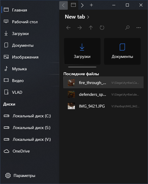
Here's a better idea that makes it closer to explorer
This moves the ellipsis menu to the context menu for no item selected along with the new menu, this will make space for the ribbon and a search box.
 Senko-Dev
on 8 May 2020
Senko-Dev
on 8 May 2020
@diligamer the previous concept was similar, but they don't want to remove those buttons, and the old versions had ribbon (or something similar), but it was removed
XPoppyX
on 8 May 2020
The ribbon needs to be brought back.
Senko-Dev
on 8 May 2020
There are no plans to bring back the ribbon, the goal for Files UWP is to rethink what a file explorer app should be. We feel that there are better ways to provide features and to keep the design simple for more users.
yaichenbaum
on 8 May 2020
- Slightly darker file properties text in list view
XPoppyX
on 16 May 2020
I now have VS and will start work on the change.
Senko-Dev
on 19 May 2020
@Senko-Dev This design concept is very good but it has not yet been approved, feel free to open a pull request so we can continue the discussion.
yaichenbaum
on 19 May 2020
@yaichenbaum We should extend design concept on how window look, when it has smallest available width.
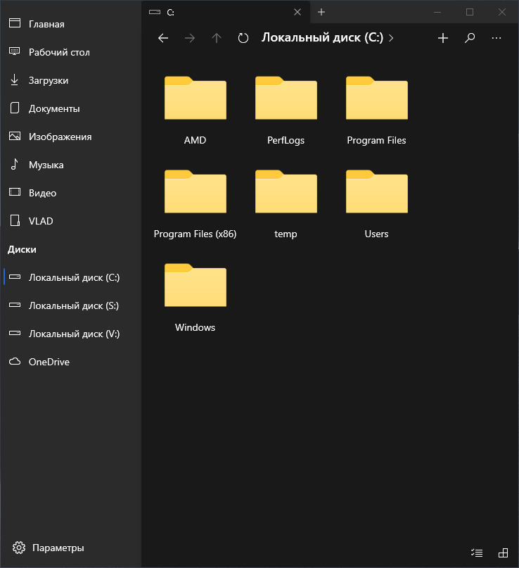
Now it looks like:
I have some draft example
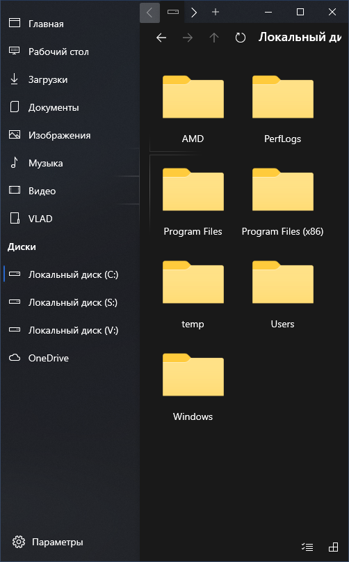
When changing window width, some elements hiding by window border.
Normal width:
Small width:
So, first way to fix it is increase minimal window size, second way is place path bar to new line when window has small width.
 tsvietOK
on 20 May 2020
tsvietOK
on 20 May 2020
@tsvietOK You brought up a great point, I think it's best to leave the navigation bar how it currently is (we can make the text size a little smaller). This would prevent the issue of controls getting cut off when the window is sized smaller.
In order to improve the tabs experience, what do you think of collapsing the sidebar to be compact when the window is sized smaller?
yaichenbaum
on 20 May 2020
@yaichenbaum I think it is a good idea, moreover there is a different variants how it could looks like when window has small size.
tsvietOK
on 20 May 2020
I still think we can use the proposed design for large sized Windows.
yaichenbaum
on 20 May 2020
@yaichenbaum What do you mean? Do we use large sized design now?
tsvietOK
on 20 May 2020
By large size, I meant including the nav buttons and textbox on the same line.
yaichenbaum
on 20 May 2020
What if the path returns to the top position when the window is small?
XPoppyX
on 9 Jun 2020
We want to thank you for your feedback and concepts. We will be closing this issue but we will keep your feedback and ideas in mind as we continue working on the app.
yaichenbaum
on 23 Jun 2020
Related issues
tsvietOK
·
30Comments
R3voA3
·
18Comments
 BuraChuhadar
·
23Comments
BuraChuhadar
·
23Comments
 KaKi87
·
31Comments
XPoppyX
·
18Comments
KaKi87
·
31Comments
XPoppyX
·
18Comments
Most helpful comment
There are no plans to bring back the ribbon, the goal for Files UWP is to rethink what a file explorer app should be. We feel that there are better ways to provide features and to keep the design simple for more users.