Clarity: Toasts/Notifications Feature Request
Select one ... (check one with "x")
[ ] bug
[X] feature request
[ ] enhancement
Expected behavior
Add a new component for displaying floating messages.
This can be seen in primeng at http://www.primefaces.org/primeng/#/growl
 mrmokwa
All 28 comments
@MRMokwa thanks for the feature request! Would you say this replace the notification functionality for you or would you still expect a notifications components? I am trying to figure out the use cases you would use each for so it would be great if you can share some!
 jaffoneh
on 13 Jan 2017
jaffoneh
on 13 Jan 2017
Notification functionality you mean the use of alert component? I'd say so, but with this different layout approach.
For example, I'd like to send a message to the user after add/modify a record:
Add Record -> Navigate back to List View -> Display floating message of sucess for X time.
Hope I made myself clear.
mrmokwa
on 13 Jan 2017
@MRMokwa thanks for the quick reply. One of the things on our roadmap (still not implemented) is a notifications components and I was wondering if that's how you would use this component as well.
The use case you describe seems to fall under that as well so this makes sense. Thanks for providing more info!
jaffoneh
on 13 Jan 2017
Is this still planned for development? I'd really appreciate a toast-notification component!
 ninodinatale
on 16 Aug 2017
ninodinatale
on 16 Aug 2017
I'd like to add this library for UI/UX discussion.
What do you think about this?
mrmokwa
on 17 Aug 2017
@ninodinatale
Toasts are still planned for development. But they are still far down the list in terms of priority. Make sure to subscribe to this issue to get updates. Once you start seeing labels like UX ready and people being assigned to this, you will know it's in development!
 mathisscott
on 18 Aug 2017
mathisscott
on 18 Aug 2017
@MRMokwa
That's an interesting library. I can't speak to the code behind it. But the design doesn't follow the guidelines/principles we follow in Clarity. So what we put together would likely look a little different.
I do like the progress bar at the top. That's fun. Perhaps that is a feature we should consider for our own notifications.
mathisscott
on 18 Aug 2017
Are there any updates regarding the priority of toast messages? We really would like to see a toast-notification component in clarity and can provide an implementation!
Find below the Change Proposal:
Summary
Implement Toast messages/notification component for Clarity.
Implementation Options
option 1 - restyle and integrate ng-snotify
use available opensource lib: ng-snotify (released in MIT license, mentioned in feature request)
adapt styling to match clarity's app level alerts (see description in Visual Design below)
integrate documentation and demopage from ng-snotify to match clarity documentation
option 2 - enhance alert component
enhance clarity alert component with the essential features from ng-snotify (see Features defined below).
either enhancing alert docu description or create a new page.
Features
choosing implementation option 2 focus on the following features:
- auto-hide notification after a configurable amount of seconds (timeout)
- support for different types of notifications (see clarity alert types)
error, warning, info, and success.
https://vmware.github.io/clarity/documentation/v0.11/alerts - multiple toast messages are stacked, new items appear on top
- Message body: support for variable content - text, icons, links, actions with dropdown ...
- Close option (x, similar to dismissable alerts)
- Positioning: default top-center
- Progress bar at top of notification, progressing according to remaining display time (feature must be parameterized: true/false)
Visual Design:
- styling should match clarity App-Level Alerts,
restyling scss must be possible, themes must be supported - simple animation on appear/disappear (fade-in from top/fade-out)
- progress bar styling similar to clarity Progress Bar on top of Card component.
https://vmware.github.io/clarity/documentation/v0.11/progress
API
Enhance clarity alert component to support auto-hide (after x seconds) and progress bar (until it hides)
Components:
ClrAlert
add input "clrTimeout: number = 0" (defines how long the alert is visible in seconds)
add input "clrShowProgressBar: boolean = false" (defines whether the progress bar is shown)
As the new parameters have default values, this change will have no breaking changes.
Implementation Plan
Affected Code:
alert.ts
alert.html
This change introduces asynchronous behavior, to hide the alert after x seconds, planned to be implemented with requestAnimationFrame.
Design should be like the progress bar in cards on the very top of the alert, colored according to the type with clarity colors.
Conclusion
Please give us some feedback which option you think suits clarity better, as we really want to see the feature inside the clarity design system!
 d-m-s
on 8 Jun 2018
d-m-s
on 8 Jun 2018
Thanks for your interest in helping with this, and I'd love to figure out how we can get a contribution towards this effort. We have other priorities at the moment to tackle this by ourselves, but we need to ensure we're aligned if you'd like to help out.
We haven't defined any UX for this component, so that should come first. You've provided two suggestions, but we're short on UX resources at the moment. We don't move ahead on implementation until the UX is researched and well defined, which you can see examples here https://github.com/vmware/clarity/issues?utf8=%E2%9C%93&q=is%3Aissue+label%3A%22UX+Ready
If you'd like to help get this moving along and have the resources to contribute to the UX proposal, then we'd ask you to build a similar proposal to what you see in some of the examples above and submit it first. When we have that, we'd be happy to validate your UX proposal and make any adjustments to match our design patterns.
Also, one of our standard principles is to ensure that things don't automatically disappear or jank for the user. I know this is common on the web, but important information should never be lost without the user directly acknowledging it.
Pinging @reddolan to add any additional details about submitting a UX proposal.
 gnomeontherun
on 8 Jun 2018
gnomeontherun
on 8 Jun 2018
Thanks for your quick reply!
Taking a look at the "UX Ready" tickets, is it a screendesign you need first?
Can you give us some more advise what's necessary?
Because from UX point of view, we basically need either a subset of the functionality from ng-snotify / or an auto-hide alert component with the features describe above.
A bit confusing to me is the statement that things shouldn't automatically disappear - because that's exactly what we're trying to reach with that component. Of course just for usecases where it serves as additional visual cue for the user to overcome change-blindness and giving appropriate feedback to the user. For more important critical information alerts should be used.
Regarding implementation:
What do you think about the two options outlined in the proposal - I guess something like a restyled version of ng-snotify won't be accepted, would it?
d-m-s
on 11 Jun 2018
find in the following a screendesign suggestion:
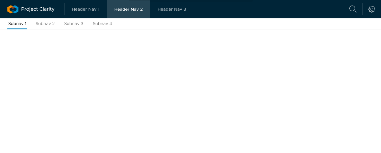
Features shown:
- visual style matching claritys applevel alerts, in this case warning
- dismiss-able on close link
- progress bar on top
d-m-s
on 11 Jun 2018
I'm collecting the UX guidelines we are trying to publish, so let me get back to you on that in a day or two (we've been working on this but haven't published it yet). A quick answer about auto-disappearing, there are ways this can be handled while still having the visual experience you describe, such as having the toast appear and fade out but still persist somewhere in a notifications bar, perhaps. I'm not the UX designer to dictate the terms of this behavior, but it was intended to be an example of something we think very carefully about and try to research and compare what other patterns do, what is fully accessible, and so forth before we build a solution.
As far as implementation question, agreeing to use ng-snotify is accepting a solution before we've outlined the specific problem and desired approach to handling it.
gnomeontherun
on 11 Jun 2018
thanks, looking forward to your reply! We've taken a look at your other 'UX Ready' tickets, especially the design specs in #1826, #1827, ... look pretty sophisticated, how do you create those? looks almost like an html prototype being screen-recorded?!
What you've described, a kind of notification center sounds like a good idea to me to restore/have access to past toast-notifications. But I would not want to tie those two feature request too close to each other - because chances are high we won't see either one in the next months then ...
Actually just some hours ago this has been filed as feature request #2350.
In the meantime i've updated the design spec in my last post, showing the progress animation and the auto-hide/fade-out. An example of stacking toast-messages will follow soon.
d-m-s
on 12 Jun 2018
I've gotten the draft of our design process up https://github.com/vmware/clarity/wiki/Contribution-Process. It has some notes about what to consider for building a design proposal. It might help to open a new ticket with the full details once you get more concrete information together so we can keep the latest version of it in the main post.
gnomeontherun
on 16 Jun 2018
Description of the request
Implement Toast messages/notification component for Clarity.
Features
- auto-hide notification after a configurable amount of seconds (timeout)
- support for different types of notifications (see clarity alert types)
error, warning, info, and success.
https://vmware.github.io/clarity/documentation/v0.11/alerts - multiple toast messages are stacked, new items appear on top
- Message body: support for variable content - text, icons, links, actions with dropdown ...
- Close option (x, similar to dismissible alerts)
- Positioning: default top-center
- Progress bar at top of notification, progressing according to remaining display time (feature must be parameterized: true/false)
Use cases with specific details
Usecase 1 - Async background updates
Summary
The user should be informed that some async processing has been finished.
UC 1.1
Displayed data on a page is being updated by an asynchronous background task.
The displayed data may or may not be updated depending if more recent data is available from different external systems.
The user should not be blocked and can work with the most current data and should be notified if updates are available.
The notification should be unobtrusive.
Toast notification is displayed eg. "Technical data has been updated!"
UC 1.2
Image a scheduler application where some sort of longterm batch-processing takes place.
The jobs take several minutes to complete, as soon as it finished a toast notification is displayed
eg. "Scheduled job xy completed successfully!"
Usecase 2 - Additional Feedback
Summary
Basically the additional feedback of the notification should overcome the problem of change-blindness,
as well as it should provide certainty for the user in which state/mode the application currently is.
UC 2.1
Editing some data in a form - can be placed in a modal (dialog or wizard) or directly on page.
After pressing save or cancel button, the user is taken to another page or the modal is closed.
Additional feedback in form of a toast notification showing "Changes discarded" or "Saved successfully" is shown.
UC 2.2
Same as UC 2.1 but after pressing save or cancel the user is not taken to another page.
Typically appears when editing takes place in a form directly on the page.
Feedback in form of a toast notification showing "Changes discarded" or "Saved successfully" provide certainty for the user that the interaction took place correctly.
UC 2.3
Public/Private switch: The content of a page can be switched showing additional sensitive information.
Gross/Net switch: The pricing information on a page can be switched between gross/net values.
The switch itself may be a button, changing it's icon or a button group.
Additional feedback in form of a toast notification showing "Private Mode on/off" or "Displaying Net prices excluding VAT / Gross pricing including VAT"
UC 2.4
Tasklist, where items can be marked as done
Additional feedback in form of a toast notification showing "Task A done" or probably "Follow up Task B created"
Links to some existing examples of similar solutions with details
- ng-snotify: https://artemsky.github.io/ng-snotify/
- growl https://www.primefaces.org/primeng/#/growl
- clarity-alerts https://vmware.github.io/clarity/documentation/v0.11/alerts
Visual Design:
- styling should match clarity App-Level Alerts,
restyling scss must be possible, theming must be supported. - simple animation on appear/disappear (fade-in from top/fade-out)
- progress bar styling should be similar to progress bar on top of the card component.
https://vmware.github.io/clarity/documentation/v0.11/progress
Images or animations with mocks showing the design and interactions
Features shown:
- visual style matching clarity’s applevel alerts, in this case warning
- dismiss-able on close link
- progress bar on top (N2H automatic pause on hover)

Features shown:
- stacking: new toast notification slide in from the top.
- different types: info, warning
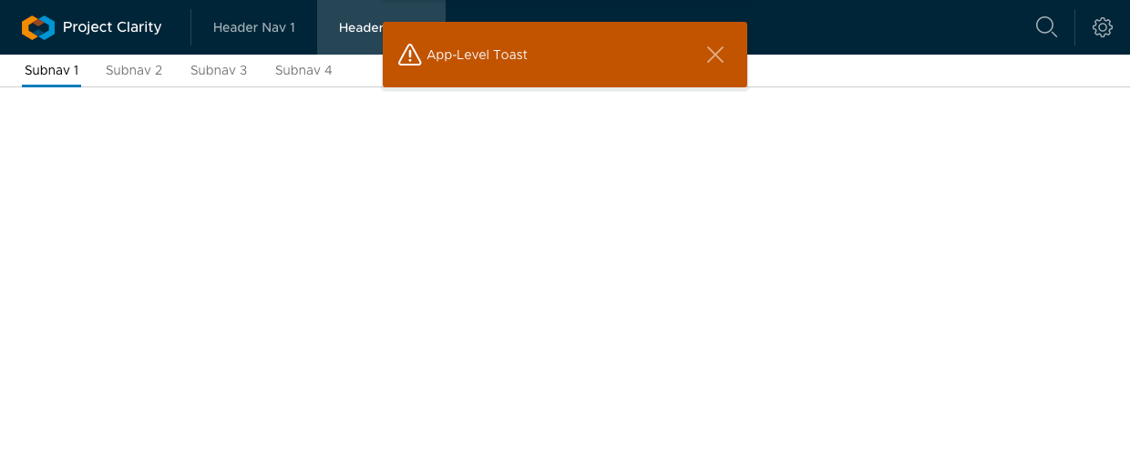
If some modal is open (wizard/dialog), toast message must appear on top of the backdrop.
Use When
- Additional feedback to overcome change-blindness should be provided.
- The user should be able to continue working on his current task.
- The message should be unobtrusively
Don't Use When
- Notification contains critical information which the user may not miss.
- The location of the message should be context-related, eg. related to a card's content.
Toast notifications should just be used where it serves as additional visual cue for the user to overcome change-blindness and giving appropriate feedback to the user. For more important, critical information alerts should be used.
Future Enhancements
A kind of notification center (feature request #2350) could provide access to past toast-notifications.
d-m-s
on 26 Jun 2018
Thanks @d-m-s for the design brief, we've alerted the design team to review this!
gnomeontherun
on 28 Jun 2018
perfect, looking forward for their reply!
thx @gnomeontherun for your quick reply and constantly updates.
another quite common example can be found in google contacts
https://contacts.google.com/
(Creating, Editing Contacts is there supported by additional feedback via snackbars informing the user about the saving-process, success-info and providing a quick -undo functionality in the snackbar)
d-m-s
on 28 Jun 2018
I'm a colleague of @d-m-s and we've implemented it now for our own use.
The demo is provided here: https://porscheinformatik.github.io/clarity-addons/documentation/0.1.0/notification
Source can be found here: https://github.com/porscheinformatik/clarity-addons/tree/master/src/clr-addons/notification
Is this something contributable? If yes, I could setup a PR for this (just need a feature branch then).
I know you're pretty busy and design for this is not done on your end.
Thanks in advance!
 Wallabeng
on 13 Aug 2018
Wallabeng
on 13 Aug 2018
@gnomeontherun @mathisscott: just wanted to ping you guys - what do you think about a contribution?
d-m-s
on 3 Sep 2018
@d-m-s
We will have to take a closer look at the addon your team built. Where we are with this internally is the design we have has UX and accessibility issues. We are awaiting those to get resolved before we can schedule it in our implementation queue. I'll ask some of our team to take a look at your addon, though.
Thanks for the suggestion.
mathisscott
on 4 Sep 2018
@d-m-s nice work on the addons, I was just looking for something like this. I do like the notifications but they feel a little too static, the in animation could be a little smoother, other than that I think this would be a great addition to clarity.
 rogerfar
on 12 Sep 2018
rogerfar
on 12 Sep 2018
This is currently in flight as a contribution from @nbewley and includes snackbars as well.
Additional considerations:
Visual design needs to be aligned with Clarity but distinct from alerts and cards.
Rules for use and content that address concerns such as @mathisscott point re: a11y and screen readers vs controls inside alerts.
A11y concerns suggest use of a drawer for storing / reviewing missed and ignored toasts, accessed by a (badged) toolbar icon - e.g. bell - is an important addition to this, allowing return to missed toasts via aria-live-region. More work with a11y team needed.
 colinreedmiller
on 4 Aug 2019
colinreedmiller
on 4 Aug 2019
Hello, is this issue still open for contributors? I would like to help out!
 aliitani
on 17 Dec 2019
aliitani
on 17 Dec 2019
The work was started but hasn't made it into Clarity yet. I think we're in a holding pattern until we get the patterns and implementations finalized from our partners working on it.
gnomeontherun
on 17 Dec 2019
Summary
Toast messages provide the user information about medium-priority events that they may want to reference later. Toast messages, when they aren't dismissed, live in the notifications panel until the user dismisses them or the notification expires.
- What is the change? A toast component
- Why should it go in Clarity? Notifications is a common need across applications and services. The toast component is one of the most common mechanisms for notifying users.
- Does this change impact existing behaviors? If so how? Yes. Since applications are leveraging other components for notifications currently, adding a toast component should allow more specific tailoring towards use cases.
- If this change introduces a new behavior, is this behavior accessible? Yes.
Use cases
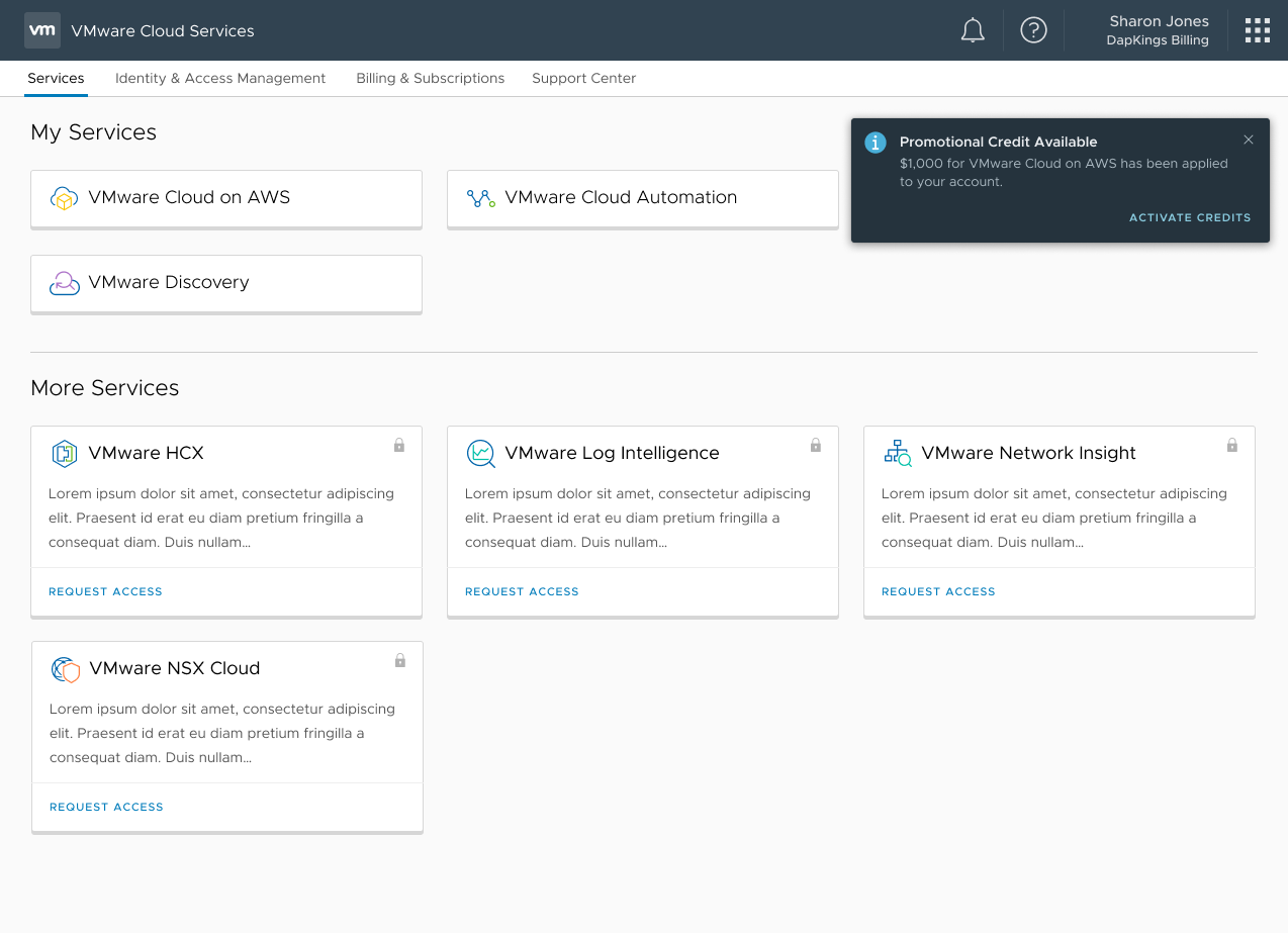
• System informs user of available promotional credits.
• System informs user of an account status change.
• System informs user of an expiring access token.
• System informs user of successful automatic payment.
• System informs user of an incoming message from another user.
Elements

- App Icon: Application that is sending the notification. Only use in multi-application environments.
- Status Icon: Informational or Error. (use Snackbar for confirmations)
- Title (max: 35 characters): Short Title Describing the Event
- Description (max: 156 characters): Short Description of the event
- Dismiss: An icon allowing the user to remove the toast from their view. Do not use "dismiss" as an action, clicking the dismiss button dismisses the toast.
- Time: Use "now" if the event is occurring currently. If the event happened in the past, use "[x] [time_period] ago"
- Actions [optional] (max: 19 characters each) (2 actions maximum): Provide the user actions to remediate the event when possible.
Examples

Usage
Do
• Provide a location for the user to navigate to from the toast.
• Use timestamps relative to the user (ex. "1 hour ago" instead of "May 11, 12:34pm")
• Use a short, succinct summary message as the title. The title should be a short, consumable phrase that quickly communicates the high-level messaging in the toast. The maximum length for the title is 35 characters.
• Use a consumable description for the toast message. The maximum length for the description is 156 characters.
Do Not
• Use "Dismiss" as an action. Clicking the dismiss button dismisses the toast.
• Use more than 2 actions in a toast. If you need to provide more actions, surface the 2 most important actions, then allow the user to navigate to the object's detail view.
• Use object identifier in the title. (ie. “VM12324235324234”). Use object identifiers in the description area as needed.
• Add icons to the toast. The toast communicates high-level information quickly; adding iconography confuses the high-level meaning.
• Show toasts when the condition or event is no longer relevant to the user. For example, if a subscription had expired, but was renewed by the user, the “Subscription Expiring Soon” notification is no longer relevant.
Competitive Research
Use Cases
• Material: User Messaging, Cross-promotion, Request for Feedback
• Lightning: Event Reminder, Task Due, User Approval, @ Mentioning
• Atlassian: Feedback, Long Running Task
Features
• Material: Navigation, Auto-dismissal, Expand/Collapse, Summarization, Grouping
• Lightning: Navigation, Dismissible, Queueing
• Atlassian: Navigation, Dismissible
User Research
14 users were interviewed in 1:1 sessions to test the validity and utility of the toast messaging designs. read more 1, read more 2
Initial user research suggested that a light notification could be difficult to see on light interfaces, which suggests toast messages should have some contrast with the background color in order to be effective. Our solution leverages the toast notification with the same background color as the notifications panel in order to reinforce the connection between the two elements. In other words, since the toast lives in the notifications panel, they should share visual characteristics.
Our findings suggest that users are able to identify and act on the toast notification. Users, additionally, provided feedback on what sorts of notifications would be valuable to what sorts of user roles.
API
N/A
Implementation plan
Angular Implementation complete.
Conclusion
Adding a toast component will enable application owners to provide more usable notifications.
 nickbewley
on 4 Mar 2020
nickbewley
on 4 Mar 2020
@nickbewley : Can you please let me know by when this component would make it to clarity library?
 JAYTAS
on 16 Jun 2020
JAYTAS
on 16 Jun 2020
@JAYTAS the clarity team is looking to restyle the visuals of the components which has resulted in this delay.
@gnomeontherun should be able to clarify their eta. Every other aspect of the notifications design system has been worked out.
nickbewley
on 19 Jun 2020
The feature request here has been captured into our list and we’re going to take it into consideration as we develop Clarity Core capabilities. In an effort to clean up our backlog and focus our attention, I’m going to close this as captured in our feature requests. Please follow our development and releases to see when we release relevant components to make this possible. Future feature requests can be made in our GitHub Discussions.
gnomeontherun
on 5 Feb 2021
Related issues
 dennitsa
·
4Comments
dennitsa
·
4Comments
 ph55
·
3Comments
ph55
·
3Comments
 Vad1mo
·
3Comments
Vad1mo
·
3Comments
 yandong01
·
3Comments
yandong01
·
3Comments
 reddolan
·
3Comments
reddolan
·
3Comments
Most helpful comment
Summary
Toast messages provide the user information about medium-priority events that they may want to reference later. Toast messages, when they aren't dismissed, live in the notifications panel until the user dismisses them or the notification expires.
Use cases
• System informs user of available promotional credits.
• System informs user of an account status change.
• System informs user of an expiring access token.
• System informs user of successful automatic payment.
• System informs user of an incoming message from another user.
Elements
Examples
Usage
Do
• Provide a location for the user to navigate to from the toast.
• Use timestamps relative to the user (ex. "1 hour ago" instead of "May 11, 12:34pm")
• Use a short, succinct summary message as the title. The title should be a short, consumable phrase that quickly communicates the high-level messaging in the toast. The maximum length for the title is 35 characters.
• Use a consumable description for the toast message. The maximum length for the description is 156 characters.
Do Not
• Use "Dismiss" as an action. Clicking the dismiss button dismisses the toast.
• Use more than 2 actions in a toast. If you need to provide more actions, surface the 2 most important actions, then allow the user to navigate to the object's detail view.
• Use object identifier in the title. (ie. “VM12324235324234”). Use object identifiers in the description area as needed.
• Add icons to the toast. The toast communicates high-level information quickly; adding iconography confuses the high-level meaning.
• Show toasts when the condition or event is no longer relevant to the user. For example, if a subscription had expired, but was renewed by the user, the “Subscription Expiring Soon” notification is no longer relevant.
Competitive Research
Use Cases
• Material: User Messaging, Cross-promotion, Request for Feedback
• Lightning: Event Reminder, Task Due, User Approval, @ Mentioning
• Atlassian: Feedback, Long Running Task
read more
Features
• Material: Navigation, Auto-dismissal, Expand/Collapse, Summarization, Grouping
• Lightning: Navigation, Dismissible, Queueing
• Atlassian: Navigation, Dismissible
read more
User Research
14 users were interviewed in 1:1 sessions to test the validity and utility of the toast messaging designs. read more 1, read more 2
Initial user research suggested that a light notification could be difficult to see on light interfaces, which suggests toast messages should have some contrast with the background color in order to be effective. Our solution leverages the toast notification with the same background color as the notifications panel in order to reinforce the connection between the two elements. In other words, since the toast lives in the notifications panel, they should share visual characteristics.
Our findings suggest that users are able to identify and act on the toast notification. Users, additionally, provided feedback on what sorts of notifications would be valuable to what sorts of user roles.
API
N/A
Implementation plan
Angular Implementation complete.
Conclusion
Adding a toast component will enable application owners to provide more usable notifications.