Clarity: [feature request] Slider component (input type="range")
[ ] bug
[ x] feature request
[ ] enhancement
input slider
I did try to search here on github and through the docs, but i could not find any. So i would like to voice my need for a slider component.
We have a design for a slider component here
 ArgTang
All 15 comments
@ArgTang: I am assuming we're talking about a slider component similar and behaves the same way to: https://jqueryui.com/slider/ or any other slider and that the focus of its use will be on touch screens, right?
 jaffoneh
on 11 Jan 2017
jaffoneh
on 11 Jan 2017
Yes, this is also a similar example http://seiyria.com/bootstrap-slider/
Thanks!
ArgTang
on 11 Jan 2017
I have two use cases that would benefit from the use of a slider.
1) associating a slider to a timeline, such that adjustment of the slider range will define a subset of the displayed timeline, and hence change a linked dataset. Ex. Timeline shows all alerts from the last 24 hours. User edits range to only show alerts between 6am and noon.
2) associating a slider to progressive values in a form, so snapping the thumb of the slider defines the one value to use. Ex. VMware vSphere has a setting for defining how aggressive DRS should behave. Values are Conservative - Neutral - Aggressive. Since the values are on a scale, showing them on a progressive slider is more compelling than 3 radio buttons.
 joshjohnsonux
on 13 Apr 2017
joshjohnsonux
on 13 Apr 2017
I upvote. I need this for my project as well. While configuring a number of knobs for an engineering test submission form, it would be nice to have a set of sliders that I can easily move with visual cues.
 sammydc
on 5 Oct 2017
sammydc
on 5 Oct 2017
Anybody found a good slider which can be styled in the Clarity way?
 Rush
on 16 Apr 2018
Rush
on 16 Apr 2018
You can use a normal range input type and style it with good browser support while we build this out. https://caniuse.com/#feat=input-range
https://css-tricks.com/styling-cross-browser-compatible-range-inputs-css/
 gnomeontherun
on 16 Apr 2018
gnomeontherun
on 16 Apr 2018
@gnomeontherun thank you. You can't imagine how much you helped me out. I was getting so frustrated not being able to find a good library.
Rush
on 17 Apr 2018
i also upvote this. http://seiyria.com/bootstrap-slider/ <-- especially something like the example 2 would be really nice to have in clarity.
 Thoplusmas
on 24 May 2018
Thoplusmas
on 24 May 2018
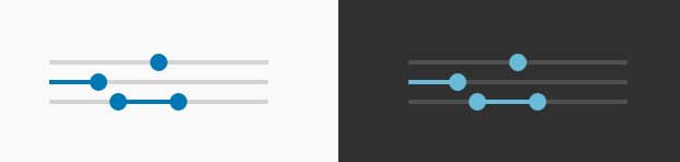
Please consider "two value slider" like this, thank you! 🙏
 beautifulinda
on 26 Jul 2018
beautifulinda
on 26 Jul 2018
Hi @beautifulinda
The range input type is something that will eventually make it into our supported form fields. Until then, please see @gnomeontherun 's comment above.
 mathisscott
on 26 Jul 2018
mathisscott
on 26 Jul 2018
On more upvote for a simple slider (one value on a fixed scale) and a range slider (two values on a fixed scale). Thanks in advance!
Something like this: https://angular-slider.github.io/ng5-slider/demos#range-slider
In the meantime I'll explore Jeremy's suggestion. :-)
 gitfan13
on 11 Sep 2019
gitfan13
on 11 Sep 2019
I started working on this, and this is what I've done so far:
_API_
- value
The default two-way bound property of the input type="range". This property can set a default value for the component. If the value is not set, the default one is (min + max) / 2.
- optionalValue
If the isDouble property is set, this two-way bound property is the value property but for the second input.
- min
The default min input of the input type="range". This one sets the minimum value that can be selected. The default value is 0.
- max
The default max input of the input type="range". This one sets the maximum value that can be selected. The default value is 100.
- step
The default step input of the input type="range". This one sets the difference between two consecutive steps.
- isDouble
A custom input that changes the behavior of the component. If it is true, the second input appears and the progress bar is between the inputs. The default value is false.
- hasProgress
A custom input that tells whether the progress bar is visible or not. The default value is false.
_How it was implemented:_
- Because the progress bar cannot be stylized, the component has a
spanelement that mimics this behavior. - The double range input is created with two
input type="range"and with the help of the mentioned span.
Can I be assigned to this issue? Thanks!
 florin-borceanu
on 27 Sep 2019
florin-borceanu
on 27 Sep 2019
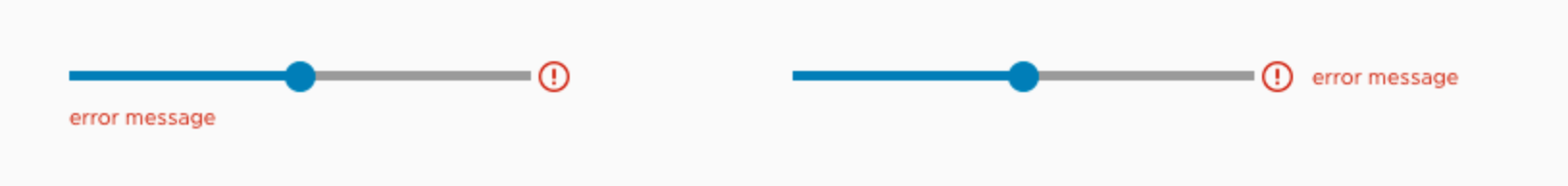
@florin-borceanu That is really nice! Is it also possible to have option for color indicators on the slider as you are moving the slider? There are cases when you want to have additional cues on whether your settings approach a certain threshold or unrecommended but valid settings. Say for example, initially green, then as you slide to 65% the color turns to yellow and as you go to 95% change the color to red.
sammydc
on 28 Sep 2019
@florin-borceanu I've assigned it, and will be curious to see the details. I wasn't expecting a dual range option in this case, so we need to consider it carefully.
@sammydc the challenge is that using color to indicate meaning is against accessibility guidelines, so there has to be supplemental messaging to indicate that same meaning. Also, we want to start with an MVP and nail that before we make it more complex. I imagine you could implement such a feature on the app side if it isn't done already by setting your own thresholds.
gnomeontherun
on 1 Oct 2019
Hi there 👋, this is an automated message. To help Clarity keep track of discussions, we automatically lock closed issues after 14 days. Please look for another open issue or open a new issue with updated details and reference this one as necessary.
![github-actions[bot] picture](https://avatars.githubusercontent.com/in/15368?v=4&s=40) github-actions[bot]
on 31 Aug 2020
github-actions[bot]
on 31 Aug 2020
Related issues
 nkolchakov
·
3Comments
nkolchakov
·
3Comments
 ph55
·
3Comments
ph55
·
3Comments
 beaker1977
·
3Comments
beaker1977
·
3Comments
 BugsyFTW
·
3Comments
BugsyFTW
·
3Comments
 srikanthps
·
3Comments
srikanthps
·
3Comments
Most helpful comment
Please consider "two value slider" like this, thank you! 🙏
