Caseflow: Caseflow Intake: Review page spacing consistency
User story
As an Intake user, I want to be able to differentiate between different categories of questions so my workflow is not disrupted.
Problem statement
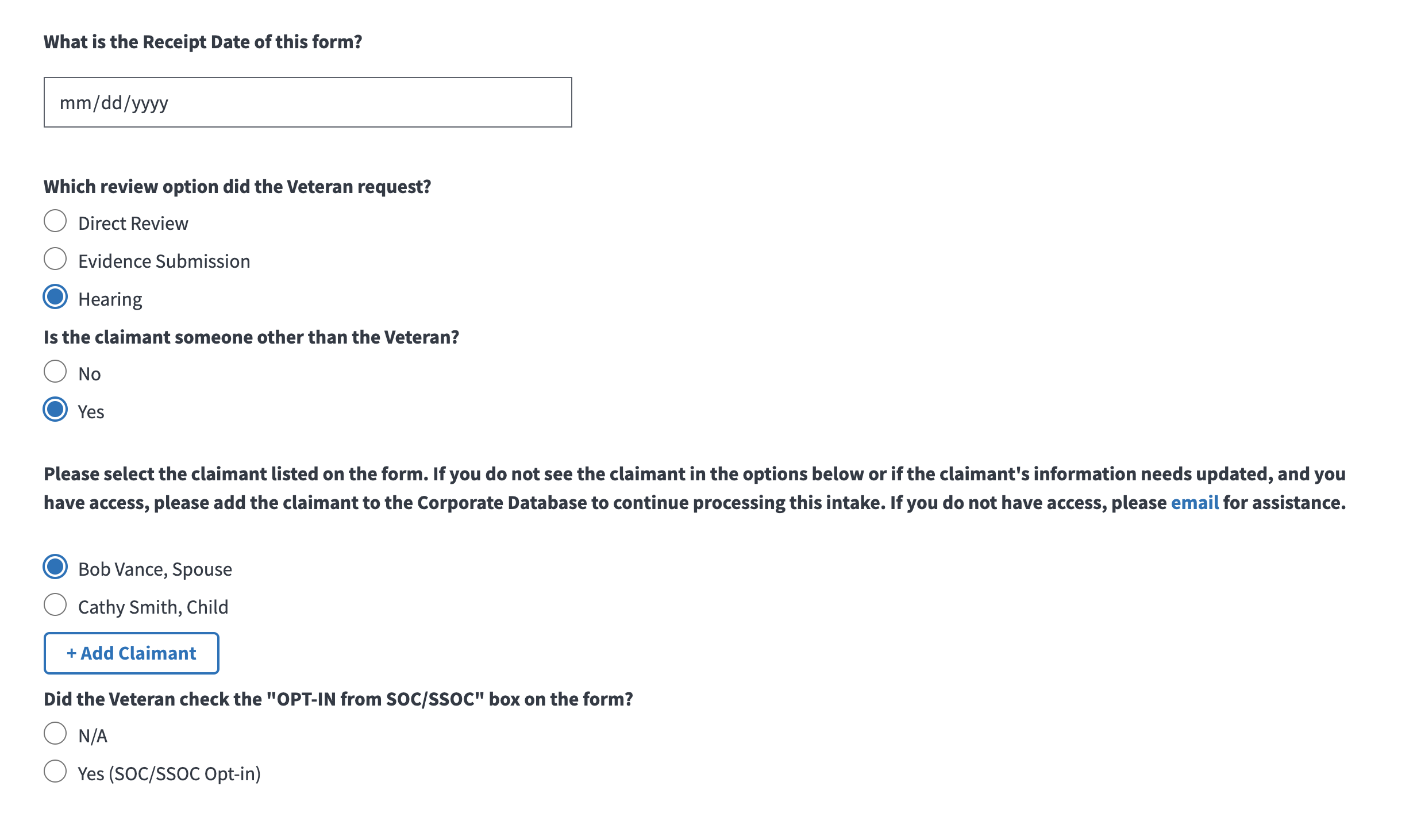
The spacing between various form fields on the Intake Review page can potentially throw users off and is inconsistent. For some questions, it is difficult to differentiate between ones that are related, and ones that are separate categories. It is especially important for us to group elements of the "Is the claimant someone other than the Veteran?" because they currently look like they are separate questions.
What is out of scope?
- Design beyond spacing (e.g. text hierarchy, flow etc)
- Making changes to the components across Caseflow
Background/context
As we're adding more components to this page, we need to ensure consistency.
Existing design and content
Success criteria
- [ ] Please edit spacing according to the design below for spacing guidance (between various categories of form fields, labels, and buttons) - Please note the annotated spacing that can be deprioritized if too complex.

Technical/logistical constraints (if known)
- Do current labels or other components have padding that can't be edited?
 rutvigupta-design
All 9 comments
@jcq I know we had roughly discussed this two weeks ago, so wanted to see if there's anything I can clarify or add to this ticket!
rutvigupta-design
on 8 Jun 2020
@rutvigupta-design This is really helpful; looking forward to us fixing the spacing! :)
 jcq
on 9 Jun 2020
jcq
on 9 Jun 2020
@leikkisa this is a general Intake improvement (but related to attorney fees designs) that is ready for dev
rutvigupta-design
on 9 Jun 2020
@rutvigupta-design @jcq Below are some discoveries and questions related the desired changes we are looking to make.
For the 10px spacing between the label element and input element on the DateSelector component, this could occur by removing the class of "cf-form-textinput" from the input element and increasing the margin-bottom to 10px on the "cf-form-textinput" class inherited by the label element. This would be the first global change.
For the 40px spacing above and below the fieldset element containing the RadioField component, the classes on this element have no styling. The two classes being used on this element are "usa-fieldset-inputs" and "cf-form-radio." This is also the case where we are looking for spacing of 20px, no class currently has a margin set.
For the spacing between the new line of text - "Please note: at this time, you can only add attorneys as claimants in Caseflow Intake" - if we decide to globally change the margin-bottom of the class "cf-form-textinput" to 10px, could we add that class to the element containing the text?
For the add claimant button, there is a class of "_1MiYeXuWkRhw-SRqKgNgKz", that has a margin-bottom of 1rem but no margin-top, could we add one here and increase the margin-bottom?
 wdrougas-tista
on 13 Jul 2020
wdrougas-tista
on 13 Jul 2020
@wdrougas-tista the design team has given the green light to proceed with the global change for the DateSelector component!
rutvigupta-design
on 15 Jul 2020
Blocked by design - Rutvi to edit ticket and design based on critical components.
rutvigupta-design
on 29 Jul 2020
@wdrougas-tista cc @jcq I finally corrected this (previous version of spacing was a little arbitrary). Knowing there is still larger work to be done around components, let me know if there are any questions or concerns! Moving to Engineering define for now, but feel free to kick it back.
rutvigupta-design
on 27 Aug 2020
For the first 20px spacing between the radio field option (margin-bottom of 0.65em) and paragraph (margin-top of 2rem), what change would make more sense? Both of these are global from my understanding
For the 10px spacing between the paragraph (margin-bottom of 2.4rem) and radio field option (no top margin), do we want to add a top margin for this specific radio field option or go ahead with a global change to the paragraph bottom as well?
I've been able to update the spacing between the add claimant button both ways and the first 30px spacing at the top will be dependent on if we make a global change to the radio field options. Hope this makes some sense, let me know if more information is needed
@jcq @rutvigupta-design
wdrougas-tista
on 11 Sep 2020
I have a very minimal understanding of this from an engineering perspective, so feel totally free to override my opinions here:
- For the first 20px spacing between the radio field and paragraph, I would be a little scared to globally change the radio button margin-bottom. I would be more okay with changing the paragraph-top because 2rem is already quite a bit. Alternatively, I am also okay with us not messing with this for this ticket.
- For the 10px spacing between the paragraph and radio field, I would recommend adding a top margin to this particular field and not a global change, because I don't know how that would affect things across the app.
Let me know if I can add any more info from my end!
rutvigupta-design
on 11 Sep 2020
Related issues
 lomky
·
4Comments
lomky
·
4Comments
 hschallhorn
·
5Comments
hschallhorn
·
5Comments
 gnakm
·
5Comments
gnakm
·
5Comments
 pkarman
·
5Comments
pkarman
·
5Comments
 laurjpeterson
·
5Comments
laurjpeterson
·
5Comments