Cascadia-code: Cascadia code seems blurry
Environment
Cascadia Code version number: v1911.21
Application (with version) used to display text: MS Terminal, GNOME Terminal, LibreOffice Writer
OS platform and version: Windows 10.0.19603.1000, Linux debian 5.5.0-1-amd64 #1 SMP Debian 5.5.13-2 (2020-03-30) x86_64 GNU/Linux
Screen resolution (i.e. 220dpi): 96dpi
Steps to reproduce
Enter some text
Expected behavior
Tex should not look blurry
Actual behavior
Text looks blurry.
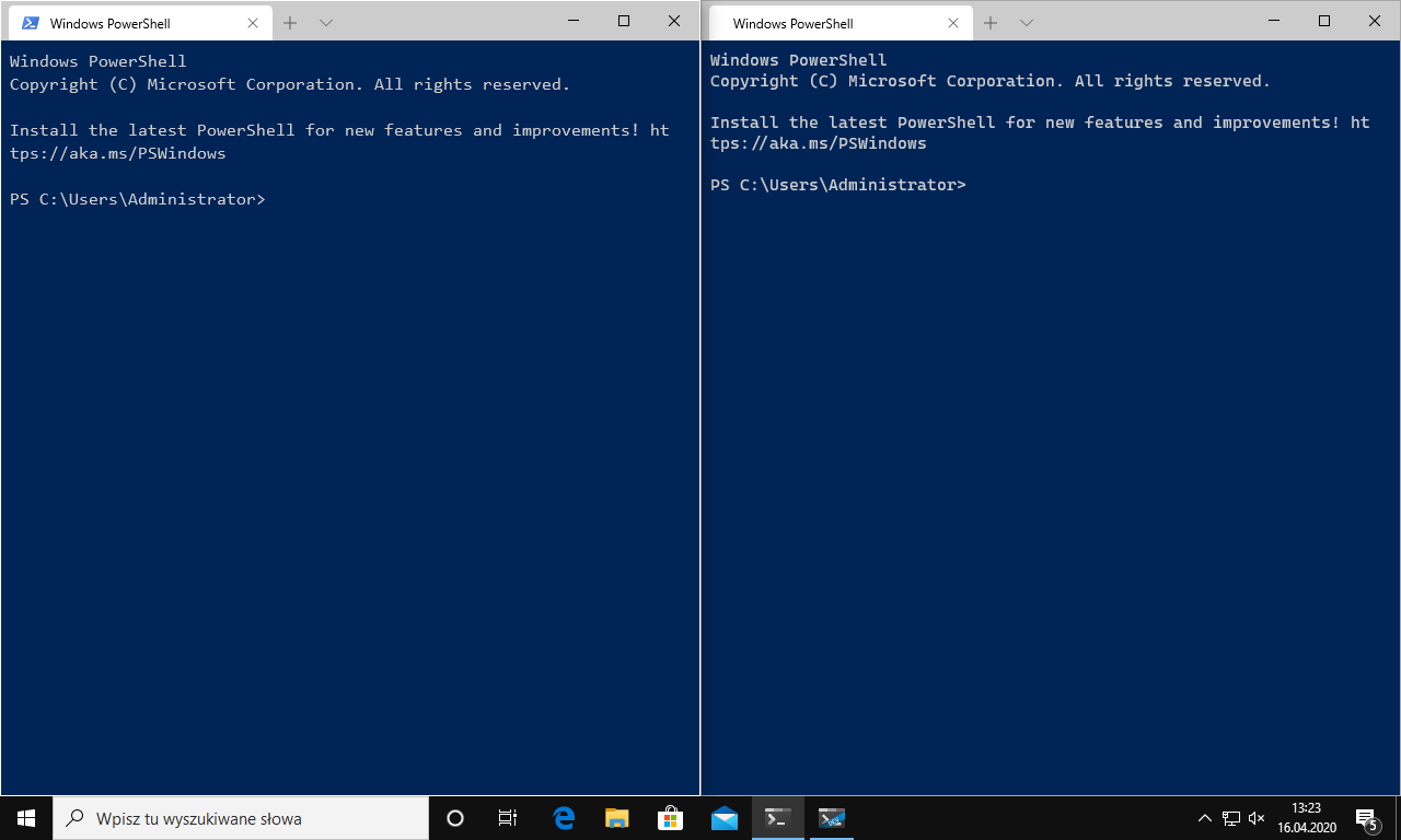
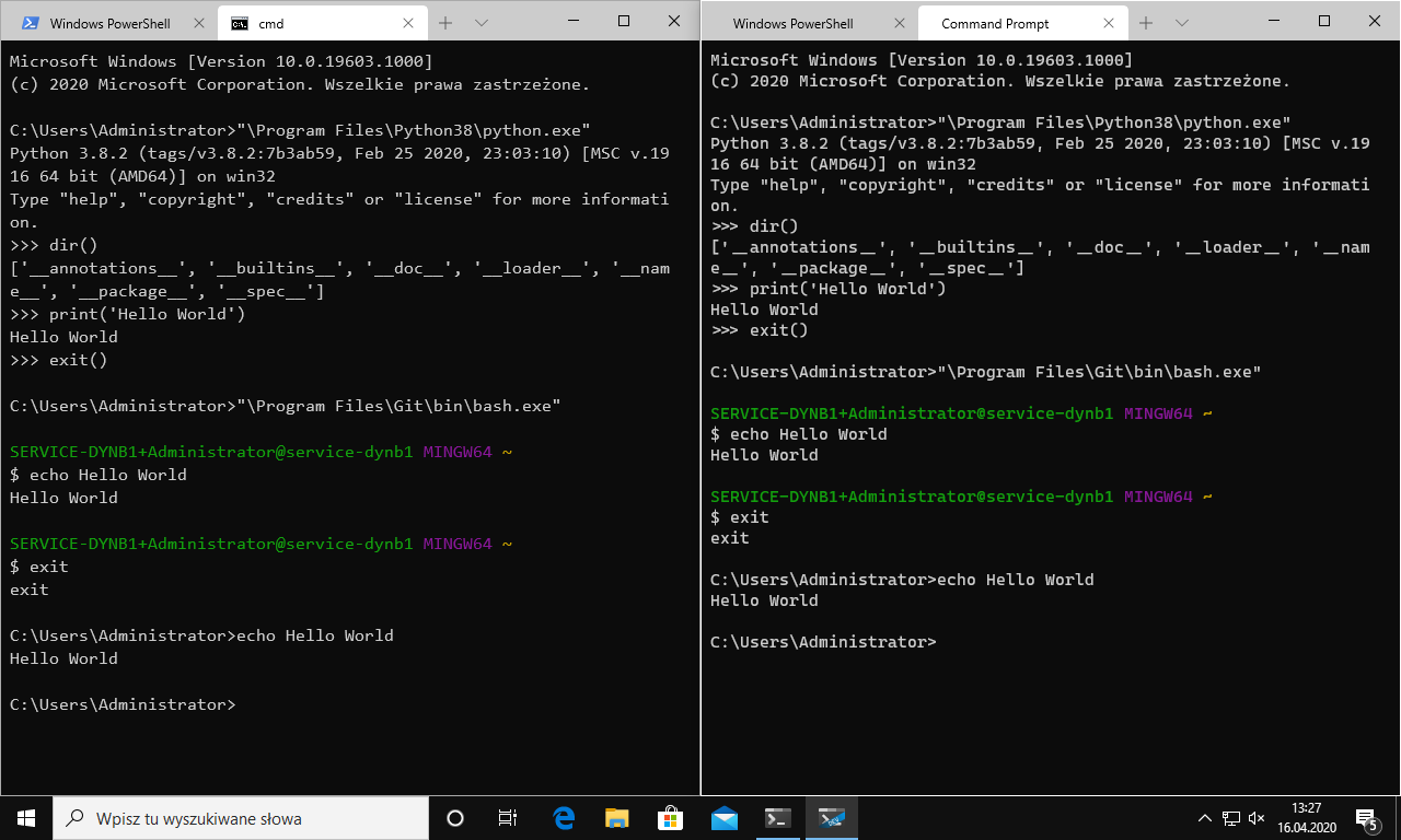
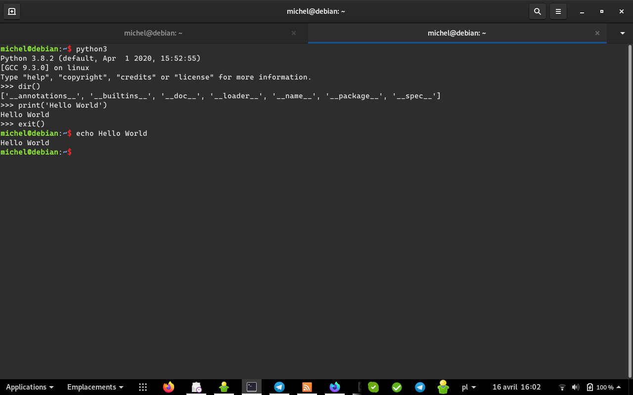
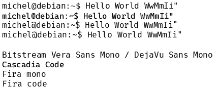
At first I thought that it's a MS Terminal issue https://github.com/microsoft/terminal/issues/5376, but then I tested in GNOME Terminal and compared several fonts in LibreOffice Writer on GNU/Linux and found the text to also be blurry. Please see the linked issue, especially:
 mimi89999
All 16 comments
Screen resolution (i.e. 220dpi): 1280x800
what DPI/screen scaling factor are you using.
 DHowett-MSFT
on 16 Apr 2020
DHowett-MSFT
on 16 Apr 2020
michel@debian:~$ xrdb -query | grep dpi
Xft.dpi:    96
michel@debian:~$ xrandr | grep -w connected
LVDS-1 connected primary 1280x800+0+0 (normal left inverted right x axis y axis) 286mm x 179mm
michel@debian:~$ xdpyinfo | grep dots
  resolution:    96x96 dots per inch
Seems quite low.
mimi89999
on 16 Apr 2020
But my resolution / screen size gives 113dpi.
mimi89999
on 16 Apr 2020
'Blurriness' is a rather hard quality to quantify in text rendering as everyone's perception of what is blurry (or not) is different. I'm not sure what you're comparing to, but what you've shown in your samples appears to be the fonts rendering as expected given your screen DPI, especially since you're observing the same characteristic across multiple fonts and multiple OS environments.
A bit of background—when a font is used on screen, the infinite resolution vector outlines of each glyph need to be adapted to the limited resolution environment of a pixel grid. As you can imagine, this can lead to significant degradation of the glyph outline quality.
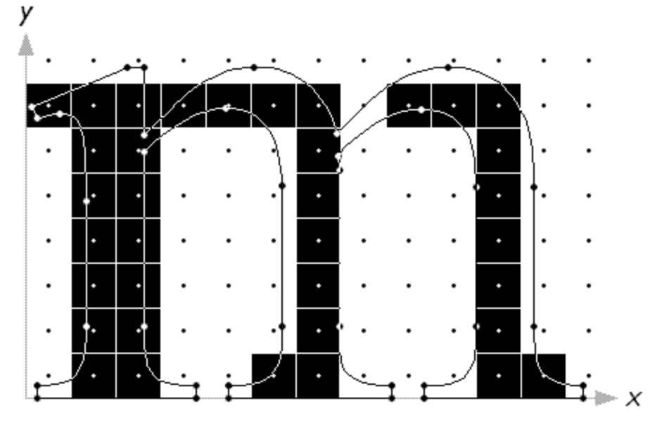
(From Beat's excellent http://rastertragedy.com/ If you ever wanted to learn way too much about text rendering.)
Historically, there were all sorts of (expensive) mechanisms to get around this problem, but this problem has been much reduced due to the prevalence of high-resolution screens. As such, many font rasterizers have moved to implementing 'font smoothing', which applies antialiasing to glyph outlines and allows curves to more perfectly replicate the actual vector outlines.
The downside is that on low resolution screens, the result can start to look blurry, especially for folks who are used to seeing the sharp aliased outlines.
In the old days of Windows (I think up to Windows 7), there was software called the ClearType Tuner which allowed users to customize how text rendering worked in Windows, and customize it for their individual preferences. It appears to still be available in Windows 10, but I seem to recall it not actually doing that much anymore, so your mileage may vary.
 aaronbell
on 20 Apr 2020
aaronbell
on 20 Apr 2020
especially since you're observing the same characteristic across multiple fonts and multiple OS environments.
I have this problem on multiple OS, but only with _Cascadia Code_. _Bitstream Vera Sans Mono_ that I'm using as my terminal font seems very sharp and _Fira_ fonts seem average. I obviously can't show the issue on my screenshots, but if you open them on a 96dpi screen you might notice the same thing that I did.
mimi89999
on 20 Apr 2020
Besides the @ that is too small and hardly readable, vertical lines (Serifs?) on top of I, l, etc. instead of being fin and black like in _Bitstream Vera Sans Mono_ are thicker and grayish.
mimi89999
on 20 Apr 2020
Per my write up above, Cascadia Code has a bit for y-direction font smoothing set. This enables better rendering of diagonals and curves at high resolutions. It may be the other fonts do not. And environments that respect that bit will render the outlines more antialiased.
As for the other issues, there's already an open issue on the @ sign that I'm planning to resolve, and in the case of the /I and /l, well, that's partly due to the darker character of the font and partly due that the outlines are not locked to the pixel grid, so the serifs may appear thicker and grayer (again, due to the lower resolution display).
aaronbell
on 20 Apr 2020
OK. I understand.
Is _Cascadia Code_ targeting HDPI screens or will something be done to make it better on 96dpi? If not, then probably _MS Terminal_ shouldn't set it as default on low DPI screens because I'm probably not the only one to whom this font appears blurry on that particular screen.
mimi89999
on 20 Apr 2020
The font was created to target contemporary hinting / rendering approaches, but there may be a way to improve it for 96DPI screens without too much work. Let me investigate and get back to you :).
aaronbell
on 20 Apr 2020
The ClearType Tuner is now included in Windows 10: %SystemRoot%\System32\cttune.exe
Note it doesn’t just let you set your sharpness and boldness preferences, ClearType uses the RGB subpixels of LCD displays to effectively triple the horizontal resolution to improve character spacing, vertical bars width and italic slants.
Running the ClearType Text Tuner makes sure that Windows known your physical subpixels orientation to do that properly.
 PhMajerus
on 21 Apr 2020
PhMajerus
on 21 Apr 2020
In a way I'm relieved, I thought it was my eyes playing tricks on me. I come from using Consolas, and I was sure Cascadia Code seemed, well, blurry.
After reading this I swapped back and forth a lot, and yes, Consolas (and also codes such as Fira Code or Jetbrains Mono) are noticably "crisper".
I took some screenshots!
Jetbrains Mono:

Consolas:
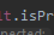
Cascadia Code:
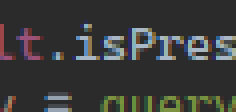
Compare elements such as the i in Consolas vs Cascadia Code, or the pink t in Jetbrains Mono. While Jetbrains and Consolas each have various "blurry" elements to their individual letters, only Cascadia is consistent in wanting to render each letter with a lot of grey/hinting every time. I think this is what makes it feel "blurry", because this overly greyscale-hinted antialiased state is the default, while with the other fonts the r in Consolas or the dot of the i in Jetbrains are an exception (and in zoomed look ugly, at that).
Is this more of a general problem how the font is meant to be used only on high-DPI displays maybe, and expects the display to have pixels way too small for me to notice this effect? If so, could future versions look into improving legibility at full HD resolutions?
 Carighan
on 22 Apr 2020
Carighan
on 22 Apr 2020
I was finding Cascadia code to be pretty crisp in windows terminal up until around a week ago when it turned into a fuzzy nightmare. I'm not certain if it was because of an update or maybe it triggered because I had accidentally zoomed out and back in again with control + scroll
 dasco597
on 26 Apr 2020
dasco597
on 26 Apr 2020
In a way I'm relieved, I thought it was my eyes playing tricks on me. I come from using Consolas, and I was _sure_ Cascadia Code seemed, well, blurry.
After reading this I swapped back and forth a lot, and yes, Consolas (and also codes such as Fira Code or Jetbrains Mono) are noticably "crisper".
For me it looks like Cascadia is more Bold than the regular Consolas. Something between Bold and Regular Consolas. My tests below. Cascadia at top (with zoom 400%) at 11 pt and windows scaling at 125%. Consolas also at 11 pt, notice that all lines are 2 pixel wide compared to Cascadias 3 pixel wide lines, this make the font look 50% more bold. I like the Cascadia font, but it needs a real Regular (non bold) option.
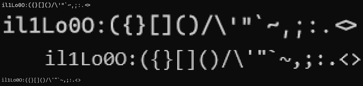
With the current status of the Cascadia font I'm putting
"fontFace": "Consolas",
in settings.json.
 moths
on 27 Apr 2020
moths
on 27 Apr 2020
It's a matter of getting used to it. Cascadia is a thicker design than Consolas and that's fine. I use Cascadia Code everywhere and Consolas feels anemic to me now. I also prefer Cascadia's softer look. :shrug:
 madig
on 30 Jun 2020
madig
on 30 Jun 2020
So. Some bad news.
As Cascadia Code is now a variable font, and will be moving forward, modifying the hinting to reduce blurriness has become significantly more work and as such is a lower priority compared to other project tasks. Hopefully the new lighter weights now available in the variable font will help improve your experience!
aaronbell
on 2 Jul 2020
I just saw the release, I'll have a look. Thanks for the heads-up! 👍
Carighan
on 2 Jul 2020
Related issues
 DoubleDeez
·
5Comments
DoubleDeez
·
5Comments
 alanbirtles
·
6Comments
alanbirtles
·
6Comments
 AndreaPasqualini
·
4Comments
AndreaPasqualini
·
4Comments
 dkgreer52
·
4Comments
dkgreer52
·
4Comments
 khoshroomahdi
·
4Comments
khoshroomahdi
·
4Comments
Most helpful comment
For me it looks like Cascadia is more Bold than the regular Consolas. Something between Bold and Regular Consolas. My tests below. Cascadia at top (with zoom 400%) at 11 pt and windows scaling at 125%. Consolas also at 11 pt, notice that all lines are 2 pixel wide compared to Cascadias 3 pixel wide lines, this make the font look 50% more bold. I like the Cascadia font, but it needs a real Regular (non bold) option.
With the current status of the Cascadia font I'm putting
in settings.json.