Describe the bug
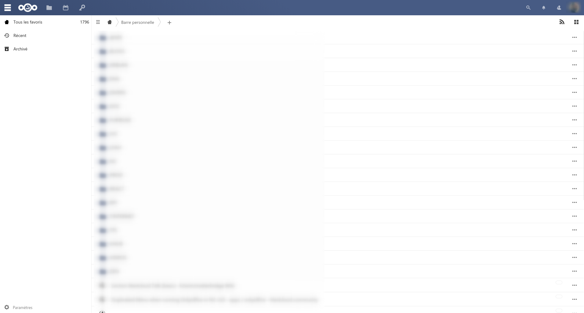
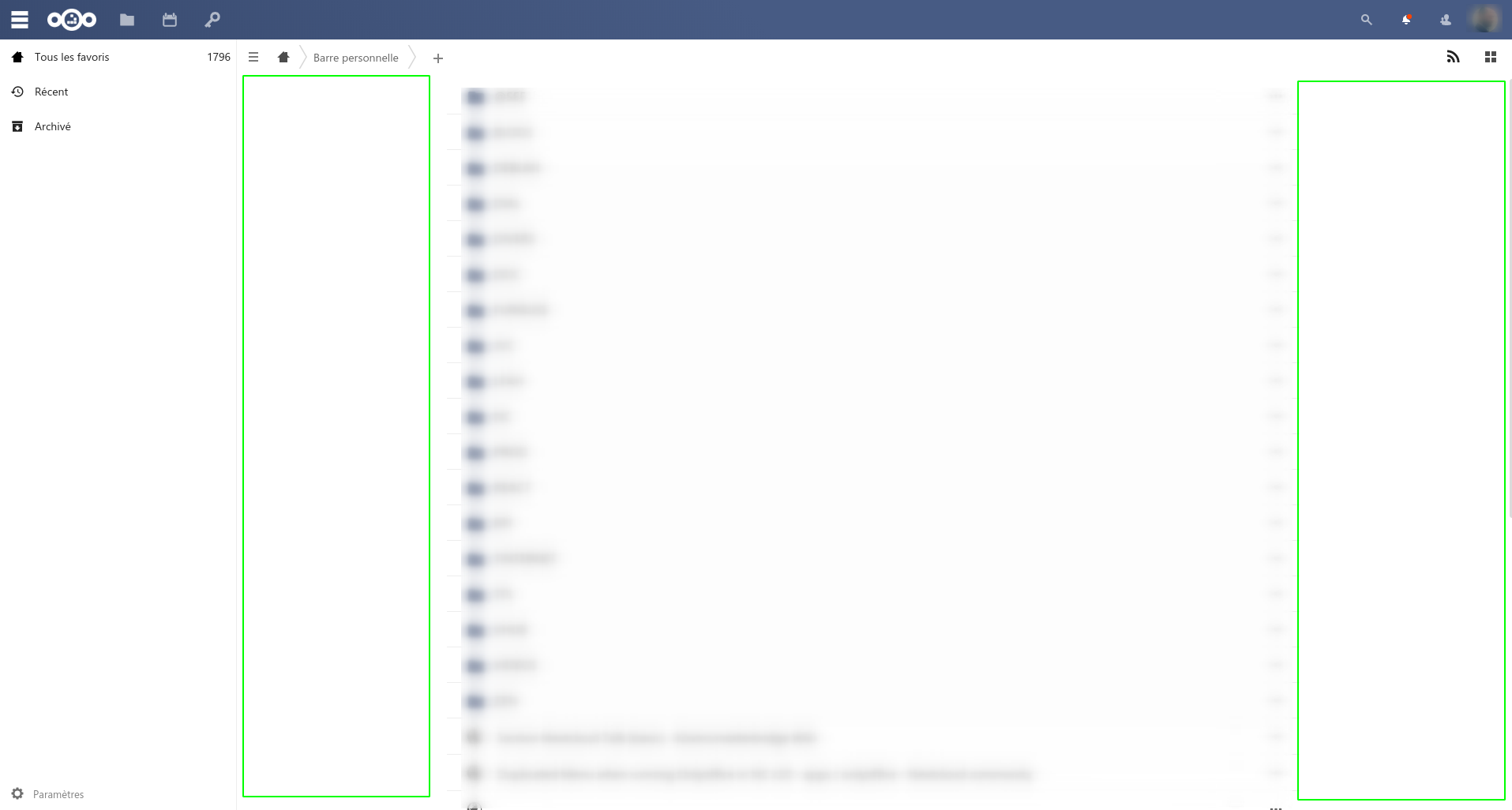
Huge padding on left and on the right of the list.
To Reproduce
Install the version >= 3.4
Expected behavior
Use all the space like versions <= 3.4.
Screenshots
 simmstein
All 7 comments
Workaround using Custom CSS:
.bookmarkslist .padding {
  max-width: 100% !important;
}
This is a feature recommended by the designers to optimize readbility.
 marcelklehr
on 1 Oct 2020
marcelklehr
on 1 Oct 2020
This is inconsistent with other lists (files, apps, etc.).
simmstein
on 2 Oct 2020
cc @nextcloud/designers
marcelklehr
on 2 Oct 2020
This is a feature recommended by the designers to optimize readbility.
Uff. Great improvement of readability for example not aligning the content to the header (breadcrumbs etc.).
 weeman1337
on 2 Oct 2020
weeman1337
on 2 Oct 2020
Going full width would be very bad for usability here, because the name of the entry and the menu are maximally far away from each other. Having a max-width is very common (see Github, Microsoft Teams, Twitter, even Wikipedia will finally limit their content width, etc etc). We also do it in Talk, Text, Mail, and other apps.
not aligning the content to the header (breadcrumbs etc.).
As per other design recommendations, the breadcrumb should instead be a heading of the current bookmarks folder, much like in Photos.
This is inconsistent with other lists (files, apps, etc.).
Yes – they can use some improvement work too.
 jancborchardt
on 16 Oct 2020
jancborchardt
on 16 Oct 2020
thanks for weighing in @jancborchardt :heart:
marcelklehr
on 16 Oct 2020
Related issues
 bspire
·
4Comments
bspire
·
4Comments
 ifuchs
·
4Comments
marcelklehr
·
6Comments
ifuchs
·
4Comments
marcelklehr
·
6Comments
 skoelzow
·
4Comments
skoelzow
·
4Comments
 homelessgamer
·
6Comments
homelessgamer
·
6Comments