Bforartists: Improve Text field highlight colour
Theme update Request
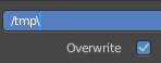
The text highlight is a saturated blue, and the text cursor also - which makes it hard to select a text field and edit it.
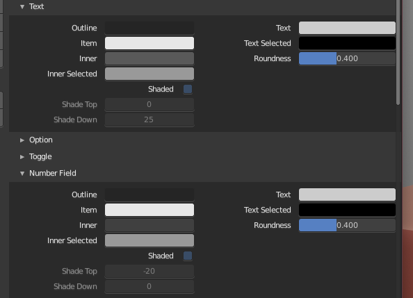
I suggest to make the text field the same as the number field.
Example of contrast issue
Describe the solution you'd like
Better contrast on highlight.
Describe alternatives you've considered
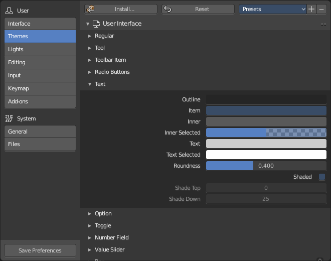
Maybe a darker blue? Less saturated?
Make it the same as the text field?

 Draise14
All 7 comments
Requires to recreate userdef_default_theme.c.
Related task: https://github.com/Bforartists/Bforartists/issues/537
AND
https://github.com/Bforartists/Bforartists/issues/616
 ReinerBforartists
on 2 Feb 2019
ReinerBforartists
on 2 Feb 2019
Draise, what exact edit box is meant here?
ReinerBforartists
on 7 Feb 2019
Now i see what you mean. The caret is hard to spot. Let's have a look for a better color that doesn't conflict with other edit boxes.
ReinerBforartists
on 3 May 2019
The caret color would be more interesting here ...
ReinerBforartists
on 3 May 2019
Bad karma. The caret color seems to be hardcoded. And i have no idea where to even start with the search.
Sliders have the same problem than the text editing props. And changing the color of the slider is no good idea. It is what identifies the slider as a slider. Perfect trap -.-
ReinerBforartists
on 3 May 2019
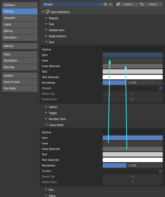
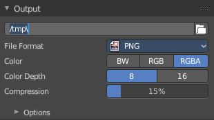
I would just change the highlight of a text box to just lighter grey, same as sliders, same as number boxes.
Theme>Interface>Text - change Inner Selected from blue to same grey as elsewhere (it's inconsistent anyway)
Draise14
on 3 May 2019
Fulfilled as requested :)
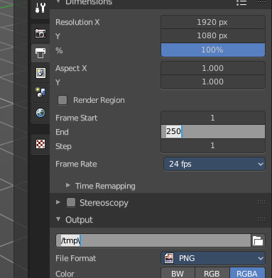
ReinerBforartists
on 3 May 2019
Related issues
 iyadahmed
·
6Comments
Draise14
·
5Comments
iyadahmed
·
7Comments
iyadahmed
·
6Comments
Draise14
·
5Comments
iyadahmed
·
7Comments
 CyberFoxHax
·
6Comments
iyadahmed
·
6Comments
CyberFoxHax
·
6Comments
iyadahmed
·
6Comments