Bforartists: Global - Responsive double column layout for long lists in panels
Issue

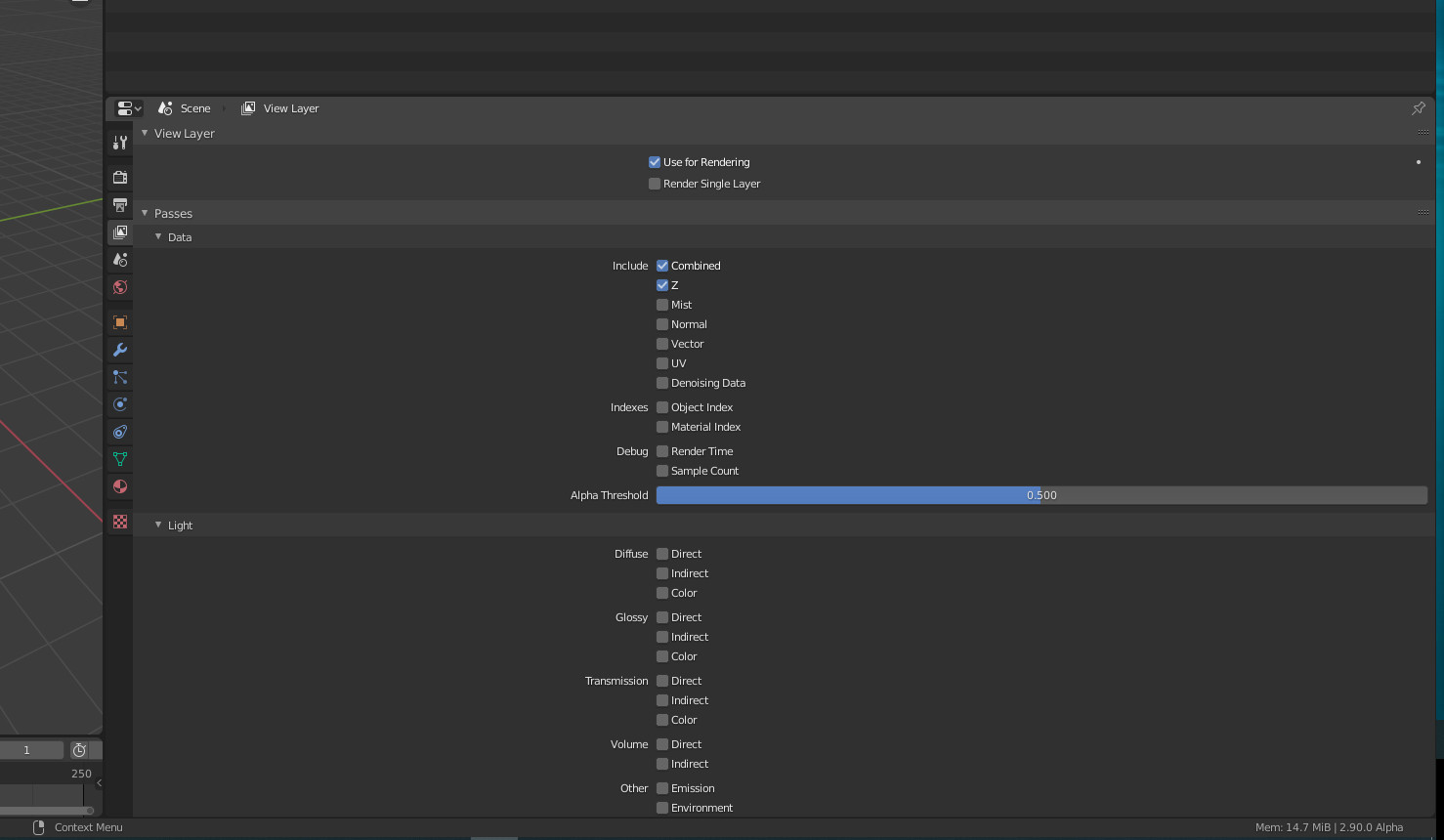
Right now, the new right aligned list system with titles is nice and clean.. but it's very single column and no-longer responsive to how wide the layout is. They don't collapse to two columns when the layout has enough width. This adds to A LOT of scrolling, expanding and collapsing, and a lot of white empty unused space.
Research
Is this intentional? Or is there something broken?
Can this be improved technically?
Task
Research if this can be improved, then make tasks to implement it in long lists (View Tab in the Properties Editor, eg)
 Draise14
All 5 comments
It's the Blender style. And yes, it wastes lots of space at the moment. But i am not sure if jumping away checkboxes is really an improvement ...
We will find a solution!
 ReinerBforartists
on 11 Jun 2020
ReinerBforartists
on 11 Jun 2020
Proof ...
ReinerBforartists
on 11 Jun 2020
The far left align to all is better than the blender way, alteast it's now along an editor edge, but yeah.. there is SO MUCH WHITE SPACE. And scrolling...
Draise14
on 12 Jun 2020
I think the solution might be to use a grid_flow, example is relations panel in object props, it adjusts automatically based on space
 iyadahmed
on 26 Nov 2020
iyadahmed
on 26 Nov 2020
Yes. That's one possible solution. But we could also get away with a simple layout.split() and two rows. Imho users rarely pull the properties editor fullscreen. But work with the current layout. A grid would be more elegant though :)
ReinerBforartists
on 26 Nov 2020
Related issues
iyadahmed
·
6Comments
ReinerBforartists
·
4Comments
ReinerBforartists
·
6Comments
iyadahmed
·
4Comments
 Neshiah474
·
3Comments
Neshiah474
·
3Comments
Most helpful comment
Yes. That's one possible solution. But we could also get away with a simple layout.split() and two rows. Imho users rarely pull the properties editor fullscreen. But work with the current layout. A grid would be more elegant though :)