When I have a line (points=true) chart with years on the x-axis spanning from say 1975 to 2019 and have a value for every year, Altair joins all the points values by default, with a line. However, if there is a gap of several years, I would prefer that Altair not to fill in the gap between points. How is this best achieved?
 ADR777
All 10 comments
I think what you're looking for is impute with a value of None. For example:
import pandas as pd
import altair as alt

data = pd.DataFrame({
    'x': [1, 2, 3, 5, 6, 7, 9, 10],
    'y': [1, 2, 3, 4, 5, 6, 7, 8],
})

alt.Chart(data).mark_line(point=True).encode(
  x='x',
  y=alt.Y('y',
    impute=alt.ImputeParams(
      value=None,
      keyvals=list(range(11))
    )
  )
)
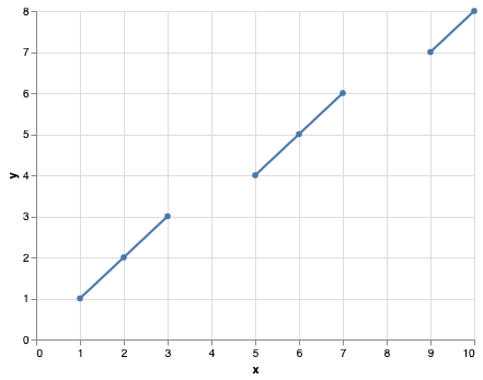
More information about the impute transform in the docs: https://altair-viz.github.io/user_guide/transform.html#impute-transform
 jakevdp
on 4 Nov 2019
jakevdp
on 4 Nov 2019
Thank you Jake
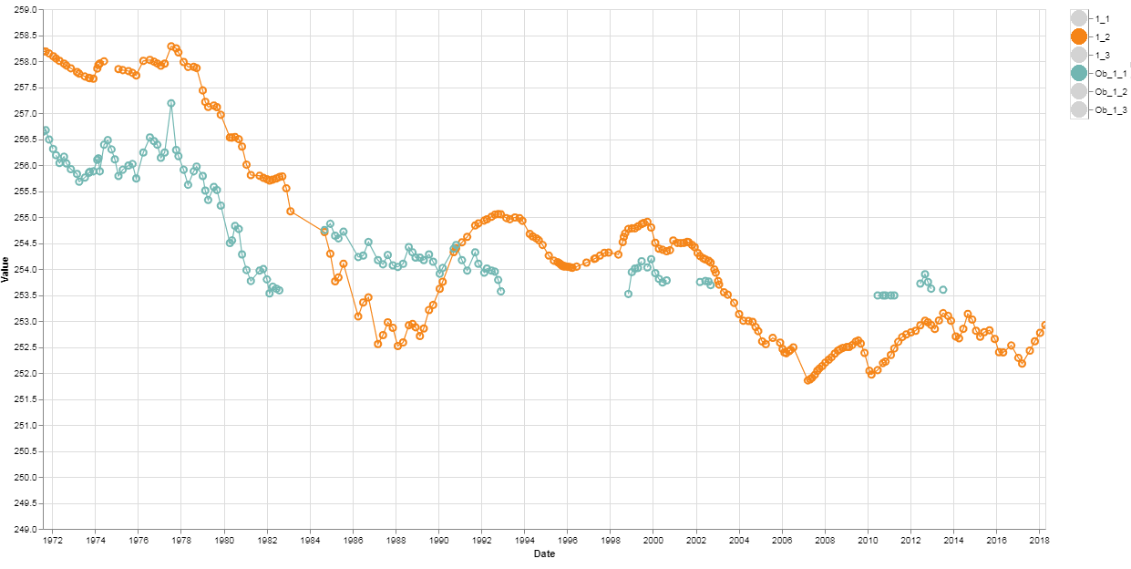
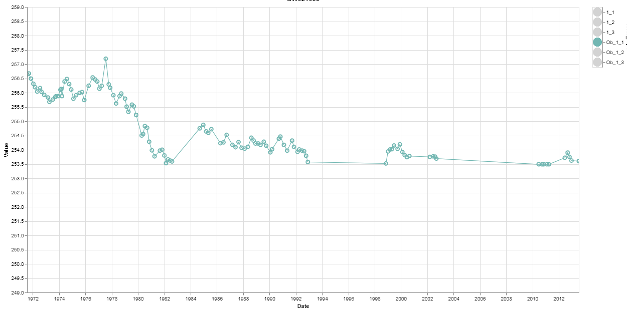
The impute works until I select only the items that are imputed, Then it fails to work as seen in the pictures below. I can send my code and files?
ADR777
on 5 Nov 2019
Hard to tell without seeing your code, but I suspect you're using a filter transform to select lines. Try using a conditional opacity instead, so the dataset itself doesn't change.
jakevdp
on 5 Nov 2019
min = bore_df['Value'].min()
max = bore_df['Value'].max()
highlight = alt.selection(type='single', on='click',
                      fields=['Hole_Pipe'], nearest=True)

# This allows you to select in the legend
# multiple items with shift key held down
selectionmulti = alt.selection_multi(fields=['Hole_Pipe'])

colors = alt.condition(selectionmulti,
                      alt.Color('Hole_Pipe:N', legend=None),
                      alt.value('lightgray'))

colores = alt.condition(selectionmulti,
                      alt.Color('Hole_Pipe:N', legend=None),
                      alt.value(None))

base = alt.Chart(bore_df).encode(
  x=('Date:T'),
  #y='Value:Q',
  y=alt.Y('Value:Q',
          impute=alt.ImputeParams(value=None),
          scale=alt.Scale(domain=[min, max])),
  color=colores
  )


# opacity=alt.value(1) makes the circles not be opaque
# opacity=alt.value(0.1) makes the circles be opaque
# .transform_filter(selectionmulti) allows only the selected items
# in the legend to be displayed in the tooltips
chartpoint = base.mark_point(point=True, size=50).encode(opacity=alt.value(1),
        tooltip=['GW_No', 'Hole_Pipe', 'Date', 'Value']).add_selection(
        highlight
  ).transform_filter(selectionmulti)


chartline = base.mark_line().encode(
        size=alt.condition(~highlight, alt.value(1.2), alt.value(2.5))
        ).properties(title=bore, width=1100, height=570).interactive().transform_filter(selectionmulti)


legends = alt.Chart(bore_df).mark_circle(size=300).encode(
        y=alt.Y('Hole_Pipe:N', impute=alt.ImputeParams(value=None), axis=alt.Axis(orient='right')),
        color=colors).add_selection(selectionmulti)


charty = ((chartline + chartpoint) | legends)

chart = (charty)


chart.save(results_dir + bore + '.html')
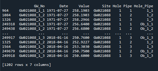
This is what the data looks like
ADR777
on 5 Nov 2019
The impute transform only works if you tell it which values you want to impute. It can get these values two ways:
- from other groups of data in the chart
- from the
keyvalsargument toImputeParams
If you're relying on (1) and you use a filter transform, then you change the values that are imputed depending on which values are present in the selected data. So you either need to (1) change the mechanism to use a conditional opacity rather than a filter transform as I mentioned above, or (2) explicitly set keyvals in your impute transform to specify which values you want imputed, as I showed in the code snippet above.
jakevdp
on 5 Nov 2019
Regarding the documentation, "the Altair documentation is very hard to understand" is not helpful because it's not actionable. The best thing you could do is contribute to the documentation to make it easier to understand. The second best thing you could do is open issues pointing out specific problems.
jakevdp
on 5 Nov 2019
I do like Altair and feel its worth the investment in time to learn it. Its the best plotting library I have come across and I see a bright future for it.
ADR777
on 5 Nov 2019
Thank You Jake for your reply. I have to spend time with my code and try to understand what you wrote and trial and error a way forward. Conditional opacity and how to use keyvals are not clear to me.
ADR777
on 7 Nov 2019
keyvals are the values at which the data is imputed. They can be specified two ways:
- explicitly, via the
keyvalsargument - implicitly, via the presence of a value in the dataset visible to the chart element
When you use a filter transform, it changes the dataset visible to the chart element, changing the implicit keyvals, and thus changing imputed data.
So to fix your issue, you can either explicitly set keyvals, or avoid the filter transform.
By conditional opacity, I meant that you could replace this
chart.transform_filter(selectionmulti)
with this:
chart.encode(opacity=alt.condition(selectionmulti, alt.value(1), alt.value(0))
This lets you hide data without filtering it, so that the automatically determined keyvals will not change based on the selection.
jakevdp
on 7 Nov 2019
Related issues
 HalukaMB
·
31Comments
jakevdp
·
36Comments
jakevdp
·
48Comments
HalukaMB
·
31Comments
jakevdp
·
36Comments
jakevdp
·
48Comments
 mroswell
·
54Comments
jakevdp
·
34Comments
mroswell
·
54Comments
jakevdp
·
34Comments
Most helpful comment
Regarding the documentation, "the Altair documentation is very hard to understand" is not helpful because it's not actionable. The best thing you could do is contribute to the documentation to make it easier to understand. The second best thing you could do is open issues pointing out specific problems.