Altair: Color range breaks after chart concatenation
Environment
- altair 3.2.0
- python '3.6.8 (default, Jan 14 2019, 11:02:34) \n[GCC 8.0.1 20180414 (experimental) [trunk revision 259383]]'
- Ubuntu 18
What
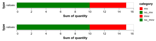
If we specify colors as mentioned in #921, and concatenate two charts, the colors break.
import altair as alt
import pandas as pd

mv_dict = {'type': ['values', 'values'], 'quantity': [5, 10], 'category': ['mv', 'no_mv']}
df = pd.DataFrame(mv_dict)
c1 = alt.Chart(df).mark_bar().encode(
    y='type',
    x='sum(quantity)',
    color=alt.Color('category',
                   scale=alt.Scale(
            domain=['mv', 'no_mv'],
            range=['red', 'green'])))

mv_dict = {'type': ['values', 'values'], 'quantity': [5, 10], 'category': ['mvv', 'no_mvv']}
c2 = alt.Chart(df).mark_bar().encode(
    y='type',
    x='sum(quantity)',
    color=alt.Color('category',
                   scale=alt.Scale(
            domain=['mvv', 'no_mvv'],
            range=['blue', 'orange'])))

c1 | c2
 SuperShinyEyes
👍1
All 3 comments
You need to specify the entire domain and range of the concatenated chart.
import altair as alt
import pandas as pd

mv_dict = {'type': ['values', 'values'], 'quantity': [5, 10], 'category': ['mv', 'no_mv']}
dff = pd.DataFrame(mv_dict)
c1 = alt.Chart(dff).mark_bar().encode(
    y='type',
    x='sum(quantity)',
    color=alt.Color('category',
                   scale=alt.Scale(
            domain=['mv', 'no_mv', 'mvv', 'no_mvv'],
            range=['red', 'green', 'blue', 'orange'])))

mv_dict = {'type': ['values', 'values'], 'quantity': [5, 10], 'category': ['mvv', 'no_mvv']}
dff = pd.DataFrame(mv_dict)
c2 = alt.Chart(dff).mark_bar().encode(
    y='type',
    x='sum(quantity)',
    color=alt.Color('category',
                   scale=alt.Scale(
            domain=['mvv', 'no_mvv'],
            range=['red', 'green', 'blue', 'orange'])))

c1 & c2
SuperShinyEyes
on 16 Sep 2019
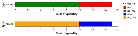
You can also use (c1 & c2).resolve_scale(color='independent') if you want each subchart to have an independent color scale.
 jakevdp
on 16 Sep 2019
jakevdp
on 16 Sep 2019
👍4
mv_dict = {'type': ['values', 'values'], 'quantity': [5, 10], 'category': ['mv', 'no_mv']}
dff = pd.DataFrame(mv_dict)
c1 = alt.Chart(dff).mark_bar().encode(
    y='type',
    x='sum(quantity)',
    color=alt.Color('category',
                   scale=alt.Scale(
            domain=['mv', 'no_mv'],
            range=['red', 'green'])))

mv_dict = {'type': ['values', 'values'], 'quantity': [5, 10], 'category': ['mvv', 'no_mvv']}
dff = pd.DataFrame(mv_dict)
c2 = alt.Chart(dff).mark_bar().encode(
    y='type',
    x='sum(quantity)',
    color=alt.Color('category',
                   scale=alt.Scale(
            domain=['mvv', 'no_mvv'],
            range=['blue', 'orange'])))

(c1 & c2).resolve_scale(color='independent')
Yes this works. Thank you @jakevdp !
SuperShinyEyes
on 17 Sep 2019
Was this page helpful?
0 / 5 - 0 ratings
Related issues
 DentonGentry
·
3Comments
DentonGentry
·
3Comments
 brylie
·
4Comments
brylie
·
4Comments
 morberg
·
3Comments
morberg
·
3Comments
 breadbaron
·
4Comments
breadbaron
·
4Comments
 galloramiro
·
3Comments
galloramiro
·
3Comments
Most helpful comment
You can also use
(c1 & c2).resolve_scale(color='independent')if you want each subchart to have an independent color scale.