Altair: dynamic axis data selection possible?
I'd like to change which column is encoded on the y axis, based on user interaction -- for example, a dropdown list of the column names. Is this possible?
 chawlaKat
All 16 comments
You can sort of do this by folding the data and using a select binding, though it's only straightforwardly possible to do on one axis. For example:
import altair as alt
from vega_datasets import data
columns = ['Acceleration', 'Cylinders', 'Displacement', 'Horsepower']
select_box = alt.binding_select(options=columns, name='column')
sel = alt.selection_single(fields=['column'], bind=select_box, init={'column': 'Acceleration'})
alt.Chart(data.cars()).transform_fold(
columns,
as_=['column', 'value']
).transform_filter(
sel
).mark_point().encode(
x='Miles_per_Gallon:Q',
y='value:Q',
color='Origin:N'
).add_selection(
sel
)
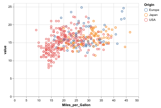
You can see the live, interactive version here.
 jakevdp
on 19 Jul 2019
jakevdp
on 19 Jul 2019
I'd been thinking of adding an example along these lines to the gallery, maybe it's time to do that :grin:
jakevdp
on 19 Jul 2019
Thanks so much, this makes my project way more doable!
chawlaKat
on 23 Jul 2019
Good news! By specifying the 'as_' property, I was able to fold the data on both the x and y axes. I think a 2d chart-style selector should allow the user to specify both, but I'll need to test that to know for sure.
chawlaKat
on 23 Jul 2019
I have one more question about this approach.
The idea is to remove selection empty state (because allor none are not suitable for my task).
I tried to disable selection clearing by setting clear=False, but it didn't work... Selection updates to empty state by left mouse button click.
Is there a solution fot this problem?
Maybe add option to empty parameter like init={'column': 'Acceleration'}
Maybe I'm doing something wrong:)
 romanzes637
on 30 Jul 2019
romanzes637
on 30 Jul 2019
Hi @romanzes637 - I think what you really want is to make the selection bound only to the binding element, not to chart interactions. This is not possible currently in Vega-Lite; there's a discussion about this somewhere but I can't find it at the moment.
A workaround is to concatenate an empty chart and add the selection to that instead.
jakevdp
on 30 Jul 2019
Thank you, I seem to understand.
I’ll try to use concatenation.
To make it clear, I want to change not the axis but the color. So, then the selection is empty, colors become strange (for empty=all) or transparent (for empty=none):)
Here is an example from sample data. (You can view it at https://romanzes637.github.io/)
Points are vectors from the 6 dimension space after dimension reduction to 2 dimensions. I want to color 2D vector by individual components of the 6D vector.
That works well only if we don’t intend to reset the selection.
import pandas as pd
import altair as alt
import numpy as np
n_vectors = 10
# x, y - 2D vector components
# c1, c2, c3, c4, c5, c6 - 6D vector components
df = pd.DataFrame({
'x': [1.574978, 1.795649, 1.725641, 0.02946, 1.957083,
0.24196, 0.258188, 0.5444, 0.841816, -1.17396],
'y': [1.033189, 1.210541, 0.879006, 1.123178, 0.616626,
0.43055, 0.837882, 0.568572, 0.397429, -1.938288],
'c1': [-0., -0., -0., 0., -0., -0., 0., 0., 0., 0.],
'c2': [-0.2, -0.3, -0.2, -0.3, -0.3, -0.3, -0.3, -0.4, -0.4, -0.4],
'c3': [1., 1., 1., 1., 1., 1., 1., 1., 1., 1.],
'c4': [-0., -0., -0., -0., 0., -0., -0., 0., 0., 0.],
'c5': [0.3, 0.3, 0.4, 0.4, 0.4, 0.5, 0.5, 0.5, 0.6, 0.7],
'c6': [-0.1, -0.1, -0.1, -0.1, -0.2, -0.2, -0.1, -0.2, -0.2, -0.3]
})
columns = ['c1', 'c2', 'c3', 'c4', 'c5', 'c6']
select_box = alt.binding_select(options=columns, name='column')
sel = alt.selection_single(fields=['column'], bind=select_box, init={'column': 'c1'})
alt.Chart(df.reset_index()).transform_fold(
columns,
as_=['column', 'value']
).transform_filter(
sel
).mark_point().encode(
x='x:Q',
y='y:Q',
color='value:Q',
tooltip=['index', 'x', 'y'] + columns
).add_selection(
sel
)
In general, this task is about visualizing scalar field on the set of objects and it could arise in various applications from my point of view.
romanzes637
on 31 Jul 2019
Yes, the best approach here, as I mentioned, would be if vega-lite provided the ability to remove the link between the selection and the chart, so that the selection can only be modified via the input widget, and unfortunately that's not supported in Vega-Lite. I'd encourage you to open a feature request there. Nothing we do in the Altair package will be able to address this fundamental issue.
jakevdp
on 31 Jul 2019
Actually, it just occurred to me there's a hack you can do to disable the selection on the chart itself. If you define your selection as:
alt.selection_single(..., on="click[event.shiftKey&!event.shiftKey]")
Then the selection will only reset if you click the chart while both holding and not holding the shift key - i.e. never :grin:
jakevdp
on 31 Jul 2019
YES! Ingenious solution:)))
Hmm, i've just tested, so it works only if we set
alt.selection_single(..., on="click[event.shiftKey&!event.shiftKey]", clear=False)
If clear is True the selection continues to reset but with two mouse clicks instead of one.
I don't know why...
So working example:
import pandas as pd
import altair as alt
import numpy as np
# x, y - 2D vector components
# c1, c2, c3, c4, c5, c6 - 6D vector components
df = pd.DataFrame({
'x': [1.574978, 1.795649, 1.725641, 0.02946, 1.957083,
0.24196, 0.258188, 0.5444, 0.841816, -1.17396],
'y': [1.033189, 1.210541, 0.879006, 1.123178, 0.616626,
0.43055, 0.837882, 0.568572, 0.397429, -1.938288],
'c1': [-0., -0., -0., 0., -0., -0., 0., 0., 0., 0.],
'c2': [-0.2, -0.3, -0.2, -0.3, -0.3, -0.3, -0.3, -0.4, -0.4, -0.4],
'c3': [1., 1., 1., 1., 1., 1., 1., 1., 1., 1.],
'c4': [-0., -0., -0., -0., 0., -0., -0., 0., 0., 0.],
'c5': [0.3, 0.3, 0.4, 0.4, 0.4, 0.5, 0.5, 0.5, 0.6, 0.7],
'c6': [-0.1, -0.1, -0.1, -0.1, -0.2, -0.2, -0.1, -0.2, -0.2, -0.3]
})
columns = ['c1', 'c2', 'c3', 'c4', 'c5', 'c6']
select_box = alt.binding_select(options=columns, name='column')
sel = alt.selection_single(fields=['column'], bind=select_box, init={'column': 'c1'},
clear=False,
on="click[event.shiftKey&!event.shiftKey]")
alt.Chart(df.reset_index()).transform_fold(
columns,
as_=['column', 'value']
).transform_filter(
sel
).mark_point().encode(
x='x:Q',
y='y:Q',
color='value:Q',
tooltip=['index', 'x', 'y'] + columns
).add_selection(
sel
)
Thank you for your response!
romanzes637
on 31 Jul 2019
@jakevdp is this solution efficient?
What would happen if I fold over x, y, color to have three drop-downs to select what to show? Would that blow up size of the table?
 arogozhnikov
on 19 Aug 2019
arogozhnikov
on 19 Aug 2019
@arogozhnikov It won't change the size of the table in the chart specification, but each fold operation does increase the size of the table in memory by roughly a factor of the number of columns in the fold.
jakevdp
on 19 Aug 2019
I recently wrote an article that contain an example of how to get dynamic data selection possible for two axis on a scatterplot, based on what you select in another plot. The solution is heavily based on this issue.
 PaulHiemstra
on 29 Feb 2020
PaulHiemstra
on 29 Feb 2020
@PaulHiemstra that's a great resource! I was mostly able to reproduce (except the init argument to the selector seems to be ignored for some reason).
Your solution is based on a finite number of buckets and a mark_rect() plot. Would it be possible to do something similar with a proper scatter plot with mark_circles() ? It would probably involve creating, without binning, a dataframe with 4 columns (variable, variable2, value, value2) for each combination of 2 features, containing all the points.
 beeb
on 26 Mar 2020
beeb
on 26 Mar 2020
@beeb this is correct. I actually had this code already written before finding out the binning already performs these stes. This is the code I wrote originally, it uses a mix of melt, merge and a second melt:
knmi_data_long = knmi_data.melt(id_vars=['station', 'datum'])
knmi_data_long = knmi_data_long.merge(knmi_data,
                     on=['station', 'datum']).melt(id_vars=['station', 'datum', 'variable', 'value'],
                                                   var_name='variable2', value_name='value2')
This should work with the data that I used in the article.
PaulHiemstra
on 26 Mar 2020
@PaulHiemstra love this solution! Thanks for sharing. I am also using the full scatter plot similar to @beeb.
Any ideas on how to dynamically update the axis labels of the scatter to match the correlation plot selection?
 jbpauly
on 29 Dec 2020
jbpauly
on 29 Dec 2020
Related issues
 choldgraf
·
20Comments
choldgraf
·
20Comments
 mroswell
·
21Comments
jakevdp
·
23Comments
mroswell
·
21Comments
jakevdp
·
23Comments
 XaviFar
·
19Comments
XaviFar
·
19Comments
 Hisham-Hussein
·
29Comments
Hisham-Hussein
·
29Comments
Most helpful comment
@beeb this is correct. I actually had this code already written before finding out the binning already performs these stes. This is the code I wrote originally, it uses a mix of
melt,mergeand a secondmelt:This should work with the data that I used in the article.