I am creating a mark_line chart and my data results in the x axis from 0-30, with the labels/ticks every 2 (0,2,4,6, etc....). I would like to change the labels/ticks to every 5 instead (0,5,10, etc.). Is there a convenient way to accomplish this?
Thank you in advance or the help!
 ghost
ghost
All 4 comments
Ticks are controlled via the axis property of encodings. So, for example, you can explicitly set tick locations using the values setting:
import altair as alt
import pandas as pd
df = pd.DataFrame({
'x': range(20),
'y': range(20)
})
alt.Chart(df).mark_line().encode(
alt.X('x', axis=alt.Axis(values=[0, 5, 10, 15, 20])),
alt.Y('y')
)
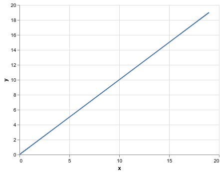
The full set of axis properties is documented here: https://altair-viz.github.io/user_guide/generated/core/altair.Axis.html The tickMinStep property might be useful if you don't want to specify the values explicitly, but want the minimum step to be larger.
 jakevdp
on 24 Jun 2019
jakevdp
on 24 Jun 2019
Thank you, that works perfectly.
Much appreciated!
ghost
on 24 Jun 2019
Is there a way to set the tick frequency for Ordinal data?
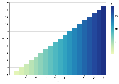
Adapted the above for a mark_rect() example:
Desired output: every 5th tick (for example)
import altair as alt
import pandas as pd
df = pd.DataFrame({
'x': range(20),
'y': range(20)
})
alt.Chart(df).mark_rect().encode(
alt.X('y:O',
axis=alt.Axis(tickMinStep = 2, labelAngle=0),
),
alt.Y('x:Q', axis=alt.Axis(values=[0, 5, 10, 15, 20])),
alt.Color('x:Q'),
tooltip=['x','y']
)

 firasm
on 17 Nov 2019
firasm
on 17 Nov 2019
tickMinStep and the like only apply to quantitative scales. For ordinal or categorical scales, you can specify values directly:
alt.Chart(df).mark_rect().encode(
    alt.X('x:O', axis=alt.Axis(values=list(range(1, 20, 2)))),
    alt.Y('y:Q'),
    alt.Color('x:Q'),
    tooltip=['x','y']
)
Note also that if necessary, the renderer will automatically adjust tick labels to prevent overlap:
df = pd.DataFrame({
    'x': range(50),
    'y': range(50)
})

alt.Chart(df).mark_rect().encode(
    alt.X('x:O'),
    alt.Y('y:Q'),
    alt.Color('x:Q'),
    tooltip=['x','y']
).properties(width=400)

jakevdp
on 17 Nov 2019
Related issues
 tonylee3399
·
3Comments
firasm
·
3Comments
tonylee3399
·
3Comments
firasm
·
3Comments
 morberg
·
3Comments
morberg
·
3Comments
 galloramiro
·
3Comments
galloramiro
·
3Comments
 pabloinsente
·
3Comments
pabloinsente
·
3Comments
Most helpful comment
tickMinStepand the like only apply to quantitative scales. For ordinal or categorical scales, you can specifyvaluesdirectly:Note also that if necessary, the renderer will automatically adjust tick labels to prevent overlap: