Altair: add vertical line faceted chart
Hello,
I'm struggling with something that I can't solve.
let's say we have the example from the Becker’s Barley Trellis Plot https://altair-viz.github.io/gallery/beckers_barley_trellis_plot.html
What I want to do is add a dashed vertical line from x=30 so I can easily see if the value from the plots i over or under that value.
thanks!
import altair as alt
from vega_datasets import data

source = data.barley()

alt.Chart(source).mark_point().encode(
    alt.X('median(yield)', scale=alt.Scale(zero=False)),
    alt.Y(
        'variety',
        sort=alt.EncodingSortField(field='yield', op='median', order='descending'),
        scale=alt.Scale(rangeStep=20)
    ),
    color='year:N',
    row='site'
)
 XaviFar
All 19 comments
import altair as alt
from vega_datasets import data

source = data.barley()
source['a'] = 30
chart_one = alt.Chart().mark_point().encode(
    alt.X('median(yield)', scale=alt.Scale(zero=False)),
    alt.Y(
        'variety',
        sort=alt.EncodingSortField(field='yield', op='median', order='descending'),
        scale=alt.Scale(rangeStep=20)
    ),
    color='year:N'
)

chart_two = alt.Chart().mark_rule().encode(
    x='a')

(chart_one+chart_two).facet(row='site', data=source)

 afonit
on 31 Aug 2018
afonit
on 31 Aug 2018
If you don't want to add a column to your dataframe, you can also put the value for the vertical line in the schema with a calculate transform:
import altair as alt
from vega_datasets import data

source = data.barley()

points = alt.Chart().mark_point().encode(
    alt.X('median(yield)', scale=alt.Scale(zero=False)),
    alt.Y(
        'variety',
        sort=alt.EncodingSortField(field='yield', op='median', order='descending'),
        scale=alt.Scale(rangeStep=20)
    ),
    color='year:N'
)

vertline = alt.Chart().mark_rule().encode(
    x='a:Q'
)

alt.layer(
    points, vertline,
    data=source
).transform_calculate(
    a="30"
).facet(
    row='site'
)
 jakevdp
on 31 Aug 2018
jakevdp
on 31 Aug 2018
Awesome, thanks for the answers, it worked like a charm!
XaviFar
on 5 Sep 2018
I was _finally_ able to draw a vertical line on my Altair's plots following the suggestions from above—thank you for that!—but I wonder if it would be possible to implement matplotlib's hlines and vlines or something like ggplot's + geom_vline(xintercept=2) too.
It would make this library so much more intuitive and easy to use!
I do like the library very much and thank @jakevdp and the other contributors for the amazing job you have done with it. 🙌
 uribe-convers
on 11 Sep 2018
uribe-convers
on 11 Sep 2018
Thanks for the tip above. I'm confused about something that indicates there's an issue with how I'm understanding part of Altair. Why doesn't the following work?
vertline = alt.Chart().mark_rule().encode(
    x='a:Q'
)
Thanks!
 sterlinm
on 22 May 2019
sterlinm
on 22 May 2019
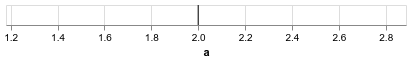
I'm not certain what exactly you're asking. If you provide data, it draws a line correctly:
import pandas as pd
import altair as alt

data = pd.DataFrame({'a': [2]})

alt.Chart(data).mark_rule().encode(
    x='a:Q'
).interactive()
jakevdp
on 22 May 2019
Sorry, I came across this issue because whenever I want to add a horizontal line to a chart, my first instinct is to try to specify x=alt.value(3) or whatever the position of the line I want is. For other encodings I can use alt.value(n) to hardcode a value. For example, I can control the size and the color of the line:
import altair as alt
from vega_datasets import data

source = data.cars()

alt.Chart(source).mark_rule().encode(
    x='a:Q',
    size=alt.value(3),
    color=alt.ColorValue('red')
).transform_calculate(
    a="2"
).interactive()
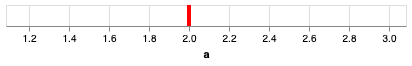
I can control the size and color using alt.value and alt.ColorValue, but if I try to set the encoding for x using alt.value I get an error:
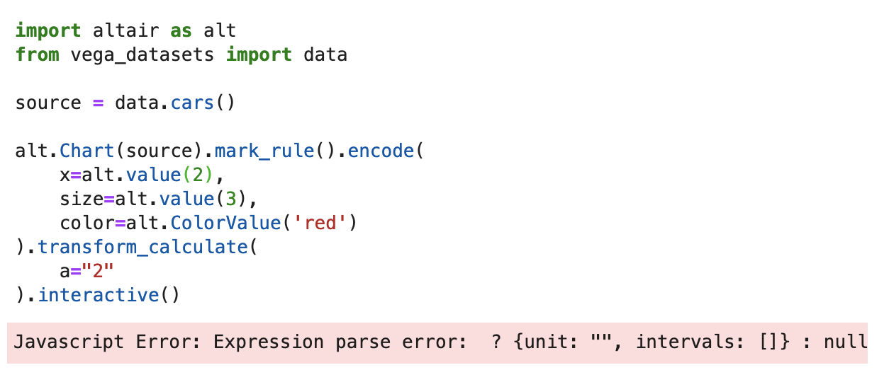
I just don't have a good handle on why I can set size to alt.value(3) but not x.
sterlinm
on 23 May 2019
(Please in the future paste the actual text of your code rather than a screenshot)
Your code works for me in the current version of Altair, though it's not a very exciting chart on its own. Perhaps you're using an older version of the library?
import altair as alt
from vega_datasets import data

source = data.cars()

alt.Chart(source).mark_rule().encode(
    x=alt.XValue(2),
    size=alt.SizeValue(3),
    color=alt.ColorValue("red")
).transform_calculate(
    a="2"
)

jakevdp
on 23 May 2019
Sorry will edit the image or when I have a chance. I didn't know about alt.XValue. Thanks!
sterlinm
on 23 May 2019
Oh, the alt.XValue vs. alt.value here is not important – they lead to the same result. I just made an error when transcribing your code screenshot (one reason it's important to paste actual code, not an image of the code)
The operative issue I believe is that you are using an old version of the library.
jakevdp
on 23 May 2019
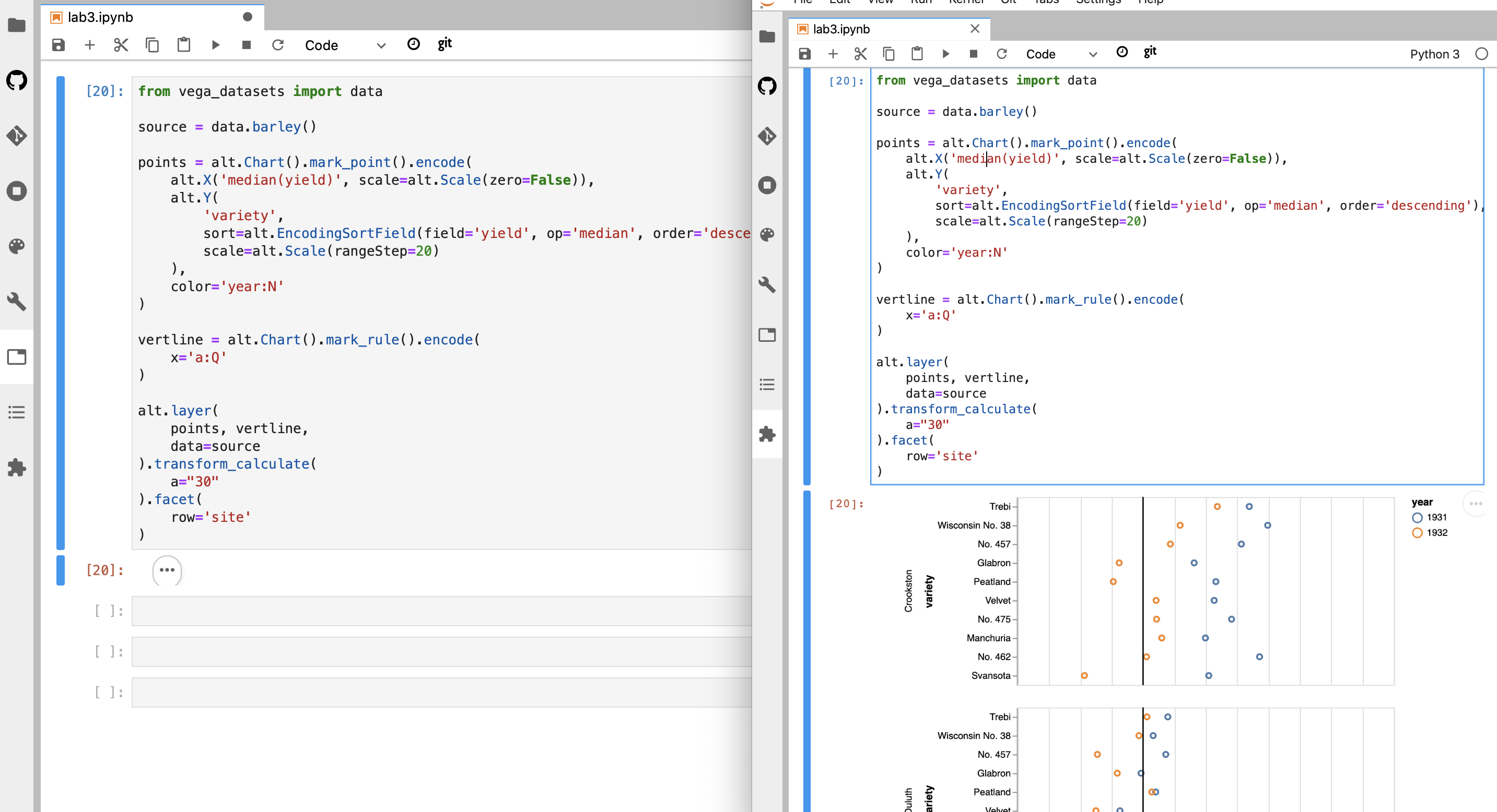
Trying to reproduce the example from above on Altair 3.2.0 :
```import altair as alt
from vega_datasets import data
source = data.barley()
points = alt.Chart().mark_point().encode(
alt.X('median(yield)', scale=alt.Scale(zero=False)),
alt.Y(
'variety',
sort=alt.EncodingSortField(field='yield', op='median', order='descending'),
scale=alt.Scale(rangeStep=20)
),
color='year:N'
)
vertline = alt.Chart().mark_rule().encode(
x='a:Q'
)
alt.layer(
points, vertline,
data=source
).transform_calculate(
a="30"
).facet(
row='site'
)
```
but I get no chart with three dots. I can display a single chart with the line if I remove the .facet()...
Does this have something to do with this comment about the change in where data is specified in Altair 3.1+ ?
 firasm
on 27 Oct 2019
firasm
on 27 Oct 2019
It works fine for me in Altair 3.2. I suspect your frontend renderer is out of date – this is not controlled by the Altair version you have installed in the Python backend, but rather by the frontend extension (i.e. the vega nbextension for jupyter notebook, or the vega labextension for jupyterlab). Update your frontend extension and the chart should work.
jakevdp
on 27 Oct 2019
Info on the frontend requirements can be found on the installation page: https://altair-viz.github.io/getting_started/installation.html
jakevdp
on 27 Oct 2019
Thanks for confirming it worked for you.
Prompted me up to update my full stack (don't think the renderer was out of date after all) and dig deeper.
Problem seems to be (of all things!!) in Safari. If I open the same jupyterlab notebook in Chrome, everything looks as it should:
Weird and bizarre.
Safari version: Version 13.0.2 (15608.2.30.1.1)
macOS 10.15.
(I also tried to reload and run without content blockers, same issue. Other charts render fine, it' just this one!)
Cheers.
firasm
on 27 Oct 2019
Strange... if you want to follow up, you could raise this issue in the Vega-Lite repository. Javascript errors reported in the browser's console may give clues as to what's going on...
jakevdp
on 27 Oct 2019
If you want multiple vertical lines at different places, do you need a separate layer for each one?
 dsandber
on 12 Jun 2020
dsandber
on 12 Jun 2020
No, you can specify multiple rule marks in a single layer by using a multiple-row dataset:
import altair as alt
import pandas as pd
df = pd.DataFrame({'x': [2, 3, 5, 7, 11]})
vert_lines = alt.Chart(df).mark_rule().encode(x='x')
Perfect, thank you!
dsandber
on 12 Jun 2020
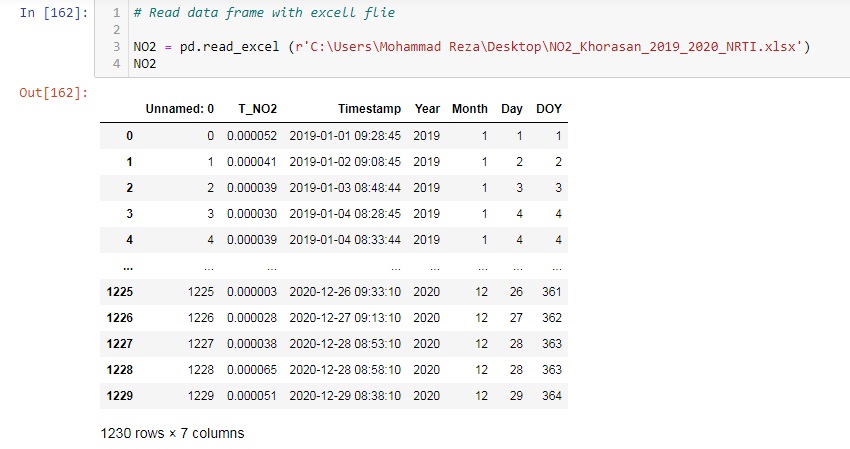
Hello, Happy New Year
I want to add a couple of vertical lines to my chart but I don't know how could you please help me?
vertical lines for two different date e.x: for Dec 09 and Dec 20
How I increase the resolution of the chart image?
when I download chart image they don't have quality
Code :
highlight = alt.selection(
    type='single', on='mouseover', fields=['DOY'], nearest=True)

base = alt.Chart(NO2).encode(
    x=alt.X('monthdate(Timestamp):Q', title='Date'),
    y=alt.Y('mean(T_NO2):Q', title='NO2 Khorasan (mol/m^2)'),
    color=alt.Color('Year:O', scale=alt.Scale(scheme='magma')))

points = base.mark_circle().encode(
    opacity=alt.value(0),
    tooltip=[
        alt.Tooltip('Month:O', title='Month'),
        alt.Tooltip('DOY:Q', title='DOY'),
        alt.Tooltip('T_NO2:Q', title='NO2')
    ]).add_selection(highlight)

lines = base.mark_line().encode(
    size=alt.condition(~highlight, alt.value(3), alt.value(3)))


rule1 = base.mark_rule(color='red').encode(
    x={'Timestamp': "2020-11-09"},
    size=alt.value(5)
)

rule2 = base.mark_rule(color='orange').encode(
    x={'Timestamp': "2020-11-20"},
    size=alt.value(5),
)


(points + lines).properties(width=600, height=350).interactive()

 Mohammadreza20
on 2 Jan 2021
Mohammadreza20
on 2 Jan 2021
Related issues
 morberg
·
3Comments
morberg
·
3Comments
 LukeMathWalker
·
3Comments
LukeMathWalker
·
3Comments
 breadbaron
·
4Comments
breadbaron
·
4Comments
 jtbaker
·
3Comments
jtbaker
·
3Comments
 maxgerma
·
3Comments
maxgerma
·
3Comments
Most helpful comment
I was _finally_ able to draw a vertical line on my Altair's plots following the suggestions from above—thank you for that!—but I wonder if it would be possible to implement
matplotlib'shlinesandvlinesor something likeggplot's+ geom_vline(xintercept=2)too.It would make this library so much more intuitive and easy to use!
I do like the library very much and thank @jakevdp and the other contributors for the amazing job you have done with it. 🙌