Altair: Tooltip example doesn't work with data aggregate transforms
I was trying to add a scatterplot tooltip based on the Multi-Line Tooltip example and think I ran across a bug. The example works fine when data are plotted directly but exhibits weird behavior when an aggregation function is applied.
import altair as alt
import numpy as np
import pandas as pd

# Create data and labels
a = np.random.randint(-5, 5, 200)
b = a * np.random.random(200)
s = np.random.choice(['first', 'second', 'third', 'fourth'], 200)
data = pd.DataFrame.from_dict({'a': a, 'b': b, 's': s}, orient='columns')

# Create a selection that chooses the nearest point & selects based on x-value
nearest = alt.selection_single(name='nearest', nearest=True, on='mouseover',  empty='none')

# Plot the mean of a against the mean of b
points = alt.Chart().mark_point(filled=True, size=100).encode(
    x='mean(a):Q',
    y='mean(b):Q',
    color='s:N'
)

# Transparent selectors across the chart. This is what tells us
# the x-value of the cursor
selectors = alt.Chart().mark_point().encode(
    x='mean(a):Q',
    y='mean(b):Q',
    opacity=alt.value(0),
).properties(
    selection=nearest
)

# Draw text labels near the points, and highlight based on selection
text = points.mark_text(align='left', dx=5, dy=-5).encode(
    text=alt.condition(nearest, 's:N', alt.value(' '))
)

alt.layer(points, selectors, text, data=data)
 gschivley
All 9 comments
What is your intended behavior here?
 jakevdp
on 2 May 2018
jakevdp
on 2 May 2018
I'm trying to show nominal data - a class that the point belongs to - in the tooltip. Here's a revised example where a few individual data points are plotted and the group that each belongs to is provided via tooltip.
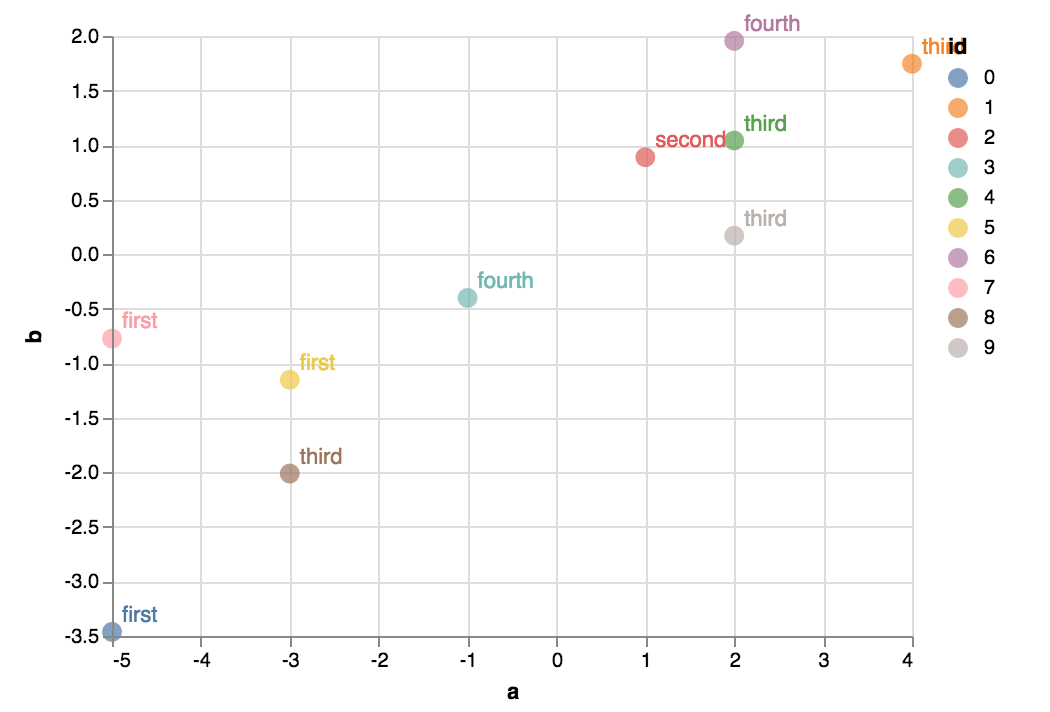
import altair as alt
import numpy as np
import pandas as pd
# a & b are quantitative values
a = np.random.randint(-5, 5, 10)
b = a * np.random.random(10)
# ids are unique identifiers
ids = range(10)
# Each point belongs to a group
group = np.random.choice(['first', 'second', 'third', 'fourth'], 10)
# Make dataframe
data = pd.DataFrame.from_dict({'a': a, 'b': b, 'id': ids, 'group': group},
orient='columns')
# Create a selection that chooses the nearest point & selects based on x-value
nearest = alt.selection_single(name='nearest', nearest=True, on='mouseover', empty='none')
brush = alt.selection_interval()
# Plot the mean of a against the mean of b
points = alt.Chart().mark_point(filled=True, size=100).encode(
x='a:Q',
y='b:Q',
color='id:N'
)
# Transparent selectors across the chart. This is what tells us
# the x-value of the cursor
selectors = alt.Chart().mark_point().encode(
x='a:Q',
y='b:Q',
opacity=alt.value(0),
).properties(
selection=nearest
)
# Draw text labels near the points, and highlight based on selection
text = points.mark_text(align='left', dx=5, dy=-5).encode(
text=alt.condition(nearest, 'group:N', alt.value(' '))
)
alt.layer(points, selectors, text, data=data)
I could aggregate the data with Pandas and then plot but that only covers one potential use case. Others might include adding a linked plot (perhaps with timeseries data) and maybe another selection to filter ids shown in the timeseries (although it isn't clear if multiple selection objects can be used like this).
gschivley
on 2 May 2018
If your goal is to show tooltips, you could use the tooltip encoding channel. It's not fully operational yet (there is some current work in the renderers that will make the tooltip implementation much better in the near future) but it works using the HTML title attribute now. For example:
import altair as alt
import numpy as np
import pandas as pd

# Create data and labels
a = np.random.randint(-5, 5, 200)
b = a * np.random.random(200)
s = np.random.choice(['first', 'second', 'third', 'fourth'], 200)
data = pd.DataFrame.from_dict({'a': a, 'b': b, 's': s}, orient='columns')

# Plot the mean of a against the mean of b
alt.Chart(data).mark_point(filled=True, size=100).encode(
    x='mean(a):Q',
    y='mean(b):Q',
    color='s:N',
    tooltip='s:N'
)

The whole thing about using selections and layers should only be used if you want to do something more sophisticated.
jakevdp
on 2 May 2018
But if you want to go the more complicated route, if you add encodings=['color'] to your selection, I think it will do what you want (there are undefined variables in your code, so I can't easily check).
jakevdp
on 2 May 2018
although it isn't clear if multiple selection objects can be used like this
yes, multiple selections can be used in a single chart. We have some examples of this; e.g. https://altair-viz.github.io/gallery/seattle_weather_interactive.html
jakevdp
on 2 May 2018
Another thing about your example: there's no reason to add transparent selectors that are identical to your points. Just tie the selection to the points themselves.
The reason that the example you refer to uses transparent selectors is that we want to select on just the x-value, not the x and y value. There's an example of a simpler nearest selection here: https://altair-viz.github.io/gallery/us_state_capitals.html
jakevdp
on 2 May 2018
The tooltip channel is exactly what I needed. I see it in the documentation now (and was happy to find the timeUnit parameter in the Tooltip class).
Also good to know about the transparent selectors. But having said that, I'm not sure it's clear what role they play in the example figure.
I've corrected the undefined variable in my second example so it should run. Adding encodings=['color'] to the selection object brought up all tooltip text and froze it. I don't need this anymore with the tooltip channel but others might try it.
gschivley
on 2 May 2018
Great!
jakevdp
on 2 May 2018
Additional documentation for anyone who comes across this.
Another thing about your example: there's no reason to add transparent selectors that are identical to your points. Just tie the selection to the points themselves.
The reason that the example you refer to uses transparent selectors is that we want to select on just the x-value, not the x and y value. There's an example of a simpler nearest selection here: https://altair-viz.github.io/gallery/us_state_capitals.html
From vega-lite documentation it looks like the transparent selectors are used because the nearest transform isn't supported for continuous mark types (lines and area).
gschivley
on 3 May 2018
Related issues
 pagpires
·
21Comments
jakevdp
·
23Comments
pagpires
·
21Comments
jakevdp
·
23Comments
 HalukaMB
·
31Comments
jakevdp
·
34Comments
HalukaMB
·
31Comments
jakevdp
·
34Comments
 XaviFar
·
19Comments
XaviFar
·
19Comments
Most helpful comment
If your goal is to show tooltips, you could use the
tooltipencoding channel. It's not fully operational yet (there is some current work in the renderers that will make the tooltip implementation much better in the near future) but it works using the HTMLtitleattribute now. For example:The whole thing about using selections and layers should only be used if you want to do something more sophisticated.