Addons-frontend: [a11y] Links to read reviews are confusing for screen reader/keyboard users
In the section where you can read reviews for each rating of an add-on (.RatingsByStar-graph), there are three links taking you to the same place, one for the star, one for the barContainer and one for the count. This results in the following output with the NVDA screen reader:
link  5
link  Read all five-star reviews
link  49
link  4
link  Read all four-star reviews
link  10
link  3
link  Read all three-star reviews
link  4
link  2
link  Read all two-star reviews
link  1
link  1
link  Read all one-star reviews
link  1
Aside from the extreme verbosity here, the meaning of the numbers isn't clear, especially when there are review counts between 1 and 5. Also, if you tab through this with the keyboard, you'll have to tab three times to get through the reviews for each rating, which provides no benefit because the links all go to the same place.
One way to solve this without changing the design too much is to hide two of the three links for each rating for accessibility (aria-hidden="true") and give them tabindex="-1" so they aren't in the tab order but are still clickable. Note that if aria-hidden is used on an element, it is critical that that element is not in the tab order, as that will confuse users. The remaining (tabbable and not accessibility-hidden) link should get a title or label providing all of the information; e.g. "Read all 49 five-star reviews".
 jcsteh
All 15 comments
@jcsteh I am Outreachy aspirant and would like to solve this issue. As you said, I tried solving this issue using tabIndex="-1" and it worked.
 muskangupta-iitr
on 21 Mar 2020
muskangupta-iitr
on 21 Mar 2020
@muffinresearch @eviljeff @jcsteh I have created a PR for this. Waiting for your review :smile:
muskangupta-iitr
on 23 Mar 2020
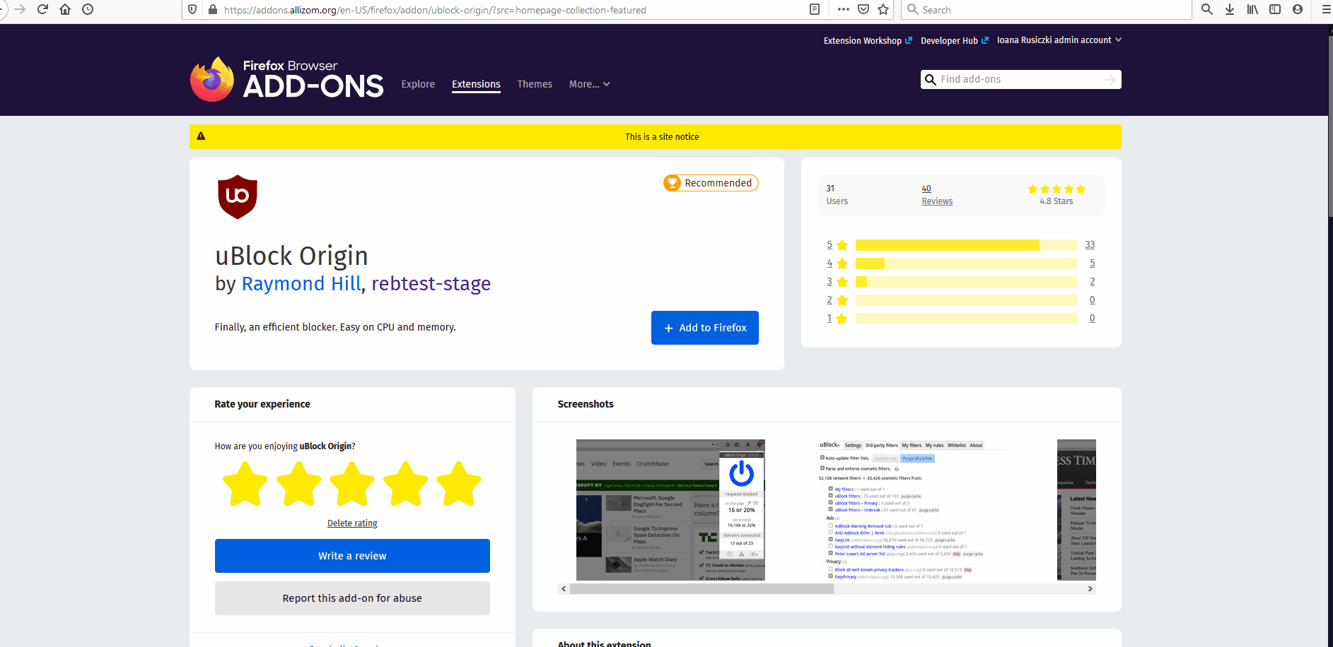
@bobsilverberg I tested on AMO stage with FF75(Win10) and I've noticed that:
on the detail page the ratings card will no longer allow keyboard navigation with Tab key on the detailed classification of the ratings. The user can only access the total number of ratings: the number, say (40) and the "Reviews" link. Both will redirect to the all reviews page.
If the user wishes to see only the 5 stars reviews it will click the number, star or the rating bar.the new behavior is also present on the "See all version" page and all reviews page where with Tab Key the name of the addon and the authors can be accessed but the ratings are no longer accessible.
The user must use the mouse hover and click the detailed classification.
https://addons.allizom.org/en-US/firefox/addon/ublock-origin/reviews/?src=homepage-collection-featured
https://addons.allizom.org/en-US/firefox/addon/ublock-origin/versions/?src=homepage-collection-featured
Let me know if that's the expected behavior for all the pages where the section is available.
 ioanarusiczki
on 22 Apr 2020
ioanarusiczki
on 22 Apr 2020
That looks like a a11y regression so we should probably fix that sooner rather than later (or revert the patch).
 willdurand
on 22 Apr 2020
willdurand
on 22 Apr 2020
@willdurand
If I read the requirements the issue is fixed - not to be able to navigate on the counts or rating bars and skip them.
I kind of disagree with not having the possibility to navigate with Tab key through the review classification - at least to be able to select the numbers for each category.
ioanarusiczki
on 22 Apr 2020
@willdurand Still not good : open twice the same page the total number of reviews and cannot open the 5 ratings only.
This should be reopened/reverted. Let me know what you've decided.
ioanarusiczki
on 22 Apr 2020
If I read the requirements the issue is fixed - not to be able to navigate on the counts or rating bars and skip them.
I kind of disagree with not having the possibility to navigate with Tab key through the review classification - at least to be able to select the numbers for each "category" (star 1 to 5).
Yeah, I don't think those "requirements" are "hard requirements". I get the idea of not having 3 links for each category but we should be able to tab on each category at least, so the issue does not seem to be completely fixed to me.
It removed the 3 links for each category but it breaks keyboard navigation so this does not look like a better approach.
willdurand
on 22 Apr 2020
@bobsilverberg what do you think? To me, it looks like a regression and the patch did not fix this issue in the end. While having 3 times the same link isn't ideal, keyboard navigation worked. Now, we only have 1 link but keyboard navigation isn't available anymore. I don't think that's an improvement.
willdurand
on 22 Apr 2020
The situation right now is unfortunately worse than it was before. With a screen reader, you get this:
Rated 4.8 out of 5
Rated 4.8 out of 5
Rated 4.8 out of 5
Rated 4.8 out of 5
Rated 4.8 out of 5
Rated 4.8 out of 5
4.8 Stars out of 5
The links are gone, but now the information about the number of reviews per rating isn't available at all, nor can you access the reviews for each rating.
If I read the requirements the issue is fixed - not to be able to navigate on the counts or rating bars and skip them.
This isn't quite what was intended. The request was to remove the duplicate links so we only have one link per rating. What we have now is no links for each rating.
jcsteh
on 22 Apr 2020
To be extra clear, I'm saying that having a single link for each rating is definitely necessary. What isn't desirable is having three links for each rating.
jcsteh
on 22 Apr 2020
@jcsteh Alright, thanks for clearing that out. Looks like none of us is happy with the result.
ioanarusiczki
on 22 Apr 2020
I've created a PR to revert these changes at https://github.com/mozilla/addons-frontend/pull/9369.
@muskangupta-iitr If you want to see if you can enhance your patch to deal with this new issue, please feel free to do so, and then submit a new PR for it.
We had some discussions around these a11y issues, about the fact that we probably shouldn't work on any of them until we've had a full a11y review conducted, complete with recommendations, and this is a good indication of why we should probably stick to that.
 bobsilverberg
on 22 Apr 2020
bobsilverberg
on 22 Apr 2020
Thanks, @bobsilverberg for mentioning me to work on the patch. I would definitely want to work on it and in fact, have found another approach to solve the issue. I have also found a solution that fixes the other two issues as well, viz. single link implementation and keyboard navigation. I would create the PR for both the approaches today and we could proceed further as you and the Mozilla team would suggest.
muskangupta-iitr
on 22 Apr 2020
In the merged patch, I removed Link tag, because I have to create a table for grid structure and finding it difficult to create a wrapped link table row, but I searched more on this issue and found a solution, we can use styling display: table and display: table-row; for achieving this. I will create a PR as I said before for this approach.
muskangupta-iitr
on 22 Apr 2020
We had some discussions around these a11y issues, about the fact that we probably shouldn't work on any of them until we've had a full a11y review conducted, complete with recommendations, and this is a good indication of why we should probably stick to that.
FWIW, I'm on the Mozilla accessibility team. I did provide recommendations here which would have fixed this. The decision was made to go with a cleaner approach, but unfortunately, that approach didn't take into account some of these recommendations. I think this was just a misunderstanding. I don't think it's constructive to wait until a complete a11y review has been done before fixing any issues; a11y isn't bad enough here that we need a complete re-design. That said, if there's some way of getting us easy access to test these changes before they land or go live, we'd be happy to do that to prevent a situation like this one from happening again.
jcsteh
on 23 Apr 2020
Related issues
ioanarusiczki
·
5Comments
 ValentinaPC
·
4Comments
ValentinaPC
·
4Comments
 yoasif
·
4Comments
ioanarusiczki
·
5Comments
yoasif
·
4Comments
ioanarusiczki
·
5Comments
 kumar303
·
6Comments
kumar303
·
6Comments
Most helpful comment
To be extra clear, I'm saying that having a single link for each rating is definitely necessary. What isn't desirable is having three links for each rating.