Addons-frontend: expand add-on description by default on desktop
Please expand, at least on desktop, the add-on description by default. I don't see any good reason to hide the most important part of the add-on page by default and it's annoying to have to click on every add-on page the "read more" link to read the description.
 cadeyrn
All 14 comments
On desktop I think this makes sense to do (remove the read more and always display the content), because nothing comes underneath the description text. If that weren’t the case, as add-on descriptions can be very long, I think this would be worth keeping. But yeah, right now it isn’t needed.
 tofumatt
on 5 Nov 2017
tofumatt
on 5 Nov 2017
@tofumatt, so shall we do it?
 tsl143
on 9 Nov 2017
tsl143
on 9 Nov 2017
Yes, I think it's fine to remove the "Read more" link on desktop. Something like the ExpandableCard or whatever we use for Search Filters might work (or at least be a good start).
tofumatt
on 9 Nov 2017
We might want to just increase the read more limit but on desktop only. Maybe there are really really long descriptions? I don't know of any offhand.
 kumar303
on 10 Nov 2017
kumar303
on 10 Nov 2017
Here's one. I agree on increasing the read more limit for desktop.
 jvillalobos
on 11 Nov 2017
jvillalobos
on 11 Nov 2017
Well there's nothing underneath the description right now so it doesn't make sense to ever limit it. I guess if we'll be adding stuff underneath though just upping the limit is fine.
tofumatt
on 11 Nov 2017
Could this be prioritized? The probability of seeing sometimes important details in the description is greatly decreased by the folded text.
 dessant
on 15 Jan 2018
dessant
on 15 Jan 2018
I'm seeing two different suggestions for addressing this:
- Always show the full description, regardless of the size.
- Increase the size of the text allowed before it is truncated and the "Read more" link is shown.
Those supporting #1 seem to do so because there is currently nothing underneath this section which might be pushed too far down the screen if we have no limit. That may not always be the case.
How can we come to a consensus on this? @tofumatt @jvillalobos @kumar303
 bobsilverberg
on 12 Feb 2018
bobsilverberg
on 12 Feb 2018
I think we should keep some limit. We don't know how the design will evolve, and it would be good to encourage devs to keep their descriptions (or the important parts at least) within some sane length.
jvillalobos
on 13 Feb 2018
and it would be good to encourage devs to keep their descriptions (or the important parts at least) within some sane length.
See for example https://addons.mozilla.org/en-US/firefox/addon/new-tab-override/
I have to explain all requested permissions, because in the past without these explanations I got a lot of questions why permission X and Y are needed. I don't want to hide this by default but the description is more important in my opinion, so it's at the end…
Or will #2757 allow to set a small text for each needed permission?
cadeyrn
on 13 Feb 2018
Experienced this yesterday as some critical caveats on the Facebook Container add-on are being hidden. Please move the truncation point far further down the page (roughly aiming to balance left and right). We should not be hiding this much information AND showing an imbalanced page.
 ryanfeeley
on 28 Mar 2018
ryanfeeley
on 28 Mar 2018
Ironally I wanted to show a screenshot but got:
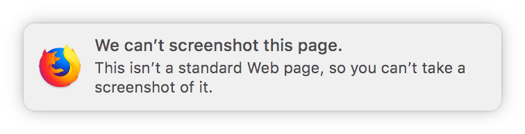
ryanfeeley
on 28 Mar 2018
For QA: This has been implemented by having the text always expanded on desktop. The full text, without a "Read more" footer should be visible on desktop, while on smaller displays the old behaviour (truncated text with a "Read more" link) should still apply.
bobsilverberg
on 3 Apr 2018
Verified this issue on AMO dev and AMO stage with FF59 (Win10 and Android 8.0).
The About this extension section on desktop contains only full text, the read more is no longer visible, while on Android with a smaller display this still applies.
Release notes section remains unchanged on both displays with the read more footer. Summary has a 250 chars limit.
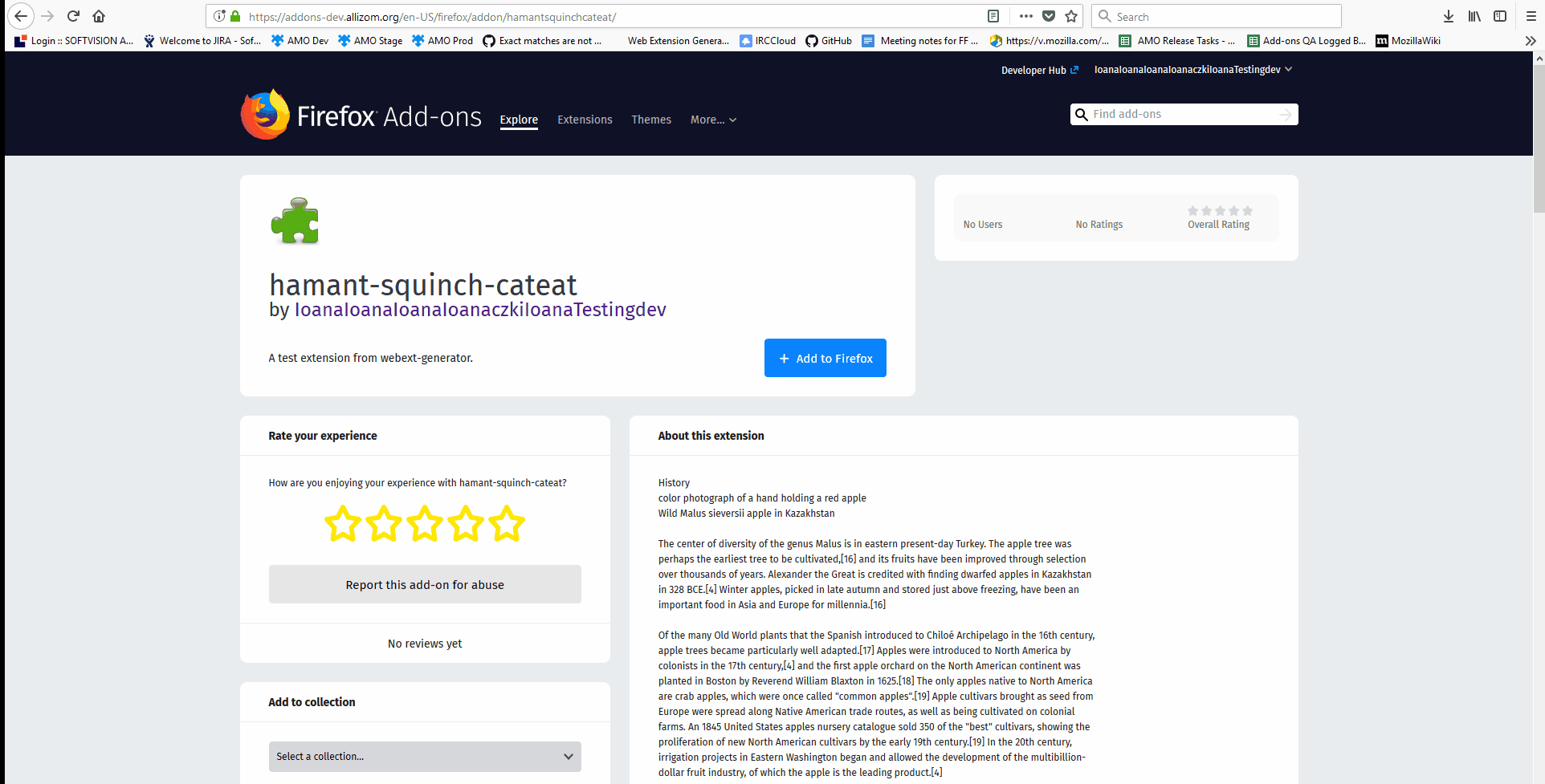
 ioanarusiczki
on 4 Apr 2018
ioanarusiczki
on 4 Apr 2018
Related issues
 yoasif
·
4Comments
kumar303
·
6Comments
yoasif
·
4Comments
kumar303
·
6Comments
 atsay
·
6Comments
atsay
·
6Comments
 SeanPrashad
·
6Comments
SeanPrashad
·
6Comments
 AlexandraMoga
·
5Comments
AlexandraMoga
·
5Comments
Most helpful comment
For QA: This has been implemented by having the text always expanded on desktop. The full text, without a "Read more" footer should be visible on desktop, while on smaller displays the old behaviour (truncated text with a "Read more" link) should still apply.