Yaru: Nautilus sidebar looks different in backdrop
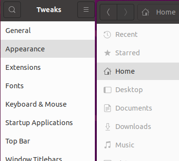
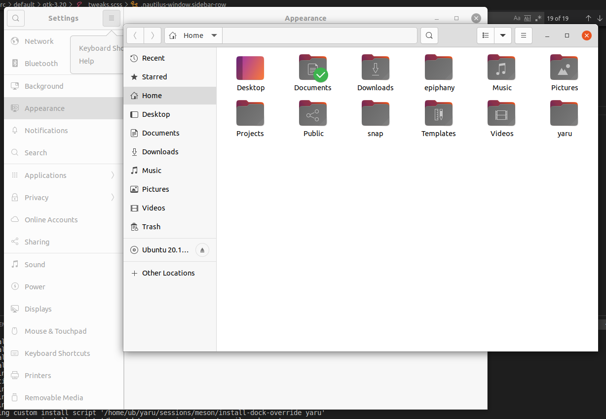
Looks like the gray sidebar in backdrop isn't the same in every app.
All 11 comments
I'm quiet happy how it looks in Nautilus, shall we adapt the others to it?
How does gnome settings look?
I'm quiet happy how it looks in Nautilus, shall we adapt the others to it?
Hmmm, TBH I would prefer something in between. What I don't like about the Nautilus styling is that the icon is gray but the text is black. Could they both be gray?
How does gnome settings look?
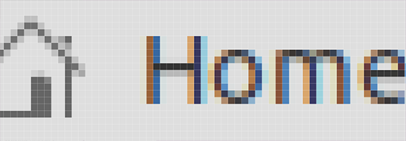
Settings is similar to Tweaks (same widget if I understood Carlo correctly)
How does gnome settings look?
for comparison here is nautilus followed by gnome-control-center in backdrop
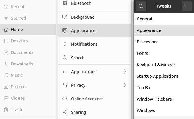
yes the text is def. too dark in the backdrop in nautilus
I'll play around with it later and share some pictures if no one else is faster =)
Adapted all to nautilus:

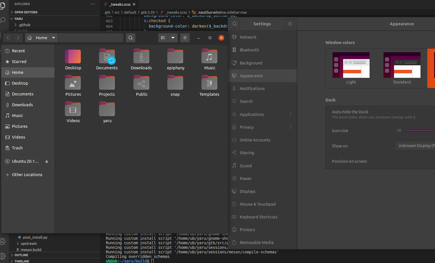
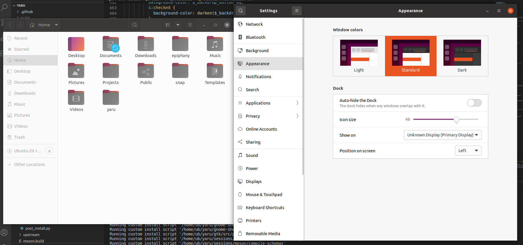
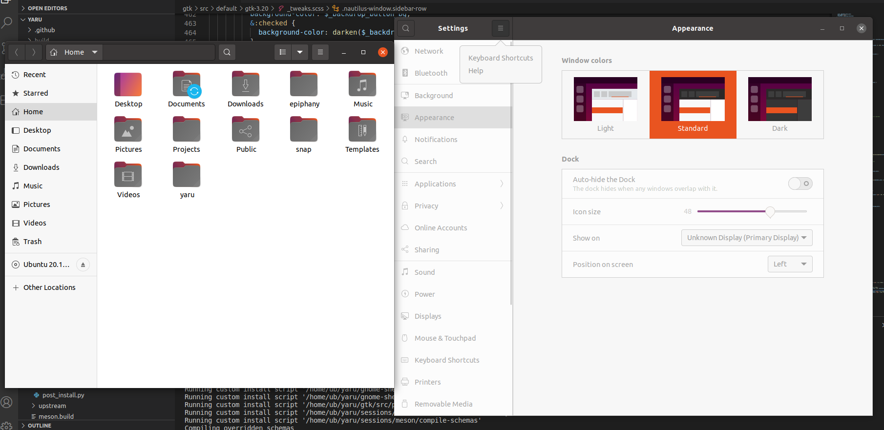
Like this @madsrh @Muqtxdir ?
What do you think about giving the non-selected labels a bit more color?
Looking at the pictures, actually now that you've put the attention to this... this is the first time the sidebar text has the same color in backdrop as the rest xD Why didn't we think of this before?
If we change the text to be less "disabled" we should then do it for the whole window, or?
aaand the default theme headerbar backdrop label color is too bright ^^
If we change the text to be less "disabled" we should then do it for the whole window, or?
Then we probably shouldn't 😀
I can try :shrug: let me see
Okay I didn't manage : | Is indeed to complicated and the risk to ruin some other place is high.
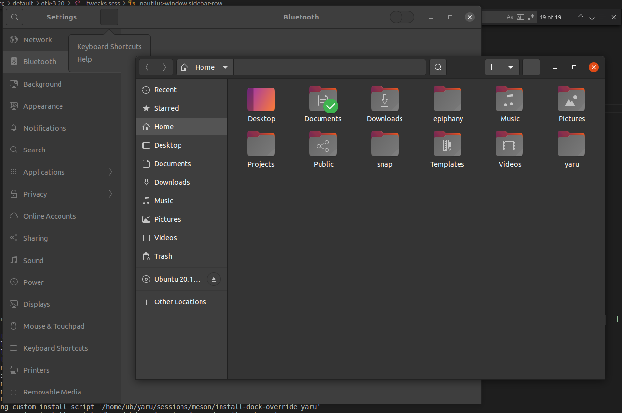
But I've found that we always missed to color the headerbar label correctly in the backdrop for the default theme.
Dark theme:
Default theme:
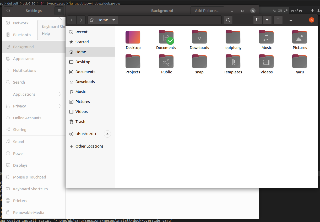
Light theme:
Most helpful comment
Adapted all to nautilus:
Like this @madsrh @Muqtxdir ?