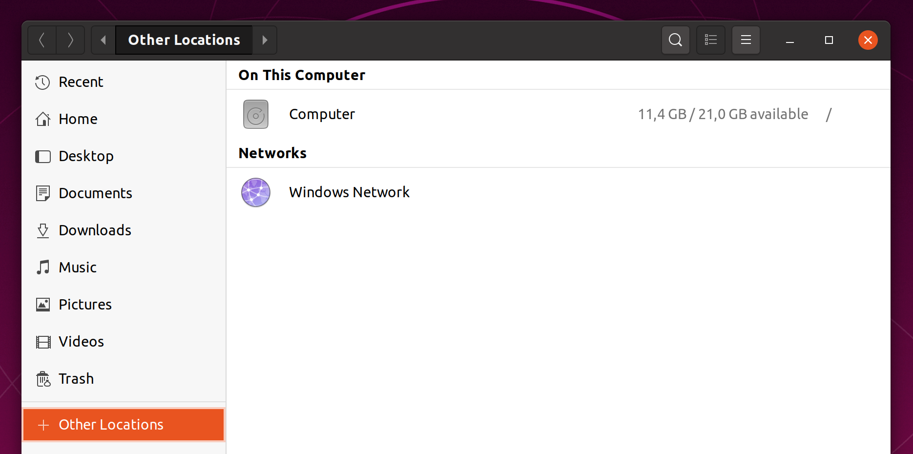
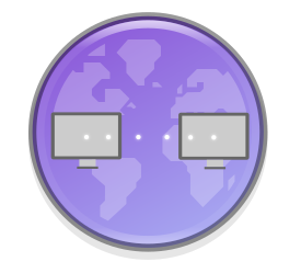
The network-group icon is ambiguously a globe with connecting lines.
Yaru
network-group

Adwaita
network-group

 Amr-Ibra
All 28 comments
In my opinion the globe is not more ambiguous than the two computers are.
 Feichtmeier
on 23 Feb 2020
Feichtmeier
on 23 Feb 2020
Yes, however, network-group is a local network between local computers, and a globe does not really reflect that.
Amr-Ibra
on 23 Feb 2020
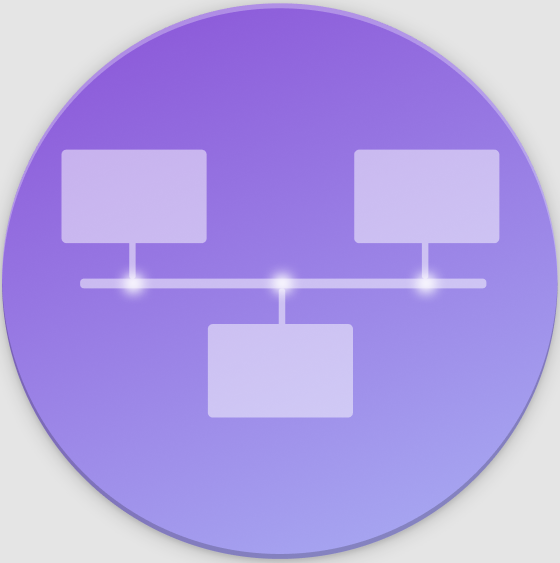
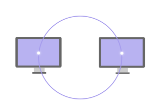
This was a quick mockup, but maybe something like this?

 rvz420
on 23 Feb 2020
rvz420
on 23 Feb 2020
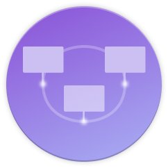
Looks nice apart from the upside down monitor.
 meetdilip
on 24 Feb 2020
meetdilip
on 24 Feb 2020
@Amr-Ibra I don't find that the icon is ambiguous. On the contrary, when we want to discover the computers on the network, we quickly know where to look.
 ghost
on 24 Feb 2020
ghost
on 24 Feb 2020
Windows Network is a local network between local computers connected to the same router. The reason why we know where to look is because of the name and because we got used to it, not because of the icon, as it doesn't really represent a local network.
Amr-Ibra
on 24 Feb 2020
Yeah you are right.
It' just that I don't like the upstream icon here and the circle looks so damn good and so damn suru styled. Maybe - if we have time - we find a solution that looks like suru and still fits the exact meaning of the icon.
Nice idea @rvz420 !
What I like about the globe is that the connection is made by a bright thin grid with dots at the knots and the baseplate shows the continents in such a sexy and subtle way.
Maybe if you could somehow achieve this with your design idea we could get it in
Feichtmeier
on 24 Feb 2020
Yeah you are right.
It' just that I don't like the upstream icon here and the circle looks so damn good and so damn suru styled. Maybe - if we have time - we find a solution that looks like suru and still fits the exact meaning of the icon.
Nice idea @rvz420 !
What I like about the globe is that the connection is made by a bright thin grid with dots at the knots and the baseplate shows the continents in such a sexy and subtle way.
Maybe if you could somehow achieve this with your design idea we could get it in
Yeah I love the globe design also...is so sexy
I don't think that thecircle shape is right in here
rvz420
on 24 Feb 2020

rvz420
on 24 Feb 2020
Maybe you could arrange the computers in a circle"bus" rather than on that horizontal "bus"? And the big image with the highlighted knots looks nice imo
Feichtmeier
on 24 Feb 2020
Maybe you could arrange the computers in a circle"bus" rather than on that horizontal "bus"? And the big image with the highlighted knots looks nice imo
rvz420
on 27 Feb 2020
Will look something like this


rvz420
on 28 Feb 2020
I actually prefer the one with the horizontal line.
Amr-Ibra
on 28 Feb 2020
Thanks @rvz420 for the nice ideas :+1:
Personally I would not exchange the current one with the ones that you've shown. Maybe @ubuntujaggers or @madsrh have any idea on how to evolve your icon
Feichtmeier
on 1 Mar 2020
I tried to put a monitor behind the globe. It looked good in bigger sizes, but I think not well enough with smaller sizes. So I tried a cluster. We can connect the globes if required but as is will be fine in my opinion

meetdilip
on 2 Mar 2020
Added connections between the cluster elements

Monitors look fine too
meetdilip
on 2 Mar 2020
But I thought that the point for a new icon was that the globe was misleading in a certain way because people would make an internet connotation. The latest proposals seem to try to reintroduce the globe which doesn't fix the original problem.
Can somebody show off a circle with just two monitors included? Without a turnt over third one? That would be less cluttered and maybe more pleasing?
 real-amano
on 2 Mar 2020
real-amano
on 2 Mar 2020
If you see this post, it talks about keeping globe a part of the icon and then incorporate monitors in some way. Since it comes from a team member, it matters. That is why I tried those.
meetdilip
on 3 Mar 2020
I am not sure whether this is any better. But since you asked @real-amano
meetdilip
on 3 Mar 2020
One more attempt trying to keep the globe in picture
meetdilip
on 3 Mar 2020
Hmm. How does that look with the monitors being vertically placed. At least the upper one resembles a friendly Emoji Smiley with squared glasses for me, the latter one at least a bit
real-amano
on 3 Mar 2020
It is normally hard to avoid that. If you want to keep monitors and the globe together. Someone more skilled will come up with a better idea.
meetdilip
on 3 Mar 2020
How about skipping the Monitor = network participant metaphor and use people instead?

@ubuntujaggers @madsrh
Feichtmeier
on 3 Mar 2020
That's nice, but is the network-group only made of actual computers? I think it can connect also servers, if so, it's a bit misleading
 clobrano
on 3 Mar 2020
clobrano
on 3 Mar 2020
It shows up for that windows network in Nautilus.
Yeah, I mean as long as people understand that they can connect to things or people the icon is fine. But then the current icon would also be fine.
Feichtmeier
on 3 Mar 2020
If you see the popular options, they are very different from the globe
https://www.google.com/search?hs=5cp&channel=fs&sxsrf=ALeKk02FqZBggfftX_ByZj1zXHEU4HoIQQ:1583239714519&q=network+group+icon&tbm=isch&source=univ&client=ubuntu&sa=X&ved=2ahUKEwiEt5zGq_7nAhUoILcAHci2DYkQsAR6BAgLEAE&biw=1366&bih=662
meetdilip
on 3 Mar 2020
I am not sure whether this is any better. But since you asked @real-amano
lovely monitors ♥
maybe arrange them like the Adwaita network group icon?
rvz420
on 3 Mar 2020
I'd move the left monitor upwards a bit and the right one a bit towards the bottom. Thus we have some sort of diagonal. That should suffice to avoid the "Emoji face".
real-amano
on 3 Mar 2020
Related issues
 pojntfx
·
3Comments
pojntfx
·
3Comments
 madsrh
·
3Comments
Feichtmeier
·
3Comments
madsrh
·
3Comments
Feichtmeier
·
3Comments
 chrisjbillington
·
3Comments
chrisjbillington
·
3Comments
 8none1
·
3Comments
8none1
·
3Comments
Most helpful comment
Windows Network is a local network between local computers connected to the same router. The reason why we know where to look is because of the name and because we got used to it, not because of the icon, as it doesn't really represent a local network.