Actual Behavior
Steps to Reproduce the Problem
- Open Gnome-settings
- Go to bluetooth
- Connect a sound device
Tested on 19.10, I will test on master with my 20.04 VM.
 Jupiter007-43
All 31 comments
Same on master.
Jupiter007-43
on 19 Feb 2020
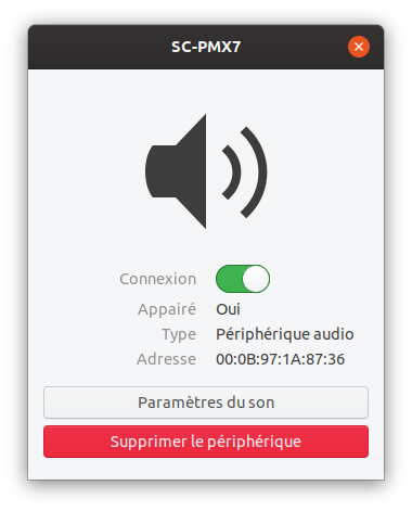
Hi @Jupiter007-43 Could you post a screenshot from Adwaita?
 madsrh
on 19 Feb 2020
madsrh
on 19 Feb 2020
Is this the intended behaviour ?
 meetdilip
on 20 Feb 2020
meetdilip
on 20 Feb 2020
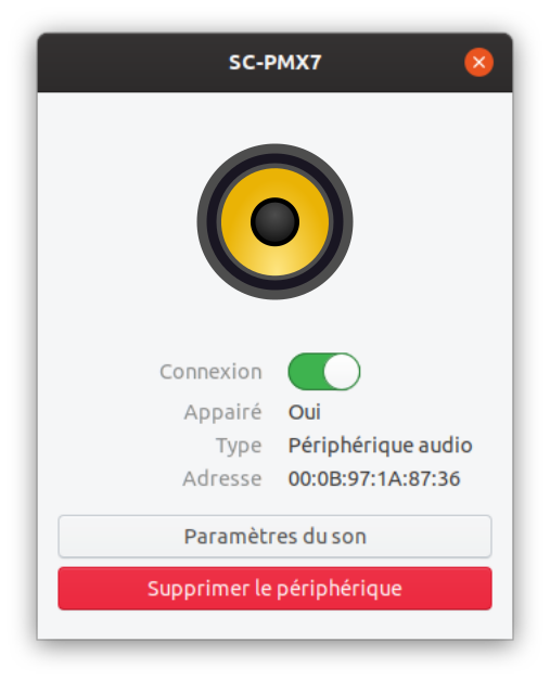
@madsrh here is :
@meetdilip No, just the full-color icon is missing and revert to symbolic 😉
Jupiter007-43
on 20 Feb 2020
Game controller icon is also missing #1951
Maybe look at the list of icon to see which are missing ?
Jupiter007-43
on 20 Feb 2020
https://github.com/ubuntu/yaru/blob/master/icons/Suru/48x48@2x/apps/rhythmbox.png
There is one for Rhythmbox which looks like the one in Adwaita.
meetdilip
on 20 Feb 2020
Jupiter007-43
on 20 Feb 2020
Too similar to Rhythmbox IMO
madsrh
on 20 Feb 2020
Yes indeed.
Jupiter007-43
on 20 Feb 2020
We could just use the speaker inside that icon? I mean, just emove the baseplate
 Feichtmeier
on 20 Feb 2020
Feichtmeier
on 20 Feb 2020
We could just use the speaker inside that icon? I mean, just emove the baseplate
The bracket / skrew holes from Adwaita are nice too. Perhaps we can borrow them too
madsrh
on 20 Feb 2020
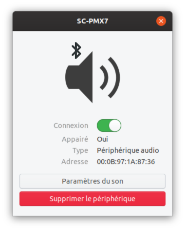
@Feichtmeier Here is
🤔 It's a good starting point, but there's something missing...
@madsrh Where is the repository for this Adwaita icon? I searched and didn't find it.
Jupiter007-43
on 20 Feb 2020
madsrh
on 20 Feb 2020
Maybe I've got a problem, but I can't find it... 😓
Jupiter007-43
on 20 Feb 2020
Maybe I've got a problem, but I can't find it... 😓
madsrh
on 21 Feb 2020
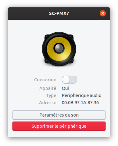
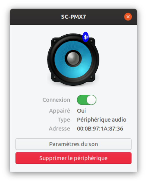
I got the icon to blue. But not sure where to put in the Bluetooth audio logo


meetdilip
on 21 Feb 2020
Mockup
meetdilip
on 21 Feb 2020
@madsrh Thanks very much! I must be really tired.
Jupiter007-43
on 21 Feb 2020
@meetdilip This icon is named audio-speakers and not audio-speakers-bluetooth so I don't think that a Bluetooth logo is needed.
Jupiter007-43
on 21 Feb 2020
@meetdilip This icon is named audio-speakers and not audio-speakers-bluetooth so I don't think that a Bluetooth logo is needed.
Sure. I was banking on the title. :)
meetdilip
on 21 Feb 2020
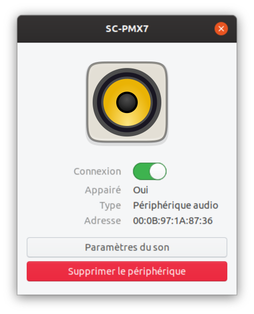
Reworked Adwaita icon

Jupiter007-43
on 21 Feb 2020
We might consider making the icon more monochrome, because I think of the yellow more as the Rhythmbox logo than a generic non-branded speaker 🤔
 ubuntujaggers
on 22 Feb 2020
ubuntujaggers
on 22 Feb 2020
Yeah, maybe that warmish gray #AEA79F
From here: https://design.ubuntu.com/brand/colour-palette/
Feichtmeier
on 22 Feb 2020
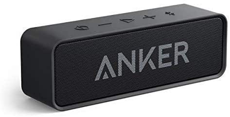
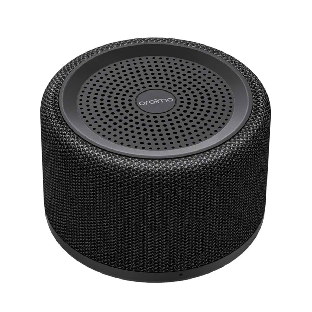
Speakers look a lot different these days
meetdilip
on 22 Feb 2020
Speakers look a lot different these days
That's only the speaker casing. That actual speaker unit looks just like that :smiley:
We might consider making the icon more monochrome, because I think of the yellow more as the Rhythmbox logo than a generic non-branded speaker thinking
Good thinking :+1:
madsrh
on 22 Feb 2020
That actual speaker unit looks just like that
That is true. But people mostly related sound device to mainly soundbar and Bluetooth speakers. I think those sell more. If we change it now, it will stay for another 5 years.
meetdilip
on 22 Feb 2020
That actual speaker unit looks just like that
That is true. But people mostly related sound device to mainly soundbar and Bluetooth speakers. I think those sell more. If we change it now, it will stay for another 5 years.
Na, I think putting a bluetooth glyph into the icon could be enough. That boxes you've posted are hard to draw in Yaru style.
I would go with this one https://github.com/ubuntu/yaru/issues/1948#issuecomment-589671132
Feichtmeier
on 22 Feb 2020
Monochrome version :

Jupiter007-43
on 22 Feb 2020
Hoping to do something different from Adwaita.

Monochrome

meetdilip
on 22 Feb 2020
Hoping to do something different from Adwaita.
That is really good @meetdilip :muscle:
I'm not sure that using a difference metaphor from Adwaita is an improvement. I prefer just creating a similar icon (similar to Adwaita) in the Yaru style like @Jupiter007-43 did here. (is there a PR incoming? :wink: )
It's just my opinion and nothing wrong with you drawing though :smiley:
madsrh
on 22 Feb 2020
It is simply a personal choice. I somehow relate pictures like this to a sound device. Haven't seen bare bone speakers much.
meetdilip
on 22 Feb 2020
Related issues
madsrh
·
3Comments
 YamiYukiSenpai
·
3Comments
YamiYukiSenpai
·
3Comments
 8none1
·
3Comments
8none1
·
3Comments
 eaglersdeveloper
·
3Comments
eaglersdeveloper
·
3Comments
 snydox
·
3Comments
snydox
·
3Comments
Most helpful comment
Monochrome version :