Yaru: Dark gray folders icons in version 29.179 (snap edge) and deb 20.04.1
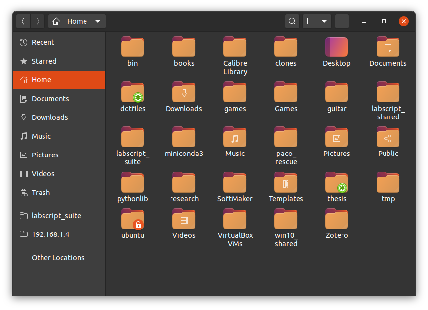
Hi, with the latest update I noticed that some icons changes drastically. In particular the folder icons are now in some shade of gray that I find very unpleasant.

Version:
snap-id:      Yd6CISPIf6tEf3ZEJ0cqSoEg9rG2VkRi
tracking:     edge
refresh-date: yesterday at 21:38 EET
channels:
  stable:    0.1    2019-03-13 (1768) 16MB -
  candidate: ↑
  beta:      ↑
  edge:      29.179 2020-01-16 (1949) 18MB -
installed:   29.179            (1949) 18MB
What did I expect?
Some mildly coloured folders icons, with a not strong colour and which is pleasant to the eyes.
What happened instead?
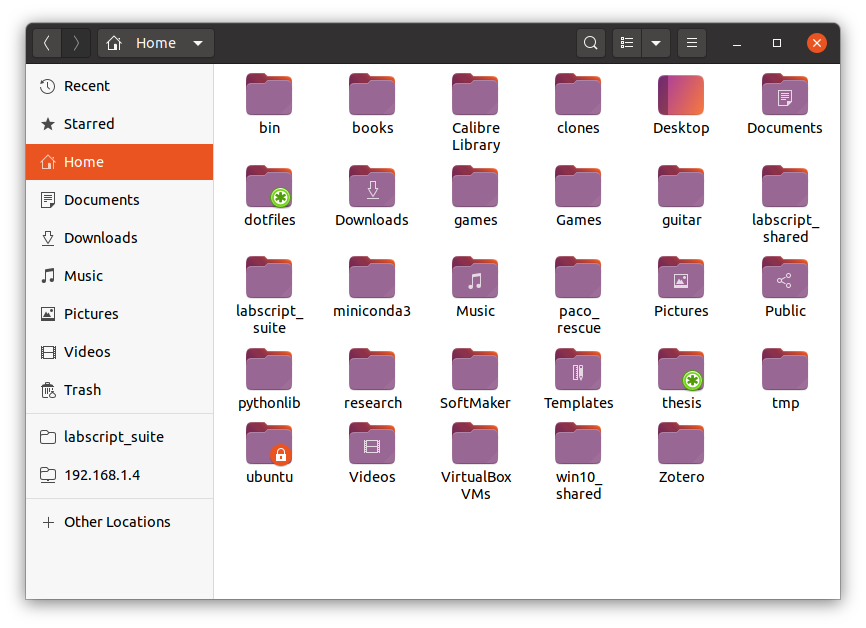
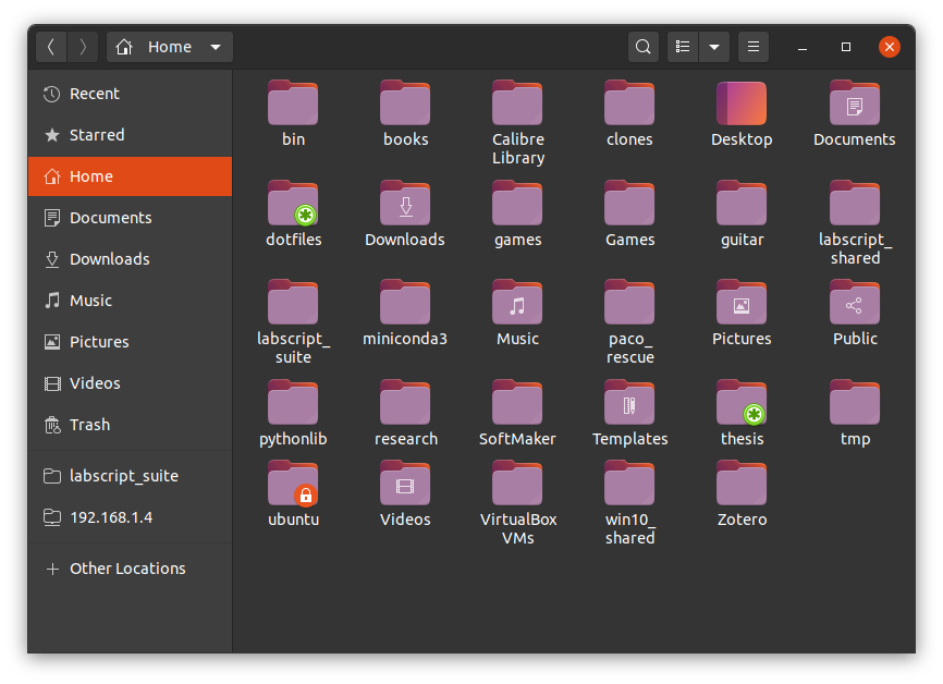
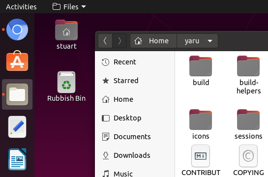
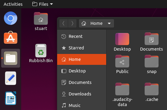
Icons have a somehow heavy gray colour, which I find very unpleasant.
Suggestion
I think that having something in a light shade of aubergine the same way we had the orange one, would look nicely and be in line with the current aubergine shift.
Addition:
Nevertheless, thank you in general for your great work :+1:
 fcole90
All 35 comments
Hi @fcole90,
thanks for the feedback. As stated here, the new folders are an experiment started during last Design Fest in London, which received already many appreciations, but I understand your concerns.
Nevertheless, thank you in general for your great work
I'm happy about this, so maybe could you edit the title and rephrase the "ugly" part? It is quite impolite :smile:
 clobrano
on 10 Feb 2020
clobrano
on 10 Feb 2020
Sorry, I didn't mean to be impolite :pray:
fcole90
on 10 Feb 2020
FWIW I too would prefer colours to shades of grey - they contrast better on the dark theme, and it's more obvious that they're content rather than chrome (everything that is chrome is some shade of grey from white to dark grey, it is nice for the folders to be different to this).
 chrisjbillington
on 10 Feb 2020
chrisjbillington
on 10 Feb 2020
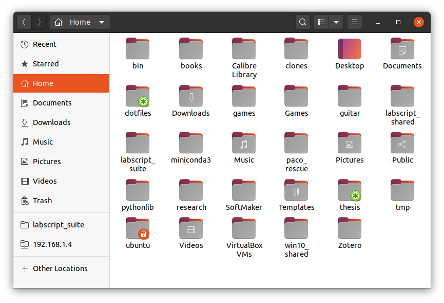
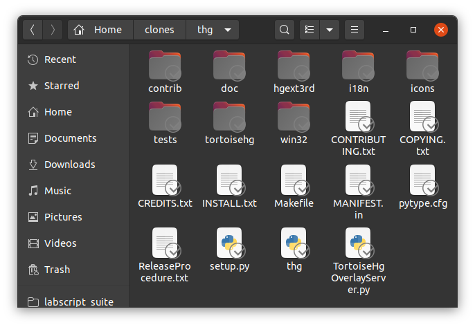
@fcole90 the bionic channel has the old gtk and shell theme but new icons. This is a bit bad because the colors and the whole palette do not match the folders. Try the current master or just try the daily 20.04 build
 Feichtmeier
on 10 Feb 2020
Feichtmeier
on 10 Feb 2020
@ubuntujaggers could you try a version with a slightly brighter gray? So the contrast on a white background is not that heavy?
Feichtmeier
on 10 Feb 2020
I love the Yaru theme, but the dark folders in 20.04.1 are not nearly as easy on the eyes as the previous 19.10 orange style. I'm not a graphics designer or color expert, but I don't think they appear to "fit in" when using nautilus to view a typical folder, with a white background and many mostly-white PDF previews and whatnot. Maybe they should only be for Yaru-dark.
Unrelated, I like that the Ubuntu purple has replaced blue in settings' sliders, even down to the audio waves on the sound test. Looks great and feels very Ubuntu. Thank you guys for your excellent work on Yaru.
 Waddlen
on 10 Feb 2020
Waddlen
on 10 Feb 2020
While I am not sure if the new folders are already perfect, I like them much more than the old ones. The overabundance of orange was overwhelming in Nautilus. Bob, the big orange blob to the left in the sidebar, the intense orange folders (and there are places in the filesystem where the whole screen is filled with folders) and in addition maybe selected folders which feature orange highlight names as well. Too much if you don't stick to displaying your $HOME.
 real-amano
on 11 Feb 2020
real-amano
on 11 Feb 2020
Bob, the big orange blob to the left
xD <3
I'm with you, but we're alone.
Anyways, yes theming is an emotional topic. The best is to stick to concepts, design ideas and guidelines instead of theming on demand. This doesn't work and will leave a Frankenstein theme.
The dark gray folders need the gtk and shell themes to fit. So we're sorry to have something inconsistent in the Bionic branch but Carlo is already on it. So, can we close this @clobrano @madsrh @ubuntujaggers ?
Any improvements can be addressed in more concrete issues. Like "contrast is too high" or sth
Feichtmeier
on 11 Feb 2020
Hi, I opened this issue to discuss the folder colour direction, not only because they don't fit with the bionic GTK theme (I'm using 20.04 daily so I don't even know how do they look in bionic).
@Feichtmeier , @real-amano I agree with you that the previous orange was too much, but I think that this is a step behind rather than forward. IMO the problem stands in the fact that whatever the colour, there are going to be a lot of square-like elements together of such colour.
That is the reason I think both orange and dark gray are not appropriate, because the first make the screen to look like flames, while the second is heavy as concrete.
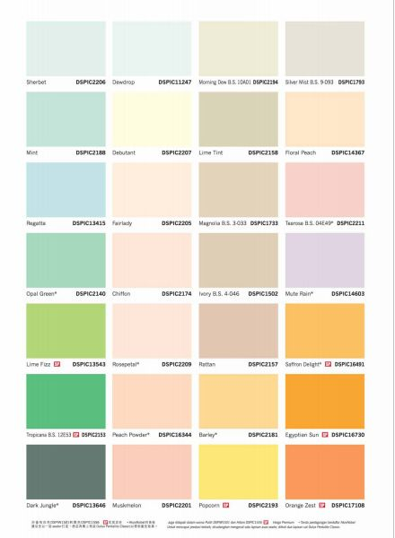
I'd suggest something like pastel colours, which are instead very gentle on the eyes :relaxed:
Some examples on how these are relaxing for the eyes. I think that what in the image is called _Mute Rain_ could perhaps be a nice pastel colour in the current shift towards aubergine, but being gentle on the eyes.
fcole90
on 12 Feb 2020
I agree that especially the folders colour is an emotional topic. So I'd suggest it gets broader discussion with the community. And if doing a selection, be picked not the most favourite, but the least hated, so to have a colour that may not be the best for anybody, but is unlikely to create very strong emotion against :blush:
fcole90
on 12 Feb 2020
Let's extend the discussion to the Design Team
cc/ @matthewpaulthomas, possibly also to Wayne, just to have a look
clobrano
on 12 Feb 2020
Just playing with changing the colour of the outside of the folder icons:
Previous light orange (gradient from #f3a054 to #d49556):
Aubergine, but a bit lighter (lightened to L=50%, #996794):
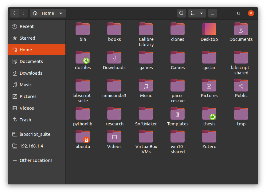
Aubergine, but even lighter (lightened to L=58%, #a97ea4):
chrisjbillington
on 12 Feb 2020
Let's extend the discussion to the Design Team
cc/ matthewpaulthomas, possibly also to Wayne, just to have a look
@waynecrosby
 madsrh
on 12 Feb 2020
madsrh
on 12 Feb 2020
As for changing contrast (more contrast on dark theme, less on light theme) whilst keeping it grey, here is 60% grey to 68 % grey (previously 40% to 48% grey):
chrisjbillington
on 12 Feb 2020
@chrisjbillington thanks for the mockups
I think something in between the current master gray and the one you've just posted could fit
Feichtmeier
on 12 Feb 2020
Sorry to be spamming so much!
FWIW the grey icons (lightened or not) also have poor contrast with grey emblems:
Coloured emblems are much more visible (this is from a project of mine that provides its own emblems):
If the icons are going to stay grey, the emblems should gain some colour, or an outline. I would prefer both - I think colour makes things more distinguishable generally.
chrisjbillington
on 12 Feb 2020
We have a full set of full colours emblems. Not sure what you mean.
Feichtmeier
on 12 Feb 2020
I think something's gone a bit wrong with your build there, it's using the symbol emblems... current Master looks like this:
The background for the symlink emblem used to be grey but it was changed to aubergine when the folders became grey :+1:
 ubuntujaggers
on 12 Feb 2020
ubuntujaggers
on 12 Feb 2020
Oh, interesting. That's great, love the colour emblems, and I see them in my build. Screenshot is from the tortoisehg nautilus extension, not sure why it is not using those emblems - maybe because they have "dropbox" in the name? I'll investigate. Is a separate issue in any case.
chrisjbillington
on 12 Feb 2020
We can symlink to new emblem names.
Yes please open an issue :+1:
Feichtmeier
on 12 Feb 2020
@chrisjbillington thanks for the mockups
I think something in between the current master gray and the one you've just posted could fit
That looks like this:
Got a local branch I can push if you like it, @Feichtmeier @clobrano @chrisjbillington @madsrh
EDIT: And on dark theme.
ubuntujaggers
on 12 Feb 2020
I think this is an improvement. Let's see what the others say :)
Could you attach more screenshots where we can see how they look on both light and dark windows?
Feichtmeier
on 12 Feb 2020
@ubuntujaggers if you have a PR let's give it a try 👍
madsrh
on 13 Feb 2020
Aubergine, but even lighter (lightened to L=58%, #a97ea4):
I have owned a real manila folder that was that colour, inside and out. I can’t say that for any of the other options! (But then I’ve never seen a folder, in any colour, that has a gradient on the inside.)
The background for the symlink emblem used to be grey but it was changed to aubergine when the folders became grey
Emblems need to be highly visible against icons they have no control over. And that’s more of a challenge if they’re not extending outside the icon’s own space (like iOS and macOS badges do, for example). I think it would be hard to achieve that with any shade of aubergine.
 matthewpaulthomas
on 13 Feb 2020
matthewpaulthomas
on 13 Feb 2020
Hi, thanks @chrisjbillington ! 😃 While I personally like more the light aubergine version, I think that the light gray version can be more broadly appreciated and perhaps folders in that colour even look more professional 😎 💼
Can you show us how it would look like with a very very light gray (almost white)? :blush:
fcole90
on 13 Feb 2020
I personally think that a shade of grey (or gradient) will be easier going
forward especially when paired with emblems. It's a matter of testing with
emblems to get the shade required for legibility.
On Thu, Feb 13, 2020 at 4:53 PM Fabio Colella notifications@github.com
wrote:
Hi, thanks @chrisjbillington https://github.com/chrisjbillington ! 😃
While I personally like more the light aubergine version, I think that the
light gray version can be more broadly appreciated and perhaps folders in
that colour even look more professional 😎 💼—
You are receiving this because you were mentioned.
Reply to this email directly, view it on GitHub
https://github.com/ubuntu/yaru/issues/1890?email_source=notifications&email_token=AKCIGARHARSXQT6BXASNBHLRCV3GXA5CNFSM4KSJAEW2YY3PNVWWK3TUL52HS4DFVREXG43VMVBW63LNMVXHJKTDN5WW2ZLOORPWSZGOELVXVSQ#issuecomment-585857738,
or unsubscribe
https://github.com/notifications/unsubscribe-auth/AKCIGATNFYU3BKQADDUKJ4TRCV3GXANCNFSM4KSJAEWQ
.
 waynecrosby
on 14 Feb 2020
waynecrosby
on 14 Feb 2020
...Emblems need to be highly visible against icons they have no control over...
...It's a matter of testing with emblems to get the shade required for legibility.
As you can see here, all of our emblems have a solid background so this really isn't the issue here. This issue here is about the color of the folders. There's a testing PR by @ubuntujaggers here if @chrisjbillington and @fcole90 want's to give it a whirl 😉
madsrh
on 14 Feb 2020
Alright, after closing the test pr from stuart.
1) Do we agree with @fcole90 that we have a contrast problem? @ubuntujaggers @clobrano @madsrh
2) If yes, how do we want to fix it?
If we don't agree - let's close it.
Feichtmeier
on 18 Feb 2020
TBH I don't have a problem here. I'm liking the folders more each day
madsrh
on 18 Feb 2020
I think the contrast is fine
clobrano
on 18 Feb 2020
I don't think so. The new folder icon in grayscale and the primary purple color (not uniform across the user interface, there is still some primary orange) don't have enough contrast in the dark mode. The Yaru theme is amazing and I think the new changes were made to be more cohesive with Ubuntu, but they aren't. Those are certainly a setback for color harmony. Experimental things should not be added as default to the end user experience. Anyway, the project is open source and it is impossible to please everyone. At anytime we can modify it for personal use or rely on derivative projects like Yaru Colors.
 danilopeixoto
on 18 Mar 2020
danilopeixoto
on 18 Mar 2020
I understand you are not happy with the decision, but we received positive feedback on this new folders. Also, purple is not the primary color, orange is, that's why it is still present.
clobrano
on 18 Mar 2020
Well, it's hard to say looking at the image below which is the primary color.
danilopeixoto
on 19 Mar 2020
The one used for selection :)
clobrano
on 19 Mar 2020
Okay, we've been in this discussion several times and don't get me wrong, this theme won't be much without community feedback and bug hunting, but we'll go with these folders for 20.04 and it's really not needed to roll up this discussion over and over. Keep in mind that we are volunteers who do this design project and theme suite in our free time. 👍
Feichtmeier
on 19 Mar 2020
Related issues
 8none1
·
3Comments
matthewpaulthomas
·
3Comments
chrisjbillington
·
3Comments
8none1
·
3Comments
matthewpaulthomas
·
3Comments
chrisjbillington
·
3Comments
 CDrummond
·
3Comments
CDrummond
·
3Comments
 sicklylife-jp
·
3Comments
sicklylife-jp
·
3Comments
Most helpful comment
I love the Yaru theme, but the dark folders in 20.04.1 are not nearly as easy on the eyes as the previous 19.10 orange style. I'm not a graphics designer or color expert, but I don't think they appear to "fit in" when using nautilus to view a typical folder, with a white background and many mostly-white PDF previews and whatnot. Maybe they should only be for Yaru-dark.
Unrelated, I like that the Ubuntu purple has replaced blue in settings' sliders, even down to the audio waves on the sound test. Looks great and feels very Ubuntu. Thank you guys for your excellent work on Yaru.