------ ISSUE TEMPLATE starts HERE ------
Expected Behavior
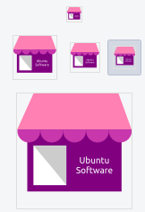
The icon for Ubuntu software should suggest that you are going to get something new there. When we see a briefcase, will people think of new goodies ?
(What you were trying to do)
Actual Behavior
Somehow the briefcase ( carry bag ? ) icon we have now evolved from some older day icon. When I see it, how am I supposed to know that it is a place we can get new stuff ? I think something like a cart or even better a shop icon with some implication about free or paid software will be more suitable.
(What happened instead)
Steps to Reproduce the Problem
1.
1.
1.
Software that presents the issue
- Name: Ubuntu
- Version: 18.04 ( I think it is the same for 20.04 when it comes out )
 meetdilip
All 7 comments
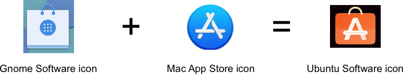
It is indeed a shopping bag :D, but I can understand that the abstraction for a thing that is already an abstraction (an application that is an abstraction to a real shop) might be hard to design.
I am biased here, since I already know what's the meaning of the icon and I can relate to it pretty easily (also it's similar to other application stores icons). What do you think @ubuntujaggers, @madsrh?
 clobrano
on 6 Jan 2020
clobrano
on 6 Jan 2020
I am just trying to have a second look on that icon. As @clobrano mentioned we are happy with it because we know what it is. Just like the floppy icon for save. I don't know those who were born in early 2000 would relate it to save.
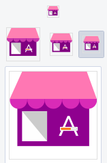
A shop at my place looks much different from this. But I tried to go with the common shop icon with this sample

meetdilip
on 6 Jan 2020
Do we call software for Ubuntu an app ? Perhaps not. But better than text which is not legible when used in small sizes.
meetdilip
on 6 Jan 2020
I find that the current icon is more understandable and better suited to software distribution. In addition, we are used to seeing this kind of icon on other popular stores.
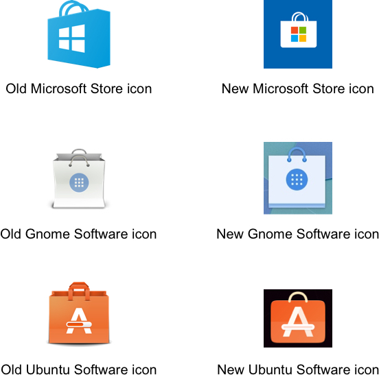
The Ubuntu icon also has the letter A affixed to it which adds another indication.
 ghost
on 11 Jan 2020
ghost
on 11 Jan 2020
Bag = shop = install / get new software ?
I don't see how. I would revert back to floppy example.
meetdilip
on 12 Jan 2020
It's not my favourite icon :\ but the current one is the "least bad option" we've found so far.
There are other visual metaphors that might be more intuitive... e.g., the magic box was a nice idea. The problem is, I find it difficult to draw many objects in a way that's recognisable, when I honour the requirement of having round corners (the fact that the bag looks like a brief case illustrates the point!).
Maybe we could have a casserole dish of new apps :thinking:
 ubuntujaggers
on 16 Jan 2020
ubuntujaggers
on 16 Jan 2020
I think it's currently a very good icon - it covers orange (branding), it's very professionally executed and pretty clear what it means. Even my father (72 years old) immediately installed some crappy google drive app because he didnt find "google drive" on his desktop at first :laughing:
As I said on the file manager issue: icons should be abstractions covering symbols. :man_shrugging:
Also:
I find it difficult to draw many objects in a way that's recognisable
I think we should really avoid this all together. Let's keep it simple
 Feichtmeier
on 16 Jan 2020
Feichtmeier
on 16 Jan 2020
Related issues
 chrisjbillington
·
3Comments
chrisjbillington
·
3Comments
 matthewpaulthomas
·
3Comments
matthewpaulthomas
·
3Comments
 sicklylife-jp
·
3Comments
sicklylife-jp
·
3Comments
 pojntfx
·
3Comments
pojntfx
·
3Comments
 mivoligo
·
3Comments
mivoligo
·
3Comments
Most helpful comment
I find that the current icon is more understandable and better suited to software distribution. In addition, we are used to seeing this kind of icon on other popular stores.
The Ubuntu icon also has the letter A affixed to it which adds another indication.