Yaru: Toggled item in header bar not clearly visible
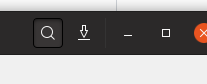
The currently toggled item in a GtkHeader bar is not clearly visible/highlighted.
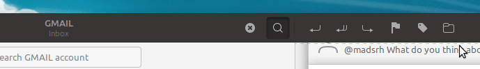
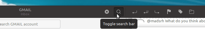
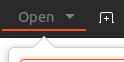
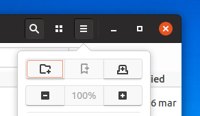
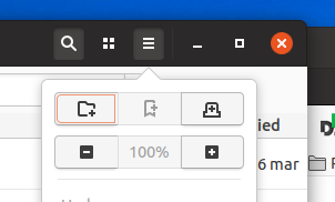
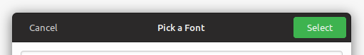
e.g. in this screenshot the magnifying glass icon has been pressed to produce the search field. However, its state is not indicated very clearly - dark on dark is not the best indicator. Perhaps it should have a lighter background?
 CDrummond
All 67 comments
This issue was originally raised by Kvantum's author. He's currently working on a matching Qt style. To mimic headerbars he's suggesting that the main toolbar in a Qt's app have a dark background. Hence the issue with toggled items not being clear. Currently he's implemented the following solution:
where the toggled items have the orange underline. Not sure if this matches up with what Communitheme is aiming for?
CDrummond
on 1 Apr 2018
I completely agree with @CDrummond; Ambiance had a similar problem. The header-bar is elegant. The hover color of buttons is OK too. But the pressed state can't be seen clearly. I don't know whether that could cause a problem in GTK3 apps (can their header-bar buttons have a toggled state?) but a matching Kvantum/Qt theme with that toggled state would be a disaster ;)
 tsujan
on 1 Apr 2018
tsujan
on 1 Apr 2018
I don't know if you followed this discussion earlier, but yes I agree that current header-bar buttons still isn't very easy to spot when pressed.
I suggested a orange line back in november.
Another option would be to keep the gray hover color and simple add the inner shadow / 3D look (like toggle buttons, not like below) when pressed. I'm sorry for this very rude mockup, but hopefully you get my point:
 madsrh
on 2 Apr 2018
madsrh
on 2 Apr 2018
I suggested a orange line back in november.
That's very nice.
Another option would be to keep the gray hover color and simple add the inner shadow / 3D look
IMHO, this isn't elegant but tastes differ.
tsujan
on 2 Apr 2018
@CDrummond Isn't this the exact thing you wanted in https://github.com/ubuntu/gtk-communitheme/issues/260 ? Atleast this is the result of the implementation.
I am confused :D
Anyways, I think the orange underline is a nice idea, maybe with a simple dark grey background without a gradient or shadow?
 Feichtmeier
on 2 Apr 2018
Feichtmeier
on 2 Apr 2018
@Feichtmeier Not sure how this related to #260 - this was with buttons that had no border, hence looked a little blurry, due to shadow. That was with buttons on a light background.
This issue here is stating that when a button is toggled, its not very visible. How does this relate to having/not having a border? Currently there is a dark border against a dark background - not exactly very clear.
CDrummond
on 2 Apr 2018
Currently there is a dark border against a dark background
And light border against a dark bg would be ugly, although visible. With this semi-flat theme, the best solution would be an orange underline, IMHO.
tsujan
on 2 Apr 2018
BTW, and not related to this: I'm curious why menus are light? Wouldn't a dark menu -- like that of Ambiance -- be more elegant? Sorry if that's already discussed and decided.
tsujan
on 2 Apr 2018
Menus are currently dark - but there is a discussion/issue about changing to white. To stop a 'wall of black' at the top of the screen.
One plus point for the underline, is that it is consistent with the chosen path bar item and menubar item.
CDrummond
on 2 Apr 2018
@CDrummond after the addition of the 1px black border on toggled/pressed/selected buttons in the header bar 1px of was "stolen" from the shadow :dancing_women:
Anyways we all agree that the current implementation needs work :)
I'll try to implement @madsrh orange line and post some screenshots
Feichtmeier
on 2 Apr 2018
@Feichtmeier but just having the shadow was not very clear! A more definitive toggled state is required (IMVHO)
CDrummond
on 2 Apr 2018
Menus are currently dark
I updated it yesterday:
You meant menubar, not menu? If the gnome-shell theme has dark menus, it's better for this theme to have them too (sorry, I don't have gnome-shell to check that). Anyhow, menus may need opening another issue.
And I see all of us agree with an underline.
tsujan
on 2 Apr 2018
@CDrummond Yes I agree :)
Just looked into it... and my css skills end right here :D @clobrano you are needed here
@CDrummond @madsrh
So in the headerbar we would have:
- unpressed and not toggled buttons
- pressed buttons
- toggled buttons
Should pressed normal buttons and toggled buttons both have the orange line?
The orange line is also present in the GtkStackSwitcher so they would fit quiet good to the togglbuttons.
Feichtmeier
on 2 Apr 2018
Should pressed normal buttons and toggled buttons both have the orange line?
IMO, that would be better.
tsujan
on 2 Apr 2018
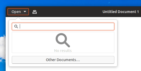
Only to be sure that we are talking about the same thing this are pressed buttons in the header bar:
This are toggled GtkToggleButtons in the header bar:
Feichtmeier
on 2 Apr 2018
@tsujan GNOME shell uses dark dialogs, etc, the Gtk theme does not. The shell, and its dialogs, should (and do) look different to apps - as it is different. Its dialogs deliberately look different so that you know you are interacting with it, and not an app.
Menus have always been white with this theme. I thought you mean menubar (my mistake), and there is an issue to make this also white-ish.
CDrummond
on 2 Apr 2018
Only to be sure that we are talking about the same thing
@Feichtmeier I think we're talking about the same thing. This screenshot shows a selected pathbar item and a pressed button -- the former is excellent while the latter lacks visibility -- and it's better to make buttons look like pathbar items when toggled by adding an orange underline to them (the presed state could be made like the toggled state too if you agree):
tsujan
on 2 Apr 2018
@tsujan I wish we could just add an orange underline, it's the first solution that comes to mind for me, but the border-radius will lead to the orange underline being curved as well. The stackswitcher uses a hack that I don't think would be possible to replicate for regular buttons.

 godlyranchdressing
on 4 Apr 2018
godlyranchdressing
on 4 Apr 2018
@godlyranchdressing wouldnt this one work?
background-color: none;
color:white;
border-left: none;
border-top: none;
border-right: none;
border-radius: 0px 0px 0px 0px;
border-color: $selected_bg_color;
border-bottom: 2px solid $selected_bg_color;
Works in the shell's calendar atleast :)
https://user-images.githubusercontent.com/15329494/38275165-45e1b08e-3791-11e8-8908-2a7628ab1cec.png
But buttons are different I guess, total button noob here
Feichtmeier
on 4 Apr 2018
Does it need to have a dark (pressed) background too or is the line sufficient?
Like @Feichtmeier is suggesting, losing the squircel background and border and only having the orange line underneath like the old mockup .
madsrh
on 4 Apr 2018
Does it need to have a dark (pressed) background too or is the line sufficient?
The line is a practical must, IMHO, but only the designers of Communitheme (developers and contributors) could decide about a background :)
tsujan
on 4 Apr 2018
@tsujan We will let @godlyranchdressing decide then :wink:
madsrh
on 4 Apr 2018
@Feichtmeier that would work, but we'll also need to have border-bottom-width: 2px for unchecked buttons and that'll lead to what might be too many allowances (to me) and possible complication.
Trying @madsrh's suggestion, but with the text color being transparentized (like it is with some Shell elements) when the button is active/checked.
Unfortunately, I don't think it looks as elegant when it comes to text buttons.
godlyranchdressing
on 4 Apr 2018
.... but with the text color being transparentized
Adding an underline shouldn't affect the text. I think Adapta has it, plus nice animations....
tsujan
on 4 Apr 2018
I tried Adapta and a few other theme that uses the colored line underneath and IMO this is a half baked solution. I still prefer the solution I suggested earlier. This is what it would look like (some tweaking is required of course)
.popup:checked { background: #5d5d5d; }
madsrh
on 4 Apr 2018
@madsrh That looks good too -- if it has no side effect -- but, frankly, an orange underline will be much better, especially because it's also used in selected header-bar items.
IMO this is a half baked
Why? There should be a safe way of adding an underline there. Doesn't gtk3 allow that?
Sorry that I can't be of any help -- I stopped making gtk3 themes since gnome-3.4 and just maintain one theme.
tsujan
on 4 Apr 2018
@tsujan I can't imagine there would be any sideeffects since this is just a color swap.
Half baked might have been a little strong worded, but what I mean was that it doesn't look as good - especially the text buttons as @godlyranchdressing pointed out. IMO it also makes more sense that the icon (_or in this case the background_) changes, rather than adding a line underneath.
I'll sleep just fine no matter which idea we go with, but the line looks less clean to me.
madsrh
on 4 Apr 2018
@madsrh mockup is similar to what we had. Somehow it got lost with latest changes.
This might bring some complaints :smile: but I propose it as well
otherwise, but it might be too subtle anyway
 clobrano
on 4 Apr 2018
clobrano
on 4 Apr 2018
especially the text buttons as @godlyranchdressing pointed out.
@madsrh That was caused by text translucency; wasn't it? An underline shouldn't affect the text if it's drawn correctly -- or gtk has an issue?
but the line looks less clean to me.
When it comes to a graphic design, we should accept the fact that tastes might differ surprisingly ;) So, we could only rely on votes, IMHO. To me, it's very clean.
@clobrano
Again, different tastes. To me, that border is an overkill.
otherwise, but it might be too subtle anyway
Not clearly visible again.
tsujan
on 4 Apr 2018
That's why I asked about the difference between toggle buttons and pressed normal buttons. With the current idea, no matter in which version, all buttons are somehow similar. And I think this is good. With the underline they stop being regular buttons to me. I don't know if anyone else feels this way?
When I look at the orange underline without this context it looks really great and ... elegant ... But in the context it hardly makes sense to me now
Feichtmeier
on 4 Apr 2018
@clobrano I agree with @tsujan that it's too much and too little.
Slightly related, what happened to this (background for buttons in headerbar)
How about something like this:
.popup, .image-button, .text-button { background: #393737; }
.popup:hover, .image-button:hover, .text-button:hover { background: #5d5d5d; border: #3d3d3d; }
.popup:checked { background: #5d5d5d; border: #222; }
I don't know why the inner shadow is so slow
madsrh
on 4 Apr 2018
Sorry for the stupid question, but was the current headerbar button style changed _intentionally_? I thought it was changed _accidentally_.
In any case, I personally like the previous headerbar button style (without a border) the most so far.
 nana-4
on 4 Apr 2018
nana-4
on 4 Apr 2018
Slightly related, what happened to this (background for buttons in headerbar)
Sorry, in backlog as well :disappointed:
Sorry for the stupid question, but was the current headerbar button style changed intentionally? I thought it was changed accidentally.
In any case, I personally like the previous headerbar button style (without a border) the most so far.
Confirm the accidentally, it was very similar to last @madsrh mockup
clobrano
on 4 Apr 2018
Confirm the accidentally, it was very similar to last @madsrh mockup
Yeah, except for the background of normal status ;)
nana-4
on 4 Apr 2018
In fact, in my branch with the attempt to revert last button change, this is the effect
clobrano
on 4 Apr 2018
In fact, in my branch with the attempt to revert last button change, this is the effect
The user still couldn't discern these toggled buttons easily.
tsujan
on 4 Apr 2018
@clobrano this looks very good. I am little bit confused though, are you and @nana-4 working on the same issue? :dancing_men:
I would be totally for removing the black border again.
This looks really strange and out of design. Especially since the removal of the red circle.
Now when you press a button suddenly there comes
A red circle
A grey squircle background
- The black border
I feel that this black border is really too much. Was never a fan of it tbh =)
Feichtmeier
on 12 Apr 2018
@Feichtmeier Not yet, sorry. I tried to remove the black border with #331, but the current button styling is more complicated than I expected, so I decided to postpone it for now. I agree with you, though. :)
nana-4
on 12 Apr 2018
Yeah, except for the background of normal status ;)
@nana-4 I was trying out background for normal status for issue 152. If you ignore that normal background, what do you think about it? Keeping the gray for pressed state and just adding the box-shadow.
madsrh
on 12 Apr 2018
@madsrh IMHO, the slightly light buttons (for normal state) don't look clean. I also imagine that users may misunderstand it is a bug. (Although I personally feel #152 is a quite minor issue,) I'd prefer to make the text/icon color of normal buttons slightly dim like this:
nana-4
on 13 Apr 2018
@nana-4 You might have a point, but you avoided the question 😆
If you ignore that normal background, what do you think about it? Keeping the gray for pressed state and just adding the box-shadow.

😄
madsrh
on 13 Apr 2018
@madsrh Sorry, I didn't understand the meaning of the question well.
I'm not against the pressed button style. It looks very good to me. I just thought the _normal_ (slightly light) background doesn't look very good to me. :sweat_smile:
nana-4
on 13 Apr 2018
I cannot describe how frustrating it is not to be able to push a PR for something as simple as a background change 😫 Anyway, @nana-4 could we try this "keeping the hover gray and adding box-shadow when checked"?
madsrh
on 13 Apr 2018
Or @godlyranchdressing could you try changing the background to stay gray in the checked state?
madsrh
on 17 Apr 2018
@madsrh When you say gray, do you mean the hover background color?
godlyranchdressing
on 17 Apr 2018
@godlyranchdressing exactly! Just keep the same color but add the shadow (see above in this issue)
madsrh
on 17 Apr 2018
@madsrh I tested the bright background with box-shadow and no black border, but I'm not sure it could work well enough because the dark background make any shadow almost invisible. What do you thing about removing the box-shadow and keeping the bright gray?
here toggled button is 5% brighter than hover
clobrano
on 24 Apr 2018
I'm totally on the flat-train btw
This would also be on par with the shell theme
Feichtmeier
on 24 Apr 2018
@clobrano This looks much better! 👏 Let's merge this one
I'm not sure if there's a UX issue beause you can't tell if the button is hovered or pressed (unless you can locate the cursor), but this version is more clean (and flat 😄)
madsrh
on 24 Apr 2018
The inconsistency of that bothers me though. If we do that, then I'm leaning towards just removing the use of shadows in buttons everywhere. :man_shrugging:
Taking some cues from from the shell is another option though. We could borrow the hover and active effect from the config/lock/shutdown buttons in the system menu popover. Either way, the hover and checked/active state will need to be different somehow.
godlyranchdressing
on 24 Apr 2018
A shadow should be dark to look like a shadow. When that background is too dark, "shadows" wouldn't be visible, unless with a screen magnifier ;)
EDIT: replying to @godlyranchdressing
tsujan
on 24 Apr 2018
@godlyranchdressing personally after watching on and working with this theme daily I think there is a style mismatch between the 3d pressed buttons and all other elements. All other elements are flat. So I would welcome such flatness =P
Feichtmeier
on 24 Apr 2018
Maybe I was a bit too fast with my reply. I like the flat look - it looks more modern, but the benefit of using shadow is that it's easy to understand when the button is pressed. Like this (blurry) one:
Perhaps if the background was a bit brighter than the hover color? 🤔
I agree with @Feichtmeier that there's a bit of a button style mismatch.
From what I've seen, there's no really good way to show the pressed state with flat design. Themes like Arc, Matcha does exactly what @clobrano did above (just with less soft colors).
I actually like the inner shadow we have now, if just the black border was removed (perhaps a brighter background to emphasize the shadow).
@godlyranchdressing do you really want to change all the buttons to flat design? I have to admit that back in november I had no idea that there would be SO many edge cases and corner cases for buttons 😄
madsrh
on 24 Apr 2018
@madsrh I'd rather make everything flat than have there be a mix. I'll try with some mockups based on the original Unity 8 style and nana-4's proposal for regular buttons.
I don't mind flat design and I can live with it if we go towards it, but having another flat theme just seems kind of expected (but I'm also biased because I really like the cross between flat and skeuomorphic).
Unity 8 style:
godlyranchdressing
on 25 Apr 2018
Sound great @godlyranchdressing 👍I can't wait to see what you come up with 😄
My only issue with nana-4's proposal is that buttons get brighter on hover. While this makes sense because it can also be applied in the headerbar (on dark buttons), it just feels odd to me.
madsrh
on 25 Apr 2018
I fear that unity8 style doesn't differentiate enough between standard and pressed. What about making it darker when pressed?
clobrano
on 25 Apr 2018
@godlyranchdressing this could become the final fit for this theme =)
I think our theme is still outstanding and can differentiate enough from others, like pure material or sth, even if it is flat, too.
Feichtmeier
on 25 Apr 2018
one stupid question here... pretty sure this was already discussed and i could not find it. The topbar has a new PR which uses transparency for the topbar when the window is maximized.
Could the gtkheaderbar get the same transparency too? The buttons could keep their color and this way could be easier recognized as buttons:
So transparency for gtkheaderbar + non-transparency for the clickable elements (buttons) in the dark headerbar.
 ghost
on 25 Apr 2018
ghost
on 25 Apr 2018
Hmmm... this looks stupid imho:
Feichtmeier
on 25 Apr 2018
okay, forget about it :smiley:
Let's see what @godlyranchdressing is preparing.
ghost
on 25 Apr 2018
@NusiNusi I'm trying to trace all the places where you ask the same things :grinning:
Please, just ask once and in one place
clobrano
on 25 Apr 2018
Much cleaner pressed button effect without so much blur.
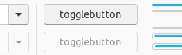
(@madsrh I think the brightness increase looks especially weird now that you mentioned it :laughing:)
I'm guessing that @nana-4 used a darker border-top-color along with a very slight box-shadow. If you use box-shadow's blur property then all sides of the button (annoyingly) gets a shadow and that's mainly what causes the blurriness. Obviously, that's how the pressed effect is done now.
Rough CSS for the above. I just copied and pasted the CSS I used in the inspector.
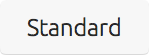
button:active, button:checked {
box-shadow: inset 0 1px 1px 0px rgba(0, 0, 0, 0.05);
border-top-color: #aaa;
background: #d8d8d8 }
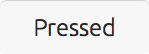
Headerbar text buttons looks much better IMO:
Image buttons in the headerbar might still have some issues, but it looks a little better to me.

Rough CSS for both:
headerbar button:hover {
background: #555252;
border-color: #555252;
}

headerbar button:active, headerbar button:checked {
background: #484545;
border-color: #282525;
box-shadow: inset 0 1px 1px 0px rgba(0, 0, 0, 0.15);
border-top-color: black
}
For the headerbar it's pretty much the same thing, darker top border when pressed + slight shadow (though the alpha value used is slightly more for the headerbar: 0.05 vs 0.15). I also brought back the border since you can see a slight gap between the top border and left and right borders without it:
I'm sure things can be finetuned a bit more.
godlyranchdressing
on 25 Apr 2018
@godlyranchdressing wow! This looks awesome imho!
White buttons are perfect (to me). Black buttons could use a tiny bit less black in the border/box shadow at the top edge while pressed
Feichtmeier
on 25 Apr 2018
Awesome work!
clobrano
on 25 Apr 2018
Well done, much better than the soft blur!
Adding one more point to Feichtmeier's to think about: Maybe the border of the pressed button should be a bit darker to keep the contrast similar to 'normal' buttons (against the now darker background). Currently the border visually fades away when the button is pressed. Would also make sense from a lighting perspective to me because the light breaks at the recessed edge and casts a shadow. (So maybe the border could even be a tiny bit stronger than for regular buttons.)
 ya-d
on 25 Apr 2018
ya-d
on 25 Apr 2018
@godlyranchdressing Isn't background: #484545; a little too close to the headerbar background color? IMO I would want something only slightly darker than the hover color.
madsrh
on 25 Apr 2018
@madsrh The PR (#366) uses #524e4e for hover #4d4949 for active.
The pressed effect doesn't show as much as it should because a line is being ignored for some reason, so I left it open for review. I don't know what I'm missing.
godlyranchdressing
on 26 Apr 2018
Related issues
Feichtmeier
·
3Comments
CDrummond
·
3Comments
 matthewpaulthomas
·
3Comments
matthewpaulthomas
·
3Comments
 8none1
·
3Comments
Feichtmeier
·
3Comments
8none1
·
3Comments
Feichtmeier
·
3Comments
Most helpful comment
Much cleaner pressed button effect without so much blur.
(@madsrh I think the brightness increase looks especially weird now that you mentioned it :laughing:)
I'm guessing that @nana-4 used a darker border-top-color along with a very slight box-shadow. If you use box-shadow's blur property then all sides of the button (annoyingly) gets a shadow and that's mainly what causes the blurriness. Obviously, that's how the pressed effect is done now.
Rough CSS for the above. I just copied and pasted the CSS I used in the inspector.
button:active, button:checked {
box-shadow: inset 0 1px 1px 0px rgba(0, 0, 0, 0.05);
border-top-color: #aaa;
background: #d8d8d8 }
Headerbar text buttons looks much better IMO:
Image buttons in the headerbar might still have some issues, but it looks a little better to me.

Rough CSS for both:
For the headerbar it's pretty much the same thing, darker top border when pressed + slight shadow (though the alpha value used is slightly more for the headerbar: 0.05 vs 0.15). I also brought back the border since you can see a slight gap between the top border and left and right borders without it:

I'm sure things can be finetuned a bit more.