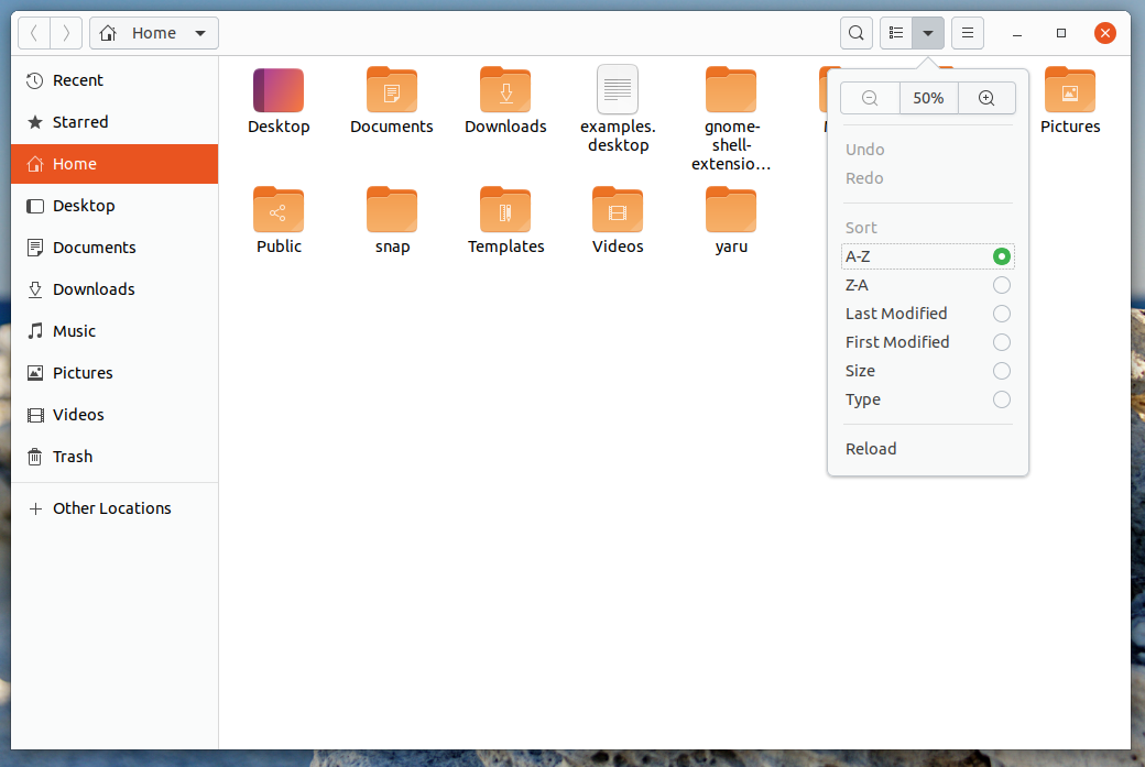
Maybe we should drop the gradients from the upstream drawing file for the headerbar and the buttons.
I think we had this also in some of the proposals I showed you.
Three lines of code change end up like this:
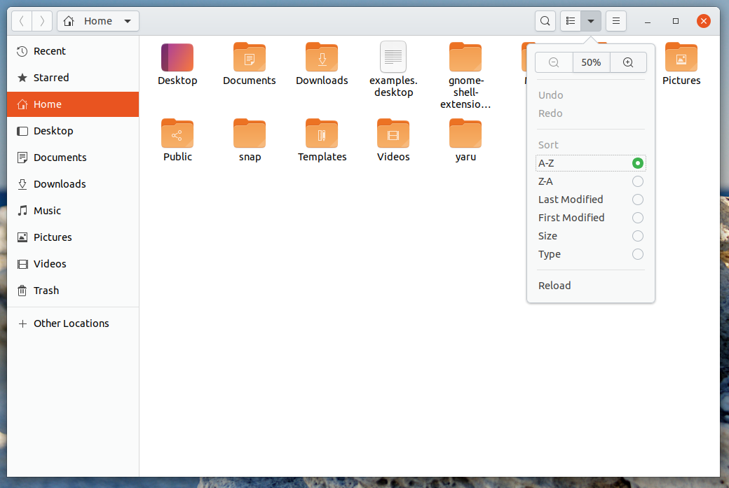
I think this is closer to the "original yaru" and everthing looks less round in the Z-axis
Downside is that buttons look less "press-me" :man_shrugging:
We could also only drop the gradient in the headerbar instead
Opinions?
For 20.04 ofc...
 Feichtmeier
All 10 comments
In that case, can the header bar colour be the same as in Yaru 1.0 ? I mean the refined ( matte ? ) white.
 meetdilip
on 23 Sep 2019
meetdilip
on 23 Sep 2019
I think we had this also in some of the proposals I showed you.
Could you please share the patch again? I'd like to see the difference on a VM
 clobrano
on 24 Sep 2019
clobrano
on 24 Sep 2019
@clobrano https://github.com/ubuntu/yaru/commit/2e8eb6bf7e421ed28135d5cce7fc04e559dc5f94
3 lines, but one could also think about only taking 1 of those 3
Feichtmeier
on 25 Sep 2019
But to prevent the buttons to merge with the background, this is also needed in _tweaks
https://github.com/ubuntu/yaru/commit/716fbf8a331a73bd90ab3b6356370ed12197a9c3
Feichtmeier
on 25 Sep 2019
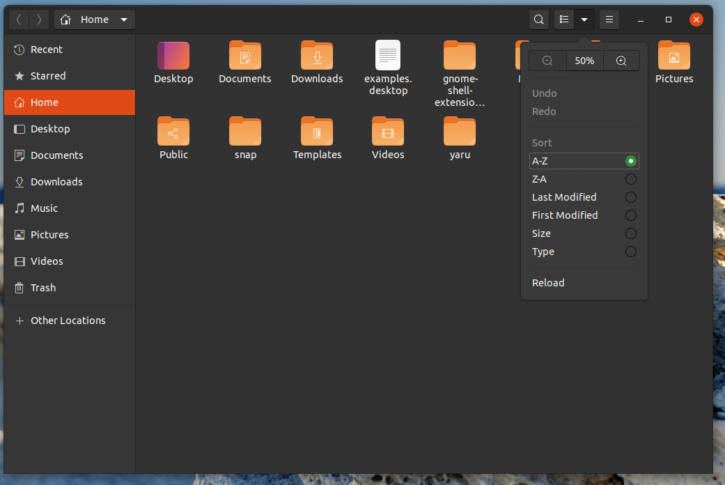
Maybe we should drop the gradients from the upstream drawing file for the headerbar and the buttons.
I think we had this also in some of the proposals I showed you.
Three lines of code change end up like this:
I think this is closer to the "original yaru" and everthing looks less round in the Z-axis
Downside is that buttons look less "press-me" man_shruggingWe could also only drop the gradient in the headerbar instead
Opinions?
For 20.04 ofc...
I took the liberty of editing the image you posted. I couldn't get the polished white as the header bar though. I used #fbfbfb
meetdilip
on 25 Sep 2019
Personally, I prefer with the gradient that gives a little "depth" and "relief" to the interface.
 ghost
on 26 Sep 2019
ghost
on 26 Sep 2019
Alright! Maybe you are right. Just leaving it open for some more opinions for some time.
Feichtmeier
on 26 Sep 2019
+1 for removing the gradient. Closer to the original is what I like the most.
 Paz-it
on 28 Sep 2019
Paz-it
on 28 Sep 2019
I'm also in favor of keeping the gradients (maybe even extending them to the checkboxes/radio buttons for consistency?), subtle depth is a great way to indicate what can be interacted with or not, and is also a little more natural and easy on the eyes compared to big solid blocks of color.
 jakedel
on 6 Oct 2019
jakedel
on 6 Oct 2019
Most people are pro keeping it. Closing for now
Feichtmeier
on 19 Oct 2019
Related issues
 mivoligo
·
3Comments
Feichtmeier
·
3Comments
Feichtmeier
·
3Comments
mivoligo
·
3Comments
Feichtmeier
·
3Comments
Feichtmeier
·
3Comments
 matthewpaulthomas
·
3Comments
matthewpaulthomas
·
3Comments
 YamiYukiSenpai
·
3Comments
YamiYukiSenpai
·
3Comments
Most helpful comment
Personally, I prefer with the gradient that gives a little "depth" and "relief" to the interface.