Yaru: Emblem lcons feedback and small issue
I'm following quietly lately, when I have free time. Not much of it as before, sorry! :disappointed:
Nit picking a bit if I may : when looking at the emblems the only one that stand out is the symbolic-link arrow that is not fitting so well in the circle. maybe a bit smaller arrow will be better.
seeing it together with all the new icons in 100% size may emphasize it :
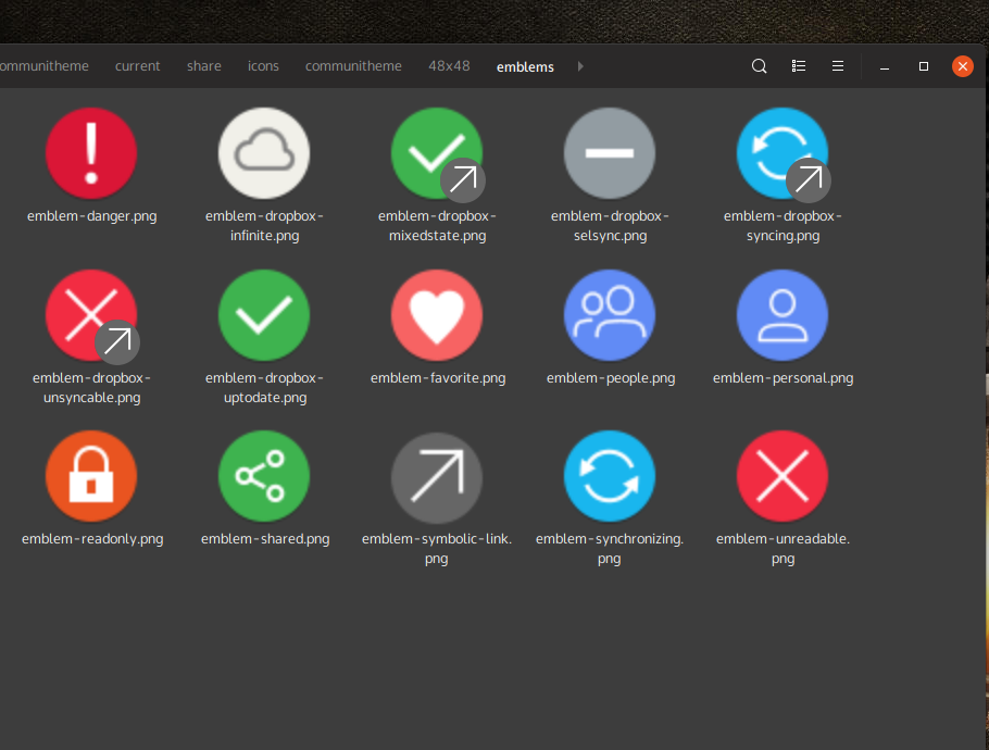
Otherwise, great work here @madsrh :+1:
_Originally posted by @Paz-it in https://github.com/ubuntu/yaru/pull/1191#issuecomment-467492449_
 Paz-it
All 9 comments
Sorry @Paz-it, I saw your comment, but forgot to reply 😞
Anyway, this is only a tiny bit smaller, but does this look better?

The current line of the arrow is exactly the same length as the line is the X (unreadable).
@Feichtmeier @clobrano the arrow is perfectly centered, so the uncentered issue is an optical illusion (or it's just because it's unbalanced).
EDIT: Okay you can't really compare the new and old with one icon, because the size and placement is slightly different in each in the icon template sizes 🤦♂️
 madsrh
on 28 Feb 2019
madsrh
on 28 Feb 2019
Hi @madsrh , it is indeed look better although, as you said it's hard to compare the new in relations with the other emblem-icons and to see it live is the best :sweat_smile:
Thanks!
Paz-it
on 1 Mar 2019
can we close this?
 clobrano
on 15 Mar 2019
clobrano
on 15 Mar 2019
can we close this?
It's up to you guys! @madsrh ...?
Paz-it
on 18 Mar 2019
It's up to you guys! @madsrh ...?
Just be avoid misunderstandings, @eaglersdeveloper actually did most of these icons, but maybe you're just asking for my opinion @Paz-it 😉
@eaglersdeveloper?
madsrh
on 19 Mar 2019
Oh my :man_facepalming: Sorry for miss-crediting @eaglersdeveloper .
I stand corrected, thanks @madsrh
Paz-it
on 19 Mar 2019
@madsrh, can you push a PR with the new emblem for symbolic link?
clobrano
on 23 Apr 2019
Do you mean this one? It's not perfect, so I was kind of hoping that @ubuntujaggers or @eaglersdeveloper would fix this.
madsrh
on 23 Apr 2019
How about...
Before:

After:
Full colour svg:

I understand the logic in cloning the diagonal line from the "X". The "X" goes very near the edge of the circle which means the arrow head is very close to the edge. On another emblem, the diagonal lines of the tick ("check mark") don't follow the "X" exactly, so I think we can depart from it here if the result is a more balanced arrow?
 ubuntujaggers
on 25 Apr 2019
ubuntujaggers
on 25 Apr 2019
Related issues
madsrh
·
3Comments
 mivoligo
·
3Comments
mivoligo
·
3Comments
 Feichtmeier
·
3Comments
Feichtmeier
·
3Comments
Feichtmeier
·
3Comments
Feichtmeier
·
3Comments
 sicklylife-jp
·
3Comments
sicklylife-jp
·
3Comments
Most helpful comment
How about...
Before:
After:
Full colour svg:
I understand the logic in cloning the diagonal line from the "X". The "X" goes very near the edge of the circle which means the arrow head is very close to the edge. On another emblem, the diagonal lines of the tick ("check mark") don't follow the "X" exactly, so I think we can depart from it here if the result is a more balanced arrow?