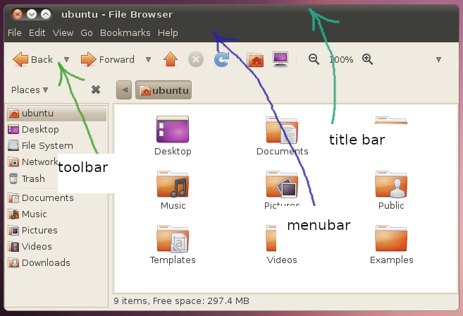
Yaru: The headerbar buttons lack of contrast compared to the background
(Sorry if it's something discussed before but I couldn't find a reference to it.)
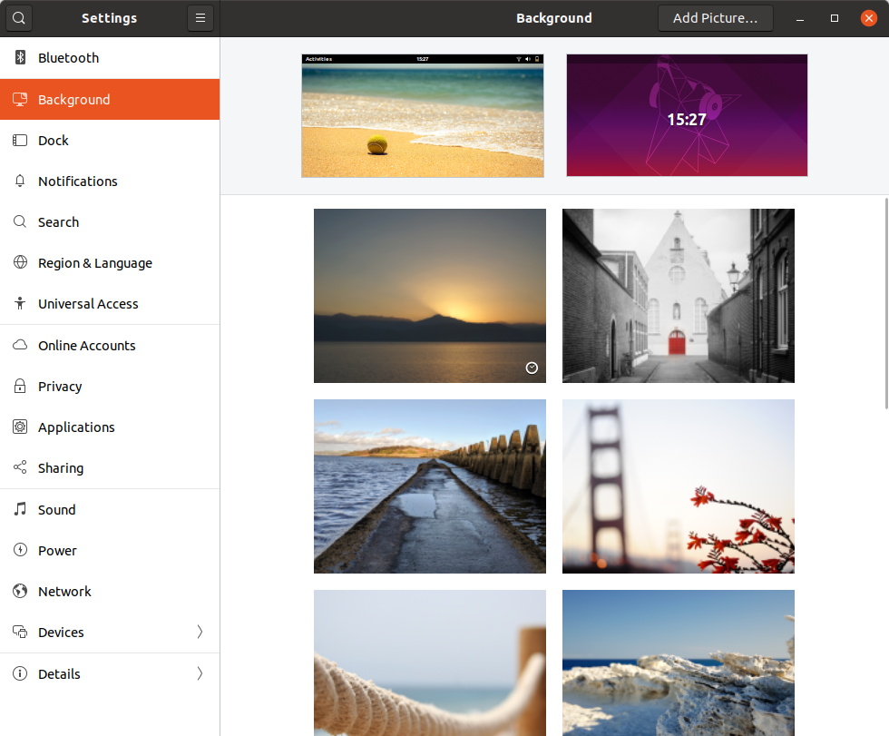
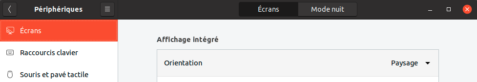
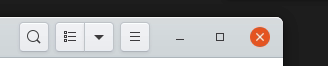
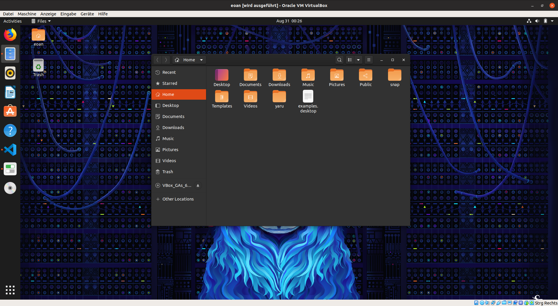
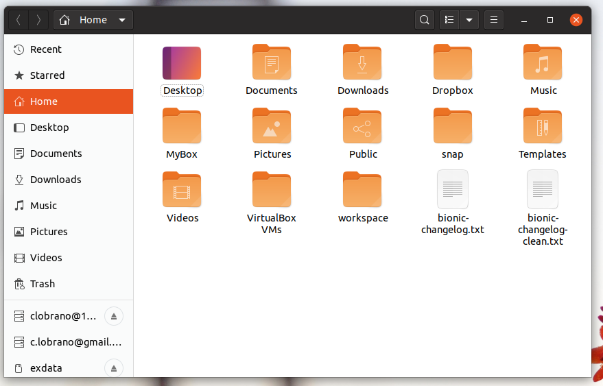
The action buttons in headerbars are not really easy to see (it's partially fault of the upstream design but Yaru has even less contrast between the bg and buttons than adwaita). The issue was discussed on the desktop IRC channel in the context of current eoan and gnome-control-center/display and some team members couldn't find the display/night mode selector at the top of the page, it's not specific to that panel though (the 'select image' in the background panel for example has the same issue)
Is there anything that we could do to make those more easy to spot for users?
 seb128
All 62 comments
Yes, we could lighten up the headerbar color for example.
The buttons are connected to that headerbar color
 Feichtmeier
on 29 Aug 2019
Feichtmeier
on 29 Aug 2019
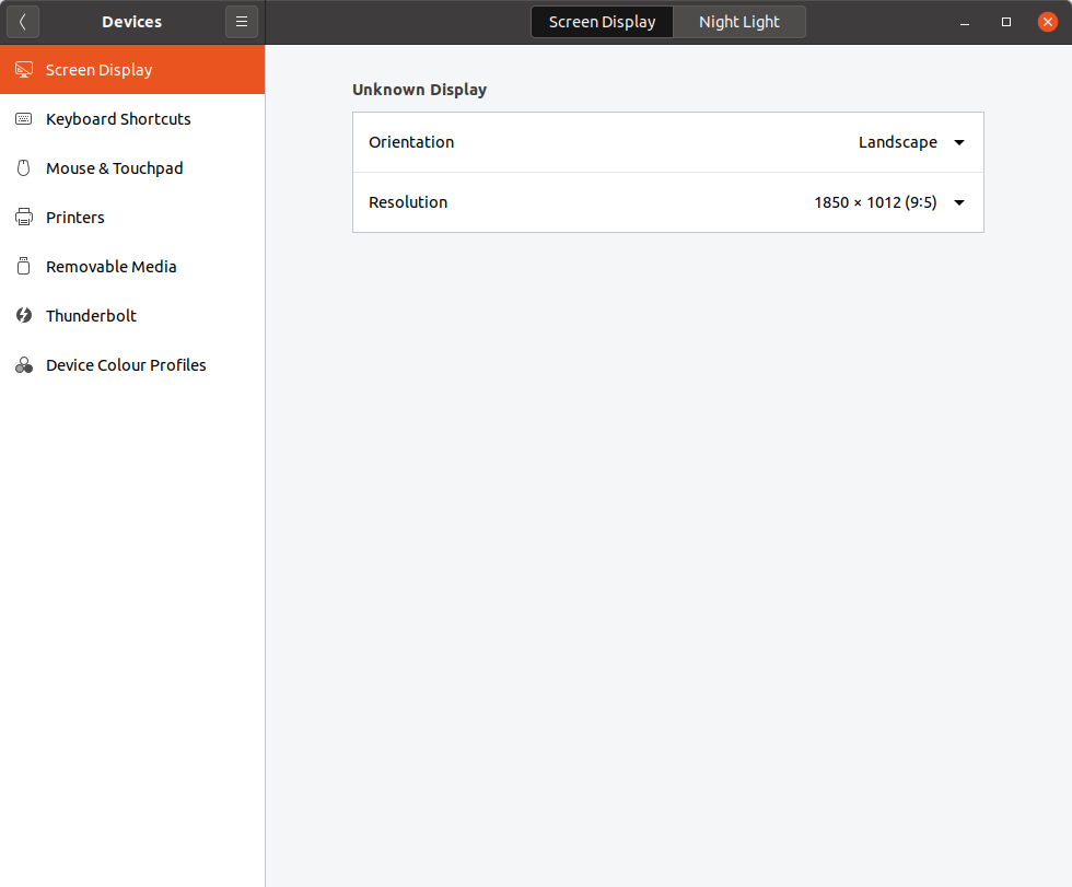
Hi @seb128, is the night mode selector coming from a new version of control-center? I could not see it, either because of this same issue or because I have a previous version of g-c-c :)
 clobrano
on 29 Aug 2019
clobrano
on 29 Aug 2019
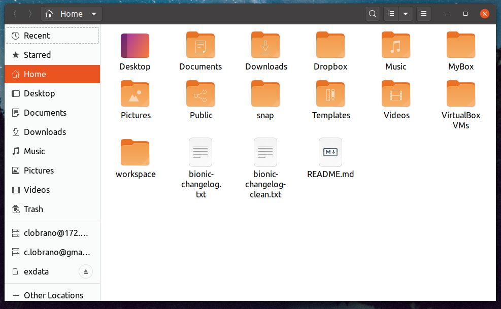
@clobrano it was moved to the headerbar in the current GNOME unstable serie so it's only in eoan, the button have a visible border/text but the bg color is pretty similar to the bg so they are not invisible just lacking contrast. I'm currently on another laptop but I will send a screenshot a bit later
seb128
on 29 Aug 2019

This is 3% lighter
:man_shrugging:
Looks less sexy (orange and dark looks really great, orange with that grayish not so much), but more easy for the eyes, IMHO
Feichtmeier
on 29 Aug 2019
What's the exact color? I was testing something similar, making a palette from our base HB color #2b2929 and using a ligher one #3E3C3C (for both headebar and top panel)

Even the top panel + dock seems less eavy with this color, what do you think?
clobrano
on 29 Aug 2019
The new one is
333030 (lighten(#3d3a3a, 3%) )
The old one is
3d3a3a
I think it looks good, but I would keep the top panel darker, so we dont have that "wall of gray" again ;D (I think that was one of @ubuntujaggers first participation)
Maybe @madsrh could help us here, too? :D
I am not really good with colours! But I agree with @seb128 about the readability issue
Feichtmeier
on 29 Aug 2019
333030 (lighten(#3d3a3a, 3%) )
uhm, why #3D3A3A? Headerbar is #2B2929. Anyway, it would be cool to have the same g-c-c to test it locally, otherwice I can open a new PR for testing
clobrano
on 29 Aug 2019
It's definitely 2b2929, no idea what I had in the copy when I pasted
Feichtmeier
on 29 Aug 2019
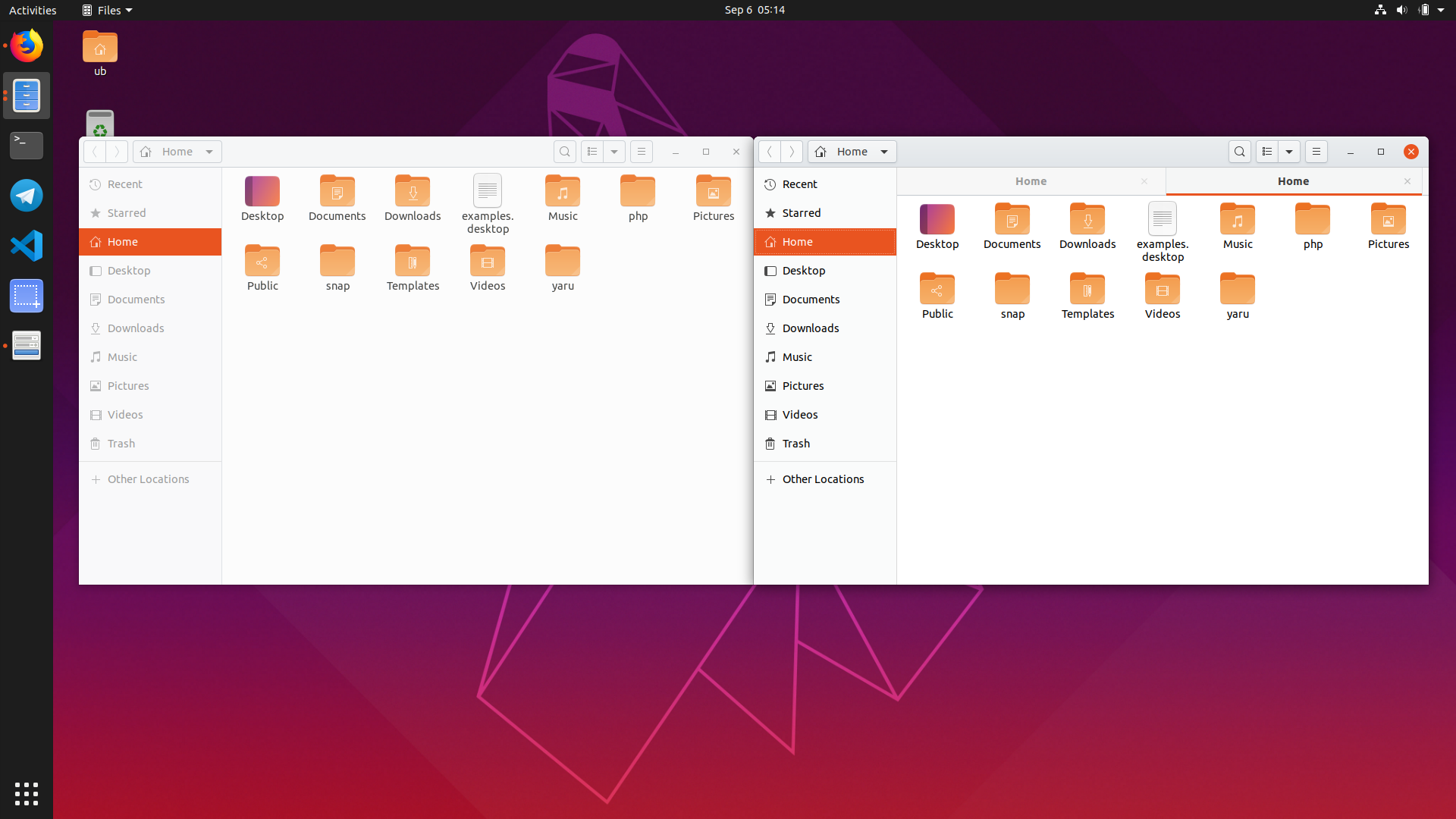
Just for reference that's a g-c-c headerbar today without change
seb128
on 29 Aug 2019
(oh and it does look better/more visible on the screenshot with an external screen, so probably the low quality screen of my test laptop doesn't help there...)
seb128
on 29 Aug 2019
Thanks @seb128, that's the stackswitcher button, I can test it elsewhere without installing the new g-c-c :+1:
clobrano
on 29 Aug 2019
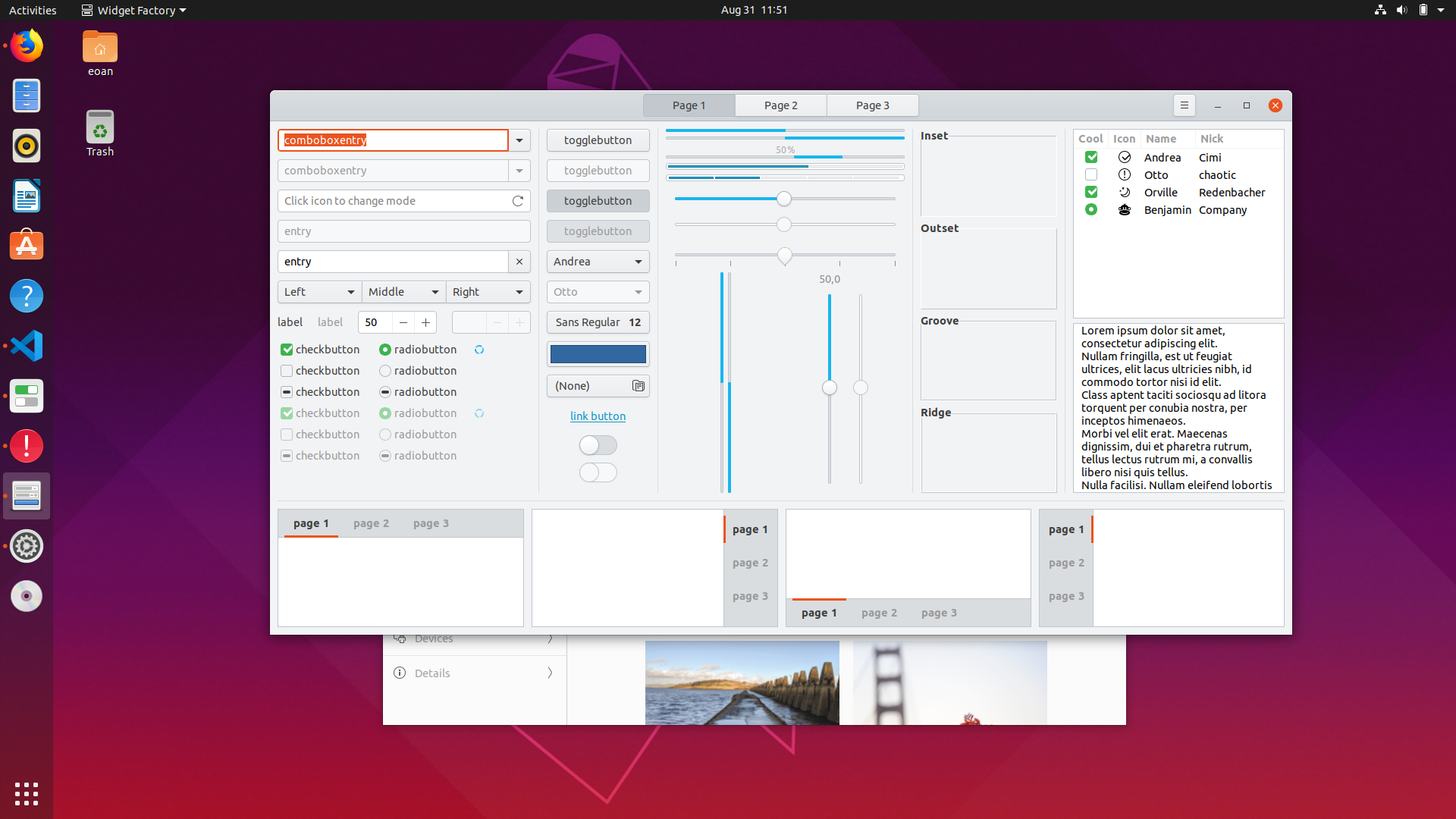
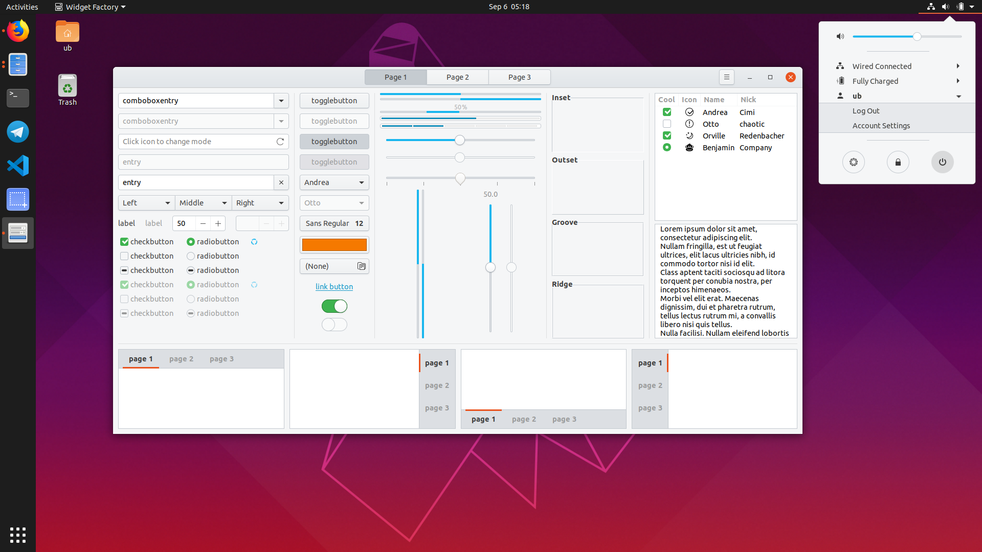
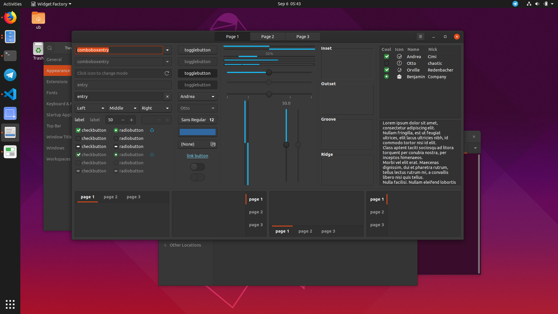
here gtk3-widget-factory with a similar stackswitcher button and proposed new hb color
clobrano
on 29 Aug 2019
The pressed buttons have also more detail like this. You can distinguish what's the shadow and what's the border which results in a sharper button.
How does it look ontop of the dark theme?
Feichtmeier
on 29 Aug 2019
It looks fine but what if option 1 is selected? it still feels like the selected and bg color are quite close
seb128
on 29 Aug 2019
It looks fine but what if option 1 is selected? it still feels like the selected and bg color are quite close

I can try to mockup a version with a different pressed button color
clobrano
on 29 Aug 2019
Thanks, I'm probably not the best to comment about the tweaks since I usually don't have a good eye for such details, it doesn't look obvious to me that there are buttons in the bar still but I think it's mostly GNOME's design fault for putting buttons in an usually location... I'm off next week but maybe @8none1 and @didrocks have an opinion on the topic
seb128
on 29 Aug 2019
To be brutally honest, they all kinda look the same to my eyes.
The discovery of those buttons in the header bar isn't great, does it warrant a more significant change to make it more obvious?
 8none1
on 29 Aug 2019
8none1
on 29 Aug 2019
I am probably a bit biased, since I see them all day and I lost the "first sight" effect.
Previously the stackswitcher buttons had light borders we cannot reproduce in this version, because of the 3D effect, which is evidently too subtle with a "crazy dark" (cit.) headerbar color :)
Just to focus on the problem:
- is it hard to spot the normal buttons from the headerbar background?
- is it hard to spot the active buttons from the headerbar background?
- is it hard to spot the normal buttons from the active one?
- all the above?
clobrano
on 29 Aug 2019
In the meantime, here are some mockups where I try to work on button borders, making them more visible.
It might look a bit exaggerated, but I'm trying to consider all the different light conditions and probably it'd be faster if I shot higher and then refine :)
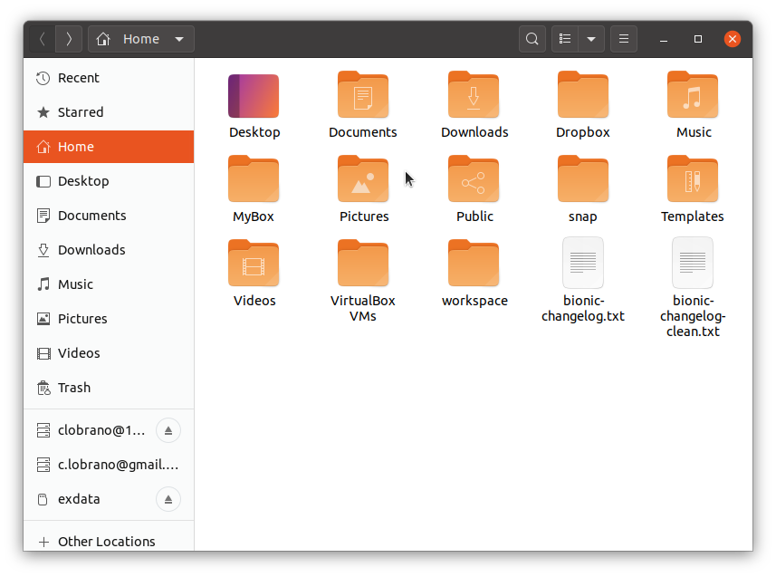
Software center
Boxes

Nautilus
clobrano
on 30 Aug 2019
Here the new g-c-c on Eoan
clobrano
on 30 Aug 2019
To avoid messing up with the discussion, I'm collecting the mockups
clobrano
on 30 Aug 2019
@8none1 @seb128
Another option would be to drop the dark headerbar in the light theme, and rely on the upstream look for the headerbar, which drops a lot of distinctive previous yaru/ubuntu design/look, but adds great usability imo, edit2: the current master is already easier to maintain than the previous theme, but with no change to the headerbar styling it becomes even easier but mostly safer and every break/issue/glitch that might occur comes directly from upstream
Edit: this is still
- our full color set
- our border-radius
- our button sizing
- less gradients on buttons/flatter look
- different titlebuttons
- flatter checks/radios


And eventually add more ubuntu colors to the titlebuttons hover:

Test branch: https://github.com/ubuntu/yaru/tree/light_theme_light_headerbar
Feichtmeier
on 31 Aug 2019
To avoid messing up with the discussion, I'm collecting the mockups
I like version 7!
That addresses my main concerns I think.
8none1
on 2 Sep 2019
@Feichtmeier I think a dark theme with a light header bar detracts from the main point of the dark theme. Just my 2 cents, but I don't think it works. I like version 7 above best. (Just my opinion)
8none1
on 2 Sep 2019
Short update after discussing with team and on IRC, I will try to improve the disabled button in order to made them look less "actionable". This is a possible solution
- no borders (or lighter ones)
- less visible label
clobrano
on 2 Sep 2019
@Feichtmeier I think a dark theme with a light header bar detracts from the main point of the dark theme. Just my 2 cents, but I don't think it works. I like version 7 above best. (Just my opinion)
I think @Feichtmeier wanted a gray headerbar on the light theme and the dark one on the dark variant
clobrano
on 2 Sep 2019
Yes, like upstream and elementaryOS. Fully light and fully dark theme. (like in the screenshots)
Feichtmeier
on 2 Sep 2019
@8none1 @seb128
Upstream uses a fully light gtk or a fully dark gtk theme.
We basically use the same files as upstream does, but make use of global variables for the sizing of the headerbar and the rounding of widgets (Those variables are inside of the upstream files and no additions. ) and ofc set other values for the colors here: https://github.com/ubuntu/yaru/blob/master/gtk/src/light/gtk-3.20/_colors.scss.
Yaru now uses a fully light and a fully dark gtk theme from the build we use but then also apply an inversion of colour for the headerbar for the light theme here:
https://github.com/ubuntu/yaru/blob/master/gtk/src/light/gtk-3.20/_tweaks.scss
_Now this following comment is my opinion alone and I don't speak for the yaru team because we strongly disagree here:_
Remember the osd styled popovers in the dark and light gtk theme? I loved them really. But they are broken by design (it was my idea -.-) because they are just containers where everything can be inside. And they are really starting to put everything inside popovers, including many custom widgets.
So as soon as some fancy gtk app developer puts a new widget into it which looks up the exported colours we just talked about at guadec, it will be broken. The same thing can happen to the dark headerbar.
These are the public colors which we also use because, as already said, we use the upstream code:
https://github.com/ubuntu/yaru/blob/master/gtk/src/light/gtk-3.20/_colors-public.scss#L10
If an gtk app dev wants to look up public colors /exported colors they look up for these variables. Those variables are differnt in the light and the dark theme and are exported from the SCSS to the gtk.css and gtk-dark.css. This means, if the system uses a light theme and we have a dark headerbar in the light theme, the app dev will make use of a text color and a background color of the light theme. Meaning basically "black text on white background". Ofc this will then be not visible inside the dark headerbar, creating basically an issue or an unthemed state.
This is ofc not directly addressing to your initial issue, but using full light and full dark themes would also help here because, as you can see from the screenshots, the upstream code already checks the contrast of buttons in the headerbar. So this would be a good opportunity to use the fully light theme, even if it does not answer our design wishes.
There are things planed for the exported / public colours. That might include headerbar colors. So when a theme has a custom widget in the headerbar (for example gnome builders big centred widget) would then theoretically look up something like @theme_headerbar_fg_color it finds the correct headerbar color and not the fg color of the rest of the theme.
But until this is happening, imho inverting the headerbar is not really a "good practice", even if executed perfectly, like in the previous theme until 19.10
Edit: here is an example: https://gitlab.gnome.org/GNOME/gnome-software/blob/master/src/gtk-style.css#L264
Feichtmeier
on 2 Sep 2019
Reminder for everyone additionally to the risk of inverting the colours: please realize that the headerbar is part of the very toolkit the rest of the apps use. So it would be probably desirable to make it look exactly like the rest of the app. It should not look alien in any way. That's the reason why drawing does not differentiate where the widget is drawn. Special casing certain container widgets should be really avoided.
Feichtmeier
on 3 Sep 2019
Hi guys, sorry for delay. Here are my thoughts.
I'm a big fan of the original dark headerbars - to me they look dark and cool. I think we lose that if we lighten them to the point where they look "grey" rather than "dark". Some of the latest ideas look nice in screenshot, but when I try the branch for real it looks a bit drab. I think, if we have to lighten them that much for usability reasons, I actually prefer Frederik's fully-light headerbar concept (at least when I try the different options for real on my desktop). Also, I certainly prefer Frederik's concept to vanilla Adwaita (by a big margin), even if it's a radical change that takes some getting used to. I think it will be less jarring if we can get back to Cosmic-style transparencies for the desktop header and launcher.
This surprises me because I love the classic Yaru look and really appreciate the work Carlo is doing to try to fix this issue without abandoning the dark headerbars. So hopefully a good answer can still be found. I just prefer all-light windows to the medium grey-ish headers after trying them both in recent days.
 ubuntujaggers
on 4 Sep 2019
ubuntujaggers
on 4 Sep 2019
For reference, the yaru which still lives on in the bionic branch has the advantage of relatively bright gray borders - but they only really look good if you make the headerbar flat:

Ambiance had the dark headerbar, too but buttons work a lot different. They are really, truely 3dish looking (which is unquestionable out of style) and the headerbar color is different:
- on a sidenote, was this still a "light" theme? Wouldn't it be easier to default to yaru-dark if a dark look is wanted as default? Then we could give the yaru light look to the users who use ubuntu in a bright room or just prefer a pure light theme (aside from the risk-to-break-dodging I described above)
Feichtmeier
on 4 Sep 2019
I agree with @ubuntujaggers. The black headerbar is Yaru's identity. It would be a pity to lose it. Personally, I find that version 5 is a good compromise.
 ghost
on 4 Sep 2019
ghost
on 4 Sep 2019
I'll give my 2 cent here too 😃
Regarding this initial issue of this bug, I still find version #7 to lack some contrast compared to the background (although it's much improved). I would like to see an obvious color/contrast difference between headerbar and buttons. It's not as slick as that cool, sexy, chocolate look we aimed for with Yaru, but it's good UX.
IMHO this would fix this issues, BUT @Feichtmeier raised some very valid points.
I agree that the dark headerbar is a big part of Ubuntus identity / recognizability (we've had a dark headerbar since 4.10!) but that's not a good reason for sacrificing usability and shipping something we know will cause bugs. Perhaps it's time to move on. The fully-light headerbar concept @Feichtmeier presented is a much safer solution, although it's a big change. Ofc the best solution would be, if upstream supported colored headerbars 😉
 madsrh
on 4 Sep 2019
madsrh
on 4 Sep 2019
@seb128 @8none1
I would like to sum up my problems with the mixed theme:
1) Gtk is not ready for an inverted headerbar as described here
2) in a normally lightened room at day the dark headerbar is worse usability wise than a light headerbar. That's why basically all plattforms or toolkits use a full _light_ or a full dark version for night and _day_
MacOS as an example:
3) Addressing the initial issue, we need to lighten up the buttons to have a good contrast to a point where they look almost gray, what's the point then to invert the colors of the headerbar in the light theme then?
4) Looking at the history of the ubuntu theme, I've noticed that the dark title bar was introduced in 10.04 with the colors ambiance used until 18.04, a window without a titlebar and only with a gtk headerbar, which is basically a box which can also have titlebuttons (client side decorations)
So imho this long history of a dark headerbar is basically an illusion :)
And a titlebar can not have any gtk widgets inside!!!
Full light/dark themes could also be expected from fancy kids only using android and osx:
Feichtmeier
on 4 Sep 2019
Ah, I wanted to submit a similar issue since a long time, but thought it would be a big NO.
An optional "fully light" is really something that I miss, I like Yaru theme but the dark headerbar blends into the panel too much, I had to customize the top bar to improve contrast/efficiency by making it somewhat always transparent, but it's ugly, I don't mind dark panel #1d1d1d honestly it is perfect, what I need is a light GTK. And it seems that a lot of users want the same.
I understand that the dark headerbar is part of Ubuntu's identity, it's why I say "optional". But nowadays headerbars are totally part of the window, IMO it makes less sense than years ago when we had real titlebars where a separation was quite needed.
If sadly it never happens, I hope that someone will upload a light Yaru in GNOME-Look or GitHub/GitLab anyway.
PS: instead of pure grey, maybe a "sepia" tint like what we have in Adwaita could do the trick, it would look like Radiance.
 DarthWound
on 4 Sep 2019
DarthWound
on 4 Sep 2019
In a normally lightened room at day the dark headerbar is worse usability wise than a light headerbar
Exactly.
Full light/dark themes could also be expected from fancy kids only using android and osx
I find it annoying and rather sad that most of the "full light" themes I found on gnome-looks are copies of some OSX theme or other. Even to the point of adding Apple's logo somewhere. I don't want to see that logo. And I really hope Linux desktop can still learn from other platforms who obviously invest a lot into usability research.
 dgutov
on 4 Sep 2019
dgutov
on 4 Sep 2019
A full light theme - though not being the default - comes with every Ubuntu install. It is called Adwaita and is just some mouseclicks away.
Now I have the choice between Adwaita (full bright), Yaru (rather bright, but with ubuntuish chocolate flavour) and YaruDark (well, dark). With the proposed changes I have the choice between Adwaita, something really close to Adwaita and Dark. That's just less choice. I lose the "mid" compromise between light and dark.
 real-amano
on 6 Sep 2019
real-amano
on 6 Sep 2019
Uhm, the current theme IS already very close to adwaita (which only works because we "upstreamed" many design ideas from yaru INTO adwaita). But we are inverting the headerbar color. Reasoning why this is not-so-good readable at day and gtk being not ready for this is summed up here
We made some changes to the light theme, currently it looks like this (many pictures incoming):


While the dark yaru theme looks like this:


Feichtmeier
on 6 Sep 2019
If preserving the most memorable Ubuntu moments is not worth it, why fork Adwaita at all? And not ship plain Adwaita?
real-amano
on 6 Sep 2019
Reasoning why this is bad design is summed up here
I wouldn't say it's "bad design", though.
clobrano
on 6 Sep 2019
To be a little bit more constructive:
If this is really going to take the bright headerbar road, can you consider putting at least a "shot" of coffee into it? To retain some of the old Ubuntu feeling? I believe that there are a lot of shades out there that are bright enough and still resemble the classic, warm "African" look and feel?
real-amano
on 6 Sep 2019
Yeah, as I said a bit of "sepia" colors instead of pure grey would give a better Ubuntu feeling. Maybe playing with the warm grey tints? But I disagree that having a full light theme is the same than default Adwaita, we still have orange accent color and other stuff. I love when distros ship their own branding, especially Ubuntu, but I agree that we shouldn't go too far from upstream. And as we said, dark headerbar has some usability concerns.
And, honestly, I'm pretty sure that if Ubuntu team use a full light theme, you'll be able to download "old" Yaru forks made by people who don't like changes, as always.
Personally I can't wait for the full light theme, I use full dark at night but at day the "hybrid" is painful. If it comes in 19.10 it would be a great birthday gift haha!
We often say that Ubuntu tries to reinvent the wheel and breaks stuff, we should be happy that nowadays Ubuntu adapts itself to upstream and tries to be GNOME compliant, without losing its identity that much. Remember the Nautilus patches with obsolete versions and other things... Anyway people will never be ok with any decision, when Unity was released because GNOME3 wasn't what Ubuntu had in mind, community was angry, when Unity was dropped community was angry even if Ubuntu became a big contributor to GNOME and improved a lot of stuff.
DarthWound
on 7 Sep 2019
@Feichtmeier Wow! As much as I was not a fan of the first version but there with these subtle hues of gray, it's just beautiful!
The green buttons fit better than with the black theme and the orange colors of the sidebar become more pleasant (before it was a bit aggressive).
There is really a sense of detail when you pay attention. In short, I'm ready to leave the dark side to have this beautiful theme :)
Great job! 🎉
These screenshots are my favorites:
ghost
on 7 Sep 2019
I really like the changes in #1493.
8none1
on 9 Sep 2019
Sorry for the delay commenting back since I was on holidays/offline, great work going through the options, +1 from me for the solution picked, thanks yaru team, I think that's going to be a noticable usability improvement :-)
seb128
on 9 Sep 2019
Awesome!! Congrats and thanks, can't wait for 19.10 :)
Genuinely asking though, what about using warmer colors than pure cold grey?
DarthWound
on 9 Sep 2019
Darn, I haven't been fast enough to talk about that before merge, but I wonder if a solution couldn't have been to have a slightly light-orange headerbar color, as a bit of a reminiscence of the "Humanity" theme ? Humanity was a theme really similar to Clearlook, but with Orange tint instead of blue, and especially on the title bar. So it could be interesting to try something kinda similar.
It would cover not inverting the color of upstream (it would just be a custom tint of the headerbar and not being "dark"), while still keeping an Ubuntu-like identity ? I can make some test of what it could look like if you want.
( Not that I don't like the result : it's give a pretty cool effect, I just think that it could have a bit more of an immediate recognizability, without messing too much with application theming. )
 Kazhnuz
on 9 Sep 2019
Kazhnuz
on 9 Sep 2019
Or a slight hue of coffee color/brown? To retain more of its "warm" identity?
real-amano
on 9 Sep 2019
The old brown titlebar wasn't really appreciated if I remember correctly :D
On Mon, 9 Sep 2019, 5:41 pm real-amano, notifications@github.com wrote:
Or a slight hue of coffee color/brown? To retain more of its "warm"
identity?—
You are receiving this because you were mentioned.
Reply to this email directly, view it on GitHub
https://github.com/ubuntu/yaru/issues/1477?email_source=notifications&email_token=AAWAAHROK2J5GR774MPEOZLQIZVCBA5CNFSM4ISB76JKYY3PNVWWK3TUL52HS4DFVREXG43VMVBW63LNMVXHJKTDN5WW2ZLOORPWSZGOD6IB76Y#issuecomment-529539067,
or mute the thread
https://github.com/notifications/unsubscribe-auth/AAWAAHXXBRJOO45WTFMYYDTQIZVCBANCNFSM4ISB76JA
.
clobrano
on 9 Sep 2019
The old brown titlebar wasn't really appreciated if I remember correctly :D
If you talk about the Humanity era _(brown, not orange)_ before 10.04 and Ambiance, you can't imagine how much I loved it :laughing: But yeah I don't think I would be fond of it nowadays. I just hope for a warmer tint than cold grey, but I wouldn't like colored headerbars.
DarthWound
on 9 Sep 2019
If you talk about the Humanity era (brown, not orange) before 10.04 and Ambiance, you can't imagine how much I loved it laughing But yeah I don't think I would be fond of it nowadays. I just hope for a warmer tint than cold grey, but I wouldn't like colored headerbars.
Maybe for that one inspiration could be Sam Hewitt's old "Humanitary" theme ? ( https://github.com/snwh/humanitary-gtk-theme / https://www.snwh.org/humanitary ). It had a warm feeling that really bring for me that old "ubuntu" feeling, and it would be a good inspiration to brand the headerbar without going too much back to the "dark headerbar" territory.
Maybe it would feel too much oldschool though ? Personally I really love it, but I can't talk for anyone else.
(I won't really bother too much, especially because we are getting off topic from this issues. Maybe another one should be opened for that topic.)
Kazhnuz
on 9 Sep 2019
If you talk about the Humanity era (brown, not orange) before 10.04 and Ambiance, you can't imagine how much I loved it laughing But yeah I don't think I would be fond of it nowadays. I just hope for a warmer tint than cold grey, but I wouldn't like colored headerbars.
Maybe for that one inspiration could be Sam Hewitt's old "Humanitary" theme ? ( https://github.com/snwh/humanitary-gtk-theme / https://www.snwh.org/humanitary ). It had a warm feeling that really bring for me that old "ubuntu" feeling, and it would be a good inspiration to brand the headerbar without going too much back to the "dark headerbar" territory.
Yeah, but it's too much imho. As I said, something like the current Adwaita headerbar is enough for me, or we could look at the warm grey palette. Honestly, Adwaita with just orange accents instead of blue would be ok. But I love Yaru for sure.
DarthWound
on 9 Sep 2019
At first I was reluctant with the new light theme. But the spirit of Ubuntu is still here ... modernized :) The orange color of the side menus fits perfectly with the new theme and the beautiful icons stand out better.
I'm afraid that by tinkering the headerbar, the result is too busy and does not fit well with the desktop of everyone (including wallpapers).
ghost
on 9 Sep 2019
Or a slight hue of coffee color/brown? To retain more of its "warm" identity?
...Honestly, Adwaita with just orange accents instead of blue would be ok.
We've tried with different shades of brown-ish warmer light headerbars, but always ended up with something close to Adwaita - we don't want that. I think the theme still keeps its identity although the shade we've chosen doesn't exactly scream "coffee". It is IMHO very modern, lightweight, clean and unique.
We appreciate all the feedback and we know it's a controversial decision that will have fans and haters, but for now we're giving this approach a try 😃
madsrh
on 9 Sep 2019
No problem, it's almost perfect, good job :) I can't wait for 19.10!
18.04 was excellent, but 20.04 will be the best LTS since a long time.
EDIT: and maybe we will get rid of the kinda useless topbar soon :stuck_out_tongue_winking_eye:
I already reduce its size with custom CSS rules:
stage { font-size: 10.75pt; }
#panel { height: 1.4em; }
@madsrh and @Feichtmeier an opinion from an intruder here:
- I think it's a good move, but also would expect something warmer as proposed by @DarthWound or even a full white approach...
- But now, without the dark header, I feel that sidebar selected items are "screaming" too much with that orange... I know it's something Adwatia does too, but it feels more relevant than the whole window. Possible solutions would be trying a really bright orange with dark text or a light gray there... not sure.
Anyways, good work there guys!
 mateuswetah
on 10 Sep 2019
mateuswetah
on 10 Sep 2019
It could only be fair if you also showed in your previewing screenshots a non-headerbar app usually used in dark mode, fully maximized, with you new light theme. For a popular choice: vscode. Then people would also know how awful the new approach could look, with its dark-light-dark sandwich, despite all the advantages. You might say that's legacy stuff but still that's the way Electron is now. Not to mention many other "legacy" apps.
 memeplex
on 11 Sep 2019
memeplex
on 11 Sep 2019
It could only be fair if you also showed in your previewing screenshots a non-headerbar app usually used in dark mode, fully maximized, with you new light theme. For a popular choice: vscode. Then people would also know how awful the new approach could look, with its dark-light-dark sandwich, despite all the advantages. You might say that's legacy stuff but still that's the way Electron is now. Not to mention many other "legacy" apps.
I don't have any electron app installed, so I can't test, does this work?
GTK_THEME=Yaru:dark vscode
If yes, then you can create a custom .desktop file in ~/.local/share/applications/ containing the following line: exec=env GTK_THEME=Yaru:dark vscode
_PS: you sound a bit rude, and it's not an issue that you'll meet only in Ubuntu, all distros shipping Adwaita or other light themes are impacted I guess._
DarthWound
on 11 Sep 2019
It's not my intention to sound rude and I know Adwaita works like that and is shipped out-of-the-box at least by Fedora, that's why I prefer(red) Yaru over Adwaita and I have supported the choice of a mixed-theme over a fully-light one in Discourse and other places.
I also know how to set a different theme by setting the GTK_THEME environment variable.
One thing I'm not being able to do is dynamically changing the variant by setting _GTK_THEME_VARIANT using xprop. Isn't that supported by mutter?
memeplex
on 11 Sep 2019
AFAIK xprop should work, except if you use Wayland session.
If it helps, remember that an optional mixed theme should be available in 20.04 LTS. And as I said in a previous comment, I'm pretty sure that you'll be able to find the old mixed Yaru in GitHub/GitLab/GNOMELook soon because a lot of people don't like changes and will provide the former stuff, as always. You could even try to backup the current one from your PC.
DarthWound
on 11 Sep 2019
I use X11. It's not xprop what is not working but setting that specific property. I'm asking about this in mutter gitlab.
memeplex
on 11 Sep 2019
This seems a bug not related to any theme and only incidentally the mixed theme worked as workaround. I understand the concern, and we are working on a way to provide all the choices our people might like, but this doesn't seem the right place to discuss it
clobrano
on 11 Sep 2019
Related issues
madsrh
·
3Comments
Feichtmeier
·
3Comments
 mivoligo
·
3Comments
mivoligo
·
3Comments
 Muqtxdir
·
3Comments
Muqtxdir
·
3Comments
 snydox
·
3Comments
snydox
·
3Comments
Most helpful comment
@Feichtmeier Wow! As much as I was not a fan of the first version but there with these subtle hues of gray, it's just beautiful!
The green buttons fit better than with the black theme and the orange colors of the sidebar become more pleasant (before it was a bit aggressive).
There is really a sense of detail when you pay attention. In short, I'm ready to leave the dark side to have this beautiful theme :)
Great job! 🎉
These screenshots are my favorites: