@ubuntujaggers @eaglersdeveloper :)
 Feichtmeier
All 23 comments
Aha, this will either be a fun one or a very hard one 😛
I've got a quiet Christmas period so should be able to get a lot of Inkscape done next week and the week after, so I'll add this to the list. I've also got battery icon to look at, let me know if there's any I've forgotten.
 ubuntujaggers
on 22 Dec 2018
ubuntujaggers
on 22 Dec 2018
You should be able to filter the issues for "icon theme"
The full color emblem-shared is also missing and the backup file ^.^ Thanks in advance!
@didrocks could we add @ubuntujaggers to the group here, too so we can or he can assign issues to him?
Feichtmeier
on 22 Dec 2018
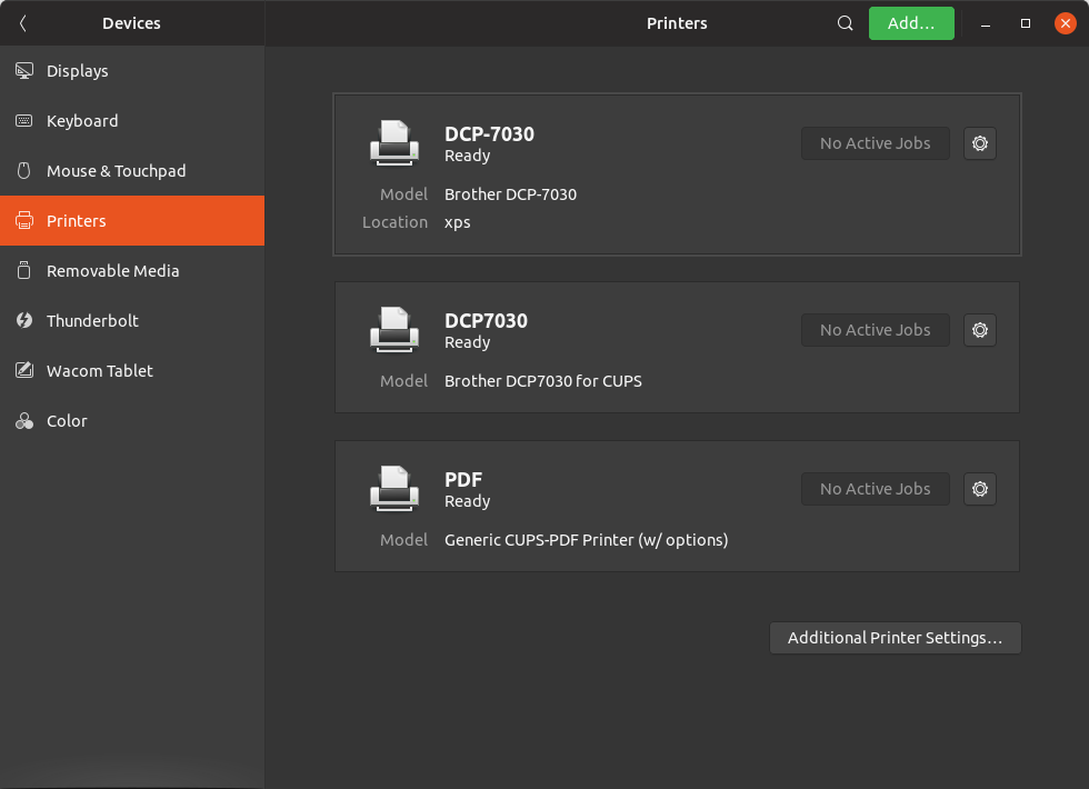
I have the "printer-network" icon, so do we need to create multiple icons?
Where are these icons stored?
To create 2-3 icons in suru style is fine, but if there's as many models as in _/usr/share/hplip/data/images/devices_ then I suggest keeping the stock icons
 madsrh
on 26 Dec 2018
madsrh
on 26 Dec 2018
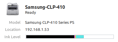
I think we should leave it with the generic icons.
I think that Samsung icon looks like an actual real Samsung printer. Which is impressive but indeed out of our scope imho
Feichtmeier
on 26 Dec 2018
@Feichtmeier So can we close this one?
madsrh
on 26 Dec 2018
No, there are generic printer icons for most printers. Only a few have that special icons :)
Feichtmeier
on 26 Dec 2018
I've been trying this one today, so far it's proving tough but I'll keep working on it.
ubuntujaggers
on 28 Dec 2018
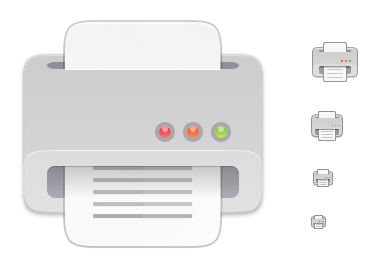
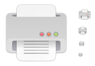
I feel like I'm making progress now - how about this (I've only done 48px so far):

The body of the printer has the same size/shape/position/gradient as the keyboard icon for maximum consistency.
Here it is with some other devices at 48px for comparison:


ubuntujaggers
on 29 Dec 2018
Looks great, indeed :)
On Sat, 29 Dec 2018 at 16:14, ubuntujaggers notifications@github.com
wrote:
I feel like I'm making progress now - how about this (I've only done 48px
so far):[image: image]
https://user-images.githubusercontent.com/38893390/50539673-fcb34200-0b7b-11e9-93df-157cad8ce411.pngThe body of the printer has the same size/shape/position/gradient as the
keyboard icon for maximum consistency.Here it is with some other devices at 48px for comparison:
[image: image]
https://user-images.githubusercontent.com/38893390/50539683-1a80a700-0b7c-11e9-94b1-4971c0189e59.png[image: image]
https://user-images.githubusercontent.com/38893390/50539687-2bc9b380-0b7c-11e9-9880-d474d9aa7213.png[image: image]
https://user-images.githubusercontent.com/38893390/50539697-4b60dc00-0b7c-11e9-8353-5546e0824705.png[image: image]
https://user-images.githubusercontent.com/38893390/50539674-0177f600-0b7c-11e9-997c-c94c042b2c31.png—
You are receiving this because you are subscribed to this thread.
Reply to this email directly, view it on GitHub
https://github.com/ubuntu/yaru/issues/1057#issuecomment-450499430, or mute
the thread
https://github.com/notifications/unsubscribe-auth/ACwAHkIDJ0vZH6_mm6jVCd8h4dkYfhbOks5u94bjgaJpZM4ZfLxf
.
 clobrano
on 29 Dec 2018
clobrano
on 29 Dec 2018
Sexy!
Feichtmeier
on 29 Dec 2018
Brilliant - I'll do the remaining sizes :)
ubuntujaggers
on 29 Dec 2018
??
ubuntujaggers
on 30 Dec 2018
It looks very nice, good job!
clobrano
on 30 Dec 2018
Just one note, have you already considered to make the top border a bit less thick?
I am talking about the mouth of printer, where the paper exits. In the small sizes, it is fine, but at the biggest one a bit less
clobrano
on 30 Dec 2018
I will certainly have a go! Do you mean the horizontal dark hairline?
ubuntujaggers
on 30 Dec 2018
This border
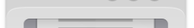
I know I am nitpicking, but usually printers have a very thin border there
clobrano
on 30 Dec 2018
I like it @ubuntujaggers but isn't there something odd about the perspective/angle?
I'm not sure if it's the same thing as @clobrano is referring to. The small icons looks perfect, but the large icon looks like I'm looking down on the printer. Does this make sense?
madsrh
on 31 Dec 2018
I like it @ubuntujaggers but isn't there something odd about the perspective/angle?
I'm not sure if it's the same thing as @clobrano is referring to. The small icons looks perfect, but the large icon looks like I'm looking down on the printer. Does this make sense?
Yes there is :) Not sure why it looks okay in the smaller 48px but not the full size one... but I agree with you, the biggest one looks odd 🤔
Okay, I've tried three things. No. 1 is making the top edge of the "mouth" thinner as per @clobrano's suggestion:
No. 2 is making the top highlight on the mouth less pronounced in the largest size, which might make the (odd) perspective jump out less:
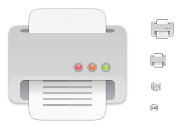
No. 3 is my least favourite - I actually tried to go along with the suggested perspective a bit more, but I don't think the result is very Suru, and I think the foreshortening would probably have to be more pronounced for it to look right (also, it makes the flat lights look weird because they aren't drawn from the same angle):
Out of the three, my favourite is the middle one (no. 2), but I'll keep playing with the svg and see what I can achieve, comments welcome as always! :)
ubuntujaggers
on 31 Dec 2018
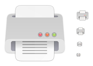
I'd prefer the 2) one
Feichtmeier
on 31 Dec 2018
I agree, #2 looks better for me as well
On Mon, 31 Dec 2018, 11:16 Feichtmeier <[email protected] wrote:
I'd prefer the 2) one
—
You are receiving this because you were mentioned.
Reply to this email directly, view it on GitHub
https://github.com/ubuntu/yaru/issues/1057#issuecomment-450628957, or mute
the thread
https://github.com/notifications/unsubscribe-auth/ACwAHvU71S_ny3w6CgYtRL0WaFcFuOMdks5u-eQYgaJpZM4ZfLxf
.
clobrano
on 31 Dec 2018
Magic, I'll push as soon as I'm on my main laptop 👍
ubuntujaggers
on 31 Dec 2018
I need to make some symlinks t make it work
Feichtmeier
on 1 Jan 2019
You can close this issue.
 eaglersdeveloper
on 3 Jan 2019
eaglersdeveloper
on 3 Jan 2019
Related issues
Feichtmeier
·
3Comments
 sicklylife-jp
·
3Comments
sicklylife-jp
·
3Comments
 mivoligo
·
3Comments
Feichtmeier
·
3Comments
madsrh
·
3Comments
mivoligo
·
3Comments
Feichtmeier
·
3Comments
madsrh
·
3Comments
Most helpful comment
??