Yaru: Inconsistent darkening of selection vs. focus rings in dark theme
yaru-theme-* 18.10.4, Ubuntu Cosmic
The text selection color scheme is very different on a light background (black text, #bfebfa highlight) than on a dark background (white text, #0f95c5 highlight).
The wiki spells out that the blue is deliberate: “We landed on a light version of the blue that we already used for sliders and progress-bars - similar to Unity 8. One of the advantages of using a very light color is that the text color doesn't change when selected. For the dark theme, we translated this to a slight darker blue with dark text.”
(Either that’s supposed to say “slightly darker blue with _white_ text”, or the white text is a bug.)
However, the focus ring is exactly the same orange (#e95420) in light and dark themes. Since text field focus and text selection are very often seen together, this looks inconsistent.
Either the text selection colors should be identical too, or the focus ring color should darken in the same way and by the same amount.
[[Originally reported in the Yaru forum](https://discourse.ubuntu.com/t/call-for-participation-an-ubuntu-default-theme-lead-by-the-community/1545/1750).]
 matthewpaulthomas
All 7 comments
Orange on dark base colour has a better contrast than the light blue on the dark base colour. Thus I don't think this logic can be applied on the text selection.
Working with dark background colours comes in with some trades.
We even flipped the contrasts on some elements and the dark theme becomes even darker in the background but the light theme becomes lighter. These are just examples to show that you can not have the same logic applied on dark and light.
Even if it might look like inconsistencies, in fact they aren't.
But we need to update the wiki. We did a ton of changes after the last wiki update
 Feichtmeier
on 21 Sep 2018
Feichtmeier
on 21 Sep 2018
I agree that orange has better contrast than the light blue. However, I don’t think that necessarily means “and therefore it shouldn’t change in the dark theme”. If that was the logic, then we wouldn’t have a dark theme at all, because the light theme has better contrast. :wink:
The final work that Canonical’s design team did, in January 2017, on the colours for Ubuntu Touch before it was retired involved using blue for focus rings:


The Vanilla form controls used on most Ubuntu Web sites are descended from that work, and use blue for focus too:

So, I’m a little surprised that an Ubuntu-Touch-inspired theme is using orange for focus at all. But if it is, then maybe it could get darker in the dark theme, just like the selection highlight does.
matthewpaulthomas
on 21 Sep 2018
I can't say that I don't like the blue focus ring.
Which colours do you propose for the focus rings for the light and the dark theme? We could test it at least with that awesome snap branches or branch snaps :)
I am really -1 for the text colour changes as the current colours for dark and light fit pretty good, have a good contrast and great usability. We will update the wiki as you suggested
Feichtmeier
on 21 Sep 2018
I am really -1 for the text colour changes as the current colours for dark and light fit pretty good, have a good contrast and great usability.
+1
For the focus ring I'll say TRANSPARENT :smiley_cat:
 Paz-it
on 21 Sep 2018
Paz-it
on 21 Sep 2018
So, I’m a little surprised that an Ubuntu-Touch-inspired theme is using orange for focus at all.
This is because the guidelines of Unity8 suggested orange as selection color, and we saw focus ring as a selection in fact.
Not sure however how the blue selection ring would fit in a dark theme, being a very thin element, I am afraid it would be lost in the background
 clobrano
on 22 Sep 2018
clobrano
on 22 Sep 2018
However, the focus ring is exactly the same orange (#e95420) in light and dark themes. Since text field focus and text selection are very often seen together, this looks inconsistent.
I am not really convinced by this point. The blue selection changed because the original one did not have a good contrast with a dark background, while the orange color is not affected by this problem.
Moreover, this orange color is the same for many other elements (basically all the selections). For consistency, should we change the orange everywhere in the dark variant?
The alternatives might be
- use the dark text selection in light variant as well (we tried, and it doesn't look as good)
- use blue focus ring (it doesn't look good in dark variant, though)
clobrano
on 11 Oct 2018
As @clobrano said we iterated over several possibilities to provide maximum consistency in the light and the dark version.
We use a dark headerbar on a light window and this makes things even more complicated.
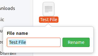
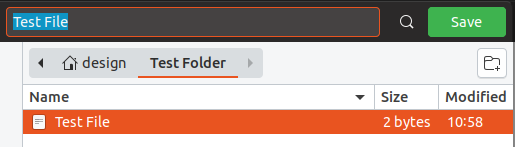
For example in your picture of the filechoser there is an text-entry in the dark headerbar. But the theme is actually light. So differentiating between the $light and $dark variant has its limits.
Carlo basically said what already happened and why the text selection is different in the dark theme, I can't add anything to this really. We tried many things and this was the best from our perspective. Doesn't mean that there are no better alternatives, ofc!
This issue is a bit overblown in my opinion that could also be the reason why I always need to re-read your two focusring issues again @matthewpaulthomas
But to break it down there are two topics...
1) text selection
We have a veeeery long text selection part 1 and part 2 issue somewhere here. But we could surely open a third one or stick with this here, since reading through all that stuff might be a bit time consuming (but then maybe we should change the main topic of this issue?)
The light blue in the dark theme just does not work. The dark background somehow shines through the text and it looks milky. So I could imagine that we could use the same darker blue with the inverted text color also for the light text selection. This comes into my mind right now.
2) The focus ring/highlight
I think that the blue text with the orange focus ring were always problematic and I think carlo and @madsrh agree here as far as I remember. However orange text selection becomes really awful when much text is selected and we end up with just too much orange in the theme (no I won't link NusiNusis issue ;) )
So the solution here might be to use a blue selection ring as well. But since the other issue is also about focus rings, I would say that we make should first try out the solid, blue focus ring, and if it works come back to the text selection and see if it is still such an issue. (?) Or vice versa ?
Feichtmeier
on 15 Nov 2018
Related issues
 pojntfx
·
3Comments
pojntfx
·
3Comments
 YamiYukiSenpai
·
3Comments
YamiYukiSenpai
·
3Comments
 8none1
·
3Comments
8none1
·
3Comments
 eaglersdeveloper
·
3Comments
matthewpaulthomas
·
3Comments
eaglersdeveloper
·
3Comments
matthewpaulthomas
·
3Comments
Most helpful comment
I am not really convinced by this point. The blue selection changed because the original one did not have a good contrast with a dark background, while the orange color is not affected by this problem.
Moreover, this orange color is the same for many other elements (basically all the selections). For consistency, should we change the orange everywhere in the dark variant?
The alternatives might be