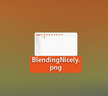
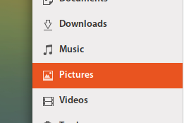
Yaru: fonts-shadow on selected vs. no-shdow
fonts-shadow :

no-shadow :

IMO, better with shadow on selected but also inconsistency.
I apologize in advance if I'm repeating a known issue, I find it hard to follow.. :)
All 7 comments
Hi @Paz-it, this is probably a new topic :smile:
One question, is there a place where we use shadow, or is it just a mockup?
Hi @clobrano ..No mockup here -- The one with shadow is a selected screenshot on the desktop.
For consistency, I think better without shadow
Edit: I just saw that fonts on desktop always have a shadow. I understand it might be a difference with other widgets, but since wallpaper can be both bright and dark, this text shadow is really needed.
So, to me is a won't fix
@madsrh, @godlyranchdressing, @Feichtmeier what do you think?
Nicely spotted @Paz-it, but I think I agree with the @clobrano above.
+1 for leaving things as they are. Some might say that desktop icons are a thing of the past 😜
Hi @madsrh ! My example was to show the font-shadow on selected. it looks much better IMHO.
Icons on desktop is from a different opera :)))
@Paz-it I understood the point, I just said that no font-shadow was a decision we made for other widgets as well, since it goes against the flat theme.
I understand, thanks @clobrano .