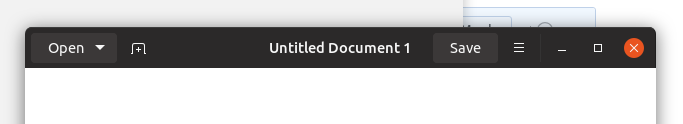
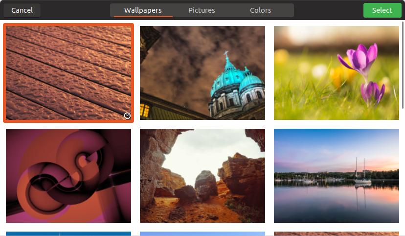
Yaru: Maybe headerbar text buttons shouldn't be flat?
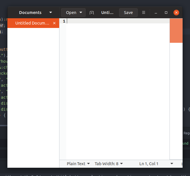
This is the last time I'll bring this up. If we reach a consensus I'll drop it forever but I'm not a fan of the border around text buttons. I get the need for it, but it looks like something went wrong. So what if we excluded text buttons from being flat? In the mockup I used $hb_pathbar_bg to have them look consistent with the pathbar/stackswitcher buttons.
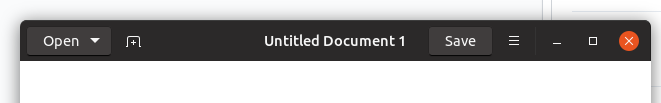
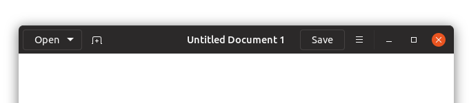
Compared to the current:
 godlyranchdressing
All 33 comments
Yes +1 I suggested this a long time ago
 madsrh
on 23 May 2018
madsrh
on 23 May 2018
Isn't the contrast between text-btns and image btns a bit harsh then?
What about using the border we have for text-btns for every btn instead?
Like a flat version of adwaita
(this is adwaita - imagine it flat)

 Feichtmeier
on 23 May 2018
Feichtmeier
on 23 May 2018
Sorry, I was a little too fast on the reply button.
I do think a solid background would be better than just a border.
I do agree with @Feichtmeier that this should apply to image-buttons as well.
I thought this was what you were suggesting @godlyranchdressing
I'll stop commenting until I have time to read what's actually being suggested 😆
madsrh
on 23 May 2018
I thought this was what you were suggesting @godlyranchdressing
oops, I think I miss that at the end, +1 for it
I worrie that having only text-buttons 3d will make the user think that image-buttons are not buttons
 clobrano
on 23 May 2018
clobrano
on 23 May 2018
I'm with you about it @clobrano ! Make them all flat 3d...Lets squire the circle!!! :))
I think @Feichtmeier is right in the middle. I tend to agree with him about it.
Another mockup maybe will help to clarify.
 Paz-it
on 23 May 2018
Paz-it
on 23 May 2018
:D to be clear, I prefer them flat
clobrano
on 23 May 2018
Flatter suggestion, basically this but with a border:
.text-button:not(.suggested-action):not(.destructive-action) {
    @each $state, $t in (all the buttons) {
        &#{$state} { @include button($t, $hb_pathbar_bg, $tc, $flat:true); border: 1px solid _border_color($hb_pathbar_bg) }
    }
}
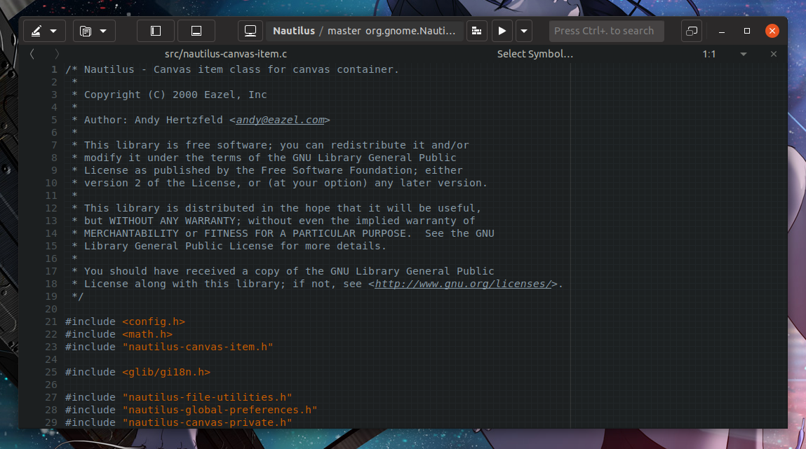
Also another example since the combination of buttons in Gedit (which IIRC was what prompted the decision to add the border?) is a little odd. The headerbar doesn't look that cluttered with every app:
godlyranchdressing
on 23 May 2018
My opinion is that these black borders give some kind of 3D effect as well, so I would prefer totally flat, since all the rest of buttons are flat
clobrano
on 25 May 2018
My opinion is that these black borders give some kind of 3D effect as well, so I would prefer totally flat, since all the rest of buttons are flat
+1
@godlyranchdressing is it because you want them to match the GDM buttons?
madsrh
on 25 May 2018
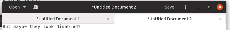
@madsrh not really, I only use borders because without them, the buttons look like they're in a currently focused state but that could just be me:
godlyranchdressing
on 25 May 2018
Maybe it's because I've been starring on the current btns for too long - but this ^ looks like the btns are toggled/pressed.
Feichtmeier
on 25 May 2018
Looks so much better! I really hope it changes to this
 DragoCubed
on 14 Jun 2018
DragoCubed
on 14 Jun 2018
@Feichtmeier yeah, I agree. That's why I put the borders. @madsrh?
Alternatively, we can make the button text color for headerbar buttons just a little darker.
Or have the title text darker and the button text lighter (but then would that make the title look like a disabled button?).
godlyranchdressing
on 14 Jun 2018
You're back @godlyranchdressing! 🎉 😄
I'm not sure what to think about this. Can I sit this one out? 😆
madsrh
on 14 Jun 2018
He's back! :clinking_glasses:
Yet, I am really not a fan of this. I would rather leave it as it is. :crying_cat_face: I think the headerbar is very beautiful as it is.
Feichtmeier
on 14 Jun 2018
There is one big advantage of the current solution: when the headerbar becomes crouded by icons that thing stays clean and easy for the eye. With a border or a background everyone becomes "busy" very fast
Border:
Border with bg:

Current master:
Border:
Border with bg:
Current master:
Sorry but the current solution looks a) the cleanest b) the easiest for the eye and c) the most elegant (that word again!) in my opinion
Feichtmeier
on 15 Jun 2018
Those aren't text buttons like I'm proposing. I can't think of any GTK3 app off the top of my head where it gets that crowded with _text buttons_.
The border to me looks a little bit like a focus state, like when you press tab and a button gets keyboard focus.
godlyranchdressing
on 15 Jun 2018
Hey @godlyranchdressing!
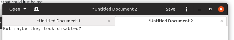
I am afraid that in both cases, the element could look disabled
clobrano
on 15 Jun 2018
edit: sorry @godlyranchdressing . I re-read this again. Too many issues in the past weeks I have become a bit dizzy.
As you correctly mentioned in the opening post, text-buttons have a border. In the headerbar
    .text-button:not(.suggested-action):not(:hover) {
      border-color: $hb_button_bg_hover;
    }
While icon buttons don't have a border. I've posted pictures showing how buttons would look if all of them have borders and or a background.
Now let's look at what you actually suggested, if we play around with text-buttons in the headerbar:
I think this could look okish when there are only text-buttons. But it looks weird when there are both text and icon buttons :thinking: This also looks like the buttons are a bit pressed.
No matter what I come up with always one think looks strange. The best I've found (if I exclude the current version which is my personal clear fav) is light border on all buttons . Mixing the buttons styles even further than the current master, makes it only weirder.
Feichtmeier
on 15 Jun 2018
Yes, but you can also argue that the border makes the button look like it's focused on.
The one place where this really sticks out to me is in the save dialog:
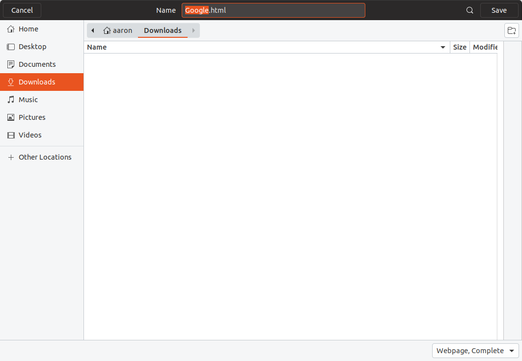
Compared to:
Also, both GNOME Builder and Gedit are iffy examples because they're two of the very few apps that have a mixture of both text and image buttons. The most common look would be the following where there's just one text button to the far left and one to the far right:

I think the keyboard focus look of the border gets even more prominent when one of the buttons is a suggested/destructive action.
But with the loss of the button's bottom highlight the dark buttons don't stick out much against the headerbar anyway so :man_shrugging: .
Also, hellos to everyone.
godlyranchdressing
on 15 Jun 2018
The shadow is back since today. I think my problem is that the stack switcher is light and pressed buttons are light. Therefore my brain can't understand that the lightness should indicate something different on text buttons. In the dark theme I tried the solution to darken the pressed buttons.
Feichtmeier
on 15 Jun 2018
Yes, but you can also argue that the border makes the button look like it's focused on.
I am not sure to understand. Our standard hover effect is a change in color, so the solution you're proposing should look even more on focus than the borders.
clobrano
on 15 Jun 2018
@clobrano currently, text buttons have a border to indicate that it's there and to make it look different from window titles, but by giving it a border, the button can be mistaken for a _flat text button having keyboard focus_. By making it look like a regular, non-flat button like I'm proposing, it'll look like a regular dark button.
godlyranchdressing
on 16 Jun 2018
I understand now, I wasn't thinking about keyboard focus. However the selection ring is orange, I'm not sure there would be any problem
clobrano
on 16 Jun 2018
How we would like to proceed with this? I think there is some kind of general agreement in favor of current headerbar buttons, isn't it @Feichtmeier, @madsrh?
If that so I think we can close this (which is silent since more than a month now)
clobrano
on 25 Jul 2018
This is another "I won't sleep over it" issue, but should I just make a PR and we can test and provide feedback? It'll look like this.
godlyranchdressing
on 26 Jul 2018
I am not a big fan of these leveled up buttons. I would say the the header bar and the flat buttons are already a real unique selling proposition of yaru. This is my honest opinion about that
Feichtmeier
on 26 Jul 2018
I am with @Feichtmeier. Probably flat headerbar button is the only thing we agreed upon since the beginning
clobrano
on 26 Jul 2018
_I like the buttons flat too_, but the border doesn't look that good to me, sorry. I like the dimmed buttons a lot after using it for a while, hopefully it can be a compromise, but if we stick to the current style then :man_shrugging:
godlyranchdressing
on 27 Jul 2018
No need to be sorry, maybe I am too accustomed now to current headerbar text-buttons. The idea is just to make them less visible possible, but since they're just text, which a little indication of their presence. I feel that changing background color or shadow box is less effective for this
clobrano
on 27 Jul 2018
Just noted that these buttons will look like the current toggled image-buttons
clobrano
on 27 Jul 2018
@godlyranchdressing made another PR as a solution for this missmatch, but I am still torn :)
Feichtmeier
on 6 Aug 2018
Since we tried almost all possible solutions and still think the current one is the best of which we've tried yet, can we close this issue?
Feichtmeier
on 26 Aug 2018
Related issues
 YamiYukiSenpai
·
3Comments
YamiYukiSenpai
·
3Comments
 CDrummond
·
3Comments
CDrummond
·
3Comments
 chrisjbillington
·
3Comments
madsrh
·
3Comments
Feichtmeier
·
3Comments
chrisjbillington
·
3Comments
madsrh
·
3Comments
Feichtmeier
·
3Comments
Most helpful comment
Isn't the contrast between text-btns and image btns a bit harsh then?

What about using the border we have for text-btns for every btn instead?
Like a flat version of adwaita
(this is adwaita - imagine it flat)