Yaru: Suggested action button active/pressed could use a different solution
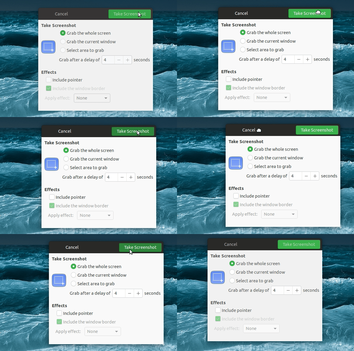
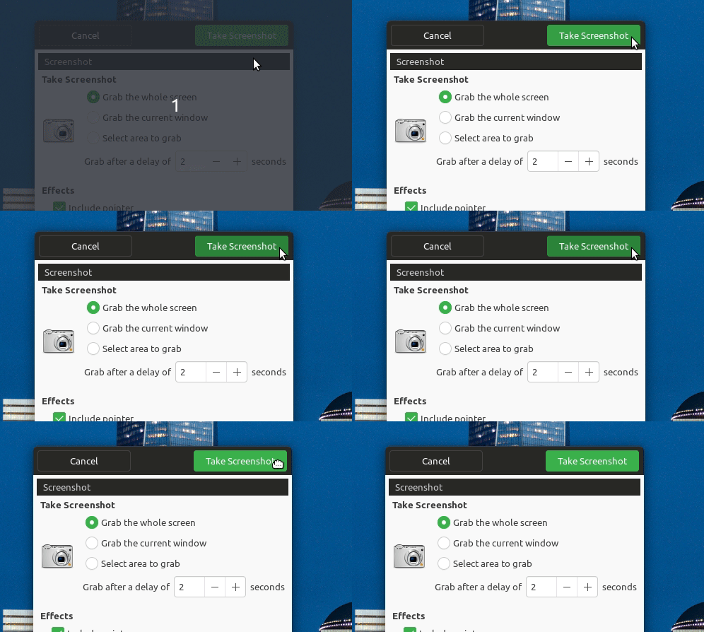
When pressed the button looks almost like it's cut off at the top border.
Edit: maybe this could be an opportunity to review the pressed buttons in header bars once more. I believe the black shadow at the top is a tiny tiny tiny bit too black:
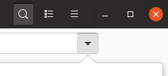
(
All 13 comments
Slightly unrelated: any chance the Cancel button could get the light border too? Or is that an application specific patch which we agreed to avoid?
Like here: https://github.com/ubuntu/gtk-communitheme/commit/3314291dd32e8821091f780da350cadb67adfbd5
@madsrh the cancel button has a border now, maybe I had the wrong branch when taking this gif
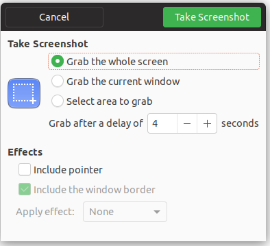
Probably the effect on suggested action is just that it uses the same style as black buttons, while it can be improved using a darker green color instead like in selection-mode
Maybe like you did it in the selection header of gnome-music etc:
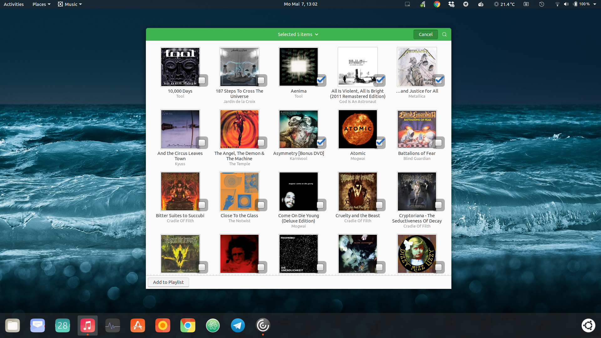
@clobrano if you fix this someday, I've one more thing that could fit that PR:

There is a little "glitch" in the "corner" if this squircly slider edge

I believe this is also the result of the dark box-shadow at the top
@Feichtmeier the glitch is probably something we can't do anything about it. I even tried with no radius and still persisted.
About the original issue of this ticket, the effect is due to the background behind the switch. Normal switches and also the ones in selection-mode have a bright background, so the shadow is clearly a shadow in fact. This one has a headerbar, which is darker than the shadow and creates this weird effect. I tried multiple solutions and the current one is actually the best I've found
Okay. Could you point me to the code?
Which one? Switch or suggested buttons?
Both, both have that hard shadow at the top (or background)


I've lightened up the active header bar btns by 5%
And lightened up the active suggested action btns by 5%
Is that okay for you @clobrano ?
```
border-top-color: darken($_border, if($c == $headerbar_bg_color or $c == $button_bg_color, 15%, 12%));
@if $c == $success_color { border-top-color: darken($_border, 7%); }
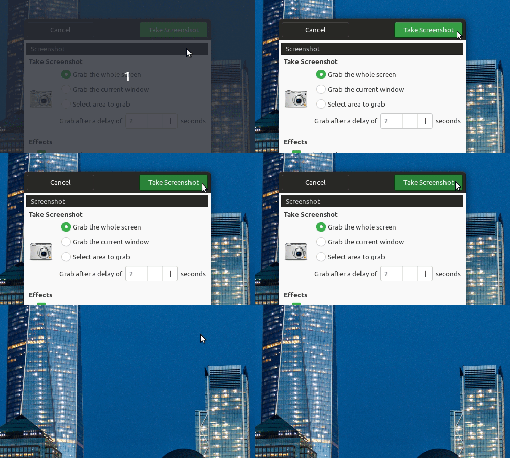
Sorry @Feichtmeier, but I don't see the improvement :thinking:
Before
After
@clobrano haha you are right. Need to try again later
@clobrano I've reduced this a bit with the darktheme. So it's basically fixed :)