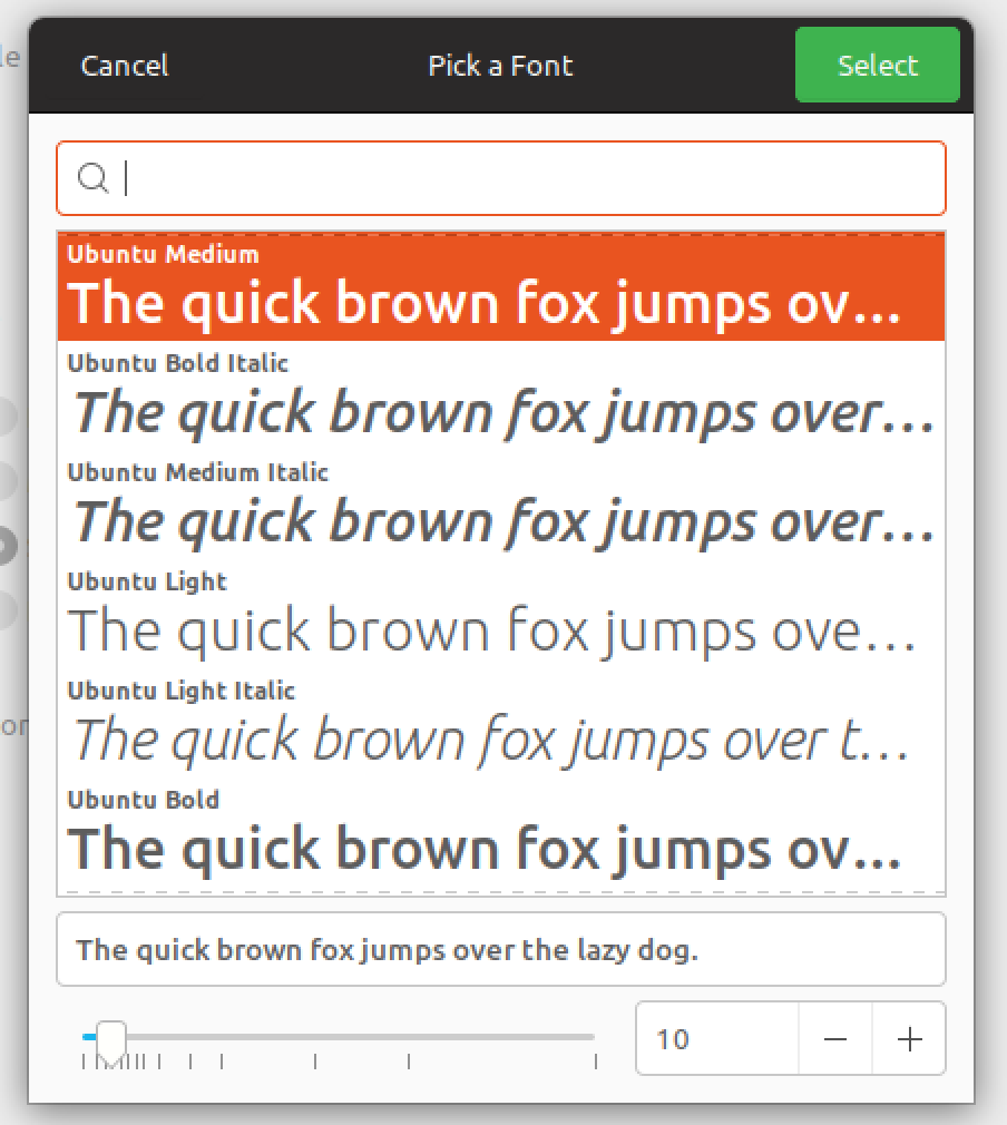
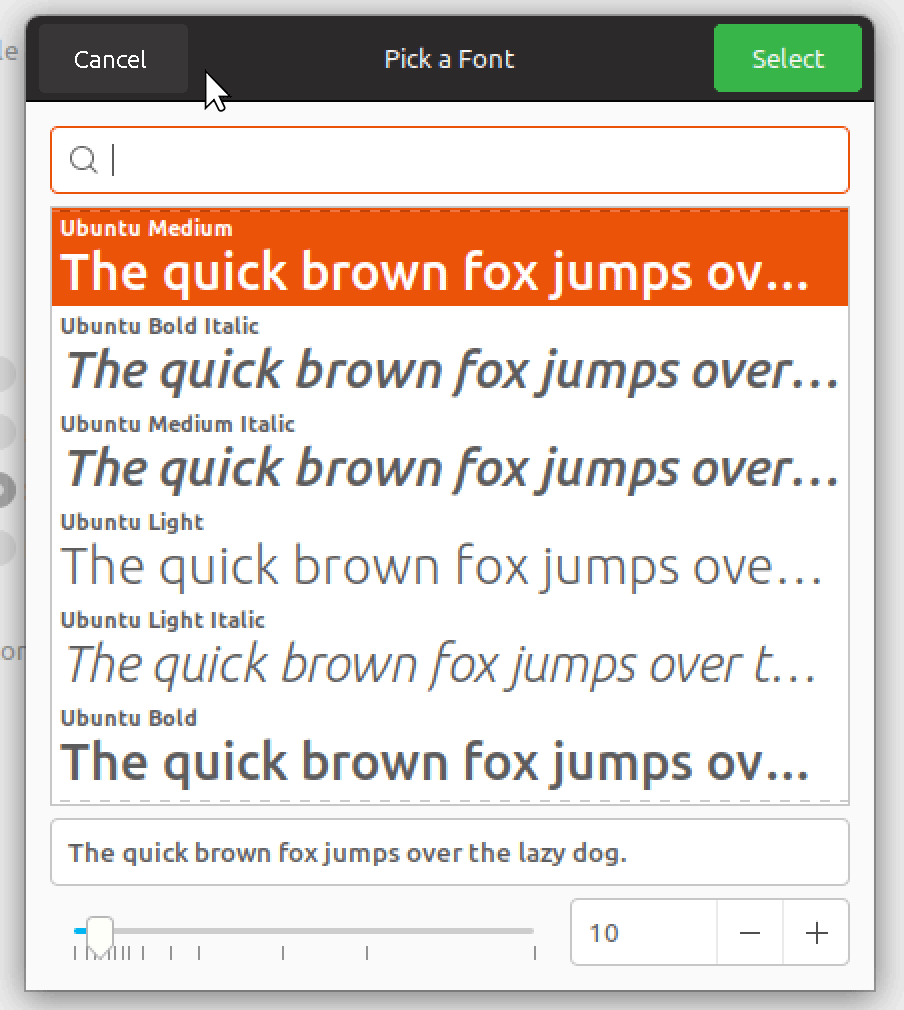
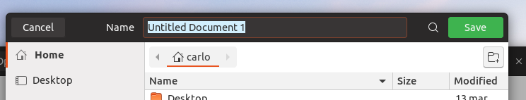
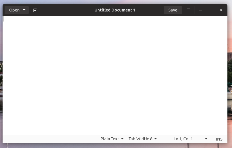
Please, set save and open dialog header button's color to green (Open, Save) and gray (Cancel) because it's not easy to find the only text buttons.
 makayjozsef
All 16 comments
+1 to give more visual guidance on how the cancel operation and to balance with green select button on the right.
 ya-d
on 12 Feb 2018
ya-d
on 12 Feb 2018
@makayjozsef, @ya-d could you please suggest me an application where the button is not of the expected type? Some time ago, SimpleScan was one of them, but I saw now that it's "Scan" button is green now
 clobrano
on 13 Feb 2018
clobrano
on 13 Feb 2018
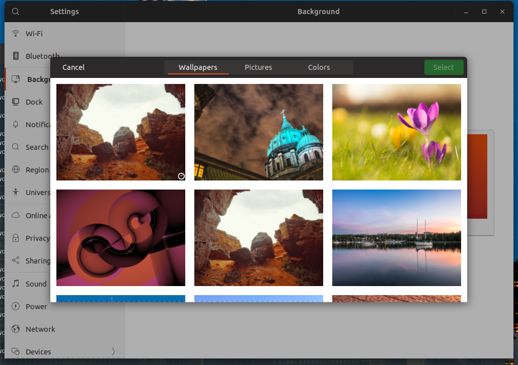
E.g. Settings > Backgrounds > Wallpaper; change font settings in Tweaks; or any Open dialogues.
Not unexpected type though. Those dialogues use a green action button in top right corner while Cancel in top left corner is plain text and not easily recognizable. Always showing the hover background for those buttons might help.
ya-d
on 13 Feb 2018
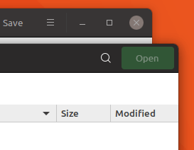
@clobrano For example: Gedit, Google Chrome, Transmission-gtk
Furthermore...
there are ugly gray shadows under window buttons at some software (Totem, eog) I don't know why.
The launcher's background color is an interesting animal too. Why is this lighter than the top panel? Use same gray color and make them an unified panel area.
The GTK menus' horizontal separator lines are black, but the maximized windows have a gray separator with the top panel. So there are mixed black and gray separator lines on the Gimp window. Just use only the gray separator everywhere.
The way is very good, but please stay with a simple, flat look and don't overdesign it.
makayjozsef
on 13 Feb 2018
@makayjozsef, @ya-d first of all, thank you for taking time to test and report this issue and the others, really appreciated.
there are ugly gray shadows under window buttons at some software (Totem, eog) I don't know why:
This is issue #158, the PR is ready
The launcher's background color is an interesting animal too. Why is this lighter than the top panel? Use same gray color and make them an unified panel area.
This is related to gnome-shell-communitheme, I'd open a ticket there, but the top panel is already under review so, this fix will come anyway
The GTK menus' horizontal separator lines are black, but the maximized windows have a gray separator with the top panel.
The best solution is to get rid of the menu separator line IMHO, since it should look more similar to headerbar, but it's a Mutter thing, not theming -> issue #16
Please, set save and open dialog header button's color to green (Open, Save) and gray (Cancel) because it's not easy to find the only text buttons.
The buttons you see green or red are styled (by the application developer, not in the theme) as "suggested-action" or "destructive-action". Those special buttons are then colored green or red by Gtk-Communitheme.
The buttons you are talking about, instead, are not designed by the application developer to be suggested nor destructive, so they do not get any special color.
Current design guideline is to have a clean and flat look, so normal buttons (e.g. text-button) do not have any background color, unless the user interacts with them (overing the mouse, clicking on it, etc.).
That said, I'm going to add the "design" label to this ticket, so that the designers can evaluate the request of having a
+1 to give more visual guidance on how the cancel operation and to balance with green select button on the right.
however, consider that there is no way for us to understand if a button is a "cancel" or "open" one, so ALL the text-button will have a brighter background if we decide to change this
clobrano
on 14 Feb 2018
however, consider that there is no way for us to understand if a button is a "cancel" or "open" one, so ALL the text-button will have a brighter background if we decide to change this
Thanks for clarification. I would give it a try with borders/background on text buttons because I find it challenging to understand those are buttons (see #127). But I see this might lead to other design issues in contrast to other buttons. So lets first wait if bold titles already help with that issue.
ya-d
on 14 Feb 2018
The reason to use the flat look with no background or border, was to achieve a clean and modern look. However I have to add my own +1 for this issue.
@clobrano Can we try to use the hover color at 50% or maybe even 33% opacity ?
This might look cluttered if there's many buttons, but we'll have to try it for a while. Any objections @luxamman ?
I would also suggest changing the disabled state color of suggested-action / destructive-action the same way (darker). The current disabled buttons steals too much attention IMO. Here it's 33%
 madsrh
on 25 Feb 2018
madsrh
on 25 Feb 2018
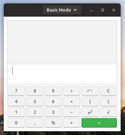
I was searching for other text-based buttons in the current system, found them in "ToDo", "Calculator", and in your example of open/save/select dialog. Seems that text-based buttons in the headerbar are not too common.
So I think this is a good way to go, also to prevent confusion - event if the overall flat-design is a little disturbed, but we also do that when using the green button for ok/open/select.
So we only adjust them to each other and in that case, I would not make the button too strong, but also not too light to be visually present in the dialogs, and not too present in other applications - because they are based on the same color, @clobrano said.
Again adjustment-fun - and watch out for the contrast^^
 Luxamman
on 26 Feb 2018
Luxamman
on 26 Feb 2018
@clobrano @nana-4
I am so confused about all those different button PR's and issues. Could you guys look over the issues and see if some of those are already fixed and close them? :grinning:
 Feichtmeier
on 20 Apr 2018
Feichtmeier
on 20 Apr 2018
Also, currently with the save button, only the text color changes when it is deactive/active - the button background should change too like the mockup above (IMO)
madsrh
on 21 Apr 2018
@clobrano Sorry for asking this again, but just to be clear:
We can't add a background only to the _Cancel_ button without affecting other headerbar buttons? If possible, I would like to try the 33% opacity of the hover background color for the cancel button (like above)
Changing the button background for "suggested-action" and "destructive-action" is possible, but we can't change the text color? Again, like above if it's possible.
madsrh
on 24 Apr 2018
We can't add a background only to the Cancel button without affecting other headerbar buttons?
We can only distinguish between text-button and image-button, but it might be not enough, since some applications (like Gnome Todo) don't style their button with text as "text-button"
Here is text-button with background 33% of the hover color
however, as said, Todo doesn't work
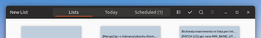
- "New list" button is a simple "button popup", so to make it bright, we should affect any other button
Moreover, I'm not too convinced for situations like gedit
Why "Save" button should be different than the toggle button on its right side?
clobrano
on 24 Apr 2018
@clobrano I absolutely agree. This fix was only for the save dialog (as comment #1 said) and looks cluttered if it's everywhere. But if the Cancel button in the save dialog doesn't have a specific ID to target, we can't change only that button 😞
How about the disabled state like below? do you need a hex/rgb value or can you simply use 33% opacity here too?

A MUCH better solution IMO would be to remove the buttons from the headerbar. I actually have reported it as a bug 😆
madsrh
on 24 Apr 2018
I wonder now if I the picture above (only with cancel and open) is a modal window. In that case I can try to limit the scope of bright button background.
How about the disabled state like below? do you need a hex/rgb value or can you simply use 33% opacity here too?
working on it
clobrano
on 24 Apr 2018
This is 20% darker, what do you think?
clobrano
on 24 Apr 2018
@clobrano it looks good - a huge improvement.
What I don't like (and this is not your fault) is that the green button is still the one grabbing my attention, when in fact it's deactivated and the Cancel button is active :thinking:
Anyway, the deactivated green button now looks deactivated compared to the active green button.
madsrh
on 24 Apr 2018
Related issues
 snydox
·
3Comments
snydox
·
3Comments
 pojntfx
·
3Comments
Feichtmeier
·
3Comments
Feichtmeier
·
3Comments
pojntfx
·
3Comments
Feichtmeier
·
3Comments
Feichtmeier
·
3Comments
 Muqtxdir
·
3Comments
Muqtxdir
·
3Comments
Most helpful comment
This is 20% darker, what do you think?