Xamarincommunitytoolkit: [Spec] TabView
TabView
We can have tabs using Shell. However, what happens if we want to have nested tabs within a specific section (Example: Grid)?, _what if we want to fully customize each tab?_. In these cases, we would need a Custom Renderer so far...
The TabView is a way to display a set of tabs and their respective content. TabView is useful for displaying several content while giving a user the capability to customize mostly everything.

NOTE: TabView is a cross-platform view that takes over when native tabs hit their limits, such as positioning with layouts, styling, and non-uniform styling like a raised button.
API
Next, a list with the TabView properties, events and visualstates.
Properties
TabView Properties
| Property | Type | Description |
|----------|:-------------:|:-------------:|
| TabItemsSource | IEnumerable | A collection used to generate the TabView's tab items. |
| TabViewItemDataTemplate | DataTemplate | the template the Tab View uses to generate tab items' header. |
| TabContentDataTemplate | DataTemplate | The template the Tab View uses to generate tab items' content. |
| IsCyclical | Bool | Enable or disable cyclical tabs navigation. |
| IsLazy | Bool | Enable or disable lazy tabs loading. |
| SelectedIndex | Int | Gets or sets the currently selected tab. Default is 0. |
| TabStripPlacement | TabStripPlacement | The TabStrip placement (top or bottom). |
| TabStripBackground | Brush | The TabStrip background. |
| TabIndicatorBrush | Brush | The TabIndicator background. |
| TabIndicatorHeight | double | The TabIndicator height. |
| TabIndicatorWidth | double | The TabIndicator width. |
| TabIndicatorPlacement | TabIndicatorPlacement | |
| TabIndicatorView | View | The TabIndicator content. |
| TabContentBackground | Brush | The tab content background. |
| TabContentHeight | Double | The tab content height. |
| TabStripHeight | Double | The TabStrip height. |
| TabContentHeight | Double | The tab content height. |
| HasTabStripShadow | Bool | Show or hide the TabStrip shadow effect. |
| IsTabTransitionEnabled | Bool | Enable or disable the transition between tabs. |
| IsSwipeEnabled | Bool | Enable or disable the swipe gesture. |
TabViewItem Properties
| Property | Type | Description |
|----------|:-------------:|:-------------:|
| Text | String | The text of the tab. |
| TextColor | Color | The text color of the tab. |
| TextColorSelected | Color | The text color of the selected tab. |
| FontSize | FontSize | The font size used in the tab text. |
| FontSizeSelected | FontSize | The font size used in the selected tab. |
| FontFamily | String | The font family used in the tab. |
| FontFamilySelected | String | The font family used in the selected tab. |
| FontAttributes | FontAttributes | The font attributes used in the tab. |
| FontAttributesSelected | FontAttributes | The font attributes used in the selected tab. |
| Icon | ImageSource | The icon of the tab. |
| IconSelected | ImageSource | The ImageSource used as icon in the selected tab. |
| Content | View | The content of the tab. Is View, can use anything as content. |
| BadgeText | Bool | The badge text used in the tab. |
| BadgeTextColor | Color | The badge text color used in the tab. |
| BadgeTextColorSelected | Color | The badge text color used in the selected tab. |
| BadgeBackgroundColor | Color | The badge color used in the tab. |
| BadgeBackgroundColorSelected | Color | The badge color used in the selected tab. |
| IsSelected | Bool | a bool that indicate if the tab is selected or not. |
| TapCommand | ICommand | Command that is executed when the user tap a tab. |
| TapCommandParameter | object | The tap command parameter. |
Events
TabView Events
| Event | Description |
|----------|:-------------:|
| SelectionChanged | Event that is raised when the selected tab changed. |
| Scrolled | Event that is raised when is swiping between tabs. |
TabViewItem Events
| Event | Description |
|----------|:-------------:|
| TabTapped | Event that is raised when the user tap a tab. |
VisualStates
The Visual State Manager (VSM) provides a structured way to make visual changes to the user interface from code.
The VSM introduces the concept of visual states. TabView can have several different visual appearances depending on its underlying state.
TabView have four specific VisualStates:
- CurrentTabVisualState
- NextTabVisualState
- PreviousTabVisualState
- DefaultTabVisualState
Scenarios
Let's see some samples covering common scenarios.
Basic Tabs
Let's see a basic example:
<TabView
    TabStripPlacement="Bottom"
    TabStripBackgroundColor="Blue">
    <TabViewItem
        Icon="triangle.png"
        Text="Tab 1">
        <Grid
            BackgroundColor="Gray">
            <Label
                HorizontalOptions="Center"
                VerticalOptions="Center"
                Text="TabContent1" />
        </Grid>
    </TabViewItem>
    <TabViewItem
        Icon="circle.png"
        Text="Tab 2">
        <Grid>
            <Label
                HorizontalOptions="Center"
                VerticalOptions="Center"
                Text="TabContent2" />
        </Grid>
    </TabViewItem>
</TabView>

TabItemsSource
Using TabItemsSource (dynamic tabs):
<TabView
    TabItemsSource="{Binding Monkeys}"
    TabViewItemDataTemplate="{StaticResource TabViewItemTemplate}"
    TabContentDataTemplate="{StaticResource TabContentTemplate}" />

Custom Tabs
The appearance of each tab can be customized:
<ControlTemplate
    x:Key="TabItemTemplate">
    <Grid>
    ...
    </Grid>
</ControlTemplate>

<TabView>
    <TabViewItem
        Text="Tab 1"
        ControlTemplate="{StaticResource TabItemTemplate}">
    </TabViewItem>
</TabView>

Cyclical Tabs
Do you want to navigate between the tabs cyclically?
<TabView
    IsCyclical="True">
    ...
</TabView>

Lazy Loading
Lazy tab loading:
<TabView
    IsLazy="True">
    ...
</TabView>

Tab Transitions and TabViewItem animations
Can use Xamarin.Forms animations to customize the transition between each tab, animate the tab when appears or disappears, or even animate the badge when appears or disappears.
<TabView>
    <TabView.TabTransition>
        <local:CustomTabTransition />
    </TabView.TabTransition>
    <TabViewItem
        Text="Tab 1">
            <TabViewItem.TabAnimation>
                <local:CustomTabViewItemAnimation />
            </TabViewItem.TabAnimation>
        <Grid
            BackgroundColor="LawnGreen">
            <Label
                HorizontalOptions="Center"
                VerticalOptions="Center"
                Text="TabContent1" />
        </Grid>
    </TabViewItem>
    ...
</TabView>

Using VisualStates
Can use different visual states to customize the current tab, the next tab, etc.
<Grid>
    <VisualStateManager.VisualStateGroups>
        <VisualStateGroup x:Name="TabViewStates">
            <VisualState x:Name="CurrentTab">
                <VisualState.Setters>
                    <Setter Property="Opacity" Value="1" />
                </VisualState.Setters>
            </VisualState>
            <VisualState x:Name="PreviousTab">
                <VisualState.Setters>
                    <Setter Property="Opacity" Value="0.7" />
                </VisualState.Setters>
            </VisualState>
            <VisualState x:Name="NextTab">
                <VisualState.Setters>
                    <Setter Property="Opacity" Value="0.7" />
                </VisualState.Setters>
            </VisualState>
            <VisualState x:Name="DefaultTab">
                <VisualState.Setters>
                    <Setter Property="Opacity" Value="0.9" />
                </VisualState.Setters>
            </VisualState>
        </VisualStateGroup>
    </VisualStateManager.VisualStateGroups>
    <Label Text="{Binding Index}" HorizontalOptions="Center" VerticalOptions="End" />
</Grid>
Create Tabs using C
You can use XAML or C# to create the UI in Xamarin.Forms. Let's see how we would create tabs using C#.
var tabView = new Tabs
{
    TabStripPlacement = TabStripPlacement.Bottom,
    TabStripBackgroundColor = Color.Blue,
    TabStripHeight = 60,
    TabIndicatorColor = Color.Yellow,
    TabContentBackgroundColor = Color.Yellow
};

var tabViewItem1 = new TabViewItem
{
    Icon = "triangle.png",
    Text = "Tab 1",
    TextColor = Color.White,
    TextColorSelected = Color.Yellow,
};

var tabViewItem1Content = new Grid
{
    BackgroundColor = Color.Gray
};

var label1 = new Label
{
    HorizontalOptions = LayoutOptions.Center,
    VerticalOptions = LayoutOptions.Center,
    Text = "TabContent1"
};

tabViewItem1Content.Children.Add(label1);

tabViewItem1.Content = tabViewItem1Content;

tabView.TabItems.Add(tabViewItem1);

var tabViewItem2 = new TabViewItem
{
    Icon = "circle.png",
    Text = "Tab 2",
    TextColor = Color.White,
    TextColorSelected = Color.Yellow
};

var tabViewItem2Content = new Grid
{
    BackgroundColor = Color.OrangeRed
};

var label2 = new Label
{
    HorizontalOptions = LayoutOptions.Center,
    VerticalOptions = LayoutOptions.Center,
    Text = "TabContent2"
};

tabViewItem2Content.Children.Add(label2);

tabViewItem2.Content = tabViewItem2Content;

tabView.TabItems.Add(tabViewItem2);
Using Styles
Can customize the appearance of the tab content, tab strip, tab item, etc. using XAML styles or CSS.
Using XAML:
<Style
    x:Key="TabItemStyle"
    TargetType="TabViewItem">
    <Setter
        Property="FontSize"
        Value="12" />
    <Setter
        Property="TextColor"
        Value="#979797" />
</Style>
Using CSS:
.customTabItem {
    font-size: medium;
    text-color: red;
}
Difficulty : Medium
More information
Based on https://github.com/xamarin/Xamarin.Forms/issues/10773
 jsuarezruiz
All 8 comments
This would be a great and very much needed addition.
Question: Would this spec allow for 'segmented tabs' also:

(Right hand side)
 Tommigun1980
on 27 Oct 2020
Tommigun1980
on 27 Oct 2020
@Tommigun1980 Yes, I will send another Spec. The controls will share some parts, but will be different controls.
jsuarezruiz
on 27 Oct 2020
@Tommigun1980 Yes, I will send another Spec. The controls will share some parts, but will be different controls.
Awesomo!! \ :D /
Tommigun1980
on 27 Oct 2020
@jsuarezruiz will we be able to use these in the appshell.xaml file?
Like just replacing the shell tabs with your custom tabs?
 vniehues
on 5 Nov 2020
vniehues
on 5 Nov 2020
@vniehues You can use it with Shell, but cannot replace Shell tabs with TabView for now. It is something that we are evaluating and could come later. cc @PureWeen
jsuarezruiz
on 6 Nov 2020
@Tommigun1980 You asked about Segmented Tabs:
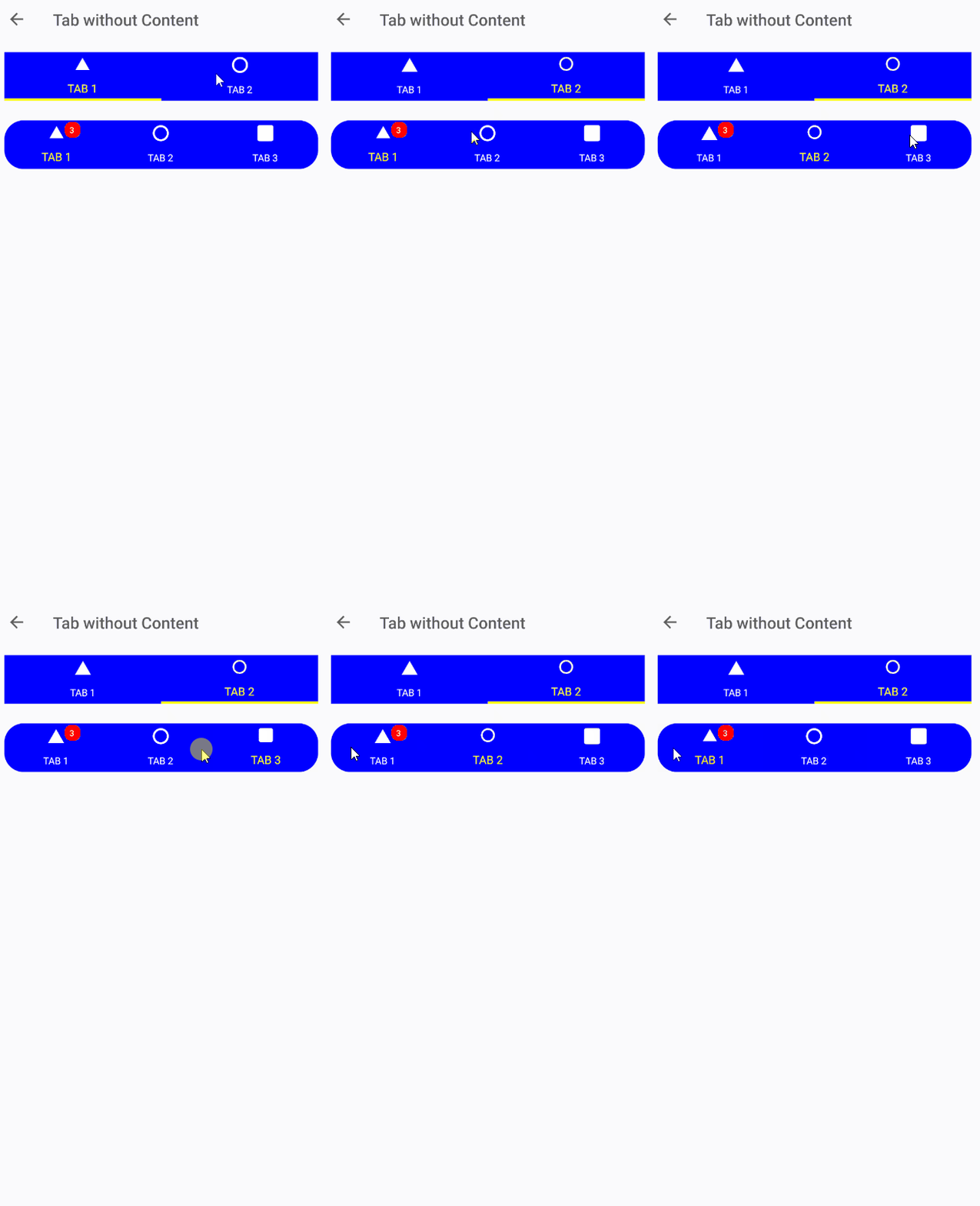
I added a specific sample.
jsuarezruiz
on 6 Nov 2020
Will the lazy load give you the option to keep loaded even when you switch tab (maybe for the future as an enhancement)? So there's no need to load again each time you go back to the previous tab and avoiding possible blinks, slow loads...
 Estevete
on 6 Nov 2020
Estevete
on 6 Nov 2020
@Tommigun1980 You asked about Segmented Tabs:
I added a specific sample.
Thank you. Looking great!
Tommigun1980
on 7 Nov 2020
Related issues
 jBijsterboschNL
·
5Comments
jBijsterboschNL
·
5Comments
 hnabbasi
·
6Comments
hnabbasi
·
6Comments
 varyamereon
·
4Comments
varyamereon
·
4Comments
 jfversluis
·
5Comments
jfversluis
·
4Comments
jfversluis
·
5Comments
jfversluis
·
4Comments
Most helpful comment
@Tommigun1980 Yes, I will send another Spec. The controls will share some parts, but will be different controls.