Www.rust-lang.org: "Get Started" does not convey "install"
Content Bug Report
Page(s) Affected
The home page.
What needs to be fixed?
I've heard from a few people that "get started" sounds like "here's a tutorial", not "here's how you install Rust". In general, it's that "how to install" is not as clear, but this was a specific action item.
Suggested Improvement
I am not 100% sure yet, but I'm thinking about it.
 steveklabnik
All 7 comments
All of that is extremely off-topic. Let's keep it directly about this issue, thanks!
steveklabnik
on 29 Nov 2018
when i originally working on this i thought about 2 buttons? though iirc @aturon wanted to keep the CTAs simple, i.e. only one. very amenable to hearing people's thoughts on iterating on this as i agree with the sentiment!
 ashleygwilliams
on 29 Nov 2018
ashleygwilliams
on 29 Nov 2018
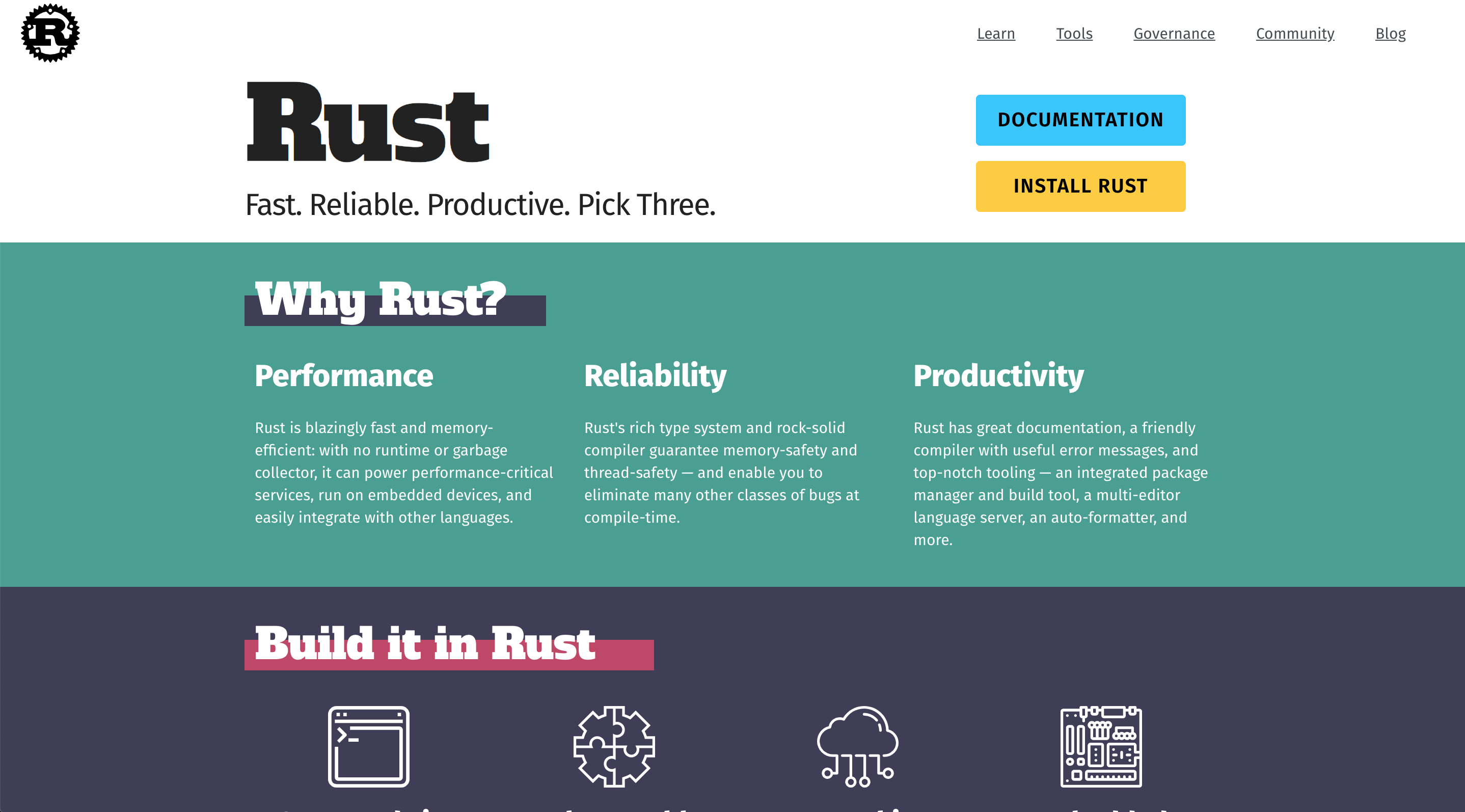
I agree with the idea of two buttons. IMO there are three main things that people who come to the home page might want:
- Install Rust
- Documentation
- Information on what Rust is, why they should be interested, etc.
I suggest we make 1 and 2 CTAs at the top of the page. And put the content for 3 further down the homepage so that it corresponds with the "scroll" action.
Mockup (please ignore other changes, I'm using dev tools to prototype so I can't easily undo the other stuff atm):
 nicoburns
on 29 Nov 2018
nicoburns
on 29 Nov 2018
I agree with this issue and the last proposal is a huge improvement. I was also hoping for some sample code, see #479.
 kolloch
on 30 Nov 2018
kolloch
on 30 Nov 2018
sample code is not in scope, but i am happy to consider the extra button to link to install (in addition to get started). @aturon what are your thoughts?
ashleygwilliams
on 30 Nov 2018
I think with the addition of "Install" to the nav bar, this is no longer needed. And in particular, it's best if we can direct people to the "Get Started" page that walks through first steps in a bit more detail.
 aturon
on 30 Nov 2018
aturon
on 30 Nov 2018
Install is now in the navbar, it could probably be better but it fixes this issue.
 XAMPPRocky
on 3 Feb 2020
XAMPPRocky
on 3 Feb 2020
Related issues
 Manishearth
·
6Comments
Manishearth
·
6Comments
 Zaechus
·
5Comments
Zaechus
·
5Comments
 jhernandis
·
5Comments
jhernandis
·
5Comments
 yoshuawuyts
·
4Comments
ashleygwilliams
·
5Comments
yoshuawuyts
·
4Comments
ashleygwilliams
·
5Comments
Most helpful comment
I agree with the idea of two buttons. IMO there are three main things that people who come to the home page might want:
I suggest we make 1 and 2 CTAs at the top of the page. And put the content for 3 further down the homepage so that it corresponds with the "scroll" action.
Mockup (please ignore other changes, I'm using dev tools to prototype so I can't easily undo the other stuff atm):