Www.rust-lang.org: Too much different colors
Design Feature Request
Summary
When browsing, I felt a bit overwhelmed by the many background color shifts.
There are (bgcolor, fontcolor, fancycolor): (white-black-yellow), (turquoise-white-aubergine), (blue-white-purple), (black-white-yellow), (purple-white-aubergine). Especially the toggeling between dark and light style is irritating.
Motivation
Using less color shifts within a single page or assigning meaning to the colors could lower the mental load experienced when browsing the site.
Unresolved Questions
- Get more feedback about how others feel about this.
 Phaiax
All 15 comments
Yes! +1 to this. Somehow, the site just doesn't feel 'serious' as a result of this. The colors are too bright and the contrast is way too much to scroll down comfortably.
 PayasR
on 29 Nov 2018
PayasR
on 29 Nov 2018
I agree, and frankly the color choices leave me a bit confused because they don't really seem to have a common theme so the entire page looks mighty awkward in my opinion. Would definitely rethink the color palette. The text offset from the background rectangle also looks strange, but maybe that's just me.
 repnop
on 29 Nov 2018
repnop
on 29 Nov 2018
The text offset from rectangle bugs me as well. If there's a box, there should be things _in_ that box maybe?
PayasR
on 29 Nov 2018
It looks _slightly_ better on a mobile layout from a quick view from the developer tools, but along with the font its super jarring and hard to read.
repnop
on 29 Nov 2018
hey! thanks for filing.
at this time we're not looking to remove the colors wholesale from the website. it is true though that some pages may have unfortunate color combinations, and we are open to hearing that feedback! if you could be specific about which pages you'd like to see changed and to what (giving the existing styles for sections)- we'd be very open to working on improving that! thanks :)
 ashleygwilliams
on 29 Nov 2018
ashleygwilliams
on 29 Nov 2018
http://beta.rust-lang.org/ on the main page, the green, pink (... red?), and weirdly light-dark gray don't mesh very well. The black on yellow on white of "Rust in production" (no header links?) is way out of place. The colors in general are too light and don't carry much "weight" to them and feel way too comical with the font. Contribution page suffers from a weird Neopolitan ice cream scheme. There's others but that's my tl;dr basically.
repnop
on 29 Nov 2018
FWIW we've discussed this in the office today and this seemed to be the most glaring issue most of us had with the new site. IMO just using one consistent backdrop would look much better than this, there's just way too much change in contrast.
 jonas-schievink
on 29 Nov 2018
jonas-schievink
on 29 Nov 2018
@jonas-schievink 100% agree
repnop
on 29 Nov 2018
thanks for the feedback. if you'd like to open a PR to reaarange some of the color backdrops on other pages that'd be great and i can give feedback on the PR directly.
as i said previously, wholesale removing the colors is not currently up for discussion. closing this, and will give feedback on specific suggestions in PRs.
ashleygwilliams
on 29 Nov 2018
I think most of the colours are fine, but the parts with the white text on top of pink/purple are pretty hard to read
 TheZoq2
on 29 Nov 2018
TheZoq2
on 29 Nov 2018
@TheZoq2 Yeah, but that's https://github.com/rust-lang/beta.rust-lang.org/issues/408
jonas-schievink
on 29 Nov 2018
I understand this issue is closed, but I did not not want to open another issue when this one is fitting. It also seemed like it was worth posting this before opening a PR. I tweaked these before finding the relevant issues, so the header underline change is more fitting to be discussed in #408, and is not the focus of the following screenshots.
Instead of removing the colors wholesale, we could try reducing the palette to be more in the spirit of the stable website while keeping the wonderful flexibility of the new layout :)
The following uses white, grey, and re-uses blue from the current stable website;
Another single highlight color could have been used.
sample of homepage:

sample of bookshelf:

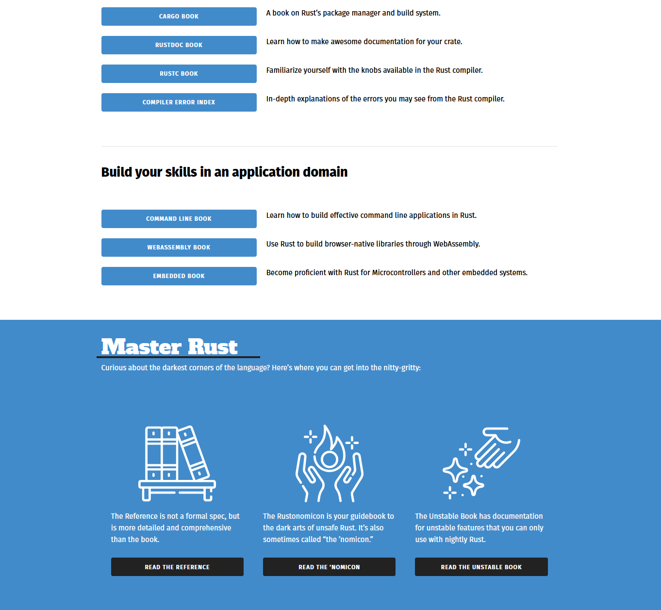
^ unsure about using the blue for the full background, but was curious to see what it looked like re-used.
Although not demonstrated above, while one page could be mostly blue, another could be mostly [another color], attaching more meaning to the palette, page, and avoiding removing color variations wholesale.
 memoryruins
on 30 Nov 2018
memoryruins
on 30 Nov 2018
For the sake of showing different pages using their own variations reduced palettes:


Background switches from white to grey then back to white:
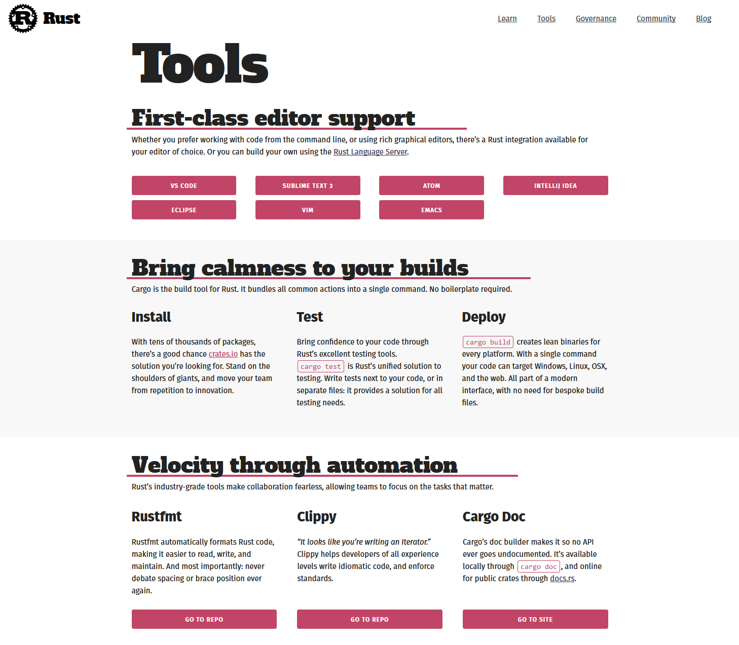
This one uses both purple and green, rather than only one:

Not final proposed colors, more so proof of concept of less variation on individual pages.
memoryruins
on 30 Nov 2018
While I don't mind the current colour scheme too much, I think those proposals look much better
TheZoq2
on 30 Nov 2018
hey folks, this issue is closed. i am locking this, as there should not be continued conversation on this.
ashleygwilliams
on 1 Dec 2018
Related issues
 Veedrac
·
5Comments
Veedrac
·
5Comments
 technic
·
5Comments
technic
·
5Comments
 joboscribe
·
6Comments
joboscribe
·
6Comments
 jhernandis
·
5Comments
jhernandis
·
5Comments
 yoshuawuyts
·
4Comments
yoshuawuyts
·
4Comments
Most helpful comment
I understand this issue is closed, but I did not not want to open another issue when this one is fitting. It also seemed like it was worth posting this before opening a PR. I tweaked these before finding the relevant issues, so the header underline change is more fitting to be discussed in #408, and is not the focus of the following screenshots.
Instead of removing the colors wholesale, we could try reducing the palette to be more in the spirit of the stable website while keeping the wonderful flexibility of the new layout :)
The following uses white, grey, and re-uses blue from the current stable website;
Another single highlight color could have been used.
sample of homepage:
sample of bookshelf:
^ unsure about using the blue for the full background, but was curious to see what it looked like re-used.
Although not demonstrated above, while one page could be mostly blue, another could be mostly
[another color], attaching more meaning to the palette, page, and avoiding removing color variations wholesale.