Www.rust-lang.org: Simplified landing page design proposal
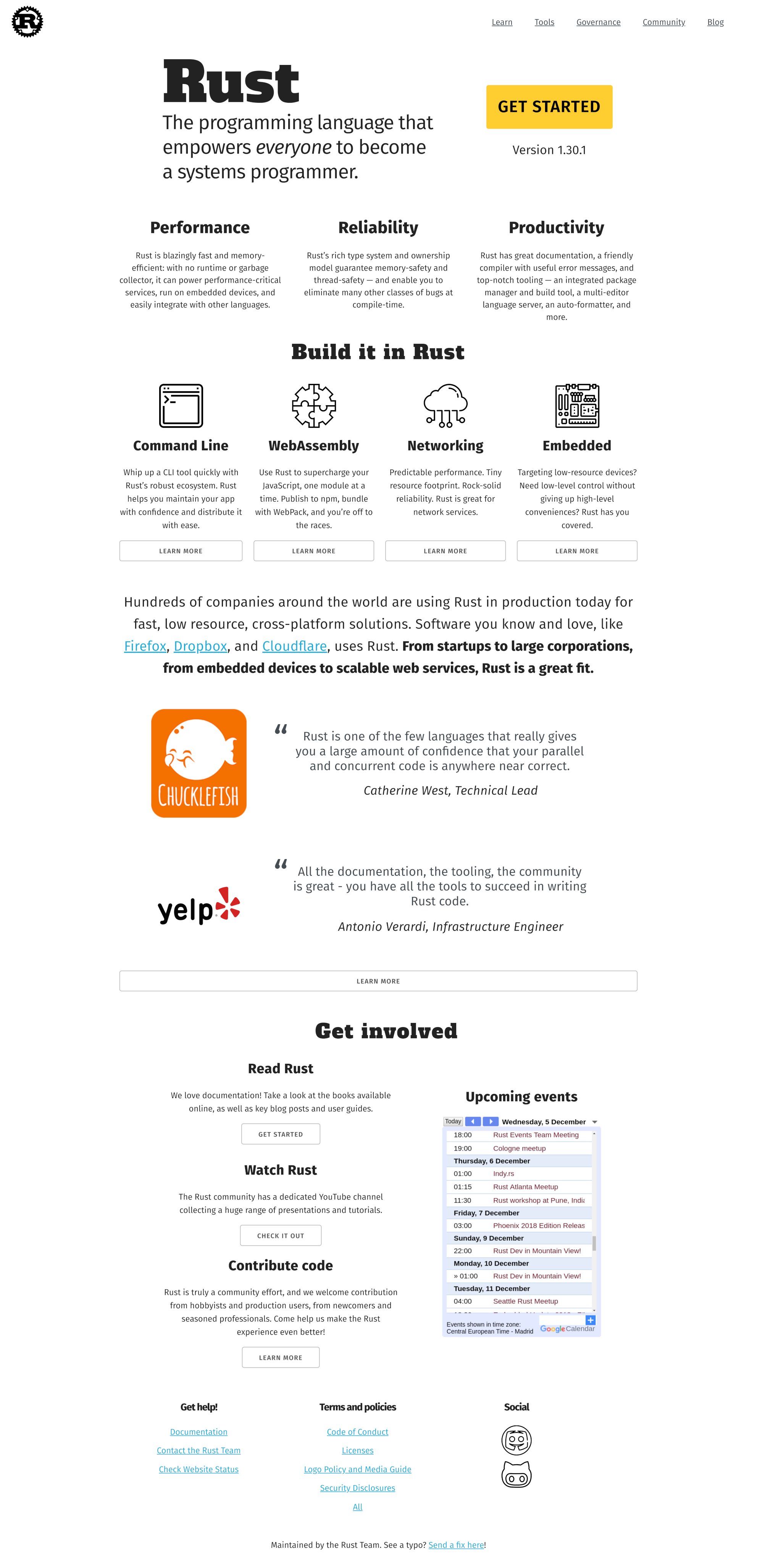
Like others, I find the landing page genuinely difficult to read. This is partially the discordant colour scheme, partially the large variety of text styles and letter spacings, and in places just little things like unnecessary dotted line breaks, uneven gaps or alternating alignments. I grew up on The Visual Display of Quantitative Information, which emphasizes the data-ink ratio: the proportion of a graphic's ink devoted to the non-redundant display of data-information.
When I look at the Beta homepage, my eyes are attracted to the top of the green dividing line, the area of highest contrast on the landing page. There is no information there, so my eyes just wander around and I feel "lost", in a sense. The three primary paragraphs are low contrast and take literally concerted effort to read.
In contrast, for the below my eyes immediately land on the trio {Performance, Reliability, Productivity}. Scanning the page is easy and the flow is simplified. Hopefully the design speaks for itself.
 Veedrac
All 5 comments
hi! we are not currently looking to wholesale change the color scheme on the website. if you have small, actionable, tweaks that you would like us to consider, please file them as individual issues. thanks.
 ashleygwilliams
on 30 Nov 2018
ashleygwilliams
on 30 Nov 2018
Seriously, I just discovered the beta site… my eyes hurt. Sorry to put it bluntly, but I think I'm not the only one to follow this opinion, if I can judge from the reactions of other people discovering this page around me. Basically, the color scheme is too contrasted, the eye is so much attracted to the titles and colors that the paragraphs are hard to read. I closed the webpage without reading anything else than the titles for eye fatigue and inability to focus in a reasonable amount of time, while I can read GitHub for hours.
The current landing page is a work of art, but it's missing the “convey information” part of a webpage.
This is, in my opinion, a big mistake. I hope you can reconsider the current design, or at least open a place to let people voice their concerns about the fact it's not readable without opening an issue from scratch.
I'm aware designers are better than developers at design, but if the website turns off too many developers, it won't do for a programming language. And what I've heard from designers up to now was that nit-picking on small, actionable tweaks was the thing they hated most, so I'm a bit surprised?
Sorry if this doesn't sound nice, but I do think the webpage is currently too “artist” and not enough “readable”.
 Ekleog
on 30 Nov 2018
Ekleog
on 30 Nov 2018
https://beta.rust-lang.org is a generic tech startup trying to sell itself to me even though it probably doesn't have a real product yet.
Obviously, that's not true. But it is what the design conveys, and I expect that's not what the design team was aiming for.
 Wallacoloo
on 1 Dec 2018
Wallacoloo
on 1 Dec 2018
Sincerely wish this proposal could be considered. The colors on beta are not pleasant.
 photex
on 1 Dec 2018
photex
on 1 Dec 2018
This issue is closed and not going to be reconsidered at this time. Please do not continue to comment. As I said previously, if you have small actionable tweaks to the current design please file them as separate issues.
ashleygwilliams
on 1 Dec 2018
Related issues
 jhernandis
·
5Comments
jhernandis
·
5Comments
 stevensonmt
·
4Comments
stevensonmt
·
4Comments
 Zaechus
·
4Comments
Zaechus
·
4Comments
 camelid
·
4Comments
camelid
·
4Comments
 joboscribe
·
6Comments
joboscribe
·
6Comments
Most helpful comment
Seriously, I just discovered the beta site… my eyes hurt. Sorry to put it bluntly, but I think I'm not the only one to follow this opinion, if I can judge from the reactions of other people discovering this page around me. Basically, the color scheme is too contrasted, the eye is so much attracted to the titles and colors that the paragraphs are hard to read. I closed the webpage without reading anything else than the titles for eye fatigue and inability to focus in a reasonable amount of time, while I can read GitHub for hours.
The current landing page is a work of art, but it's missing the “convey information” part of a webpage.
This is, in my opinion, a big mistake. I hope you can reconsider the current design, or at least open a place to let people voice their concerns about the fact it's not readable without opening an issue from scratch.
I'm aware designers are better than developers at design, but if the website turns off too many developers, it won't do for a programming language. And what I've heard from designers up to now was that nit-picking on small, actionable tweaks was the thing they hated most, so I'm a bit surprised?
Sorry if this doesn't sound nice, but I do think the webpage is currently too “artist” and not enough “readable”.