Wp-calypso: Typography: Improve Reader sidebar Following list
Steps to reproduce
Starting at URL: https://wordpress.com/read
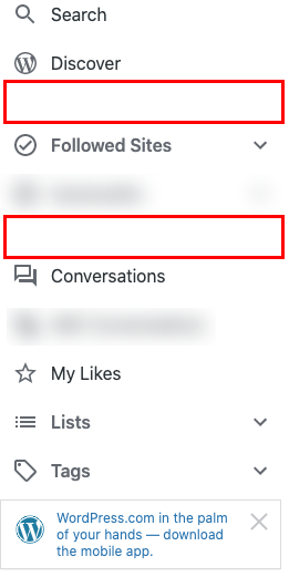
The list of sites you're following aren't indented right under their heading. Hierarchy is lost here especially since they share the same font size.
See: https://github.com/Automattic/wp-calypso/pull/43295#issuecomment-644955101
cc @sixhours
 jancavan
All 5 comments
I also noticed there's a large space between some nav items. Not sure if that's intentional.
jancavan
on 30 Jun 2020
/cc @bluefuton can you confirm if the extra space @jancavan noted above is intentional?
 sixhours
on 6 Jul 2020
sixhours
on 6 Jul 2020
Hi @sixhours 👋 I will have to defer to @Automattic/lighthouse here as they made the referenced changes to the sidebar.
 bluefuton
on 6 Jul 2020
bluefuton
on 6 Jul 2020
@bluefuton thanks for the ping, @evilluendas designed the extra spacing and new indenting, he will be back from AFK on Thursday
 unDemian
on 7 Jul 2020
unDemian
on 7 Jul 2020
Hello! The space is intentional, but it was added to somewhat help with the lack of hierarchy. I'm not very familiarized with Calypso design patterns and I wasn't able to find any existing pattern that indented items with icon, but if hierarchy can be achieved in a better way I'm totally in favor of removing those spaces. 👍
 evilluendas
on 9 Jul 2020
evilluendas
on 9 Jul 2020
Related issues
 jeherve
·
3Comments
jeherve
·
3Comments
 jjchrisdiehl
·
3Comments
jjchrisdiehl
·
3Comments
 ghost
·
3Comments
ghost
·
3Comments
 rickybanister
·
3Comments
rickybanister
·
3Comments
 spen
·
3Comments
spen
·
3Comments
Most helpful comment
@bluefuton thanks for the ping, @evilluendas designed the extra spacing and new indenting, he will be back from AFK on Thursday