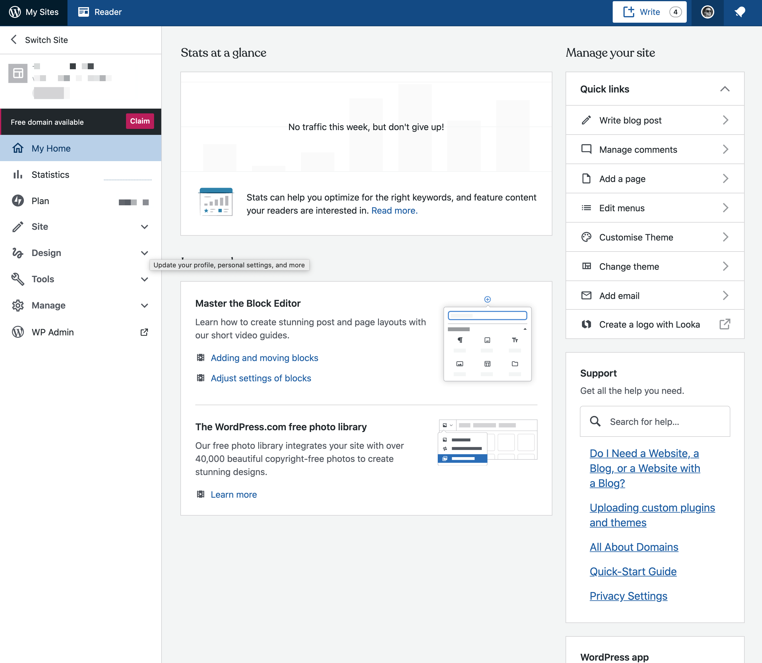
Wp-calypso: (8P) Search for Navigation/Site Settings
It can be difficult to find the right pages to visit on WordPress.com to perform a particular site action.
Let's allow folks to search for a setting or action to perform. We'll approach this in two steps.
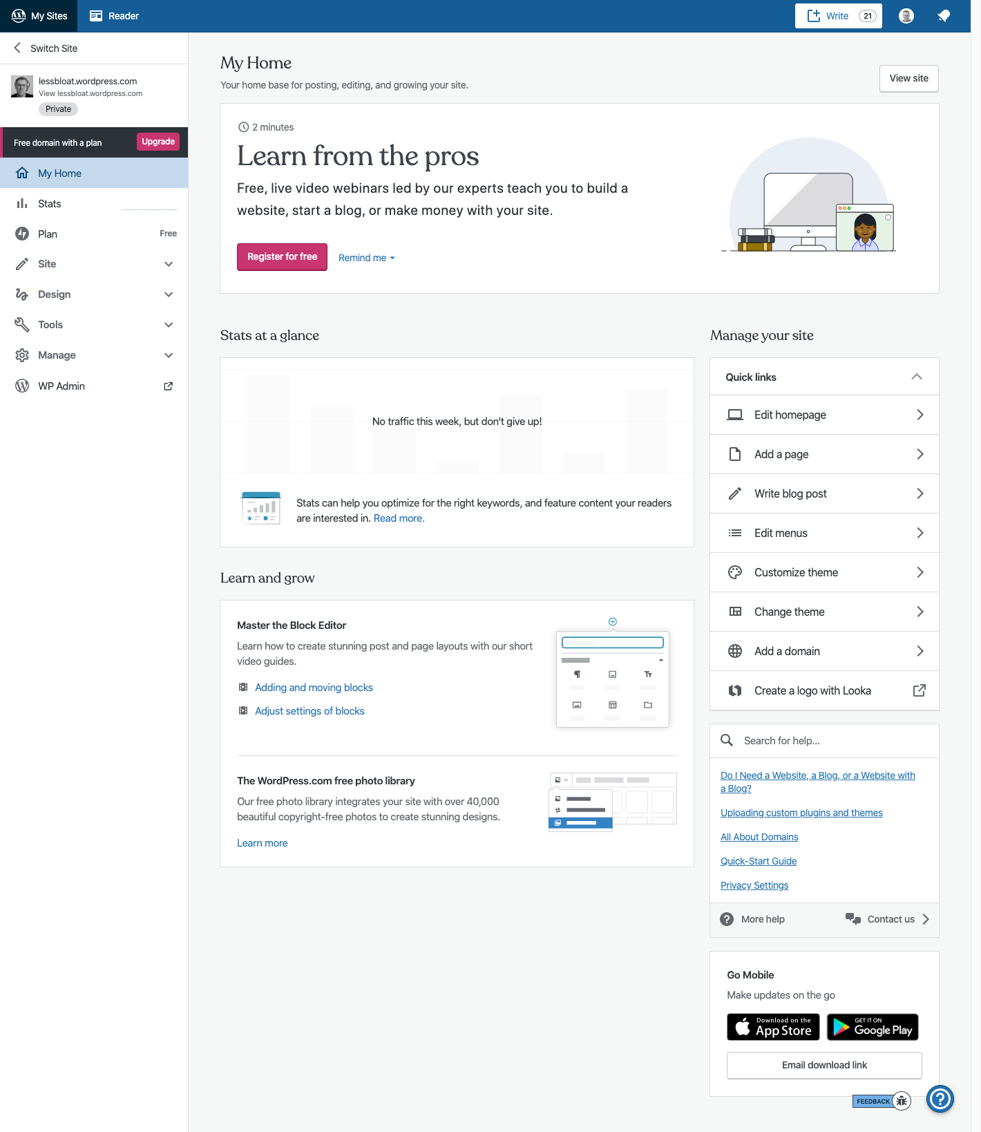
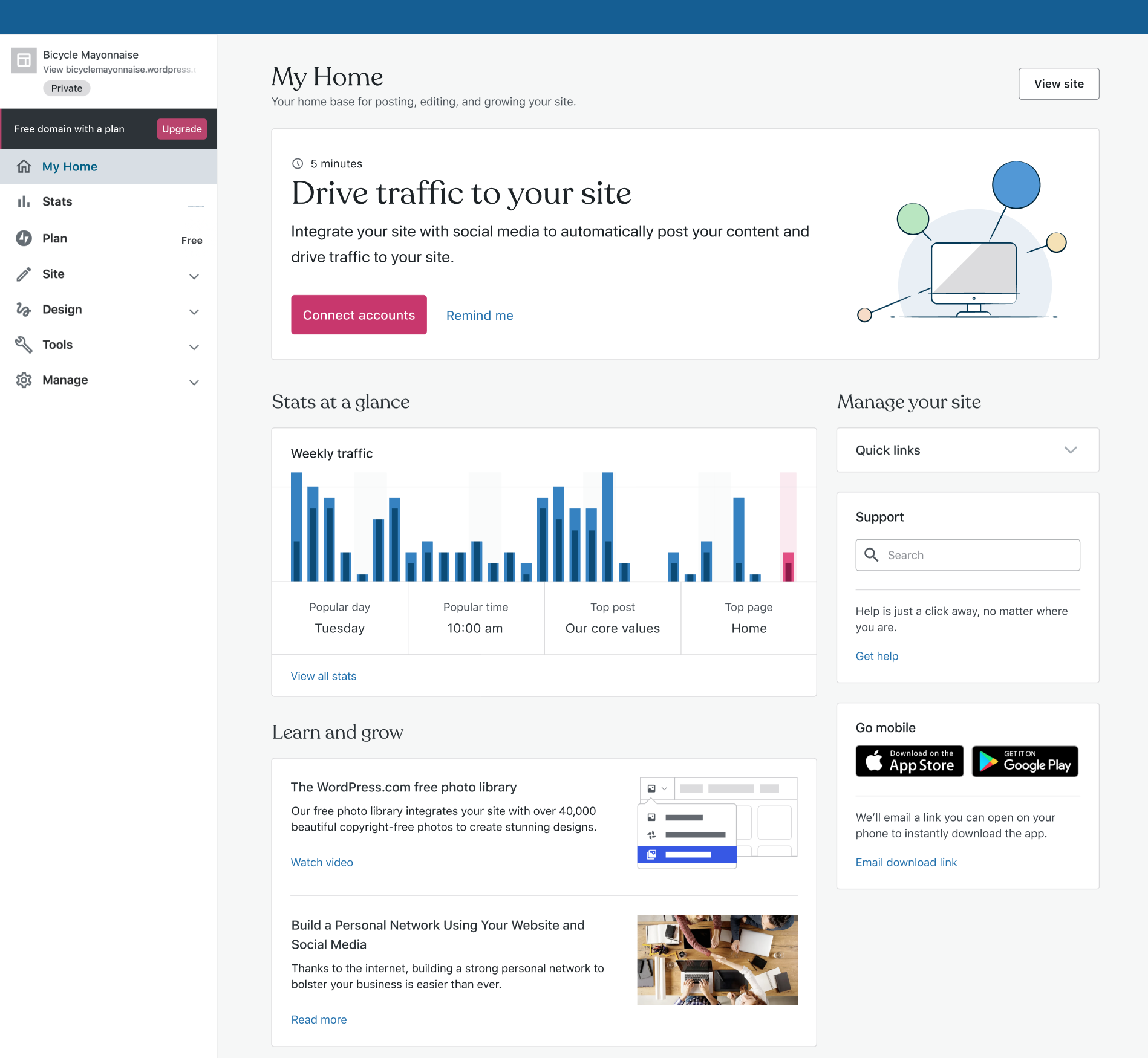
First, let's embed the help FAB directly on My Home:
After this is done (probably in another Issue/PR), let's revive @ramonjd's PR which included helpful hints for where to find things. We'll need to make sure we can translate it somehow.
 gwwar
gwwar
All 40 comments
Clarification as discussed in a recent meeting: the idea would be to make the help section that shows up when pressing the FAB (floating action button) a permanent citizen of My Home.
 frontdevde
on 7 May 2020
frontdevde
on 7 May 2020
also want to link this issue that deals with the same problem
 olesyabrk
on 12 May 2020
olesyabrk
on 12 May 2020
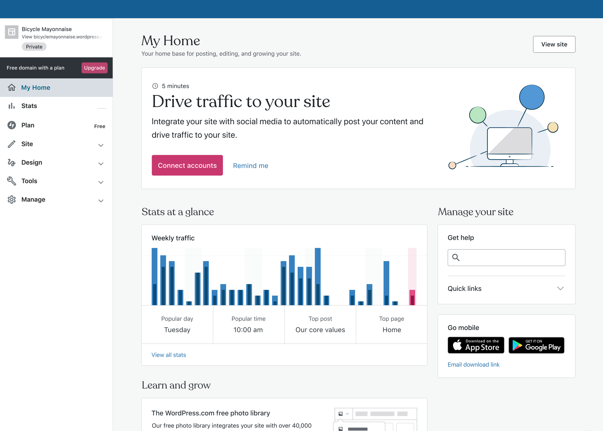
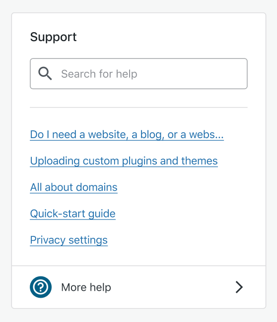
OK, a few options here to match the rest of the Customer Home design patterns:
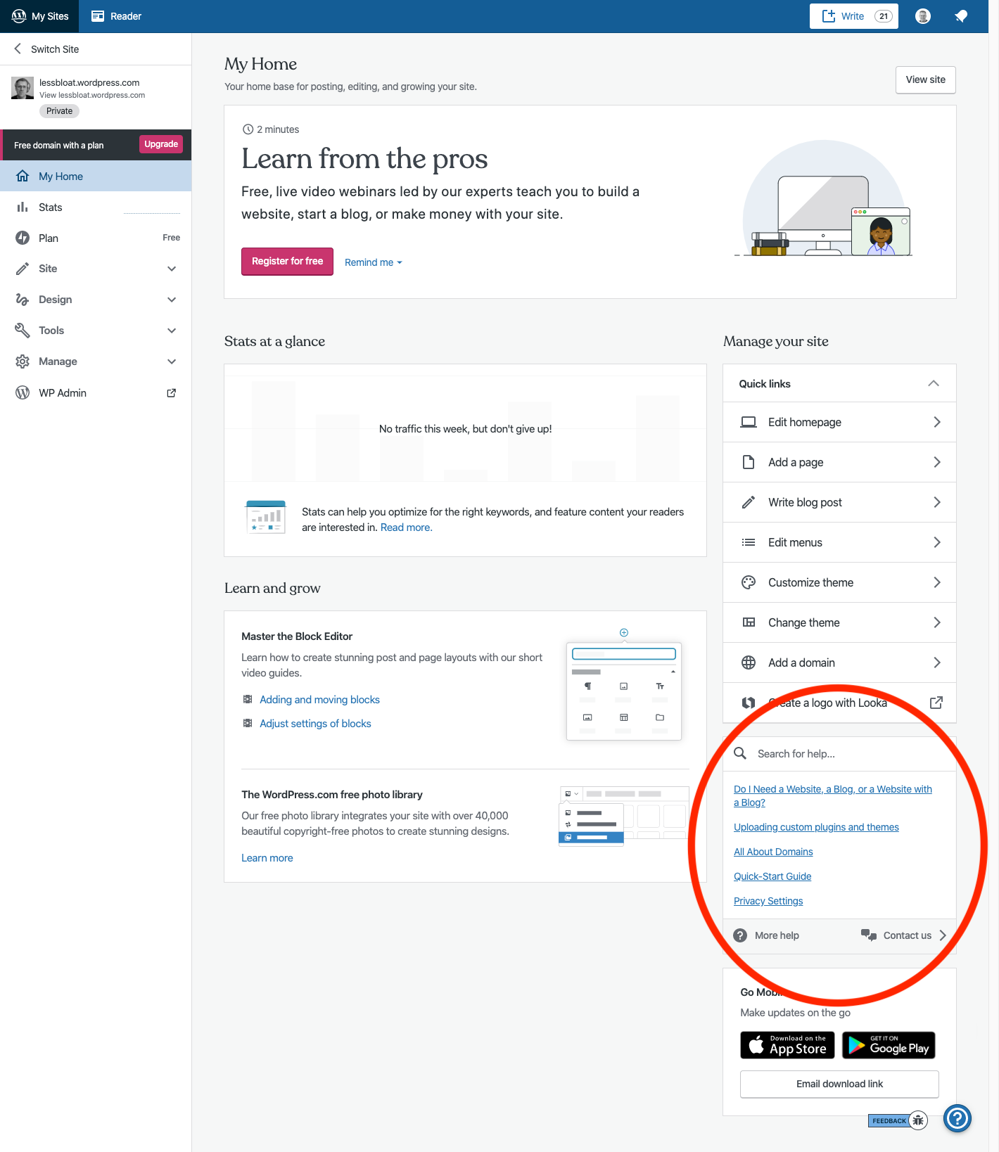
This is a close replica of the existing FAB layout. My main concern here is that with Quick Links and the Support link modules expanded, we're not only overwhelming the customer with a neverending parade of links, Support is also falling below the fold, so we're losing discoverability which is the main purpose of this project.
Having said that, I designed a minimized Support version:
That would keep it above the fold, but hide the content behind an extra click, so a little bit of a trade-off there.
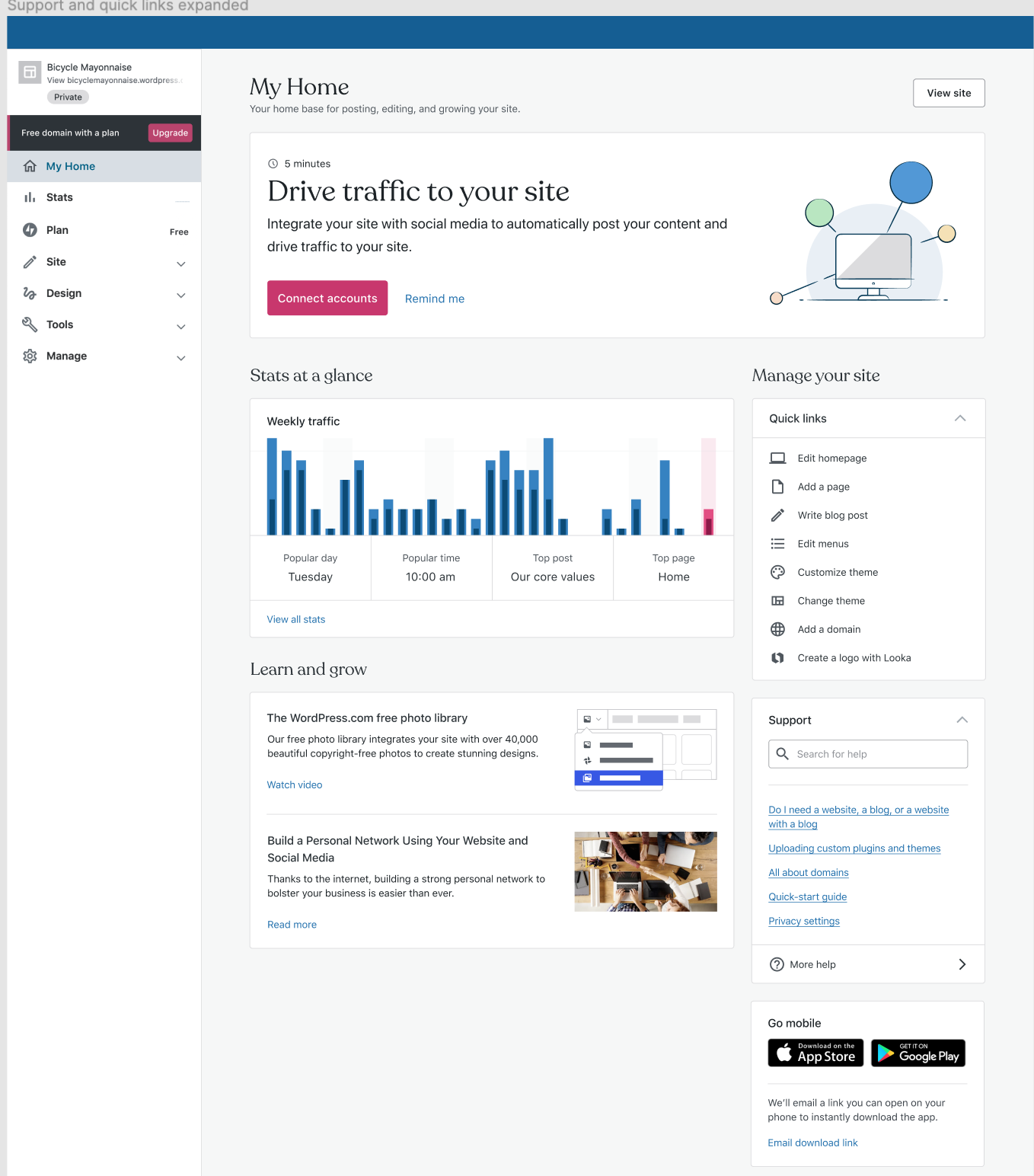
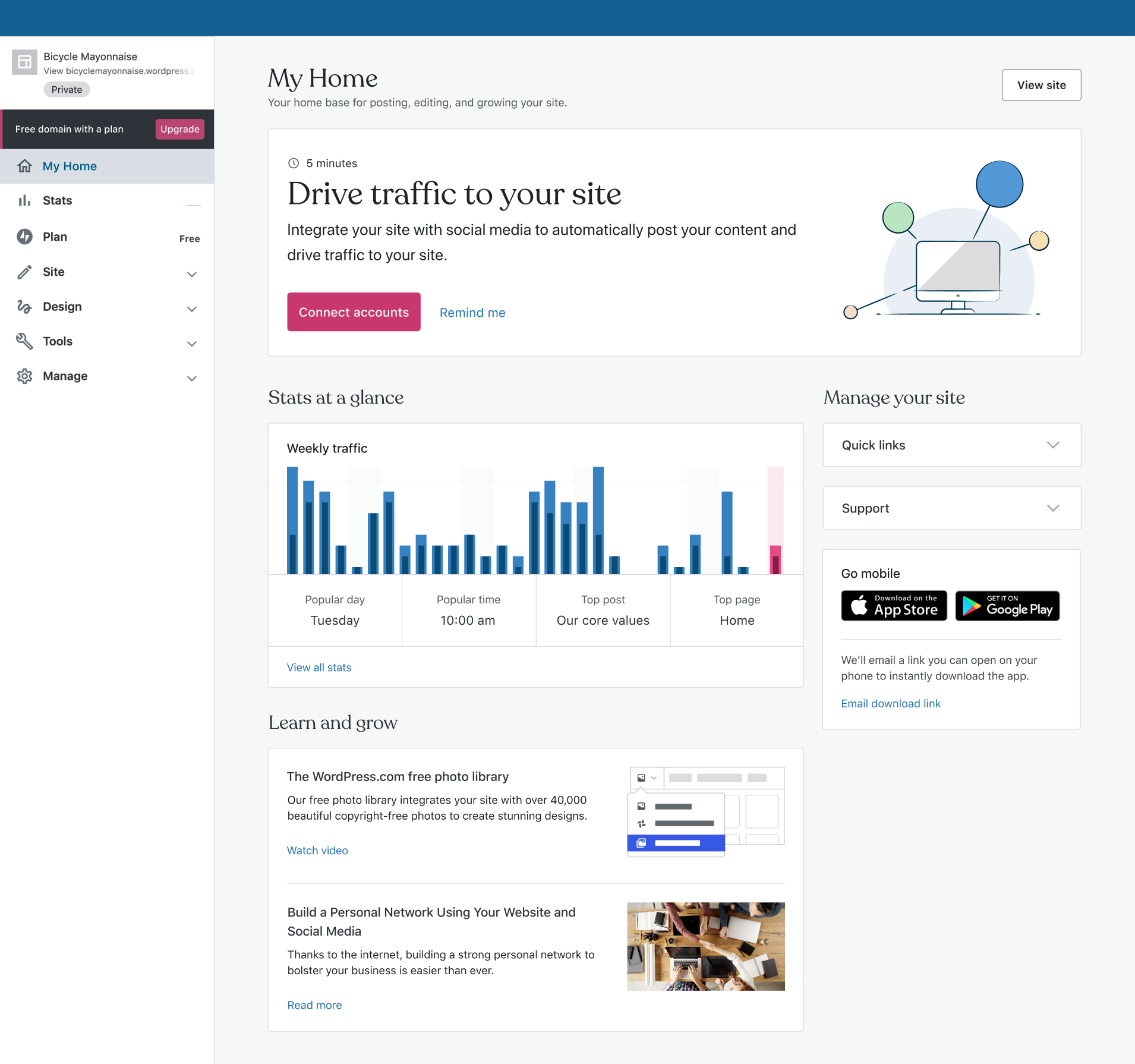
Which brings me to a design that @danhauk introduced in earlier Customer home iterations:
Do we need those extra links or can we get away with just a search field? I think it looks cleaner and still maintains its discoverability and usability.
In addition to that, I have iterated on combining Support and Quick Links since there is quite a bit of overlap and thematically it makes sense to display them together which remains my preferred approach to solving for both discoverability and layout improvements.
Pinging @davemart-in , @lcollette and @jancavan for feedback
olesyabrk
on 12 May 2020
I'm a fan of this one for the v1. My goal for the v1 is just to prove whether embedding this UI directly on My Home leads to more people interacting with support. Once we verify that hypothesis, I'm happy to invest more time into optimizing this section further.
I have iterated on combining Support and Quick Links since there is quite a bit of overlap and thematically it makes sense to display them together
Interesting exploration. Personally, I'm not a fan of combining them. There may be some overlap, but they serve different purposes in my mind. Quick links are meant to be a dependable, constant, unchanging list of links that I can return to much more akin to navigation. The help section is more ephemeral. I'd love for it to eventually adapt based on your previous search patterns, what we know about you, and things like pages you've visited recently. I know that is a bit down the line, but I see this as a separate function from Quick links.
 davemart-in
on 12 May 2020
davemart-in
on 12 May 2020
@davemart-in thanks for your feedback, sounds good to me. @lcollette and @jancavan -- do you have anything to add? If not, then we can submit the following as the official design for this ticket:
olesyabrk
on 12 May 2020
v1 works for me. I brought this up to Dave yesterday, but I'm curious how it'll behave since the search results change based on the user's input, so there might be some jumpiness there. We could make Support the bottommost card, but that'll bring it down the fold even further. Or we could maybe assign a fixed height to it, or a fixed number of search results.
 jancavan
on 13 May 2020
jancavan
on 13 May 2020
Good point @jancavan. Thoughts @olesyabrk?
davemart-in
on 13 May 2020
@jancavan excellent point, can we limit the search results to 6 and if the search result wraps to a second line, we can just truncate it to keep the height consistent? What do you think @obenland @davemart-in ?
olesyabrk
on 13 May 2020
We could also fix the hight of the box and scroll results
 obenland
on 13 May 2020
obenland
on 13 May 2020
Could we cap at 5 or 6 results, with a link to see all results prepopulated at /help? I hesitate to add inline scrolling as there are inherent usability issues when scrolling content in a small area.
 lcollette
on 13 May 2020
lcollette
on 13 May 2020
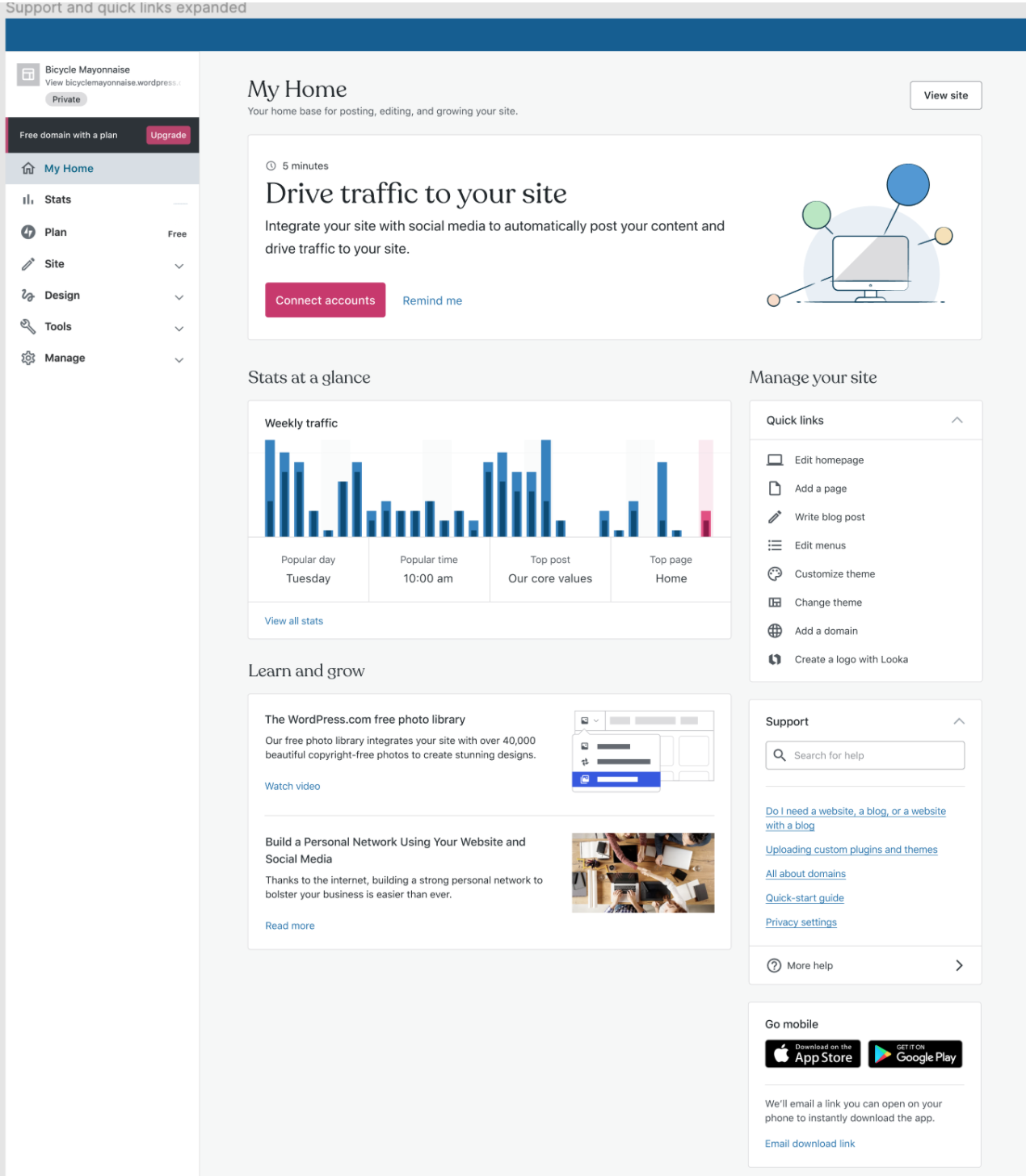
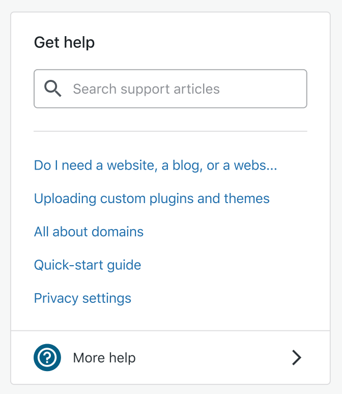
The help box has five suggested articles displayed by default and results are always capped at four articles.
It does jump, as @jancavan mentions based on the length of article titles and translations, even though there's a fixed number of results. If there are no results, it gets even taller, showing 'no results' with the five default articles below.
I did a quick inspector hack, reversing the order of the mobile nudge and support card. With a task present the top of the support box is 893 pixels down from the top of the viewport with quick links closed. With quick links open, the default, both the mobile card and search are off screen on my laptop monitor. I don't know if that's a blocker, but it is something to consider for all of the proposed solutions.
The mobile nudge, while we're at it, is the odd one out in this sidebar. For new customers, they're introduced to the apps via the checklist. For more tenured customers, we now have task cards. Perhaps we put an item in the backlog to remove the mobile prompt from the sidebar and try it in a different location. Perhaps even outside of a card in the footer of the page? On mobile web there's a much more aggressive overlay (at least in the editor).
Another thing I miss in the solutions proposed here is a way to teach the help fab. I think we can introduce customers to it without any duplication and perhaps without inadvertently increasing any burden on support (there's already a contact us link on the My Home screen). Is there a way to hint at the existence that this same content will be accessible via the FAB on other screens? This could come through the presence of the blue icon in or near the box, or some other affordance. Without that I feel we're asking customers to relearn a piece of UI once they leave the Home page.
 rickybanister
on 13 May 2020
rickybanister
on 13 May 2020
@rickybanister Thanks for jumping in. You're bringing up important points re: discoverability of FAB. The current scope of this project was decreased to the following per @davemart-in:
My goal for the v1 is just to prove whether embedding this UI directly on My Home leads to more people interacting with support. Once we verify that hypothesis, I'm happy to invest more time into optimizing this section further.
Which is not to say we're abandoning more improvements to this section, but instead we're experimenting on it for MVP.
I also am curious if we need a mobile card so prominently displayed on the customer home. @lcollette and @danhauk what are some of the metrics you've seen of our users interacting with it? How essential is it?
olesyabrk
on 13 May 2020
I agree with @lcollette re: scrolling in a small area. Since removing the mobile card is not on the table for this project, let's cap the results at 6 and truncate the longer results to keep it one line per item.
cc: @davemart-in @obenland
olesyabrk
on 13 May 2020
Are we retaining current behavior when clicking on the search results links?
jancavan
on 14 May 2020
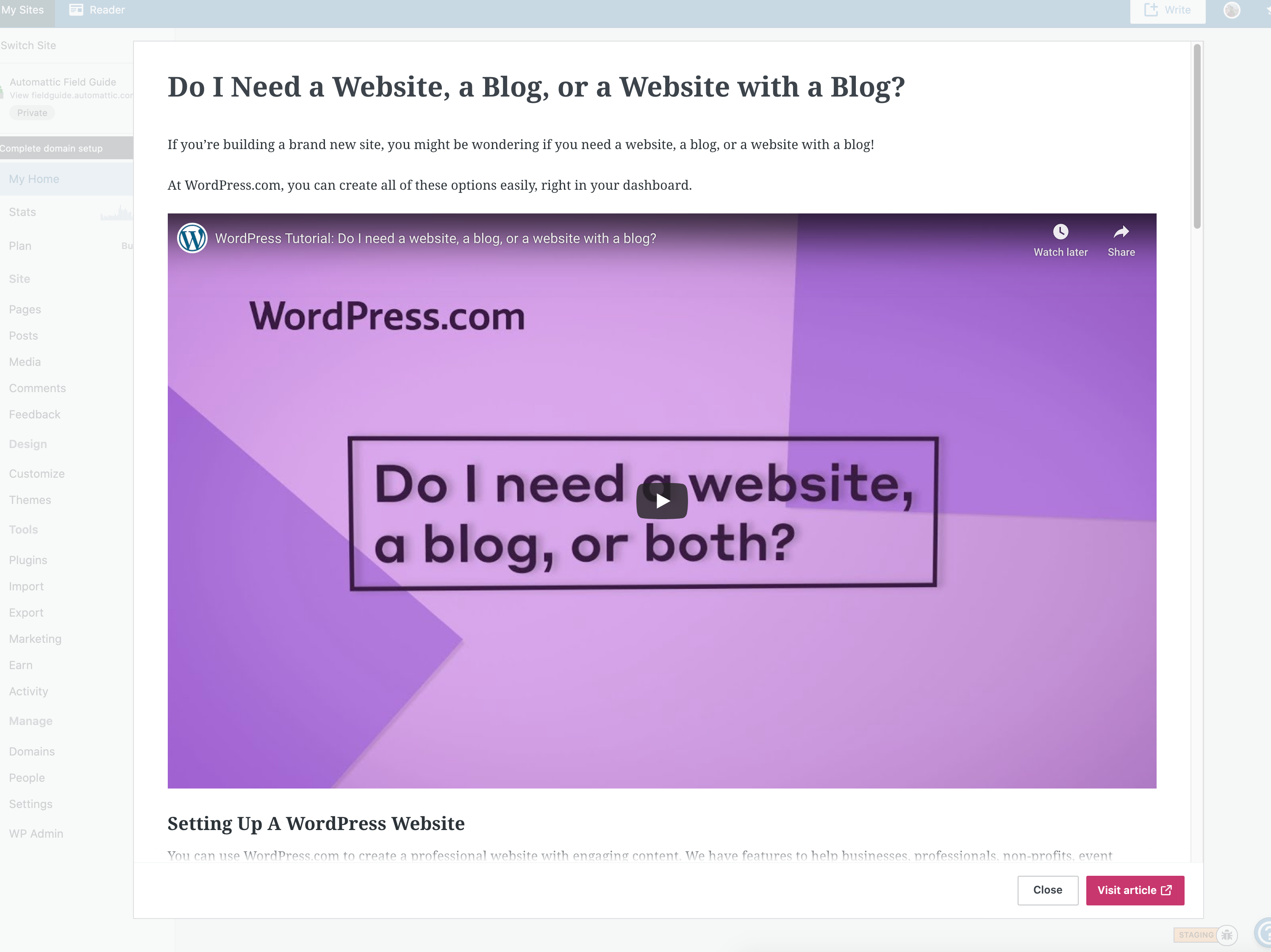
@jancavan no, we're going straight to modal like this:
olesyabrk
on 14 May 2020
I'm going to be taking a look at the code implementation here.
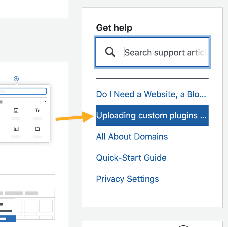
As there's been a fair amount of discussion regarding Design and UX I'd like to clarify that the following is the "accepted direction".
Firstly the initial visual state is as per:
...then once a search result is clicked the corresponding support page shows up in a Modal:
I also note that the FAB icon is hidden on this view (presumably to avoid duplication?).
@olesyabrk Is there anything else I need to consider before I dive in here?
 getdave
on 19 May 2020
getdave
on 19 May 2020
Research
The following will evolve organically as I work through the research phase of this task.
Useful locations in code:
- Sidebar "Support" card -
client/my-sites/customer-home/cards/features/support/index.jsx. - Inline Help component(s) -
client/blocks/inline-help
Questions
- ~Can we reuse existing "Inline Help" code for searching and displaying results?~ ✅ Yes
- ~Can we reuse existing code to display full search result documentation page within modal?~ ✅ Sort of. May need refactoring.
- Should we extract portions of Inline Help code to reusable, _shared_ components that are not coupled to either "Inline" or "Customer Home" versions of the widget?
- What CSS changes will need to be accommodated for the existing code to allow it to work on the Customer Home?
Current Proof of Concept
getdave
on 19 May 2020
@getdave thanks for jumping in on this. For search results to avoid the card from jumping heights, let's go with this:
I agree with @lcollette re: scrolling in a small area. Since removing the mobile card is not on the table for this project, let's cap the results at 6 and truncate the longer results to keep it one line per item.
And to answer your question:
I also note that the FAB icon is hidden on this view (presumably to avoid duplication?).
This is to follow the existing behavior with the FAB, skipping the preview.
olesyabrk
on 19 May 2020
Should we extract portions of Inline Help code to reusable, shared components that are not coupled to either "Inline" or "Customer Home" versions of the widget?
@getdave Use your best judgement but I would recommend copy/pasting into a new component since it sounds like needs may diverge for the two components. If there are shared pieces that makes sense you can then pull those out and refactor as needed with a fun 🔪PR. (eg https://github.com/Automattic/wp-calypso/pull/41855 https://github.com/Automattic/wp-calypso/pull/42255 )
If there's another iteration of the support card, if it's pretty drastic update making a different component, before switching them out fully in views has been helpful in past sprints.
For the most part code reuse generally isn't that helpful vs the coupling/bugs it introduces when folks don't test in all areas or aren't aware of usages.
We also have updated documentation for the server pieces of My Home in PCYsg-qpk-p2 though don't hesitate to reach out to Serenity for a review or chat.
gwwar
on 19 May 2020
@getdave reposting the Figma doc for colors/font sizes/details.
Small change from the final version is replacing the generic Help icon with the FAB icon to aid discoverability.
olesyabrk
on 19 May 2020
Thanks, @olesyabrk for bringing in the Fab!
Some minor feedback/suggestions:
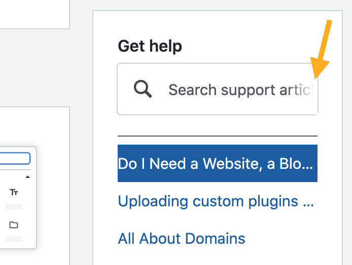
- Rename Support to Get help for clarity
- Remove the underline from links (to match the other blue links on My home)
- Update placeholder text from "Search for help" to "Search support articles" to better represent the functionality
lcollette
on 19 May 2020
 olesyabrk
on 20 May 2020
olesyabrk
on 20 May 2020
Update: actually there are only two components that I'd need to duplicate:
- client/blocks/inline-help/inline-help-search-card.jsx
- client/blocks/inline-help/inline-help-search-results.jsx
...so this may not be too bad. I would still advocate sharing the existing Redux implementation as it's pretty UI agnostic.
I've gone ahead and duplicated the components in https://github.com/Automattic/wp-calypso/pull/42365/commits/28842b511a84f699f0cdbf6a42496ba0d1e67c2f
If there's another iteration of the support card, if it's pretty drastic update making a different component, before switching them out fully in views has been helpful in past sprints.
@gwwar I'm concious that Dave indicated, this is not something we're 100% certain will be retained.
~It would be a fair amount of effort to decouple and refactor the components vs sharing them. @davemart-in would you be happy for me to circle back to a refactor once we're confident the implementation on the Customer Home is here to stay?~
To be clear, I don't mind putting in the effort, but it's important we understand that this will have a _significant_ knock-on effect in terms of the delivery time for this work. Therefore, if we're not fully committed then are we happy to invest this effort?
getdave
on 21 May 2020
Let's hold off on investing any more into this. For this v1 pass, as long as it works, I'm 👍. Once we have some more data, I'm happy to circle back and clean things up.
davemart-in
on 21 May 2020
@davemart-in Question regarding tracking. Currently, we are tracking when a user submits an empty search string. Do we want to continue with this or would you prefer I filter out empty strings to avoid noise?
getdave
on 21 May 2020
@getdave , I agree with @lcollette suggestions, here is the updated mock.
@olesyabrk Any chance you can granted me access to that file?
Design Querieis
@olesyabrk I'd also like to check on the following items of design:
- Where does the "More help" link take you again? Remember the existing FAB will be hidden on this page.
- The search results are all left aligned with no horizontal padding. However this "breaks" the keyboard navigation (using down arrows) "selected" state visuals. See existing FAB.
- On smaller screens the placeholder text is clipped due to it being fairly verbose. Any ideas on reducing the wording or altering the design?
- Can I confirm that the placeholder text shown in the design has sufficient contrast for a11y reasons?
- What was decided regarding fixing the height of the box and the number of results...etc? Note that we can't always guarantee a _minimum_ number of results. For example, there might be only a single result for a given query. We can however, limit the _maximum_ number of results shown.
Much appreciated
getdave
on 21 May 2020
Question regarding tracking. Currently, we are tracking when a user submits an empty search string. Do we want to continue with this or would you prefer I filter out empty strings to avoid noise?
If it's not too difficult @getdave I'd say filter out empty strings.
davemart-in
on 21 May 2020
The big thing we want to know is: Did the click or search come from the inline support card (within Customer Home), or via the floating action button version (in the right hand corner).
davemart-in
on 21 May 2020
@gwwar I'm concious that Dave indicated, this is not something we're 100% certain will be retained.
To clarify copy/paste here is totally fine in it's own folder 👍We can always delete unused code later.
I naturally assume devs have an urge to refactor or aim for code reuse which isn't always needed. This of course can be done at a later date if the code has value and needs more changes.
gwwar
on 21 May 2020
@getdave, here is my feedback and responses:
- The links should be identical to the font, size, color, and hover of the other links on customer home. See below:
- More help link takes you here: https://wordpress.com/help
- > The search results are all left aligned with no horizontal padding. However this "breaks" the keyboard navigation (using down arrows) "selected" state visuals. See existing FAB.
Not sure what this means. The links should have the focus status of other links on the Customer Home, no dark blue background.
- Placeholder text is not the replacement for labels, it's not read by screen readers, and the contrast rules don't typically apply there if there are other cues. "Get help" above the search field is an indicator for that. If we observe user confusion post implementation, we will try a more descriptive label.
- Let's drop the placeholder text on smaller screens altogether.
- Let's keep the box height consistent. If there are fewer results, there will be white space. It's temporary tho, so I don't see a problem there, @lcollette any objection to that?
- Let's max results to five.
Thanks for reaching out, let me know how it goes! Good job!
olesyabrk
on 22 May 2020
Thanks for feedback. Now we've moved to a specific implementation I've responded to the design points over on the PR.
getdave
on 22 May 2020
Reopening this issue as it was closed by an accidental merge.
frontdevde
on 25 May 2020
Update: the client side code to add the new Card is in place. However the new card will not show up until we deploy the Phab diff (see code-D43941) that enables the card on the various variations of the "My Home" section via the layout API.
Next steps to follow.
getdave
on 28 May 2020
~This~ "Get help" search card on the "My Home" is now in production https://github.com/Automattic/wp-calypso/commit/3574c1b761a7f3f230e76971a87afe5078a0b086
getdave
on 4 Jun 2020
Is it best to open a new issue for a tiny improvement of this feature? I noticed this difference and hope it can be addressed:
| Search for Menu | Search for Menus |
| ------------- | ------------- |
| |
|
 zdenys
on 18 Jul 2020
zdenys
on 18 Jul 2020
@zdenys yes, please, and a bit more background on this would be helpful. @jancavan worked on the expansion of the Support card.
olesyabrk
on 21 Jul 2020
@olesyabrk what I meant is that for the search menu the Edit my menu link appears, but for menus it does not and I guess it should as users may type menus, not only menu.
Also, is there a list of keywords for which the Show me where to shows up and for which suggestions can be offered?
zdenys
on 21 Jul 2020
@getdave could you share how the string matching works, is it hard coded or is there any synonym matching happening? If not, that would be a wonderful future improvement.
rickybanister
on 21 Jul 2020
@zdenys @rickybanister This file contains all suggestions and keywords, menus could probably be added here: https://github.com/Automattic/wp-calypso/blob/8e806f2ce055e30db6a3eb7e627d052ce48c7169/client/blocks/inline-help/admin-sections.js#L78
obenland
on 3 Aug 2020
cc @boonerang in case you feel like contributing any synonyms to the help search to spur on your nomenclature discussion.
rickybanister
on 3 Aug 2020
Related issues
 jeherve
·
3Comments
jeherve
·
3Comments
 vparkhere
·
3Comments
vparkhere
·
3Comments
 kellychoffman
·
3Comments
kellychoffman
·
3Comments
 gedex
·
3Comments
kellychoffman
·
3Comments
gedex
·
3Comments
kellychoffman
·
3Comments
Most helpful comment
~This~ "Get help" search card on the "My Home" is now in production https://github.com/Automattic/wp-calypso/commit/3574c1b761a7f3f230e76971a87afe5078a0b086