Wp-calypso: Layout Grid Block: grid-column-end does not apply on Firefox
The layout grid block does not seem to have grid-column-end applied only on Firefox web browser.
An example page: https://ayatesonlinetutor.com/about/
Checked web inspector and lookup CSS and HTML classes, everything seems to be in place
Browser / OS version
Firefox 74.0.1, 75.0
Screenshot / Video

image link: https://cloudup.com/cTpgVMUCL6k
Editing the grid-column-end does not affect the results.
Context / Source
Does not affect other web browsers such as Chrome or Safari.
Located a similar issue in https://github.com/Automattic/wp-calypso/issues/37743 , so they could be related.
 edwinho89
All 12 comments
Here is a screen recording on a test site: https://d.pr/v/WhncOn/Ijfb44zO6o
In the test I added the Slideshow block.
I now wonder if we are dealing with one issue only, or if there are more things in play.
 ivan-ottinger
on 14 Apr 2020
ivan-ottinger
on 14 Apr 2020
cc @Automattic/tinker
 simison
on 7 Jul 2020
simison
on 7 Jul 2020
I'm not sure I fully understand what is being shown here. @edwinho89 is the problem that the grid goes horizontally off the edge of the page?
I'm looking at the page in Firefox 78 (the latest version) and it looks fine:

We did have a previous issue where Firefox behaves differently to Chrome & Safari, depending on the contents of the grid. This feels like it might be the same issue but I'm unable to reproduce.
https://github.com/Automattic/block-experiments/issues/27
It's possible this could be a Firefox version difference so it would be worth upgrading to the latest version (a good idea generally anyway) and seeing if that changes things. If it is a version difference we can look at whether a specific fix is appropriate.
 johngodley
on 8 Jul 2020
johngodley
on 8 Jul 2020
I'm currently debugging this, and although it's hard to reproduce both this issue and #37743 in the latest version of Firefox, I am seeing some horizontal scrollbar appearing in Firefox on mobile breakpoints, that shouldn't be there and isn't in Chrome or Safari. In both cases there's a slideshow block also in the mix, and in both cases the issue appears to be fixed when the slideshow block is removed. But I'm still zeroing in.
 jasmussen
on 8 Jul 2020
jasmussen
on 8 Jul 2020
It's definitely reproducible with this markup:
<!-- wp:jetpack/layout-grid {"column1DesktopSpan":6,"column1TabletSpan":4,"column1MobileSpan":4,"column2DesktopSpan":6,"column2TabletSpan":4,"column2MobileSpan":4,"className":"column1-desktop-grid__span-6 column1-desktop-grid__row-1 column2-desktop-grid__span-6 column2-desktop-grid__start-7 column2-desktop-grid__row-1 column1-tablet-grid__span-4 column1-tablet-grid__row-1 column2-tablet-grid__span-4 column2-tablet-grid__start-5 column2-tablet-grid__row-1 column1-mobile-grid__span-4 column1-mobile-grid__row-1 column2-mobile-grid__span-4 column2-mobile-grid__row-2"} -->
<div class="wp-block-jetpack-layout-grid alignfull column1-desktop-grid__span-6 column1-desktop-grid__row-1 column2-desktop-grid__span-6 column2-desktop-grid__start-7 column2-desktop-grid__row-1 column1-tablet-grid__span-4 column1-tablet-grid__row-1 column2-tablet-grid__span-4 column2-tablet-grid__start-5 column2-tablet-grid__row-1 column1-mobile-grid__span-4 column1-mobile-grid__row-1 column2-mobile-grid__span-4 column2-mobile-grid__row-2"><!-- wp:jetpack/layout-grid-column -->
<div class="wp-block-jetpack-layout-grid-column wp-block-jetpack-layout-grid__padding-none"><!-- wp:paragraph -->
<p>Two columns, both span 6 layout columns, i.e. 50% width each.</p>
<!-- /wp:paragraph --></div>
<!-- /wp:jetpack/layout-grid-column -->

<!-- wp:jetpack/layout-grid-column -->
<div class="wp-block-jetpack-layout-grid-column wp-block-jetpack-layout-grid__padding-none"><!-- wp:jetpack/slideshow {"ids":[61,59],"sizeSlug":"large"} -->
<div class="wp-block-jetpack-slideshow aligncenter" data-effect="slide"><div class="wp-block-jetpack-slideshow_container swiper-container"><ul class="wp-block-jetpack-slideshow_swiper-wrapper swiper-wrapper"><li class="wp-block-jetpack-slideshow_slide swiper-slide"><figure><img alt="" class="wp-block-jetpack-slideshow_image wp-image-61" data-id="61" src="http://localhost:8888/wp-content/uploads/2020/07/5184599_031119-kgo-shutterstock-rain-img.jpg"/></figure></li><li class="wp-block-jetpack-slideshow_slide swiper-slide"><figure><img alt="" class="wp-block-jetpack-slideshow_image wp-image-59" data-id="59" src="http://localhost:8888/wp-content/uploads/2020/07/download.jpeg"/></figure></li></ul><a class="wp-block-jetpack-slideshow_button-prev swiper-button-prev swiper-button-white" role="button"></a><a class="wp-block-jetpack-slideshow_button-next swiper-button-next swiper-button-white" role="button"></a><a aria-label="Pause Slideshow" class="wp-block-jetpack-slideshow_button-pause" role="button"></a><div class="wp-block-jetpack-slideshow_pagination swiper-pagination swiper-pagination-white"></div></div></div>
<!-- /wp:jetpack/slideshow --></div>
<!-- /wp:jetpack/layout-grid-column --></div>
<!-- /wp:jetpack/layout-grid -->
The slideshow block has to be present. And for some reason, because a layout grid column doesn't have an explicit width set, Firefox allows it to expand beyond that. I'm currently trying to see if simply applying a width fixes it.
jasmussen
on 8 Jul 2020
There's definitely something going on with the Jetpack Slideshow block. I believe I can fix the issue on the frontend by applying a width to the grid column container, but in the editor, I see this:
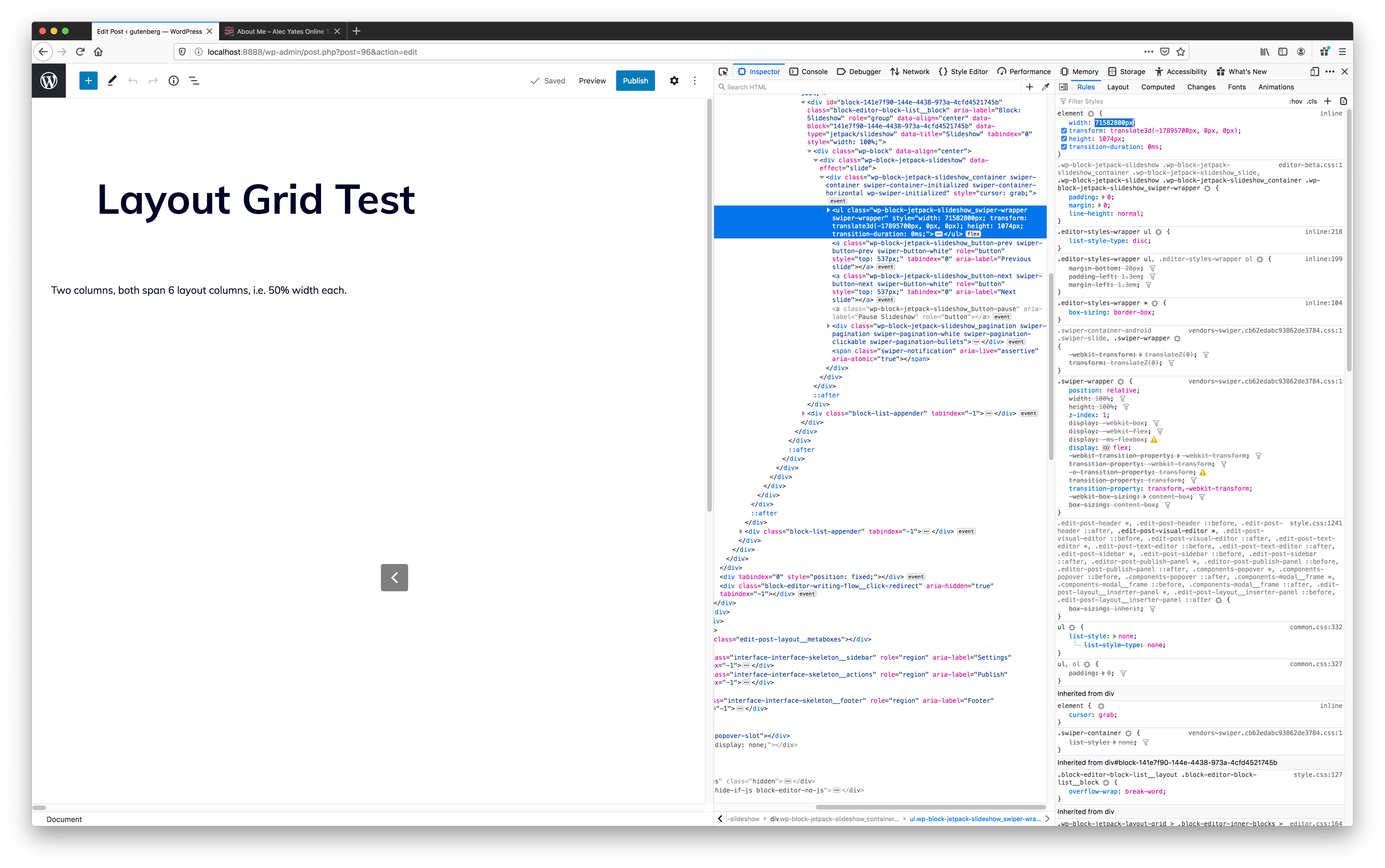
That width calculation definitely seems off. I'm going to see if I can reproduce this in the Columns block also.
jasmussen
on 8 Jul 2020
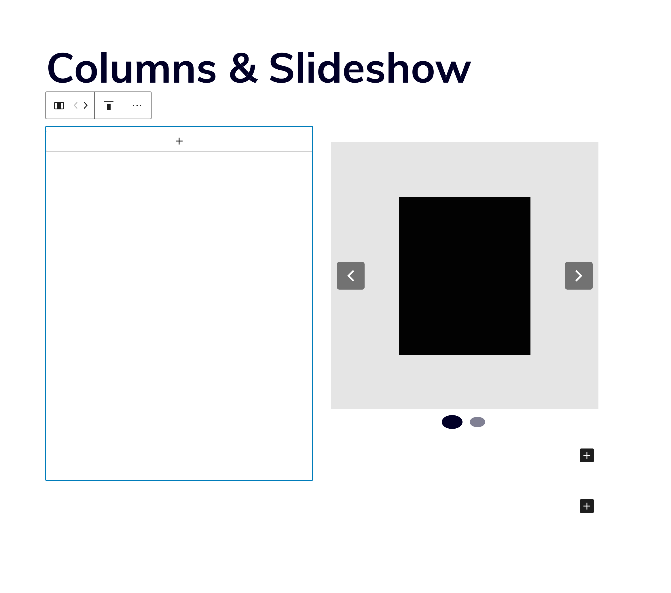
It's not an issue in the columns block:
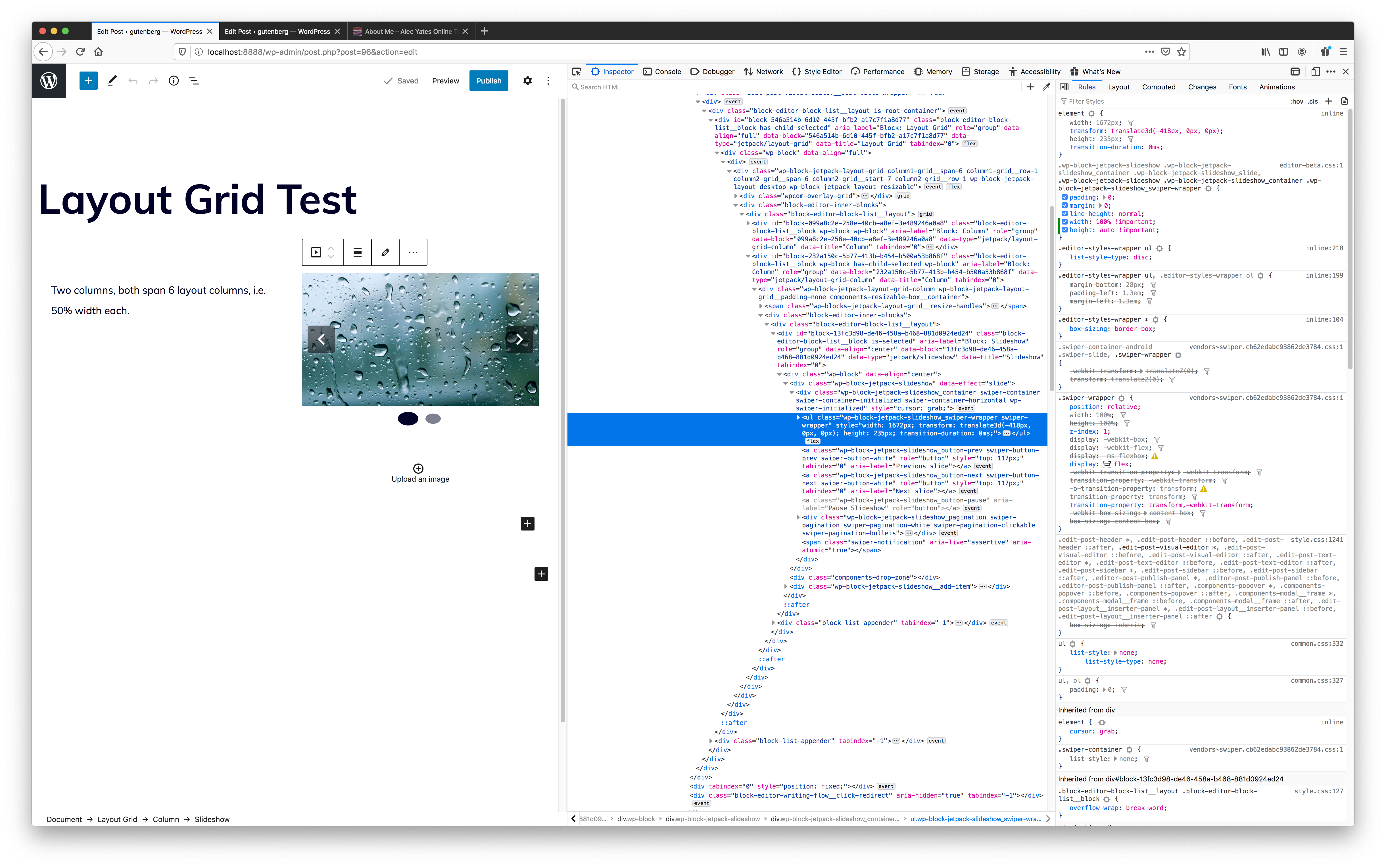
But it does not seem like the layout grid is at fault here. It looks like there might be a race condition in the jetpack slideshow block, which causes the width applied to it to be crazy out of bounds in Firefox. I can hack together a fix to get it to work in the layout grid block, like so:
but that hack is pretty bad and not something we can ship. We need some insights from someone who worked on the slideshow block. @jeherve do you know who might that be?
jasmussen
on 8 Jul 2020
Heads up to @Automattic/explorers also already at this point, if it turns out to be problems in Jetpack block(s). :-)
simison
on 8 Jul 2020
We need some insights from someone who worked on the slideshow block.
@aaronrobertshaw recently worked on https://github.com/Automattic/jetpack/pull/15529 to address issues with the column block, and may have some ideas on this.
 jeherve
on 8 Jul 2020
jeherve
on 8 Jul 2020
The issue with the Slideshow block appeared to be that it would grow to whatever size it could while the column would stretch to accomodate its content. This meant there was nothing to stop the inner block from growing out of control.
I believe this might have been an issue with other blocks as well not just the Slideshow block.
I've knocked up a PR that tweaked the layout grid column styles constraining the column to have a max-width of 100%. It works for me but I'm open to better ideas.
 aaronrobertshaw
on 9 Jul 2020
aaronrobertshaw
on 9 Jul 2020
Thanks so much for looking, Aaron.
I've knocked up a PR that tweaked the layout grid column styles constraining the column to have a max-width of 100%. It works for me but I'm open to better ideas.
I could swear I tried this, and that it did not work inside the editing canvas. But I'll give your PR a go, thank you!
jasmussen
on 9 Jul 2020
Anytime 🙂
I wasn't 100% accurate when I commented that I tweaked the layout grid column styles, in the editor it needed to be on the inner .wp-block element for me. The previous max-width: none rule was a little too generous.
Hopefully, the PR gives us a start on resolving the issue anyway.
aaronrobertshaw
on 9 Jul 2020
Related issues
 rickybanister
·
3Comments
rickybanister
·
3Comments
 spen
·
3Comments
spen
·
3Comments
 roccotripaldi
·
3Comments
roccotripaldi
·
3Comments
 kellychoffman
·
3Comments
kellychoffman
·
3Comments
 vparkhere
·
3Comments
vparkhere
·
3Comments