Wp-calypso: (2P) SPT: Template thumbnails are missing an active state
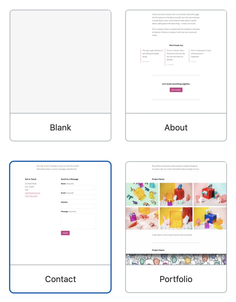
When you click on a thumbnail to see its larger preview, there is no active state to indicate which thumbnail has been clicked.
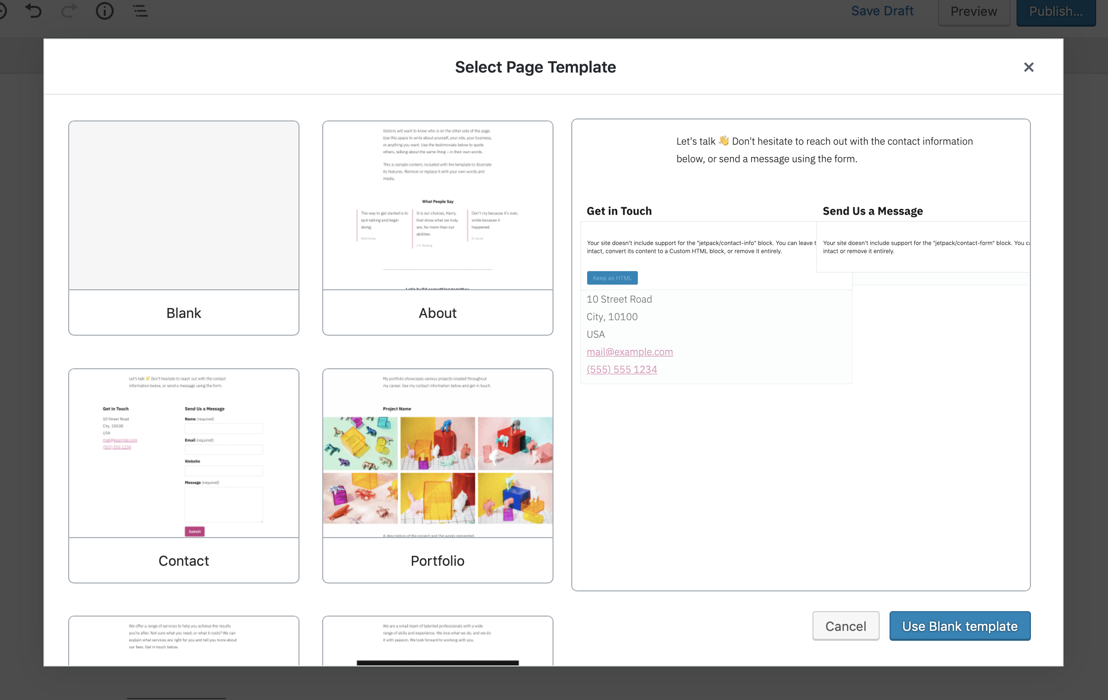
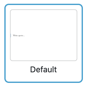
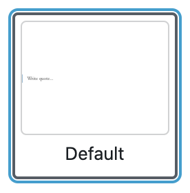
In the screenshot above I've clicked on the Contact template, but there's no indication of this. I suggest we add a border around the currently active thumbnail:
 shaunandrews
All 8 comments
Make the blue frame based on the selected template prop, rather than CSS :hover.
 obenland
on 11 Sep 2019
obenland
on 11 Sep 2019
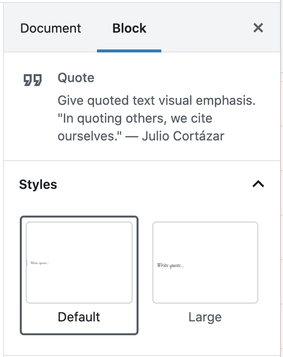
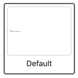
Main issues addressed in #36346. However, this work brings up an opportunity for updating our tile styles. We are using the exact same blue border for :hover, :active and selected item. We initially modelled our UI after the "Styles" tiles from Gutenberg as shown here:
Meanwhile, those styles in Gutenberg got significantly updated from the point we started. Should we also update ours too, @shaunandrews?
To summarise current Styles styling from Gutenberg:
- hover only changes the background of the tile to a light gray
- keyboard :focus and :active show the blue outline
- active selection shows a grey border
- active selection AND focus/active at the same time show both borders
 marekhrabe
on 26 Sep 2019
marekhrabe
on 26 Sep 2019
those styles in Gutenberg got significantly updated from the point we started. Should we also update ours too, @shaunandrews?
@marekhrabe I'm not opposed to updating to match. Right now our hover and active states are the same, so this could help.
I will say I find the double border style from Gutenberg to be a little strange.
shaunandrews
on 27 Sep 2019
@marekhrabe Did we address this anywhere? I've been reviewing https://github.com/Automattic/wp-calypso/pull/36456#pullrequestreview-296149146 and it's not possible to tell the difference between the "active" state and the focus/hover state on the preview thumbs.
 getdave
on 2 Oct 2019
getdave
on 2 Oct 2019
I will say I find the double border style from Gutenberg to be a little strange.
Agreed on the strange part but I view the consistency as a higher priority so we might as well update to use the same styles.
Did we address this anywhere?
Not yet.
marekhrabe
on 2 Oct 2019
Reopening to address the styling
marekhrabe
on 2 Oct 2019
As you've self-assigned this one I'm not going to tackle it. I think it's important to have this complete and in place for:
- The demo.
- This iteration.
- The next release.
Shout when you need a review.
Much appreciated.
getdave
on 3 Oct 2019
@shaunandrews please see https://github.com/Automattic/wp-calypso/pull/36524
getdave
on 4 Oct 2019
Related issues
 BrookeDot
·
3Comments
BrookeDot
·
3Comments
 apeatling
·
3Comments
apeatling
·
3Comments
 rickybanister
·
3Comments
rickybanister
·
3Comments
 aduth
·
3Comments
aduth
·
3Comments
 kellychoffman
·
3Comments
kellychoffman
·
3Comments