Wp-calypso: Plans: Correct table structure to improve Accessibility
Steps to reproduce
Starting at URL: https://wordpress.com/start/onboarding-blog/plans
These were a few issues brought up by user testing participants when using assistive devices (JAWS, built-in browser accessibility tools) to navigate through Plans in the Signup flow.
This can be broken up into separate PRs.
What I expected
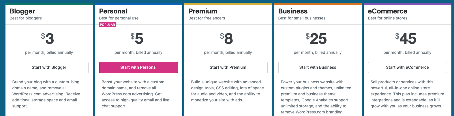
- For table to have a
<caption>tag - For price to be using
<b>or<span>, or maybe even<data>? - I don't know why prices use a random
<header>tag instead of a table heading<th>to define header cells of a table (to associate rows and table heading) - Highlight which Plan is being selected
- Use
<aria-label>for info icons - For buttons to have association with the column they are in
- More visible hover states for buttons
- Darker color for Plan descriptions
What happened instead
- No
<caption>tag for entire table - Price is a random heading tag, it is a
<span>but contained inside an<h4>(It doesn't even look like there are other heading tags that come before it) - Use
<th>instead of<header> - It's not telling me which plan I've selected (I think table headings will solve this?)
- Info icons are out of context, they are unlabeled
- Buttons have no association with the elements around them
- Button hover states are very faint (cc @drw158 @cburton4)
- Plan description font color (light gray) is hard to read
Browser / OS version
Test participants used both Mac and PC
@enriquesanchez @boonerang @davidakennedy Feel free to add anything that I missed in this issue or create a new one.
cc @sararosso @dzver
 jancavan
All 10 comments
Can I see screenshot for the light text in question?
 davewhitley
on 12 Jul 2019
davewhitley
on 12 Jul 2019
Can I see screenshot for the light text in question?
@drw158 It's the Plan descriptions right under the buttons.
jancavan
on 12 Jul 2019
Thank you. Because it looks like it's using the correct minimum gray, you might consider changing it to the dark, almost black gray. --color-text I think.
davewhitley
on 12 Jul 2019
In addition to these, I remember another issue from that same session was that these buttons did not have a label:
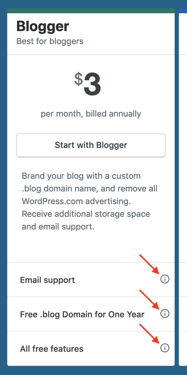
<button type="button" aria-haspopup="true" aria-expanded="false" class="info-popover plan-features__item-tip-info">
    <svg xmlns="http://www.w3.org/2000/svg" viewBox="0 0 24 24" class="gridicon gridicons-info-outline needs-offset" height="18" width="18"><use xlink:href="/calypso/evergreen/images/gridicons-84d04a83ed8c3cfc40de995e9bd32649.svg#gridicons-info-outline"></use></svg>
</button>
 enriquesanchez
on 12 Jul 2019
enriquesanchez
on 12 Jul 2019
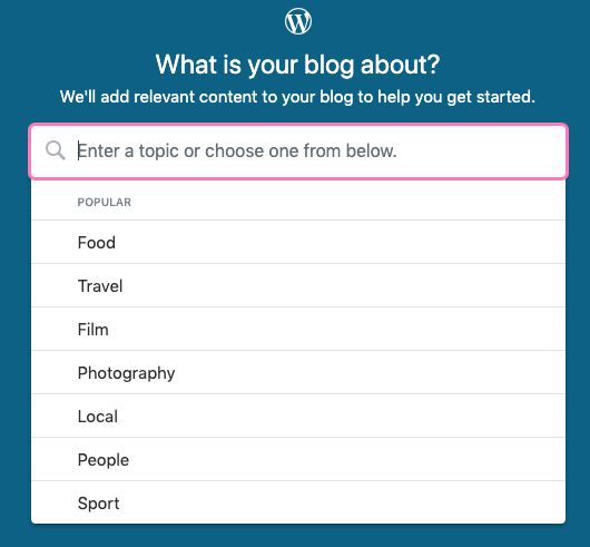
Another thing I'd like to add:
At least two participants didn't realize that typing in a keyword would auto-suggest topics. They thought their choices were limited to the default ones we list:
jancavan
on 17 Jul 2019
I've worked through most of the issues called out here (PR here) and now I'm questioning why Plans are in a table in the first place.
Tables are meant for tabular data, read left to right. This table is presentational, breaking a fundamental development rule and creating content association issues with assistive devices.
Replacing the table markup with divs would make solving these outstanding issues simpler:
- It's not telling me which plan I've selected
- Info icons are out of context, they are unlabeled
- Buttons have no association with the elements around them
I'm inclined to go this route in a separate PR.
Thoughts?
 lcollette
on 20 Jul 2019
lcollette
on 20 Jul 2019
@lcollette There's been some discussion about redoing the plans table in divs on this post - p9jf6J-1Lc
 sararosso
on 22 Jul 2019
sararosso
on 22 Jul 2019
Looped @danielwrobert in. We're going to tackle the refactor.
lcollette
on 22 Jul 2019
cc'ing @lancewillett @anneforbush who are following paid plans work while I'm out.
sararosso
on 22 Jul 2019
@lcollette Yes, probably makes sense to handle those in a separate PR.
jancavan
on 24 Jul 2019
Related issues
 rickybanister
·
3Comments
rickybanister
·
3Comments
 gedex
·
3Comments
gedex
·
3Comments
 ehg
·
3Comments
ehg
·
3Comments
 kellychoffman
·
3Comments
kellychoffman
·
3Comments
 spen
·
3Comments
spen
·
3Comments