Wp-calypso: Navigation: add support for rounded displays such as iPhone X
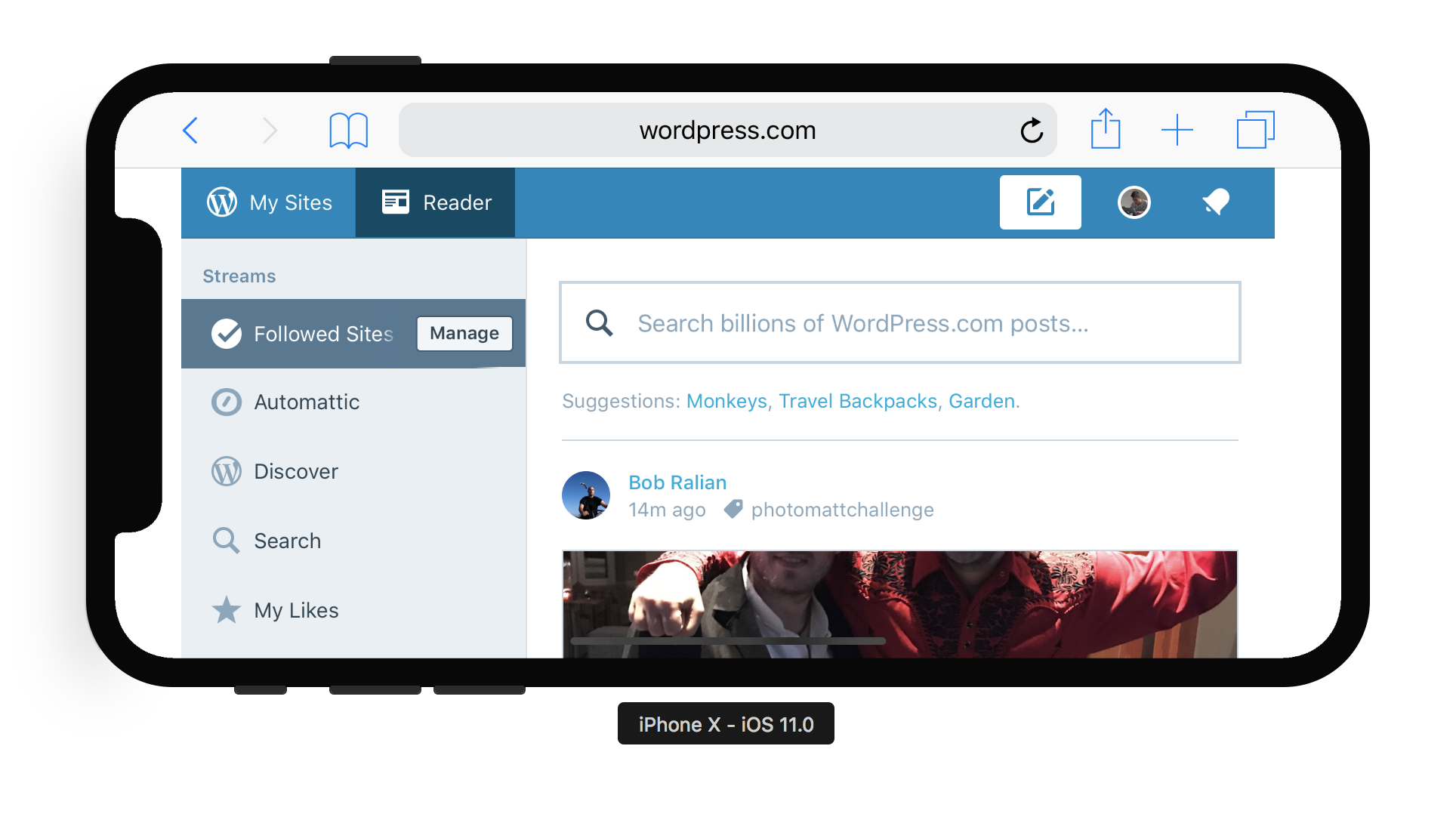
I found this article that surfaced how new iPhone X will render sites in regard to their camera "notch" in the landscape mode. The default behavior for all sites is to letter-box them (screenshot below).
In order for sites to take advantage of the extra space, Apple Safari implements a part of "CSS Round Display Level 1" spec (currently draft) and also provides CSS constants safe-area-inset-* that can be used in margin/padding/position calculations.
Steps to reproduce
- Starting at URL: https://wordpress.com
What I expected
No white stripes on sides.
What happened instead
White stripes. Sad.
Browser / OS version
Safari, iPhone X (currently available in latest iOS Simulator)
Screenshot / Video
Context / Source
manual-testing
 marekhrabe
All 13 comments
 apeatling
on 29 Sep 2017
apeatling
on 29 Sep 2017
@marekhrabe Want to take a quick stab at a pull request as a proof of concept?
 lancewillett
on 29 Sep 2017
lancewillett
on 29 Sep 2017
Not sure how possible that is but I'd like to make use of that extra space on the non-notch side and align our content in the same way as Safari toolbar.

I can take a look during the weekend or at the beginning of next week. I really want this done before I buy the X so the motivation is definitely there 😂
Edit: however starting with the same padding on both sided sounds like a good idea and we can move further from there.
marekhrabe
on 29 Sep 2017
Cool, @marekhrabe — it doesn't need to be a perfect solution to start. Just making it look less bad is fine with me.
lancewillett
on 29 Sep 2017
One other thing, this is not taking into account the safe zone at the bottom, where the drag up bar is. I'm not sure you are supposed to show content overlapping that.
apeatling
on 29 Sep 2017
I'm not sure you are supposed to show content overlapping that.
This is something I want to test once I get the device (which I hope it's sooner than later considered expected restrictions on shipping). I expect it to behave like Safari auto-hiding toolbar at the bottom, which is _actually_ still tappable with the same area even when it's invisible.
If that's the case, it's fine overlapping it to content, but we should avoid putting interactive elements accessible exclusively there (i.e. make sure there's margin at the bottom of scrolling pages, extra margin for buttons, etc).
 folletto
on 3 Oct 2017
folletto
on 3 Oct 2017
I think that's it. No worries about content overlapping the bottom safe area and we add the safe-area-inset- as a bottom padding of scrollable pages so everything is accessible. Hopefully there is one place to do that and we don't need to alter it specifically for individual views.
marekhrabe
on 3 Oct 2017
Is this done or picked up by someone?
(Asking as the iPhone X is out this week)
folletto
on 30 Oct 2017
Don't see any of these changes on my X, so no. @marekhrabe Were you willing to make these changes?
apeatling
on 6 Nov 2017
Sorry, I forgot to post an update. I spent some two afternoons trying to solve this and got pretty frustrated by the lack of tools available. Some quick notes:
- not many resources online so far about this, lots of trial and error
- Apple only released a part of tools they intend to make available
constant()works well in current iOSmin()andmax()are not implemented yet. Once they will be, we will face the problem that their names collide with Sass functions so we cannot really use it directly 😞- Sass fn
unquotemight be the way we would need to use
padding-left: unquote( "max( 15px, constant( safe-area-inset-left ) )" );
Example
I started by adding the viewport-fit=cover. Then I focused on the Masterbar as a proof of concept. I added paddings/margins to menu items based on new constants and this is a result:
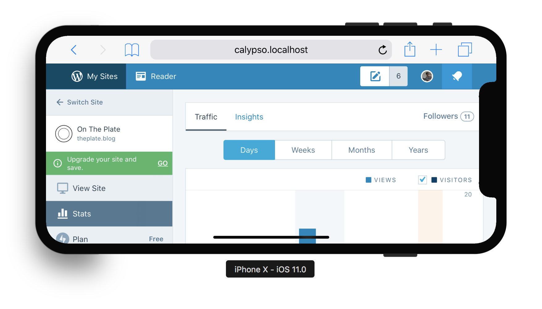
(notice "My Sites" and "Notifications" being offset correctly from sides)
Problem is that this works only in landscape. Once you rotate your phone back to portrait, the constant safe-area-inset-left will become 0px and thus the padding of My Sites button will be suddenly zero - the WordPress icon will be glued to the very edge of the display. Without those min and max functions, this is pretty hard to solve.
Another (minor) problem I saw was the sidebar, in order to achieve the effect that menu items are starting from the very edge of the phone, we cannot really set padding on just the sidebar. We need to ensure every individual item that can appear in the sidebar will have its own padding, based on the constant. That's a lot of specific overriding and potential things to miss.
Most difficult will be the content area. We have a general place that defines a padding for the main content area but there are some views that don't use it and need a custom solution (for example /view/site.wordpress.com, which needs to be padding-less). We would need to go over all possible views in order to be sure we got everything covered.
I don't think that this is a matter of one afternoon anymore. Exploring the concrete usages in Calypso, I start to think that this is a pretty big fish to fry and the unfortunate thing is that we need to take "all or nothing" approach. Once we opt for the viewport-fit=cover, all of Calypso needs to support the safe areas, otherwise, we have potentially inaccessible content.
marekhrabe
on 9 Nov 2017
Once you rotate your phone back to portrait, the constant safe-area-inset-left will become 0px and thus the padding of My Sites button will be suddenly zero - the WordPress icon will be glued to the very edge of the display. Without those min and max functions, this is pretty hard to solve.
Maybe I'm naive, but doesn't calc work there?
Like: calc( safe-area-inset-left + our-default-margin )?
Once it zeroes, we just get our margin. We could use a multiplication on safe-area-inset-left if we want something a bit less without screwing up the math?
I'm aware this doesn't solve the whole thing you mentioned (ouch – yet great dive there!) but maybe it helps...
folletto
on 9 Nov 2017
it might definitely help some cases, great tip worth trying! :) I'm not sure when min and max fns are coming to WebKit — Apple is not really an open book on those topics…
marekhrabe
on 9 Nov 2017
This issue has been marked as stale and will be closed in seven days. This happened because:
- It has been inactive in the past 9 months.
- It isn't a project or a milestone, and hasn’t been labeled `[Pri] Blocker`, `[Pri] High`, `[Status] Keep Open`, or `OSS Citizen`.
You can keep the issue open by adding a comment. If you do, please provide additional context and explain why you’d like it to remain open. You can also close the issue yourself — if you do, please add a brief explanation.
![stale[bot] picture](https://avatars3.githubusercontent.com/in/1724?v=4&s=40) stale[bot]
on 6 Aug 2018
stale[bot]
on 6 Aug 2018
Related issues
 BrookeDot
·
3Comments
BrookeDot
·
3Comments
 spen
·
3Comments
spen
·
3Comments
 aduth
·
3Comments
aduth
·
3Comments
 vparkhere
·
3Comments
vparkhere
·
3Comments
 kellychoffman
·
3Comments
kellychoffman
·
3Comments
Most helpful comment
Not sure how possible that is but I'd like to make use of that extra space on the non-notch side and align our content in the same way as Safari toolbar.
I can take a look during the weekend or at the beginning of next week. I really want this done before I buy the X so the motivation is definitely there 😂
Edit: however starting with the same padding on both sided sounds like a good idea and we can move further from there.