Wp-calypso: Checkout: validation errors on mobile
Originally reported by @scruffian.
If I have an error when checking out on mobile, it becomes difficult to complete the checkout form, because the errors hide the fields, so I can't edit them. When I scroll the error doesn't move away, so I have to dismiss it. The obvious solution to this is show the errors inline, but that's not a quick fix.

 fabianapsimoes
All 12 comments
It looks like CSS handling has changed a bit.
360x640:

412x732:

320x568:

@mtias @folletto @breezyskies @MichaelArestad Do you feel like we really should be able to inline error messages or should we rather make sure we don't create such long error notices? :D
I think that we might also show only the first error for a given field in this case or even figure out if we could group errors by type.
 gziolo
on 5 Oct 2016
gziolo
on 5 Oct 2016
should we rather make sure we don't create such long error notices
Definitely this. We haven't discussed this thoroughly so might be just my opinion, but any notice that is longer than a few words, one line, should be reconsidered.
That said, this one probably requires some kind of quick fix to start with. :P
 folletto
on 5 Oct 2016
folletto
on 5 Oct 2016
@fabianapsimoes It looks like this issue happens only when you click Save Card or Checkout button (depending on the flow) on the empty form. We might also display all messages only when user tries to submit form, but display only the last message when user goes to the next field? Then we would make it much more user friendly as a bonus :)
gziolo
on 5 Oct 2016
Yep, that seems to be the case indeed. I'm going to page @ranh and @breezyskies here, with regards to simplifying the copy and input on when to display the messages. I like the suggestion to show validation on blur, but I wonder if it can get annoying easily.
fabianapsimoes
on 5 Oct 2016
I agree that this notice could use a rethink. Both the copy and the presentation are not ideal. For example terms like "issue", "field", and "invalid" don't have to be used. There is unnecessary repetition for every field that is missing, when a simple "please fill all missing details" might have been enough.
I can help out with copy based on how we decide to proceed.
 ranh
on 6 Oct 2016
ranh
on 6 Oct 2016
I double checked what is the current status of HTML5 form validation. It looks like it has improved a lot and it works almost in 100% for the browsers we support. See http://caniuse.com/#feat=form-validation.
I think it would make perfect sense to use built-in HTML form validation when user types in form fields, and only show notice when user tries to submit the form. What do you think?
I also did an experiment and added required property to all form fields. This is how it changed validation flow:

It was super simple change and without too much thinking reduced list of errors to the absolute minimum. We are able to inline also invalid field errors messages in a similar fashion.
gziolo
on 6 Oct 2016
@gziolo Oh, interesting! How much can we style the native validation messages, so it's closer to Calypso's feel?
fabianapsimoes
on 6 Oct 2016
I bet we can customize it fully :) I'm sure we can customize error messages. I have seen also articles where they suggest hiding default messages and provide own experience instead. I'll explore it further tomorrow.
gziolo
on 6 Oct 2016
@fabianapsimoes it turns out we don't have any control over UI of the error messages. Every browser provides their own styles. We can only change the message displayed to the user.
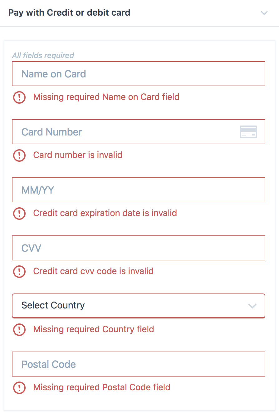
Taking that into account, we probably should skip all HTML5 implementations and move error handling inline like this if we want to keep one style of handling forms in Calypso:

Though with the current design of the form it can be hard to provide flexible solution for the longer error messages.
For the reference screen from devdocs forms section:

gziolo
on 7 Oct 2016
Though with the current design of the form it can be hard to provide flexible solution for the longer error messages.
This is a known issue, and one of the reasons we haven't moved to inline validation yet, as it would require a rethink of the form design (and likely a/b testing to make sure there isn't any major impact on revenue). The checkout form was one of the earliest pieces that we designed for Calypso store, so it's quite out of sync with the current patterns.
The simplest option here would probably be moving country and postal code to their own line, giving both a bit more room for inline validation, all fields going to full width at the <480px breakpoint. A quick inspector mockup:

Another thing noted in checkout is that the label originally used the "float label" pattern, but that appears to be broken, causing a usability problem (once you start typing in a field, there's no longer any indication of what that field is). We should probably update to use the Calypso standard labels at this point (this could be handled in a separate PR but just wanted to note it here). @mikeshelton1503 previously mocked up a version of this for Purchases:

 breezyskies
on 7 Oct 2016
breezyskies
on 7 Oct 2016
With #8666 I want to address form fields changes:
The simplest option here would probably be moving country and postal code to their own line, giving both a bit more room for inline validation, all fields going to full width at the <480px breakpoint.
Then I would like to create a follow-up PR where we could add logic to AB test changes related to error handling and maybe experiment with the "float label" pattern.
gziolo
on 12 Oct 2016
Closing because this was effectively tackled in #8666, and it now appears like this:
 Copons
on 8 Mar 2018
Copons
on 8 Mar 2018
Related issues
 spen
·
3Comments
spen
·
3Comments
 BrookeDot
·
3Comments
BrookeDot
·
3Comments
 apeatling
·
3Comments
apeatling
·
3Comments
 vparkhere
·
3Comments
vparkhere
·
3Comments
 kellychoffman
·
3Comments
kellychoffman
·
3Comments
Most helpful comment
This is a known issue, and one of the reasons we haven't moved to inline validation yet, as it would require a rethink of the form design (and likely a/b testing to make sure there isn't any major impact on revenue). The checkout form was one of the earliest pieces that we designed for Calypso store, so it's quite out of sync with the current patterns.
The simplest option here would probably be moving country and postal code to their own line, giving both a bit more room for inline validation, all fields going to full width at the <480px breakpoint. A quick inspector mockup:
Another thing noted in checkout is that the label originally used the "float label" pattern, but that appears to be broken, causing a usability problem (once you start typing in a field, there's no longer any indication of what that field is). We should probably update to use the Calypso standard labels at this point (this could be handled in a separate PR but just wanted to note it here). @mikeshelton1503 previously mocked up a version of this for Purchases: