Webiny-js: Question: How to add select box and number range UI components
This is:
- Question
Detailed Description
I'm completely new to webiny so apologies if this is something already handled.
I would like to use a select box instead of a radio button select for the number selection.
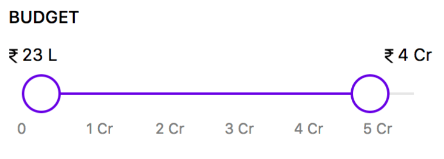
I would also like to add a number range element to the content model configuration. Is it possible / how easy is it to add a plugin to extend the functionality or would this be something I could contribute to the project? Below is the sort of thing I would like to create / use.
Thanks folks 👍
 designreact
All 15 comments
Hey @designreact, could you clarify what you're talking about here, is it a CMS field with predefined values (sounds like it), is it a React component for custom view you're building?
I'll be able to give you useful references once I know what you're looking for :)
 Pavel910
on 27 Jun 2020
Pavel910
on 27 Jun 2020
Thanks for the promt response 🙂
Both are for the data entry, which are configured on /cms/content-models/:content-model-id
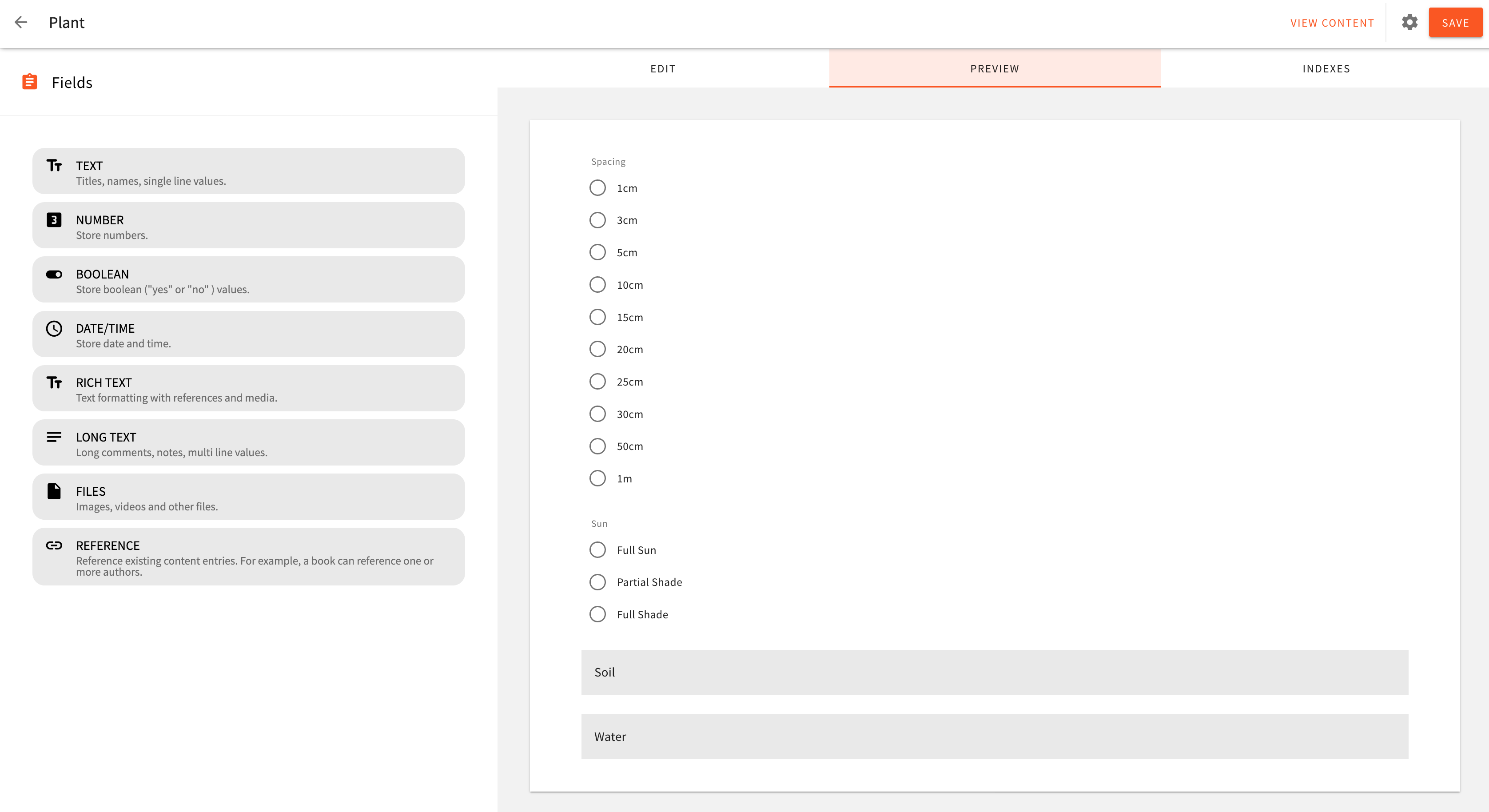
I'd like to be able to use a select instead of radio button here:
I also want to add a new model field type called something like "Range" which would enable the slider style control previously posted. I'm building a vegetable planner and having a slider for month ranges rather than checkbox lists would make data entry a lot faster. Outside of my scope I think this would be useful for a few different scenarios.
designreact
on 27 Jun 2020
@designreact Great! Yeah there is definitely a way to add a new plugin(s) to add different components for rendering of the UI.
The best place to start is this here folder: https://github.com/webiny/webiny-js/tree/master/packages/app-headless-cms/src/admin/plugins/fieldRenderers
It contains field renderers, essentially, those are plugins to render an appropriate UI component, based on how you configured your field.
Currently, we only have radio buttons, but following that particular plugin you cam implement dropdown or a slider:
https://github.com/webiny/webiny-js/blob/master/packages/app-headless-cms/src/admin/plugins/fieldRenderers/radioButtons.tsx
To start you need to register a new plugin in your admin app. A good example can be found here: https://github.com/webiny/webiny-examples/blob/master/iframe-page-element/admin/src/App.tsx#L12
In our Storybook, you can find the library of UI components we use for our admin app. There are also Slider and Dropdown available, so you can use those for your field plugins: https://storybook.webiny.com/?path=/story/components-slider--usage
You can develop this for your own purposes, and publish the package to npm, or you could work on our repo, and contribute to the project directly. We would really love that!
If you need more help, let us know.
Pavel910
on 27 Jun 2020
Great, gives me a much appreciated starting point. Having storybook as a reference is a big plus too.
Thanks 👍
designreact
on 27 Jun 2020
Hi folks,
I've dug into the range slider I would like to add and (depending on your thoughts) think this may be better as a standalone plugin.
Where I am currently stuck is with the underlying slider component from material components web. I was a little disapointed with this discovery but it states:
Note that vertical sliders and range (multi-thumb) sliders are not supported, due to their absence from the material design spec. - https://github.com/material-components/material-components-web/tree/master/packages/mdc-slider
Though the sliders section on https://www.material.io/components/sliders#usage does appear to have range sliders.
This leaves me with a few of approaches:
- Submit a pull request to material components with the range functionality, then add to webiny
- Create a custom range slider and submit to webiny
- Create a standalone custom range slider plugin
I'll touch base with the team at material-components and suss out what their appetite is for adding a range slider and go from there.
designreact
on 29 Jun 2020
@designreact for UI components we're using RMWC library (which is a wrapper for material components). Looks like they don't have range sliders either. The guy maintaining https://github.com/jamesmfriedman/rmwc is very responsive, so I would suggest opening an issue there, and hearing his thoughts on it. He really knows Material Components top to bottom so seeking his opinion would help us decide what to do next.
Just curious, what kind of value would a Range Slider support? I mean, if you have predefined values for numbers, say, 2,3,4,5,6, would selecting 3-5 store 3,4,5 to the database ?
Thanks for your time! Cheers! 🍻
Pavel910
on 29 Jun 2020
GitHub died an hour ago, so I'm pasting this now.
I'm also interested in how the selected range would be represented as an actual value in the content model.
But I think @Pavel910 is on to something here.
The simplest way to look at the range of numbers is that we are looking at a number field, with predefinedValues and mutlipleValues both enabled.
So, the canUse callback for the field renderer plugin would look something like this:
canUse({ field }) {
            return field.type === "number" && !field.multipleValues && get(field, "predefinedValues.enabled");
        }
 doitadrian
on 29 Jun 2020
doitadrian
on 29 Jun 2020
What value is stored is an interesting question.
I think that given the component might have to support large ranges and/or support sliders which are not given a step / quantized. We probably want a tuple of the upper and lower bounds, something like:
<Slider min={2} max={6} step={0.25} />
const range: Range = [3.25, 5.75];

getIsInsideBounds([lowerBound, upperBound]: Range, n: Number): Boolean {
  return n > lowerBound && n < upperBound;
}

const isInsideRange = getIsInsideBounds(range, 4);
So if you had a list of 1, 2, 3, 4, 5, we would store for example [3, 5] (and not [3, 4, 5]) ?
doitadrian
on 29 Jun 2020
@doitadrian @designreact I think predefined values may not fit very well this concept of ranges. What if the range is 1 - 1000 ? For this we would literally have to change the way user defines the actual values in the Content Model Field when range is selected 🤔 @doitadrian will surely have an idea, as he worked very closely on this.
Pavel910
on 29 Jun 2020
With the present slider we only get to set 3 values; min, max and step. This sort of fulfils my requirement as I'm working with months (1 to 12 with a step of 1).
Initially I was looking to see how to best get these values into the new content model modal, and also how to default and possibly hide the multipleValues & predefinedValues switches, but I got distracted by the slider functionality.
A richer experience where the slider shows month labels above the thumbs aligns with wanting to use predefined values.
At this stage I'm happy to settle on using numbers without labels. Though it depends what functionality the webiny team feel is appropriate.
designreact
on 29 Jun 2020
So if you had a list of
1, 2, 3, 4, 5, we would store for example[3, 5](and not[3, 4, 5]) ?
That was my thinking, yes.
designreact
on 29 Jun 2020
Yeah, I'm also thinking this is not something we should be trying to hard-fit into the existing set of features.
I had a couple of ideas on how to tackle this, and all of them would require upgrading the system, unfortunately. It's not as easy as adding a plugin. :/
It's not just about the UI as well, another question that comes into play is how will the users query this? What if they wanted to perform queries on these ranges, just to pull specific records? The GraphQL schema (e.g. filter operators) might be specific to this field as well.
The GQL and the searching bit is the most important part here, as multipleValues fields are not even searchable at the moment. We should think of the way that will enable searches in the future.
My current idea is that this should just be two fields internally and that in the UI, we'd have them be displayed as a single field (so, range component). So basically, the renderer would be setting values on multiple fields. In this solution, we would need to upgrade the field renderer's capabilities.
All in all, I don't see this as something that will be of a high priority at the moment. But, what we can do is, @Pavel910 and I can jump on a call, to discuss this in more detail, and we could provide you with a final plan on how to approach this whole subject (and help you along the way with the implementation, of course).
So, if this is something that is of critical importance for you, let us know, and we'll look it over, and provide you with some guidelines.
doitadrian
on 29 Jun 2020
It's not critical as I can use multiple fields and the single thumb slider component for separate monthStart and monthEnd.
I'll reach out to https://github.com/jamesmfriedman/rmwc and see if I can help get a two thumb slider contributed. If in the meantime you fancied defining an approach for adding support for multipleValues fields that would be great.
So far from what I've seen its a neat little framework but a large amount of the project is still veiled in fog for me 🌁 but I'd be keen to help where I can on the slider work.
designreact
on 29 Jun 2020
Please reopen this issue once you add more information and updates here. If this is not the case and you need some help, feel free to seek help from our Slack Community or ping one of the reviewers. Thank you for your contributions!
doitadrian
on 10 Oct 2020
Related issues
 jsblx
·
4Comments
jsblx
·
4Comments
 TommyJackson85
·
6Comments
Pavel910
·
5Comments
TommyJackson85
·
6Comments
Pavel910
·
5Comments
 jacqui
·
6Comments
jacqui
·
6Comments
 icy-meteor
·
4Comments
icy-meteor
·
4Comments