Webiny-js: Headless CMS - Welcome screen
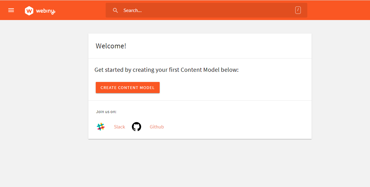
Create a welcome screen for when users first enter the admin area.
A welcome screen should contain:
- button to create a first content model/page
- access to Webiny community
 SvenAlHamad
All 19 comments
 EmilK15
on 29 May 2020
EmilK15
on 29 May 2020
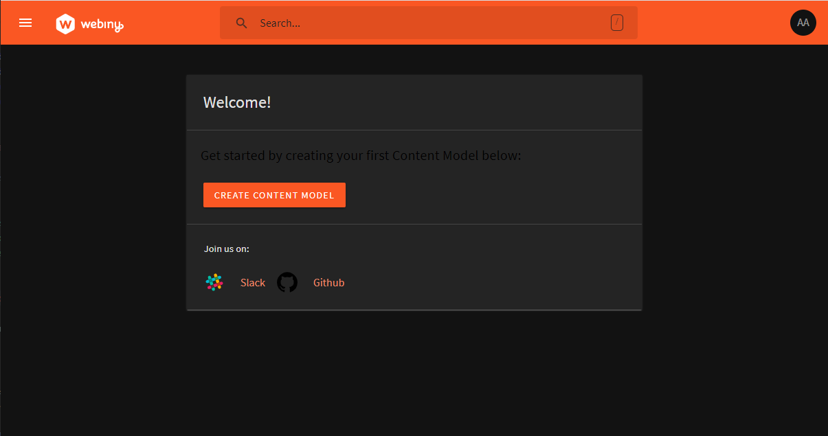
Dark mode version
EmilK15
on 29 May 2020

Similarly the bottom could be spaced out so its two community links per line like this
EmilK15
on 29 May 2020
I think we should add a lot more context here, because out of the blue you're inviting people to create a Content Model, and they are in here for the first time. It's kinda confusing.
 Pavel910
on 29 May 2020
Pavel910
on 29 May 2020
Thanks for the screenshot @EmilK15
I would add a few changes to the screen:
- The font size on dark mode should also change. It should be white.
- As for "Join us", please rename that into "Join our community:"
- Let's have Slack (https://webiny.com/slack), Github (https://github.com/webiny/webiny-js), Medium (https://blog.webiny.com) and Twitter (https://twitter.com/WebinyPlatform) there.
SvenAlHamad
on 29 May 2020
Also agree on the what Pavel said - maybe just add some context to both the upper bit regarding the task of creating the first content model and the lower bit that people know that in our community they can learn, discuss and ask for help.
SvenAlHamad
on 29 May 2020


Above are the new page previews with the added body text, fixed dark mode lighting, and links to Medium and Twitter pages.
EmilK15
on 29 May 2020
@EmilK15 FormBuilder is one thing. Content Models are part of Headless CMS, and that's another thing.
From this text it sounds like in FormBuilder you're creating a Content model.
Also, it's not File Builder, it's Form Builder.
Pavel910
on 29 May 2020
I see we didn't mention it, but a link to the docs site might be useful here as well.
 doitadrian
on 29 May 2020
doitadrian
on 29 May 2020
I think additional formatting should be added here as well.
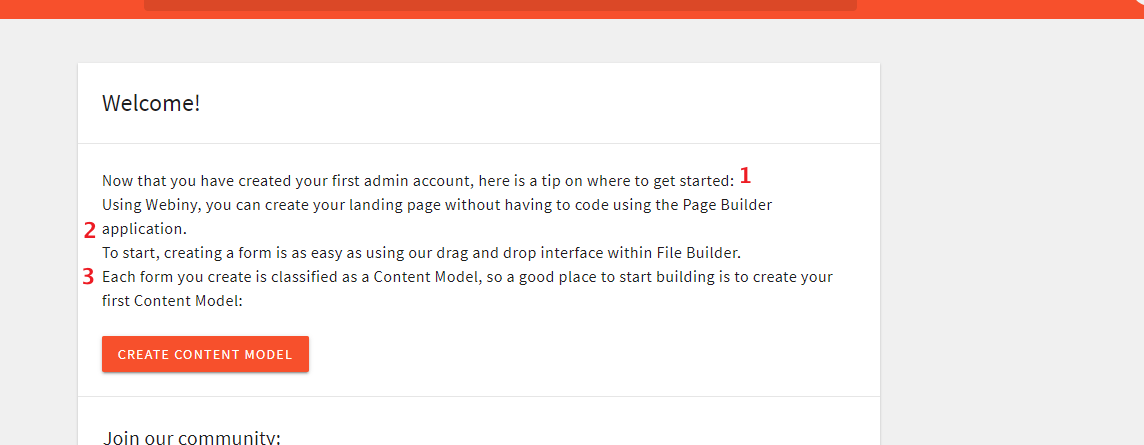
We ended the sentence (1) with :, and then in a new line, we just started a new one (2 and 3).
Using list bullets might be a nicer approach here.
doitadrian
on 29 May 2020
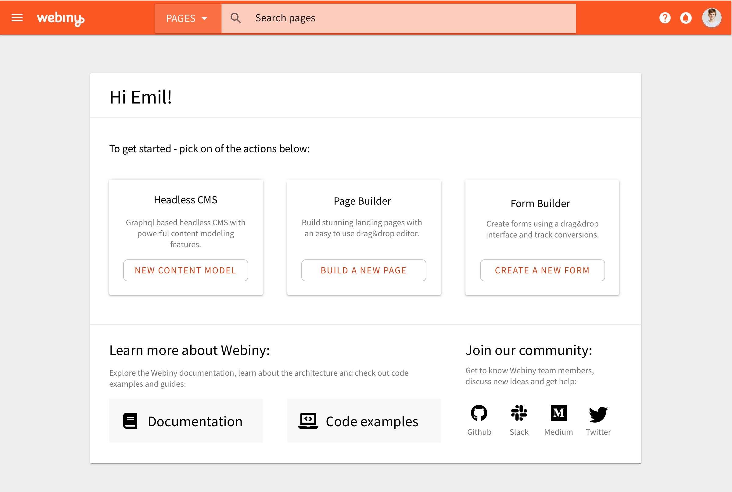
I had a think about this, and the main problem I had with this approach was that it won't work for when a user has multiple apps installed, i.e. headless + pb + fb. To solve that my idea is that each app can have a plugin to register it's own very simple widget to the welcome screen. I've created a mockup below. The plugin for registering widgets takes 3 parameters: title description and a CTA. This approach will now work regardless if the user has 1 app, or 10 apps installed.
I've also polished out the visual style for the rest of the screen.
SvenAlHamad
on 30 May 2020
This looks great and is very easy to implement!
Pavel910
on 30 May 2020
Agreed! Looks awesome :rocket:
 Ashu96
on 30 May 2020
Ashu96
on 30 May 2020
@SvenAlHamad how is this layout achieved in the CSS/Grid context ,is this a 4+4+4, then if we have 5 widgets it breaks down into a new Grid Row, or is this a flexbox with fixed widget width which breaks itself and centers everything?
Pavel910
on 30 May 2020
@Pavel910 the part with app widgets can be a simple flexbox where you have 3 boxes with a fixed width. This way even if you have more than 3 apps, flexbox will automatically push the remaining boxes into new rows, you don’t need to code that logic, flexbox css will handle it.
SvenAlHamad
on 30 May 2020
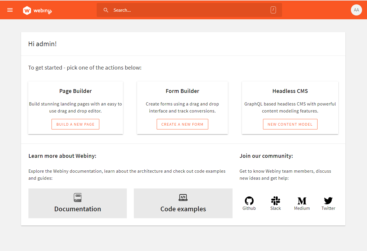

Latest look and feel for the welcome page
EmilK15
on 1 Jun 2020
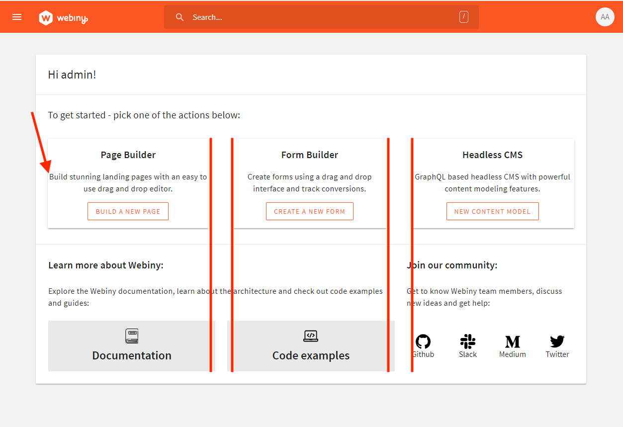
@EmilK15 almost there, two small bits to be corrected:
- The padding inside the app box needs to be bigger, set it to something like 20px (see the arrow in the image)
- The grid is not aligned correctly between the upper bit and lower bit. I suggest adjusting it by tweaking the width or the margins.
SvenAlHamad
on 2 Jun 2020
And if you don't mind, I'd put those button icons left of the text, the Documentation and Code examples. It would look a lot cleaner that way.
Pavel910
on 2 Jun 2020
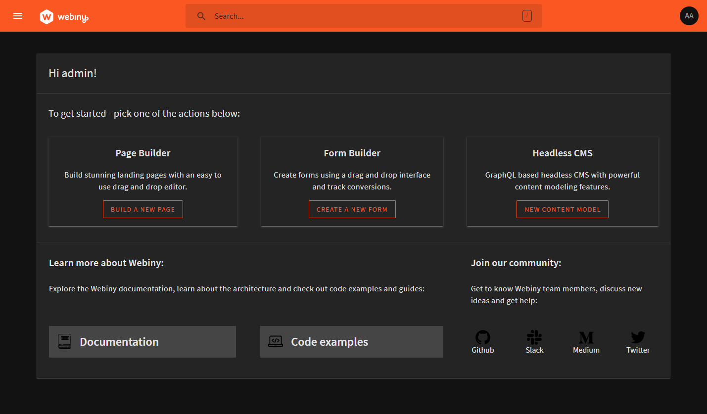
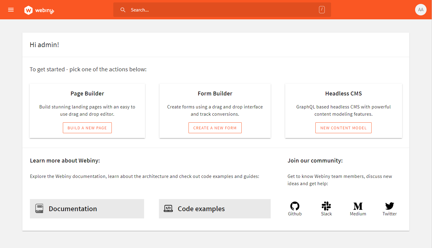
Latest screenshots with those revisions you mentioned
EmilK15
on 2 Jun 2020
Related issues
doitadrian
·
4Comments
 jacqui
·
6Comments
jacqui
·
6Comments
 akve
·
6Comments
doitadrian
·
4Comments
akve
·
6Comments
doitadrian
·
4Comments
 bigb123
·
3Comments
bigb123
·
3Comments
Most helpful comment
I had a think about this, and the main problem I had with this approach was that it won't work for when a user has multiple apps installed, i.e. headless + pb + fb. To solve that my idea is that each app can have a plugin to register it's own very simple widget to the welcome screen. I've created a mockup below. The plugin for registering widgets takes 3 parameters: title description and a CTA. This approach will now work regardless if the user has 1 app, or 10 apps installed.
I've also polished out the visual style for the rest of the screen.