Webiny-js: Headless CMS - Add Publish / Save & Publish buttons
Instead of a single "Save" button in the form footer, let's remove the footer completely, and move the button to the right side in the form header. We'll call it "Save", the label doesn't change. But we'll also add another button, called "Save and Publish", which will do just that.
This will significantly improve the UI.
P.S. The rest of the actions in the header will be moved to the left side.
 doitadrian
All 4 comments
With this, we should also adjust the form view in general.
- Make its max height the height of screen.
- Once the form reaches the screen height, the scrolling will kick in.
- The header must always be still / visible on the top of the form, so that the user can always access the actions in it.
doitadrian
on 9 Jun 2020
Hey team, @SvenAlHamad @webiny/developers
I need your feedback about the new content form structure
Changes:
- Now, we will no longer have the footer. The
savebutton is now moved to the form header. - There is also a
Save & Publishbutton right besideSave - The actions like
Revision menuanddeletecontent has been moved to the left side. - The
Publishaction has been removed because now we haveSave & Publish
5. Form header is fixed and only the form's body is scrollable (if the content extend beyond the fixed height)
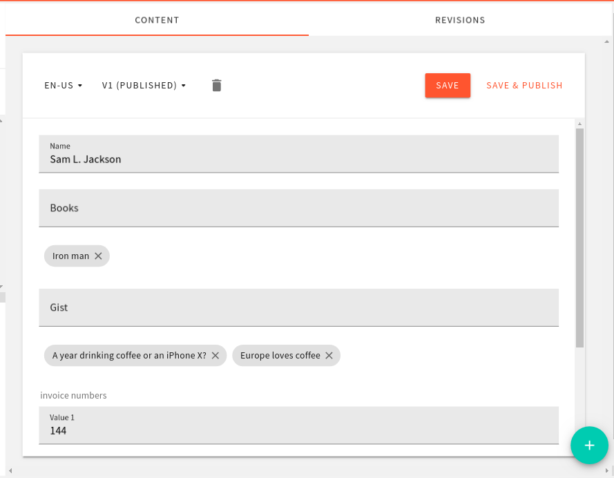
https://www.loom.com/share/c468e08c7f824d98a5b85b89c5b58c0d
Question:
The trash/delete icon looks a bit off on the left side. I'm thinking of moving it on the very right side in a 3 dot menu, what are your thoughts on this?
 Ashu96
on 15 Jun 2020
Ashu96
on 15 Jun 2020
@Ashu96 how about adding a dropdown menu like in Page Builder Editor, so we have Save as a button and to the left of it we'd have those 3 dots dropdown button, you can put Delete in there and maybe even Save & Publish. Let's see how that would look like.
EDIT: Oh man I didn't read the last sentence, where you suggest exactly that 😆
 Pavel910
on 15 Jun 2020
Pavel910
on 15 Jun 2020
From my side:
- I think moving the delete option under the "3 dots" menu is a good approach
- The scrollable area on the right side, I would expand it to the bottom, like in the page builder. It won't matter if the "plus" button goes over it in this case.
- For the "save" button I would use "secondary button" style, and for the "save & publish" I would use the primary button style (https://storybook.webiny.com/?path=/story/components-button--standard-buttons)
 SvenAlHamad
on 15 Jun 2020
SvenAlHamad
on 15 Jun 2020
Related issues
doitadrian
·
5Comments
doitadrian
·
4Comments
Pavel910
·
6Comments
 khayong
·
6Comments
khayong
·
6Comments
 V1xel
·
7Comments
V1xel
·
7Comments
Most helpful comment
From my side: