Web-bugs: picnicss.com - design is broken
URL: https://picnicss.com/tests#
Browser / Version: Firefox Mobile 61.0
Operating System: Android 7.0
Tested Another Browser: Yes
Problem type: Design is broken (Multiple Issues)
Description:
- When pressing the "Menu" button under the "Nav" heading, the page is now scrollable horizontally.
- There is a large amount of blank space at the bottom of the page, which is not reproducible in Chrome 65.
- It seems that the content is slightly misaligned (not at the center of the screen width). This is also visible in https://picnicss.com/documentation . This might not be a Webcompat issue as this problem also occurs in other mobile browsers.
- The Tooltip widget (on https://picnicss.com/documentation ) is also slightly misaligned. Not reproducible in Chrome 65 as well.
Steps to Reproduce:
- Visit the site.
_From webcompat.com with ❤️_
 reinhart1010
All 10 comments
Thanks for the report. I was able to reproduce some of the reported issues and found some new ones too.
When pressing the "Menu" button under the "Nav" heading, the page is now scrollable horizontally.
- reproducible both on Firefox and Chrome => "Non-compat" issue.
There is a large amount of blank space at the bottom of the page, which is not reproducible in Chrome 65.
- reproduced on Google Pixel (Android 8.0.0) - 1080 x 1920 pixels (~441 ppi pixel density)
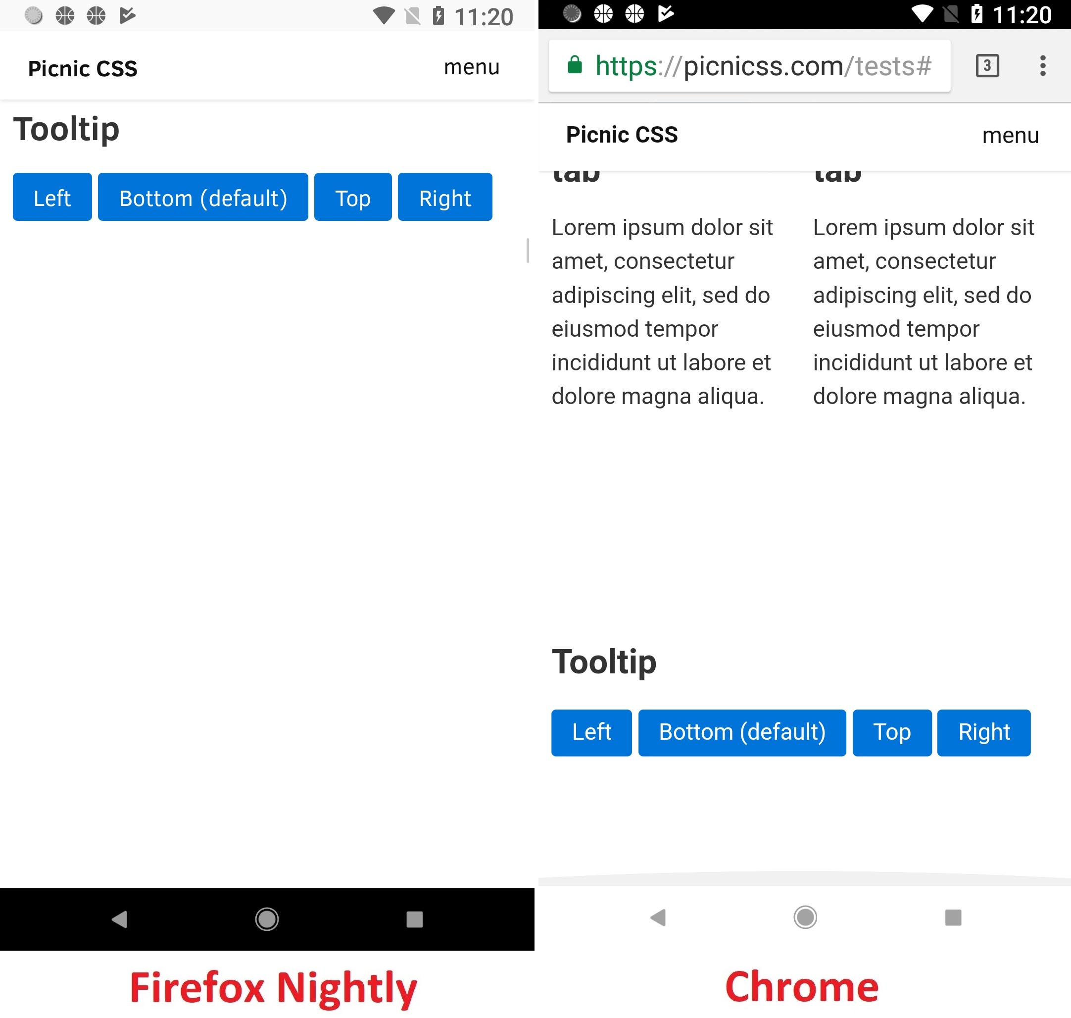
Affected area:
<p>
    <button data-tooltip="This is a great tooltip" class="tooltip-left">
    Left
  </button>
    <button data-tooltip="This is a great tooltip">
    Bottom (default)
  </button>
    <button data-tooltip="This is a great tooltip" class="tooltip-top">
    Top
  </button>
    <button data-tooltip="This is a great tooltip" class="tooltip-right">
    Right
  </button>
</p>
It seems that the content is slightly misaligned
- reproducible both on Firefox and Chrome => "Non-compat" issue.
The Tooltip widget (on https://picnicss.com/documentation ) is also slightly misaligned.
- can't reproduce.
Other "Compatibility" issues on Firefox only:
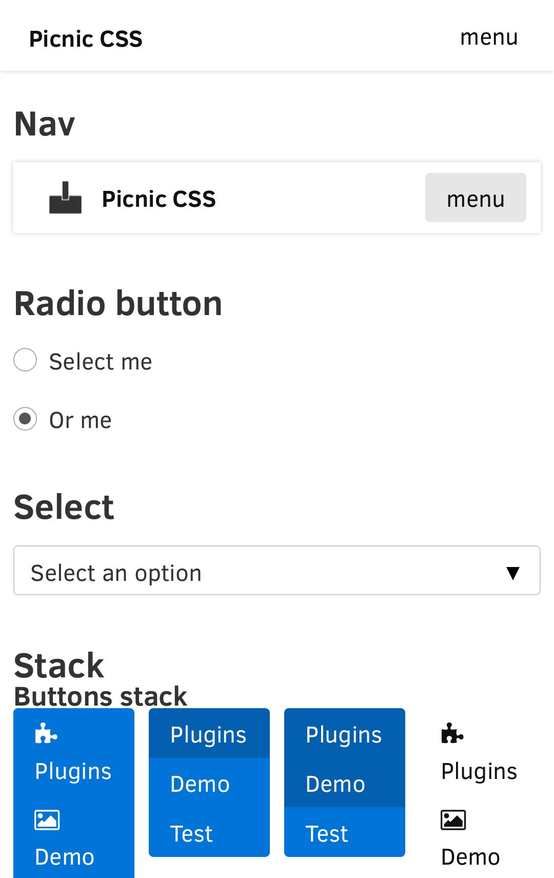
- Small allocated space for Titles (e.g. "Image stack" / "Input")
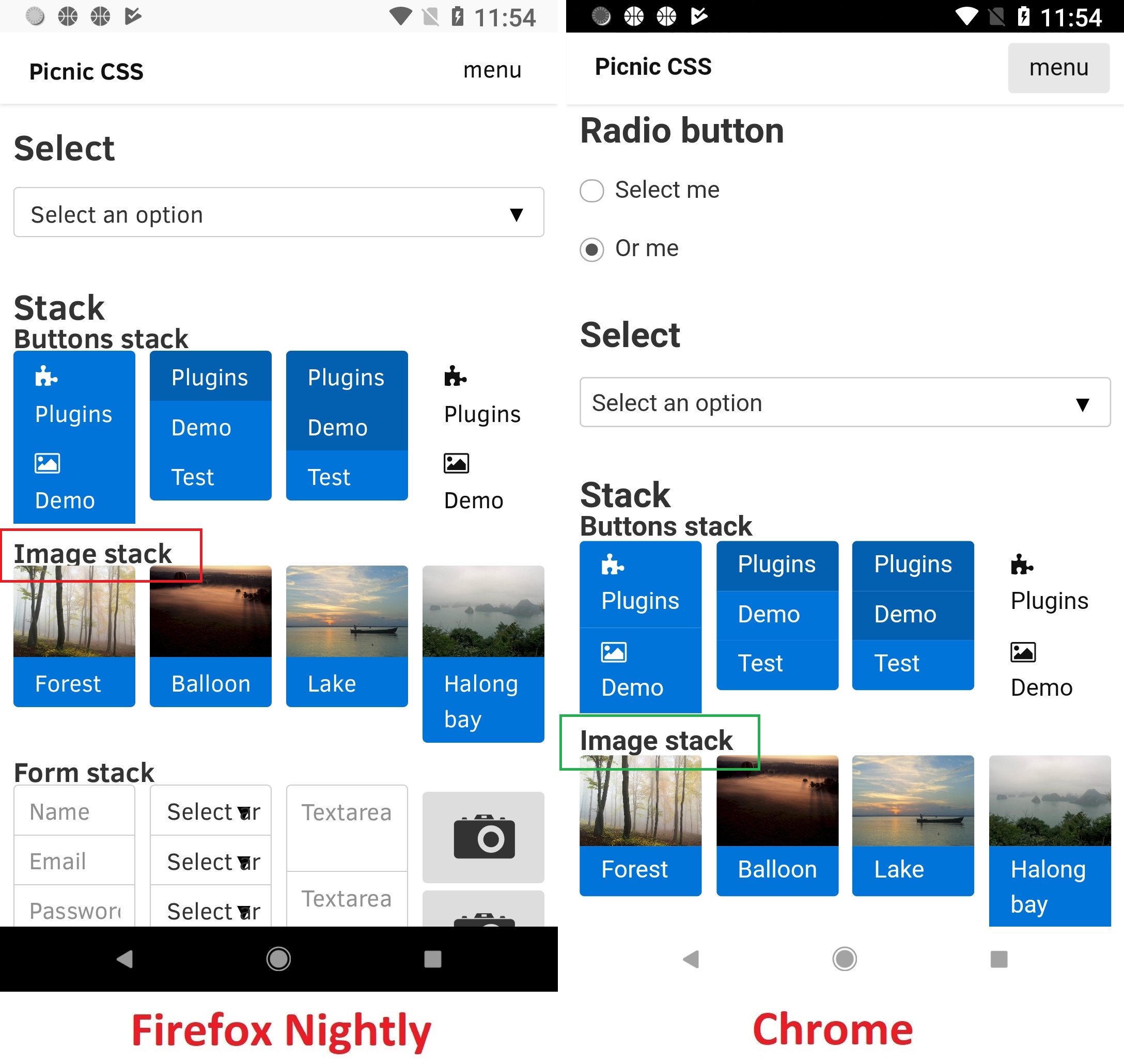
Affected area:
<h3>Image stack</h3>
- Small allocated space for the text on the right side of "Browse" button ("Input" section)
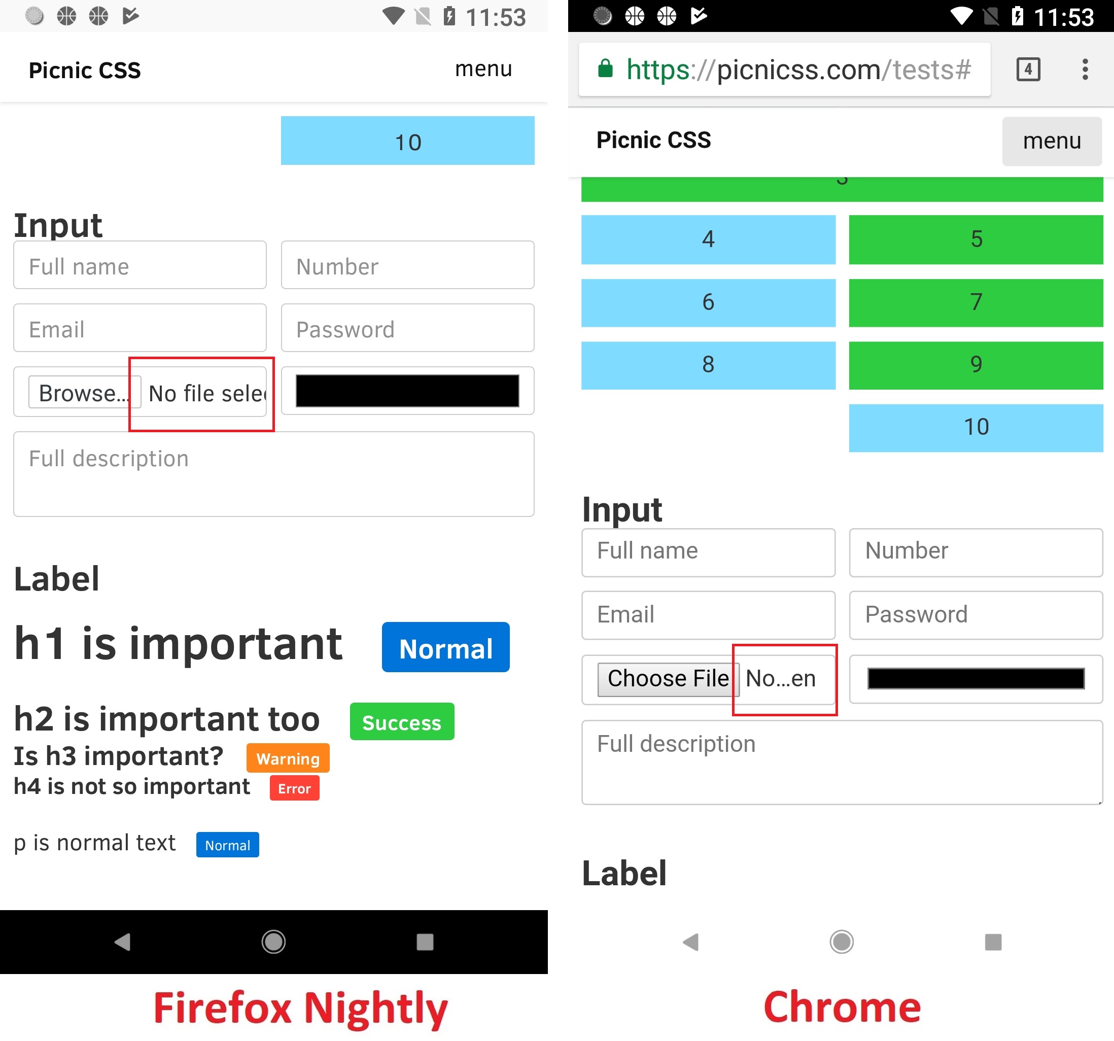
Affected area:
<div>
    <input type="file">
</div>
Other "Compatibility" issues on Chrome only:
- Missing padding between labels in "Label" section.
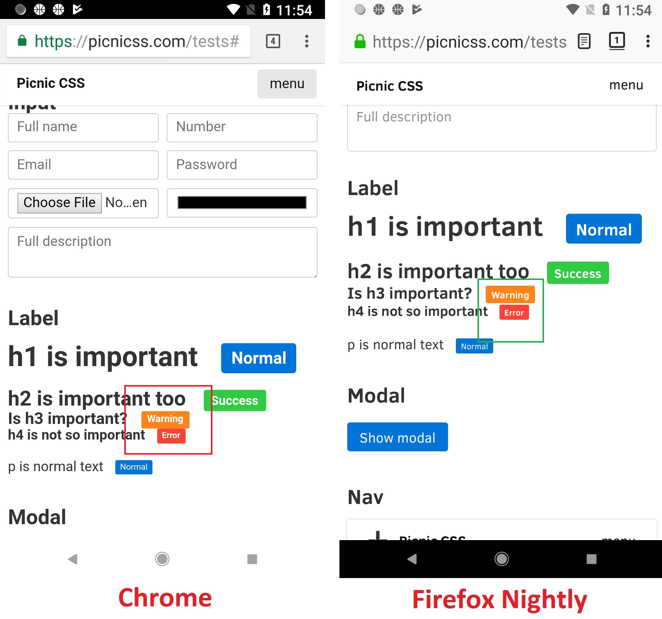
Affected area:
<h3>Is h3 important?
    <span class="label warning">Warning</span>
 </h3>
<h4>h4 is not so important
    <span class="label error">Error</span>
</h4>
Tested with:
Browser / Version: Firefox Mobile Nightly 61.0a1 (2018-03-18)
Operating System: Google Pixel (Android 8.0.0) - 1080 x 1920 pixels (~441 ppi pixel density), Samsung Galaxy S7 Edge (Android 7.0) - 1440 x 2560 pixels (~534 ppi pixel density)
Moving to Needsdiagnosis for further investigation.
 softvision-oana-arbuzov
on 19 Mar 2018
softvision-oana-arbuzov
on 19 Mar 2018
for the margin-bottom There is a 500px in the markup.
.intro {
    padding: 10px;
    max-width: 960px;
    width: 100%;
    margin: 100px auto 500px;
}
and the body is
html, body, main {
    display: block;
    color: #333;
    background: #fff;
    width: 100%;
    height: 100%;
    margin: 0;
    z-index: 5;
}
when we remove the height: 100%; the bottom margin is applied in a similar fashion.
I'm not sure why.
 karlcow
on 20 Mar 2018
karlcow
on 20 Mar 2018
About "Image shack", just the classical https://bugzilla.mozilla.org/show_bug.cgi?id=1392147
karlcow
on 20 Mar 2018
Small allocated space for the text on the right side of "Browse" button ("Input" section)
I would say this is related to https://bugzilla.mozilla.org/show_bug.cgi?id=1365434 and choices about the labels and its default layout.
karlcow
on 20 Mar 2018
Missing padding between labels in "Label" section.
karlcow
on 20 Mar 2018
https://picnicss.com/ is a library.
The native HTML elements get a boost so you don't need to write presentation classes mixed with your HTML.
They probably would benefit of imposing the default sans-serif fonts for mobile to be Roboto.
or to make sure that this is compatible with all the sans-serif fonts on each mobile device/browser.
@reinhart1010 that might be a good feedback to open on https://github.com/franciscop/picnic/issues
karlcow
on 20 Mar 2018
Let's move this to contact ready
karlcow
on 4 May 2018
Pinging @franciscop to make them aware.
 adamopenweb
on 4 May 2018
adamopenweb
on 4 May 2018
Wow thanks a lot! Yes, bugs and misalignments have been creeping in steadily over the years, it's great to see the list here!
First I'd have to clean-up the code, Picnic CSS is long overdue for an overhaul in several fronts; but the amount of work required is quite huge, so I've been putting it off and off. I am even using Picnic at work for some smaller components (buttons, grid and such) so even the SCSS would need quite a bit of love as well.
However, right now my priorities are CSS > SCSS > Website. Then, within my projects server.js (the website itself based on picnic) also has higher priority to Picnic, so realistically speaking I won't be able to fix this within the next few months as none of the issues seem life-or-death.
I will ask at my day job about this to see if at least fixing bugs in the libraries we use (including Picnic) would be okay. Again, thanks a lot for the reports :heart:
 franciscop
on 4 May 2018
franciscop
on 4 May 2018
[Fixed]
There is a large amount of blank space at the bottom of the page, which is not reproducible in Chrome 65.
Small allocated space for Titles (e.g. "Image stack" / "Input") - same as in Chrome.
Small allocated space for the text on the right side of "Browse" button ("Input" section) - same as in Chrome
Missing padding between labels in "Label" section.
Other elements on the page are displays similar in Chrome (non-compat).
Taking in considerations the above, I'd close it as Fixed.
Tested with:
Browser / Version: Firefox Nightly 68.0a1 (2019-08-05)
Operating System: LG G5 (Android 8.0.0) - 1440 x 2560 pixels (~554 ppi pixel density), Samsung Galaxy S7 Edge (Android 8.0.0) - Resolution 1440 x 2560 pixels (~534 ppi pixel density)
softvision-oana-arbuzov
on 6 Aug 2019
Related issues
 webcompat-bot
·
4Comments
webcompat-bot
·
5Comments
webcompat-bot
·
4Comments
webcompat-bot
·
5Comments
 scheinercc
·
6Comments
scheinercc
·
6Comments
 IngrownMink4
·
3Comments
IngrownMink4
·
3Comments
 bvanrijn
·
4Comments
bvanrijn
·
4Comments
Most helpful comment
Wow thanks a lot! Yes, bugs and misalignments have been creeping in steadily over the years, it's great to see the list here!
First I'd have to clean-up the code, Picnic CSS is long overdue for an overhaul in several fronts; but the amount of work required is quite huge, so I've been putting it off and off. I am even using Picnic at work for some smaller components (buttons, grid and such) so even the SCSS would need quite a bit of love as well.
However, right now my priorities are CSS > SCSS > Website. Then, within my projects server.js (the website itself based on picnic) also has higher priority to Picnic, so realistically speaking I won't be able to fix this within the next few months as none of the issues seem life-or-death.
I will ask at my day job about this to see if at least fixing bugs in the libraries we use (including Picnic) would be okay. Again, thanks a lot for the reports :heart: