Wcag: 2.4.11 Unusual scenario: two 'visible indicators' within the same hit area
Given:
The working group is interested in feedback about the minimum area metric, and if there are unusual scenarios where visible indicators are caught by the wording.
I thought it'd be worth raising this as a possible 'unusual scenario'.
It seems relevant to the conversation in #1075 – originally posted this there although it was closed, but now raising as a separate issue.
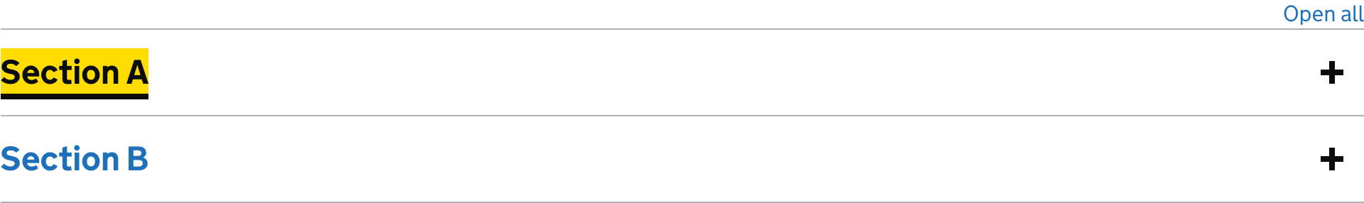
I've been looking at the WCAG 2.2 focus appearance criteria would apply to the accordion component from the GOV.UK Design System:
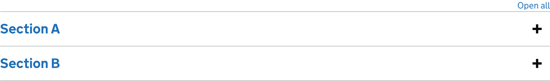
The hit area to expand a section is the entire area between the top and bottom border:
The 'Understanding Success Criterion 2.4.11: Focus Appearance (Minimum)' document has the note:
"If the control has a visible boundary smaller than the hit area, the size measure is taken from the visible boundary."
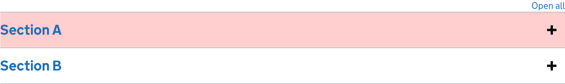
However in this instance we seem to have two visible indicators within the same hit area – the section header and the '+' on the right hand side.
How should the size measure be calculated in this instance? There seems to be a few options…
Drawing the smallest possible area that covers both visible boundaries:
This results in a very large minimum focus indication area.
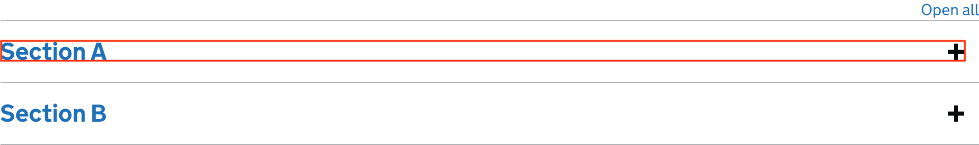
945px + 945px + 30px + 30px = 1950px
Summing the visible area of the two elements:
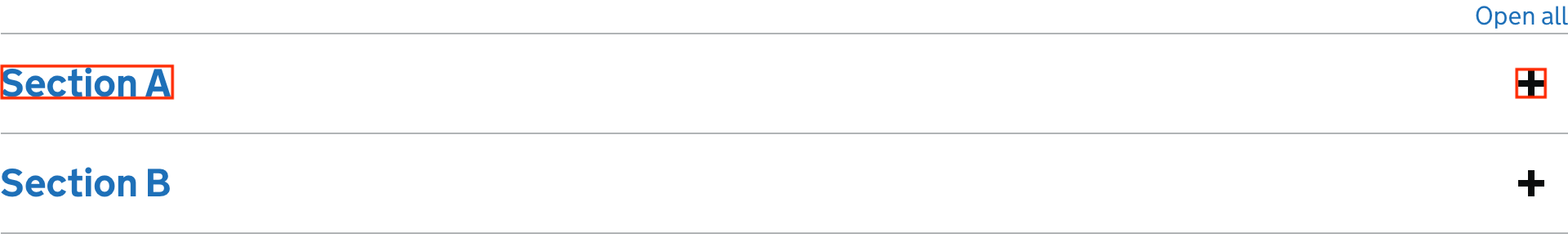
104px + 104px + 30px + 30px + 16px + 16px + 16px + 16px = 332px
Only considering the heading
I think this is effectively treating the '+' as a supplementary element outside of the control but within the control's hit area?

104px + 104px + 30px + 30px = 268px
For context, this is our current focus state:
It has a focus indication area of 104px × 4 = 416px (the yellow is not treated as part of the focus indication area, as it does not meet the change of contrast criteria). I would consider it to be visible.
 36degrees
All 16 comments
(My comment, chair hat off.)
The note about visible boundary was added to tackle a situation where someone expands the hit around a visible control. E.g. a large card has a ‘buy now’ button at the bottom, but the whole card accepts a click. The visible indicator can be specific to the button, and it’s generally better when it aligns with the visible boundary.
I think that is very close to the Gov.uk accordion case, as the text is the <button>, and the whole area has been made clickable.
You could argue the plus/minus sign is a status indicator rather than a separate control, it just happens to be with the click-area.
Therefore the current implementation is fine, you focus on the button and do the calculations based on that size.
 alastc
on 21 Aug 2020
alastc
on 21 Aug 2020
Looking at the complexities of doing these calculations, I am beginning to think that it may be easier to enumerate ways that pass (and possibly have a calculation as fallback for things not enumerated): i.e. whitelist common good focus options.
These seem main candidates:
- Solid 1px outline (or thicker) all around focusable element
- Twice that, i.e. 2 px (or thicker) for dotted / stroked outlines)
- 2 px (or thicker) full underline for inline text (or we may settle for a minimum of 3px)
- Twice that (i.e. 4 px or thicker) for dotted / stroked underlines of inline text
- Partial-length underlines must increase thickness to cover the same surface as solid 2 (or 3) pixel full-length underlines
- 8px (or thicker) line on shorter side of element
- Full background colour change of target ( contrast 3:1 or more against unfocused background)
- Colour inversion of target
- All else: Ways of showing focus not covered here must cover a surface equal to 1px full outline (and meet 3:1 against unfocused area)
I am honestly not sure whether this is workable, but it would give designers a clear idea of common and approved ways of showing focus (also as a nod to COGA) and eliminate complex calculations for most common situations (anyone keen to calculate how many corner pixels you would have to subtract, or work out whether links are taller than wide?) All this would not be needed if we have a whitelist.
@alastc Is it worth creating a separate issue for this?
 detlevhfischer
on 25 Aug 2020
detlevhfischer
on 25 Aug 2020
I'd support @detlevhfischer proposal to have an approved list of certain methods and then have a catch-all for other methods not listed that falls back to the area calculation.
 mraccess77
on 25 Aug 2020
mraccess77
on 25 Aug 2020
an approved list of certain methods
I'm hoping this is meant only as non-normative/informative examples, and not some kind of mandated "you are only allowed to use these"
 patrickhlauke
on 25 Aug 2020
patrickhlauke
on 25 Aug 2020
Assuming it is: "Use one of these or use the size calculation", I think we could focus on the ones that are close. E.g. NOT the background colour changes.
alastc
on 25 Aug 2020
No mandate to use a specific thing - just agree on simplification for testing common methods while allowing anything that passes the size calculation. Otherwise calculations will require tools and sorting out aliased pixels and all sorts of things.
mraccess77
on 25 Aug 2020
@patrickhlauke of course not meant as an exhaustive list, as made clear in the last bullet. I personally like to highlight stuff by making them wobble slightly for 4.9 secs while giving them a huge soft drop shadow and a silvery sheen.
detlevhfischer
on 26 Aug 2020
@alastc can you clarify why
Full background colour change of target ( contrast 3:1 or more against unfocused background)
...is not a good whitelist candidate (assuming that text contrast to background is kept at 4.5:1 or better in focused and unfocused state, which can mean also changing font colour)? You have been wading through this this longer than anyone else...
detlevhfischer
on 26 Aug 2020
Assuming it is: "Use one of these or use the size calculation", I think we could focus on the ones that are close. E.g. NOT the background colour changes.
I think that the list is a "here's a bunch of ways to meet or exceed the requirements of the size calculation" so the full background color is a good example to include.
 awkawk
on 26 Aug 2020
awkawk
on 26 Aug 2020
I'm a little confused about whether everyone is thinking this is (normative) text in the SC, or not?
If it is normative SC text, then I'd go with the least possible number of items. In that case then something which (IMO) obviously passes the size criteria like a full background change is not needed.
If it's a list of examples in the understanding, sure let's add 'em all.
alastc
on 22 Oct 2020
Hi everyone,
I'd kept this open in case we tool the approach above, but we have discussed and agreed to this approach:
Minimum area: The area of the focus indicator is either:
- at least as large as the area of a 1 CSS pixel thick perimeter of the unfocused control;
- at least as large as a 4 CSS pixels border along the shortest side, and no thinner than 2 CSS pixels.
Survey: https://www.w3.org/2002/09/wbs/35422/wcag22-focus-appearance-updates2/results#xq1
Minutes: https://www.w3.org/2021/01/19-ag-minutes.html#t02
Understanding document: https://w3c.github.io/wcag/understanding/focus-appearance-minimum.html (Should update soon)
Based on that we'll close this issue, but please raise a new one if there are problems with the new text.
alastc
on 20 Jan 2021
Hi @alastc, the survey appears closed. It's hard to tell with the proposed changed if there still remains a contrast requirement - can you confirm that either way the area is measured there is still a >=3:1 contrast requirement?
mraccess77
on 22 Jan 2021
The snippet above is just the first bullet (now with sub bullets), the other three bullets remain.
Sent from my phone, apologies for typos.
On 22 Jan 2021, at 21:02, Jonathan Avila notifications@github.com wrote:
Hi @alastc, the survey appears closed. It's hard to tell with the proposed changed if there still remains a contrast requirement - can you confirm that either way the area is measured there is still a >=3:1 contrast requirement?—
You are receiving this because you were mentioned.
Reply to this email directly, view it on GitHub, or unsubscribe.
alastc
on 22 Jan 2021
Hi @alastc changing the area requirement has an impact on the contrast requirement. The contrast waiver for a 2px indicator was predicated on it being a 2px perimeter around the control. If the perimeter is no longer required then 2px only on one side would not be enough for users with low vision. While I like the area change the 2px exception would now need to be adjusted.
mraccess77
on 25 Jan 2021
Hi @mraccess77,
The maths of the new metric means that a control will not pass the new metric with a 2px thick line on one side unless it is quite thin.
E.g. a 100px square would require 400px area, so a 2px line would be half the required area.
You need shapes where the shortest side is half the longest side before a 2px line on one side will consistently pass.
E.g. a 200 by 100 control requires an area of 4 * 100 = 400. So a 2px line for a width of 200px = 400px.
I'm not sure that updating the adjacent contrast bullet (if that's what you meant) would improve things, compared to the extra complexity?
alastc
on 25 Jan 2021
@alastc I'm thinking of the pretty common scenario where text is a control like a button or link and the height is only 16px or so while the width is say 80px. In this case 16x4 is 64. So the indicator only has to be 32px wide by 2px height with no contrast requirement. This 32px by 2px indicator could just be along the bottom edge of a button and could be virtually the same color as the button background and pass.
mraccess77
on 26 Jan 2021
Related issues
alastc
·
7Comments
patrickhlauke
·
8Comments
 DanteGagne
·
9Comments
DanteGagne
·
9Comments
 vavroom
·
6Comments
patrickhlauke
·
8Comments
vavroom
·
6Comments
patrickhlauke
·
8Comments
Most helpful comment
@patrickhlauke of course not meant as an exhaustive list, as made clear in the last bullet. I personally like to highlight stuff by making them wobble slightly for 4.9 secs while giving them a huge soft drop shadow and a silvery sheen.