Wcag: 2.5.8 Larger target sizes could conflict with people needing page zoom
As someone who is somewhat visually impaired, this criteria confuses me. I have my browser and desktop zoom factors set to a comfortable scale for me. They increase the size of all controls to a level that makes it very easy for me to read as well as click on targets with my mouse and in absolute device pixels, all of the controls are greater than 44x44 pixels. If I set my zoom and DPI scaling to 100% in both cases, I find the sizes of MANY controls in many places to be too small for my own comfort.
What I don't understand is why this criteria basically says that every individual application must now increase the size of all of their controls for all users. If this gets approved, any application developers or website designers who decide to comply with it will increase their controls to 44x44 CSS px, which will now be scaled for me to 77x77 device pixels... which is too large. This will start to force out content and require me to reduce my zoom for THOSE sites/applications. Then, as soon as I go to a site that isn't conformant, I need to zoom back in. I would vastly prefer to have a browser or OS setting that allows me to set the scale to a consistent scale that's comfortable for me.
I feel like this is going to make my overall experience much worse since now I'll have to constantly be changing my zoom factor based on which page I'm going to. Please help me understand the principle here on why making use of the browser settings is an unacceptable solution?
 DanteGagne
All 9 comments
Noting first of all that the SCs are aimed at developers. In this case it's essentially saying that developers can't rely on users zooming as a get-out-of-jail card for making their controls small ("it's ok, if users find it too small, they can zoom").
I would vastly prefer to have a browser or OS setting that allows me to set the scale to a consistent scale that's comfortable for me.
This SC does try to set a baseline minimum for comfortable/usable controls at default/100% scale (roughly, at least). of course, this may or may not work for all users, and their own specific resolution/zoom/what they consider "comfortable".
I'll have to constantly be changing my zoom factor based on which page I'm going to
most browsers should remember zoom levels on a per-site/per-domain basis.
 patrickhlauke
on 2 Sep 2020
patrickhlauke
on 2 Sep 2020
What is the baseline minimum for 100% scale in the SC? Is that 44x44? Since that's so much larger than what most desktop applications use, I feel like it's going to make everything comically large. And yes, I know that the SC is focused on web experiences over desktop applications, but I still assert that such a discrepancy between the web content and the desktop content is going to be uncomfortable.
most browsers should remember zoom levels on a per-site/per-domain basis.
From this, I still suspect I'd have to get into the habit on pretty much every web page I go to, to reset the zoom depending on their compliance. I don't see that as an improvement over the existing experience of just setting my Zoom value once and having it be consistent across pretty much all the web pages I visit.
Today, my zoom is set to 150%. I literally can't remember the last time I needed to adjust my zoom value, since that 150% makes every site I go to comfortable in scale. If this SC goes into effect, any page that wants to comply with it will require me to change my zoom factor for that page. How is that making my life better?
I'm not arguing that controls need to be big enough to interact with them... I understand that quite intimately. I just don't understand for whom this criteria is trying to improve their experience and why there's value in degrading the experience of one set of users who have an accessibility need to improve the experience for a different group.
DanteGagne
on 3 Sep 2020
Hi @DanteGagne,
Please help me understand the principle here on why making use of the browser settings is an unacceptable solution?
Some people may have perfect vision and want to use the default visual size, but have a mobility impairment that makes small targets very difficult to use.
Since that's so much larger than what most desktop applications use, I feel like it's going to make everything comically large.
I don't think that's the case, for example, looking around this page most links & controls on this page would pass the new criteria, except perhaps the links under "3 participants" with our faces. That one is close, I'd have to measure it.
The toolbars in Google docs would have to be _very slightly_ bigger. Looking at the Toolbar of a more traditional editor, the drop-downs next to buttons would need to change, but the other buttons are mostly fine.
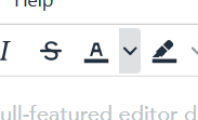
(alt = screenshot from TinyMCE showing several buttons, one with a very narrow drop-down button next to it.)
I am fairly skeptical that sites meeting this requirement would mean you have to zoom out. It's possible you use a particular style/type of site that I do not though, it would be helpful if you had some examples to hand? For sites I use regularly, it is ones like the W3C that would have to make the most changes, e.g. listings like these:
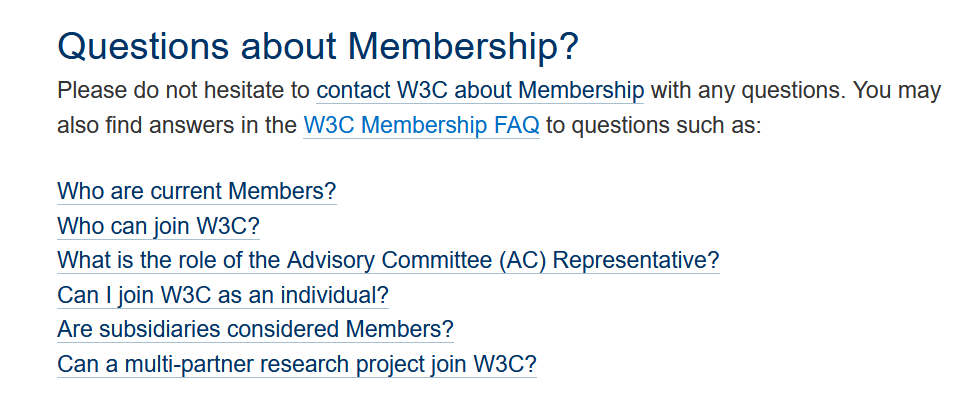
(alt = screenshot from W3C site showing a list of links with no vertical spacing.)
Those which already design for touch-screen usage will generally be fine. (A bit like those which designed for responsive mobile usage are generally good when it comes to zooming.)
 alastc
on 3 Sep 2020
alastc
on 3 Sep 2020
Hello,
Firstly, I love that this rule is attempting to address the needs of people with motor impairments. It's great to see an Accessibility Group focus on this but I agree with Dante I don't think this will have the intended response. I'll counter some of your counters below. However, I think it's a bit too general and will create a lot of work to accommodate but will generally have low impact because of the ways we would need to account for it.
Some people may have perfect vision and want to use the default visual size, but have a mobility impairment that makes small targets very difficult to use.
- Alastair
Speaking on the behalf of designing for rich application like Office Online/Google Docs/etc. changing the hit targets will always require changes to the surrounding elements to help with grouping and hierarchy, and yes Dante would need to zoom out because of this. The changes we would make to accommodate this rule would require blanket changes to Increasing type ramps, padding, spacing between elements, iconography, etc. If we were to change the size of actionable controls without changing pretty much zooming, we would negatively impact the Information Architecture of the application as basic principles like proximity(the first Gestalt visual principle) would be impacted, and the sizing of actionable and non-actionable controls within every toolbar/menu/pane/etc would need to be bumped up to look appropriate within the interface.
We use spacing as a way of grouping controls in almost all apps(even this editor does it and would need to change I've put boxes around the spaces, I am assuming the reply button it a split for the sake of example)

When we are to adapt to this rule we would likely need to do so by bumping up the size of our UI(essentially do a DPI change / browser zoom) which there are already mechanisms to do with either browser or OS zoom. Assuming, an app reflows appropriately I think this rule will have little impact on people with motor impairments as they are already getting a changes similar to the one we would need to apply to accommodate this rule, and decrease zoom within the app of the main content(Excel sheet, PowerPoint Slide, Word Document).
Looking at the Toolbar of a more traditional editor, the drop-downs next to buttons would need to change, but the other buttons are mostly fine.
- Alastair
I am responding to this quote below in a separate thread as it's not related to Dante's concerns. but the TLDR of that is this is about how the rule assumes click and touch create the same behavior, actually when you click on a split button like that it behaves differently in our apps if you touch or use a pointer device.
Theo
 Rainhale
on 3 Sep 2020
Rainhale
on 3 Sep 2020
I would add that changes in Office applications to increase touch target areas negative impact me. Many users with low vision of blind spots in their vision and are limited to a narrow field either by magnification software, zoom level, or by field view of such as looking closely. Expanded touch areas means less controls appear in the visual field. I prefer the condensed interface in Office apps to remove whitespace so I can fit more on my screen. Larger icons often mean more disclosure controls are required and thus more cognitive load for some to figure out behind which control the content they want is located. Unfortunately, what works best for one person doesn't work the best for another. We really need flexibility of design based on user needs.
 mraccess77
on 3 Sep 2020
mraccess77
on 3 Sep 2020
@alastc just popping in to say that when I look at the two examples you gave -- google docs and the tiny mce editor -- I see them both being extremely far away from the 44px threshold. Are you sure you're testing at 100% zoom?
For me, google docs at 100% zoom has editor buttons that are 26px wide, with barely a few pixels between -- well under 44px on this toolbar:

Tiny MCE is barely better, with 34px buttons in the demo on their home page:

I'm not citing this as an inherently good or bad thing, just a note that the 44px size in this criterion is significantly larger than what I currently find for most grouped controls on the web.
 smhigley
on 4 Sep 2020
smhigley
on 4 Sep 2020
Hi @smhigley, Yes I noticed in another thread that in my setup (mild zoom) meant the tool I was using was very, um, flattering to the target sizes.
There are a few issues around this now, we're convening a group of people to work on it.
alastc
on 9 Sep 2020
Hi everyone, the mobile TF proposed an update which I added to this comment on 1384.
It would help to keep discussion of that in one place, so I'm just cross-linking...
alastc
on 10 Sep 2020
Hi everyone,
The text of the success criterion has been significantly updated, and the group believes it resolves the issue so this issue is being closed. There will be another review opened soon.
alastc
on 2 Mar 2021
Related issues
alastc
·
7Comments
 LaurenceRLewis
·
4Comments
smhigley
·
8Comments
LaurenceRLewis
·
4Comments
smhigley
·
8Comments
 36degrees
·
10Comments
patrickhlauke
·
10Comments
36degrees
·
10Comments
patrickhlauke
·
10Comments
Most helpful comment
Hi @smhigley, Yes I noticed in another thread that in my setup (mild zoom) meant the tool I was using was very, um, flattering to the target sizes.
There are a few issues around this now, we're convening a group of people to work on it.