Vscode-pull-request-github: UX is not that nice for viewing files in some repos
This depends on the repo but for VS Code the extension is pretty bad as displaying the files. This screenshot shows that for this PR I don't know what files are and opt to click each of the files to discover what they are (hover takes too long):
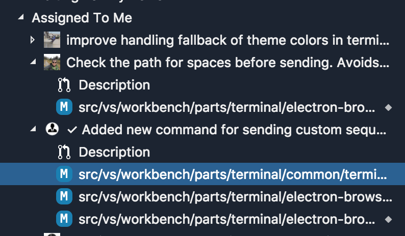
Note that this is after double clicking the sash which is meant to set the viewlet to the "optimal" size.
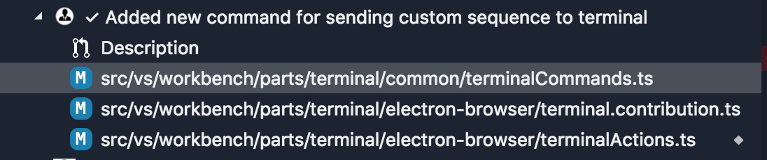
The viewlet takes almost half the width of my macbook's monitor to show the files fully:
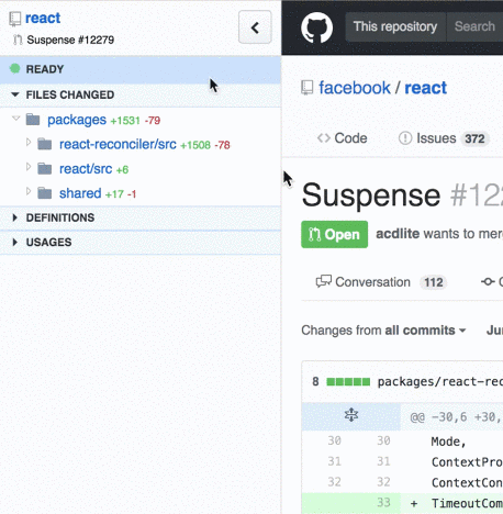
This is how that problem was solved for disambiguating tabs:

I'm not sure what the best way to improve this is as putting the file names at the start would degrade the experience when the PR has mostly short paths, due to the folders not being lined up.
 Tyriar
All 5 comments
Have you considered a nested tree for the changed files? Like a subset of the explorer files tree, showing only the changed files. It would expand the list vertically, but make it easier to fit the entire thing horizontally.
I build rubberduck, a browser extension for GitHub pull requests, and I've gotten consistent feedback that the nested view gives an instant overview of the changes (case in point). One downside is that it needs additional clicks to expand a deeply nested file, but I've found that to be a worthwhile tradeoff (and can auto-expand multiple levels maybe?)
 arjunattam
on 8 Sep 2018
arjunattam
on 8 Sep 2018
As an idea, what do you think about viewing the file extension icons on the left side and badges (M for merged) on the right side?
 NavyAdmiral
on 8 Sep 2018
NavyAdmiral
on 8 Sep 2018
Thinking about this more and reading the comments we should probably try and match what we do in the explorer and search. Search for example will show the file name first and the folder slightly greyed out:

The icon could be on the right could also help and then we could move the change state over the the right just like in the explorer:

I'm sure this would need more ext API to get right.
Tyriar
on 8 Sep 2018
@arjun27 I wouldn't mind that as an option but I personally wouldn't use it, I get frustrated when I'm forced to use the mouse in the explorer for example (when I can't access a file via ctrl/cmd+p).
The file name is the primary info that needs to be communicated so we should make sure that's easily accessible.
Tyriar
on 8 Sep 2018
The tree items have already been changed to display the file name, and then the full path as a description after it the same way the explorer and search show.
Additionally, we just merged a PR that will add a setting for toggling between a tree and a flat view of these files - by default it's set to tree.
 RMacfarlane
on 10 Oct 2019
RMacfarlane
on 10 Oct 2019
Related issues
 erihanse
·
4Comments
erihanse
·
4Comments
 kieferrm
·
4Comments
kieferrm
·
4Comments
 dbaeumer
·
4Comments
kieferrm
·
4Comments
dbaeumer
·
4Comments
kieferrm
·
4Comments
 adrinjalali
·
4Comments
adrinjalali
·
4Comments
Most helpful comment
@arjun27 I wouldn't mind that as an option but I personally wouldn't use it, I get frustrated when I'm forced to use the mouse in the explorer for example (when I can't access a file via ctrl/cmd+p).
The file name is the primary info that needs to be communicated so we should make sure that's easily accessible.