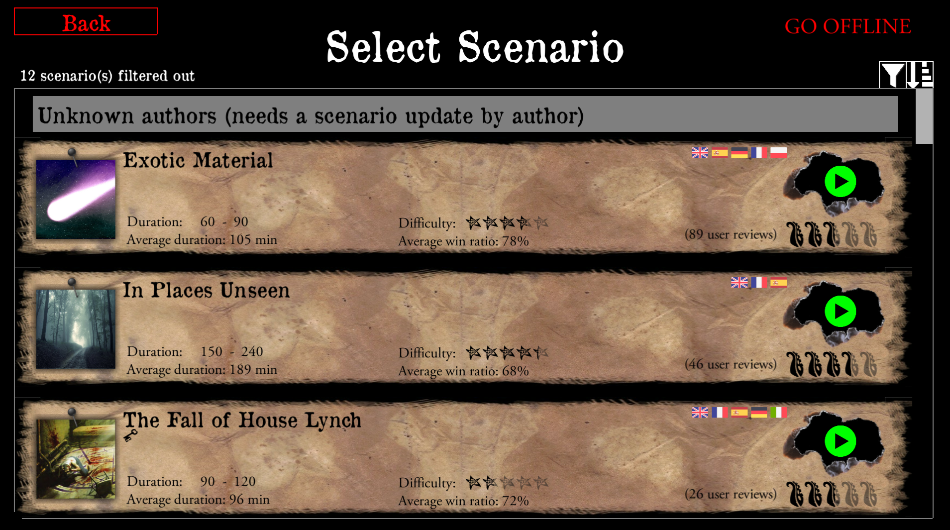
Valkyrie: Grey play button is confusing
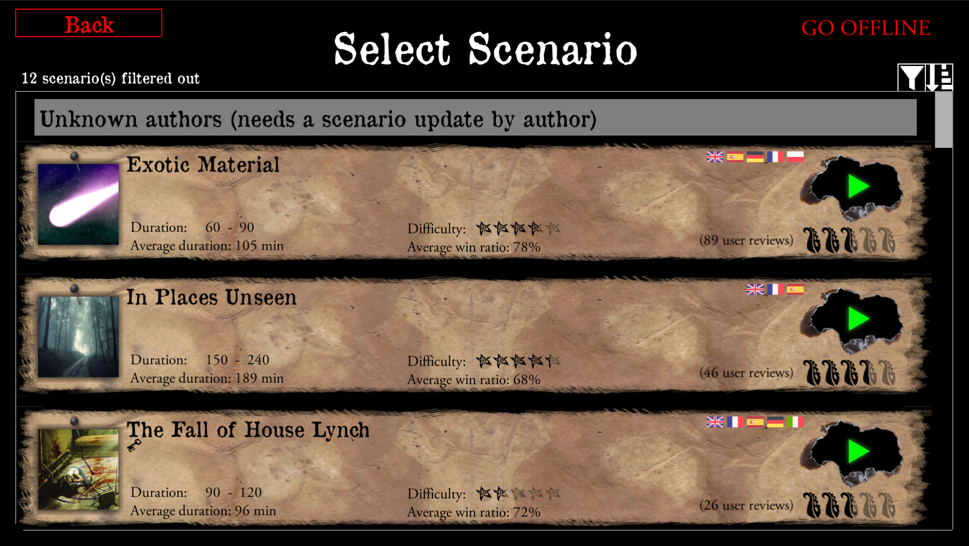
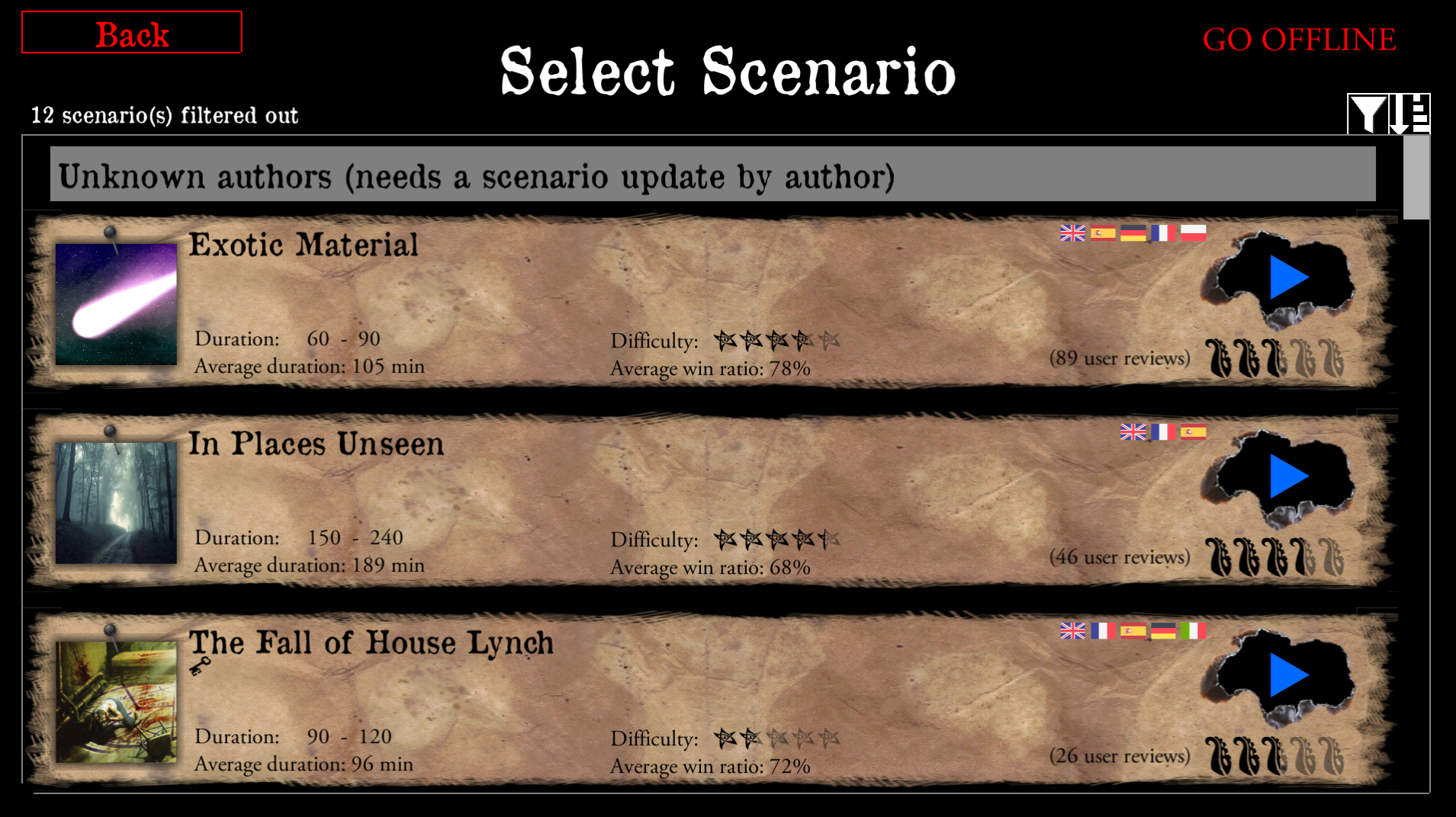
The grey play button is confusing, like it's not available, maybe a green or blue button may be better. On my phone it was really hard to press, but suspect will be fine on a tablet.
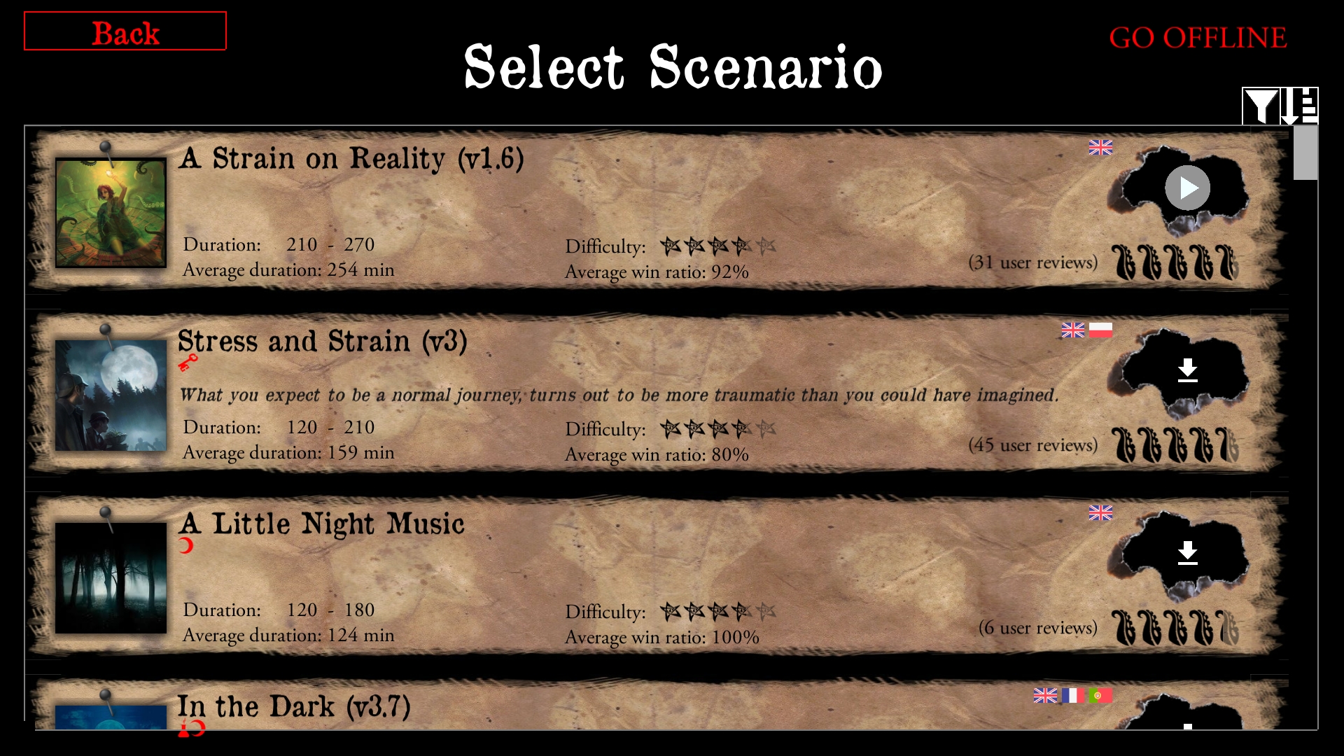
_Originally posted by @scrubbless in https://github.com/NPBruce/valkyrie/issues/1033#issuecomment-459514276_
 BenRQ
BenRQ
All 34 comments
I'm happy to take and try any proposal on this.
Here is the original file.

Please keep the aspect ratio.
BenRQ
on 2 Feb 2019

 redwolf2
on 2 Feb 2019
redwolf2
on 2 Feb 2019
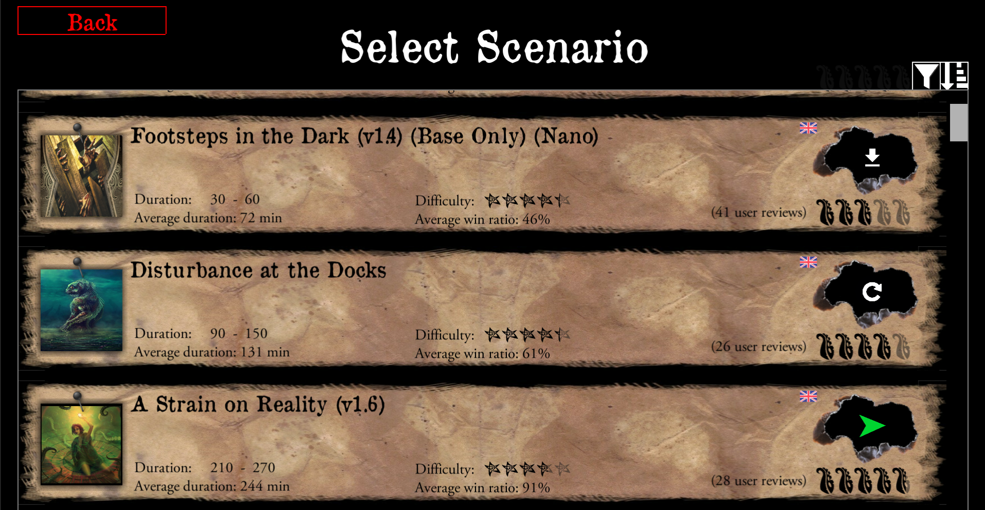
We tried something similar on discord, in my opinion it did not look so good.
What do you think ?
BenRQ
on 2 Feb 2019
I've seen that and I agree, a "play" button is IMO the most valid symbol to use. The button in the image is more of a "next" button and has some simiarities to a paper plane symbol used for "send".
redwolf2
on 2 Feb 2019
Could you just update your grey button to green or blue? The symbol itself is perfectly fine, it's just the colour that's confusing. I'd do it but on my phone ATM!
 scrubbless
on 2 Feb 2019
scrubbless
on 2 Feb 2019

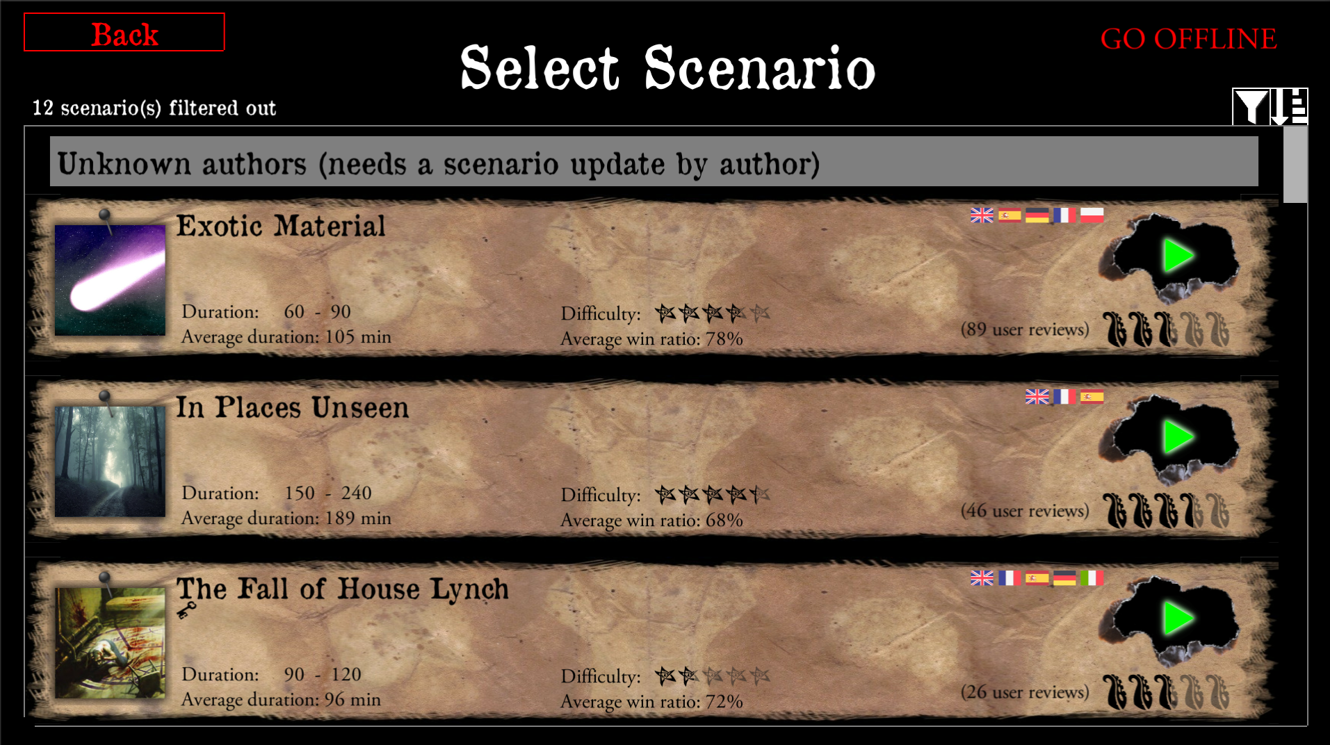
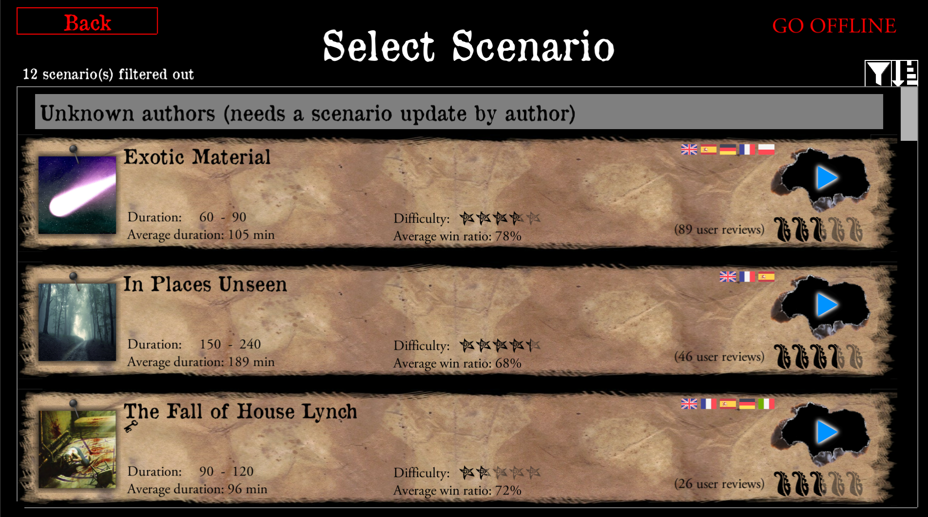
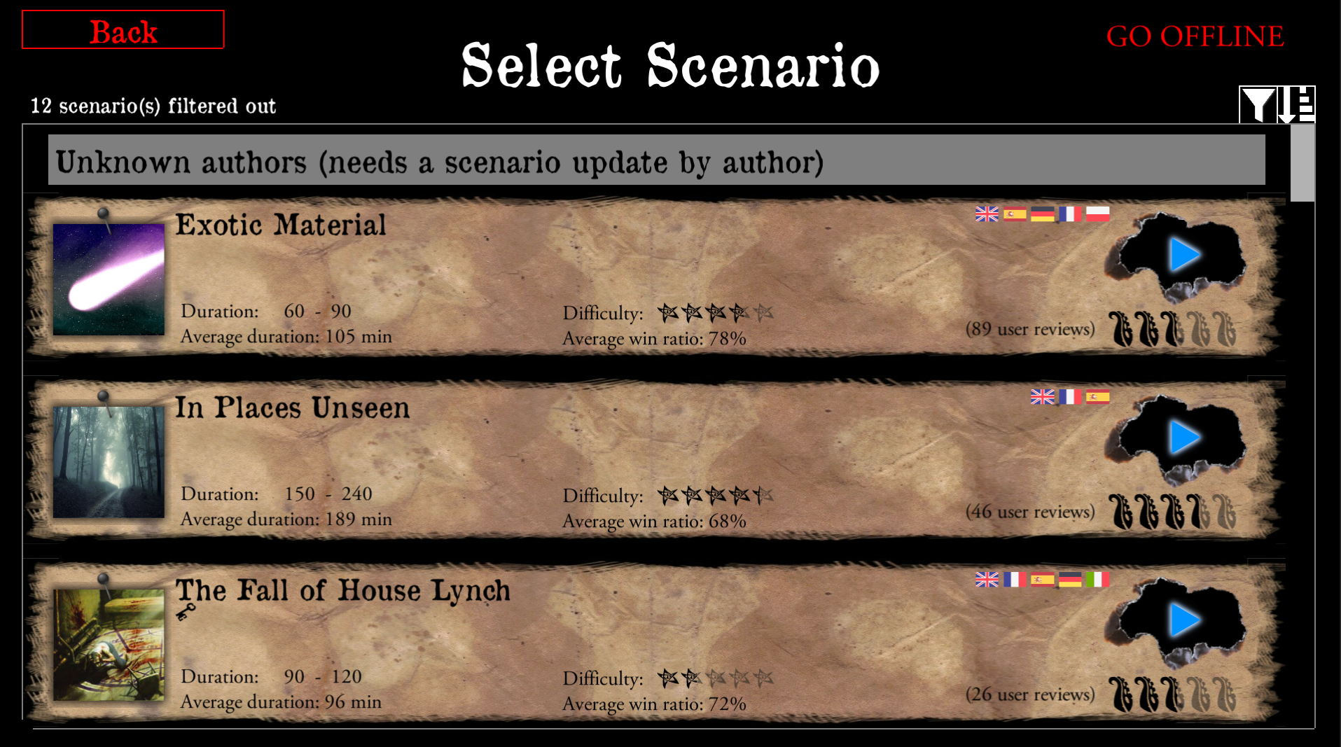
I can anso make a blue variant ... one moment
Update:



redwolf2
on 2 Feb 2019
BenRQ
on 2 Feb 2019
BenRQ
on 2 Feb 2019
BenRQ
on 2 Feb 2019
The halo doesn't look as great as expected the non halo ones are better. I will also recreate a round one.
redwolf2
on 2 Feb 2019
Halo is probably to strong.
I think it would be better with a really dim light, like a small shadow.
The green is to "fluo" for me :P
BenRQ
on 2 Feb 2019


redwolf2
on 2 Feb 2019
BenRQ
on 2 Feb 2019
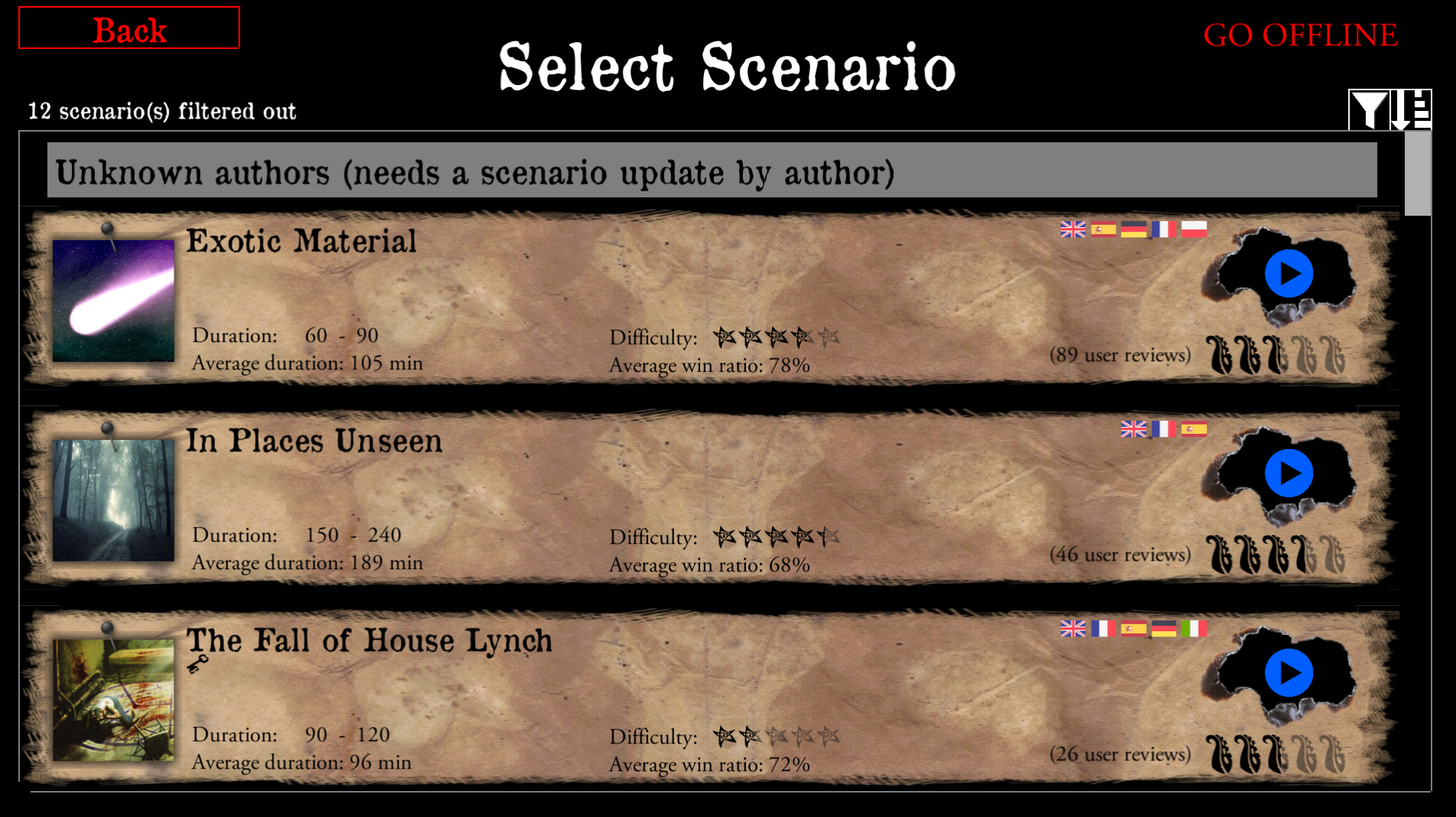
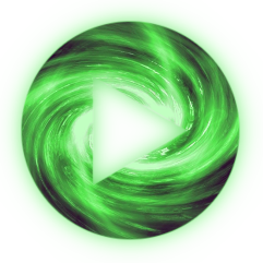
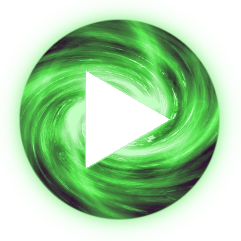
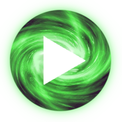
I like the green one, it pops the best. Here they are with a mild halo.


redwolf2
on 2 Feb 2019
We won't see the dark halo on black background
BenRQ
on 2 Feb 2019
All this is already way better than my awful grey button.
I let you guys vote and agree on one, or propose even more logos.
I need to sleep, I'll take new capture if required tomorrow.
BenRQ
on 2 Feb 2019


ok, no problem. Good fight, good night.
redwolf2
on 2 Feb 2019
Wow, the last green is great, @redwolf2!
 chrismaliszewski
on 2 Feb 2019
chrismaliszewski
on 2 Feb 2019
Yeh that's cool, last green one!
scrubbless
on 2 Feb 2019
First green : 👍 to vote

Second green : 👀 to vote
BenRQ
on 2 Feb 2019
I like both 😋
BenRQ
on 2 Feb 2019
Second green is sharper.
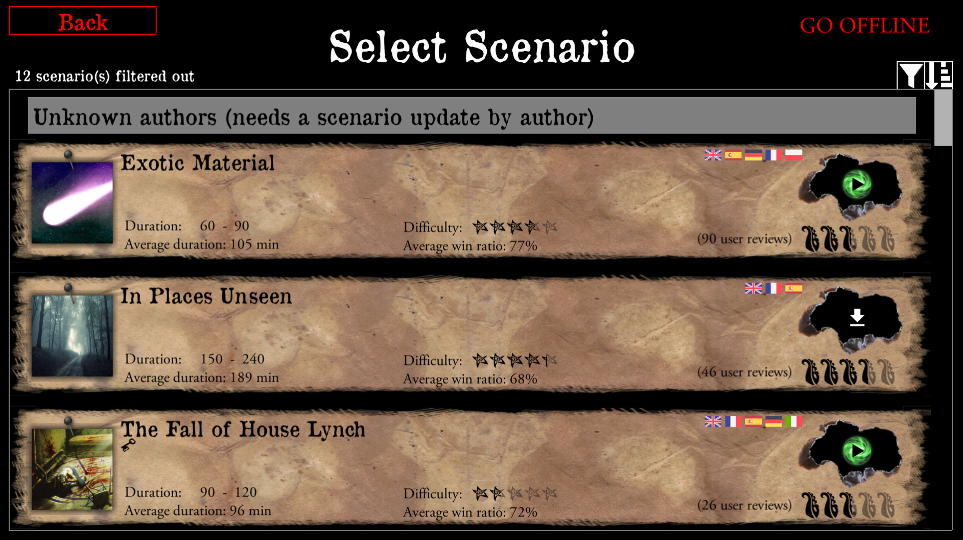
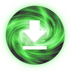
Can we make the download button like that maybe in blue!?
scrubbless
on 2 Feb 2019
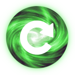
There is also the update button


BenRQ
on 2 Feb 2019
 redwolf2
on 2 Feb 2019
redwolf2
on 2 Feb 2019
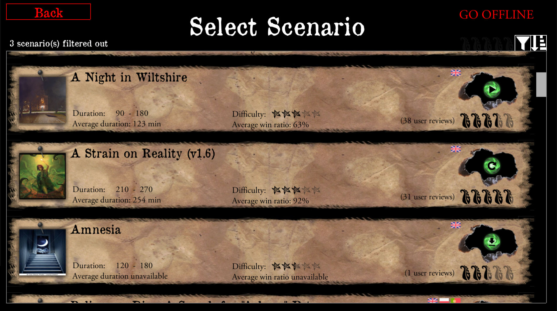
Is it just me or does the download arrow looks off center.
All look good though
scrubbless
on 2 Feb 2019
BenRQ
on 2 Feb 2019
Yeh that download arrow is off center :D.
Looks good in app though @BenRQ
scrubbless
on 2 Feb 2019
Should I commit and close this then ?
BenRQ
on 2 Feb 2019
@redwolf2 does that download arrow look off center to you?
scrubbless
on 2 Feb 2019
It's off as the other things are.
If we want to be precise.
When you change the size of images to 5cm, the circle instead of having a diameter of 4cm, it has 4.1cm (according to my fast calculation). Because of that, the shapes are in the centre of the circle but off the centre of the image for 0.1cm.
The confusion is enlarged more with the icons which have different sizes and are placed in a different manner:
-'update' is the widest; it's a reference point here,
-'download' is centred to it; it's ok,
-'play' however is not centred but aligned to the right of the circle but we more focus on it so the 'download' button seems off because of that.
0.1cm off is not a problem nor the alignment is. All looks fine to me and I really like the design!
chrismaliszewski
on 2 Feb 2019
Haha it looks off in Ben's screenshot too. Maybe I have an eye for alignment.
It's not a problem still looks good, jsut didn't know if it was an easy fix
scrubbless
on 2 Feb 2019
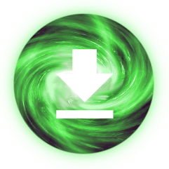
Here is a more centered download arrow, it wasn't off by much. I think most of it is due to the swirl creating an optical illusion?!
redwolf2
on 3 Feb 2019
Yeh that looks better and you could be right about the illusion :D
scrubbless
on 3 Feb 2019
OK it's merged. Closed.
BenRQ
on 3 Feb 2019
Related issues
 jlederer2
·
7Comments
jlederer2
·
7Comments
 asn-d6
·
6Comments
asn-d6
·
6Comments
 EMILIPULIDO
·
8Comments
BenRQ
·
8Comments
scrubbless
·
4Comments
EMILIPULIDO
·
8Comments
BenRQ
·
8Comments
scrubbless
·
4Comments
Most helpful comment
ok, no problem. Good fight, good night.